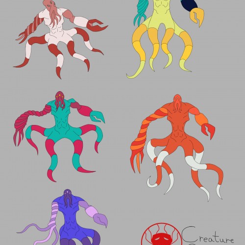
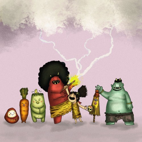
I decided to go with the mimic octopus color palette as the main one. The colors compliment each other nicely, and it doesn't look too busy as a result.
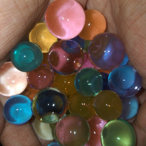
I was trying out different color palettes to see which one I preferred. The top palettes are based off the mimic octopus and the blue-ringed octopus, respectively. The rest aren't inspired by anything, I just thought the colors looked nice.
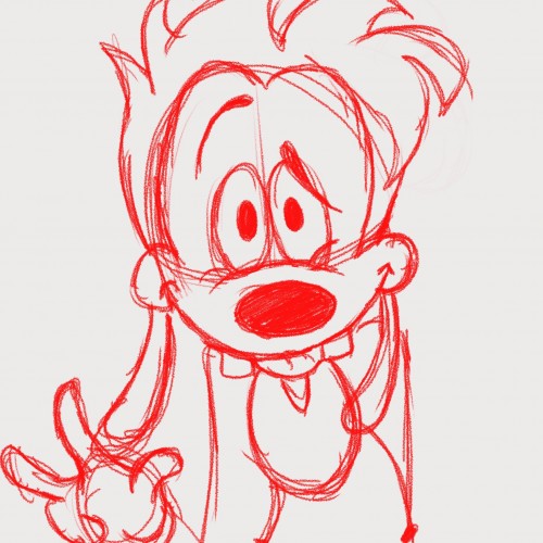
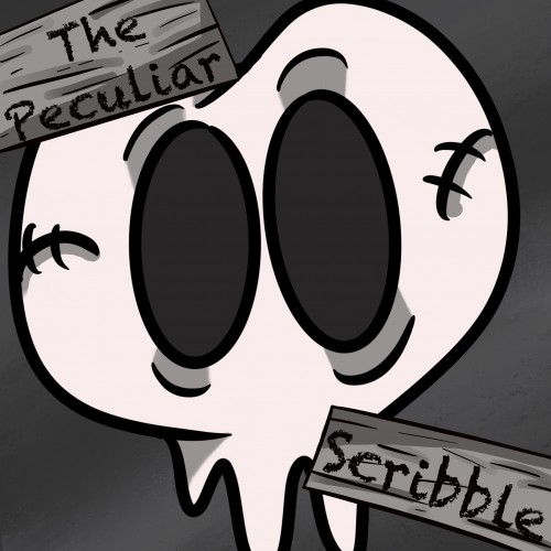
This is a new logo I created for my Webtoon, The Peculiar Scribble. It is about Scribble and his adventures in a place called, The Realm. Scribble is a heartwarming comic that is suitable for all ages. If you would like to read more below is the link to the comic: https://www.webtoons.com/en/challenge/the-pecuilar-scribble/list?title_no=866623
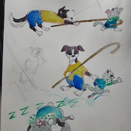
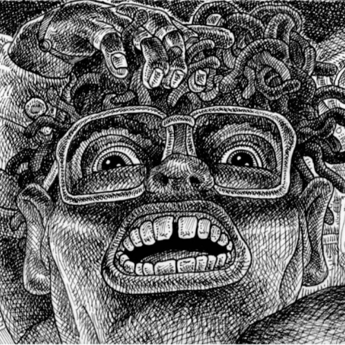
Having younger siblings is 50% about having spoiled rotten playmates and 50% about making sure those little morons dont accidentaly kill themselves. Border collies are so hard to draw antropomorph! Ever noticed how they most of the time keep their head lover than the bum?
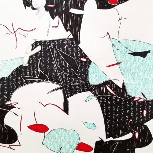
Whether the script in the background is an actual sutra is not the concern, even if it is, would it be readable to most? I question the use of lines in Calligraphy. Without the recognition of the exact words or meaning, can we still appreciate the quality and skills involved? Armed with a Chinese writing foundation, I adapted the use of the eight strokes (the basis of construction to Chinese character). The `writings’ resembles Chinese/Japanese writings but in fact, they are not. I needed a texture. With language as a symbol of culture, by visually adapting these kind of lines endears us to the image.
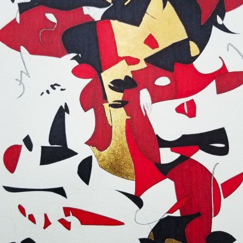
Some works were born to be prodigious. Once the preliminary lines were laid within the first minute, the quality of the shapes, the diagonal composition and the weight were balanced out.
With the black mass as the hood, a face, hidden underneath, is unveiled. With the addition of the black fingers and the white hand, the full figure surfaced naturally.
The black fingers are the minimal suggestions to add character. The title `Remorse’ came about because of the bowed head and the pose.
utube clip: https://youtu.be/mb48rCx-lYI
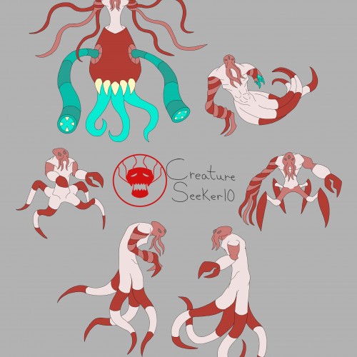
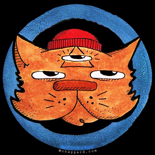
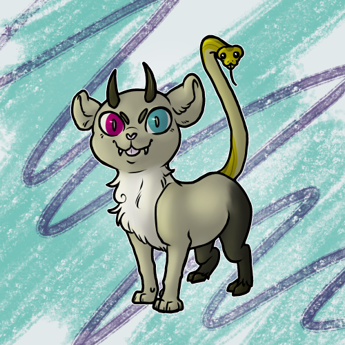
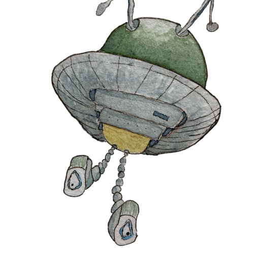
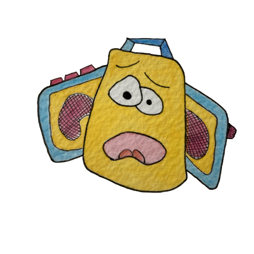
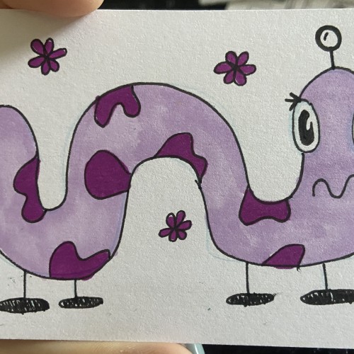
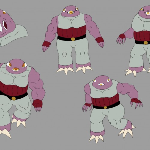
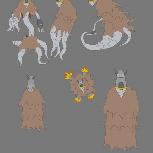
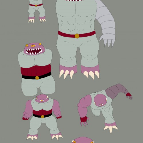
A 3-eyed creature I've been designing. The lower drawings the designs I'm leaning more towards. I was messing around with colors a bit, and they're the ones with the color pallet I'm leaning more towards.
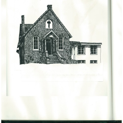
This pen-and-ink illustration was done for the cover of a church statement of faith.
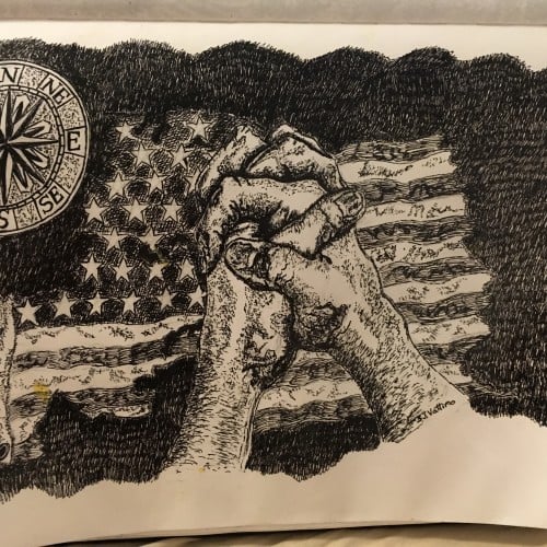
I named this illustration Foundation of America because I believe this country was
founded by Christians who had strong faith in the God of the Bible, and through
faith, prayer, and sacrifice, the patriots overcame the mighty British military. By the
hand of God, a new nation was born: the United States of America. When the United
States was filled with God-fearing people, God raised the country to be a super power,
and the world envied the United States and flocked to her shores, the land of freedom
and opportunity.
Now this country has forgotten the God who gave birth to her and now is setting
up new idols to worship: idols of wood, stone, metals that do not hear or see or
care. Because the United States has forgotten God, it has been plagued with storms,
tornadoes, floods, droughts and her enemies are waging war with her, waiting to
celebrate her fall.
It is my hope and prayer that people who love this country will return to honoring God
and return to giving Him thanks for all the great works He has done for this nation
and turn from our sins and follow God by obeying His Word: the Holy Bible. That
God will remove His hand of judgment and His blessing may return to our country.
This church was fist built in 1890 and is still being used as a church. It is in Norristown,
Pennsylvania. This was the first Bible-believing church I attended when I became a
Christian.
(October 28, 2017)