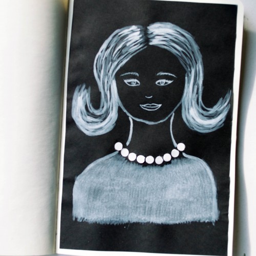
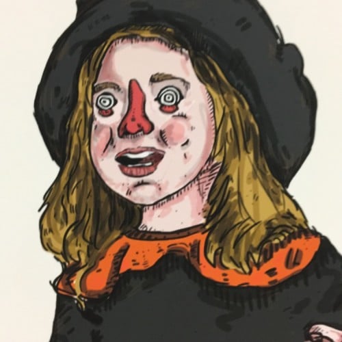
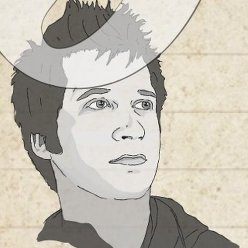
The idea for this portrait came to me when I was looking at a packaging of soap - it was very glossy and it looked like it could look like pearls. As well as the soap packaging, I used white ink mixed with acrylic paint (for opacity) on black paper.
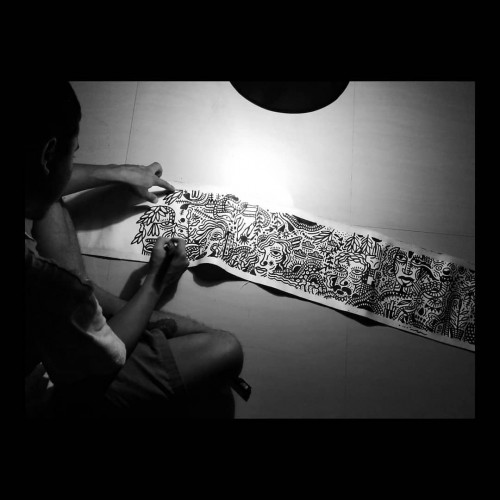
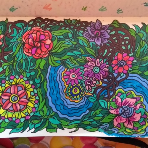
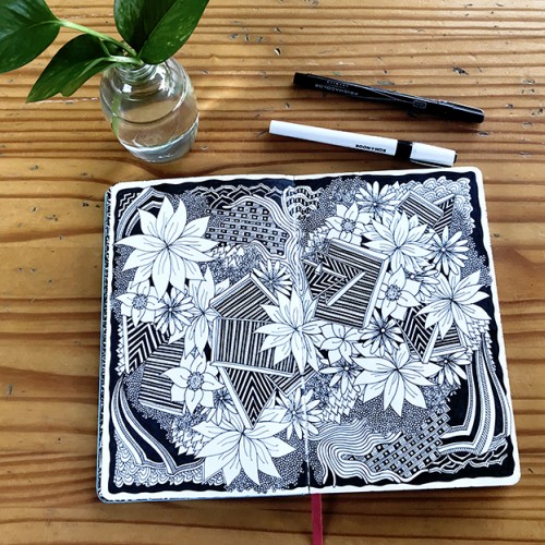
India ink on tissue paper. I had never used ink on this kind of paper before; I really liked the results! There are some folds and wrinkles on the paper that give the pattern some interesting details. The paper is also super absorbing, which plays nicely with the quantities of ink. Since it's very thin, there can easily be overlays between textures. And finally, when trying to use less ink (so that it wouldn't seep through and cause a big dot - the absorbing quality is nice, but it was also somewhat of a challenge!) I used very little ink on the lettering, causing a scratchy, dry look.
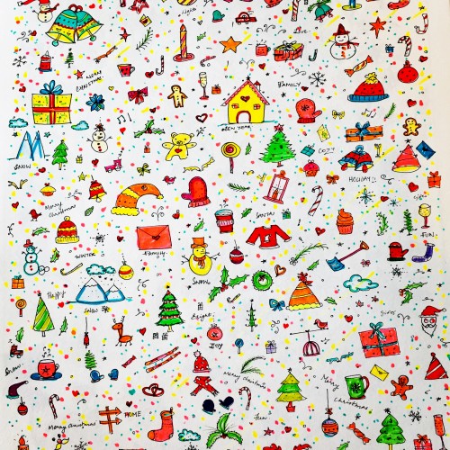
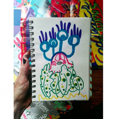
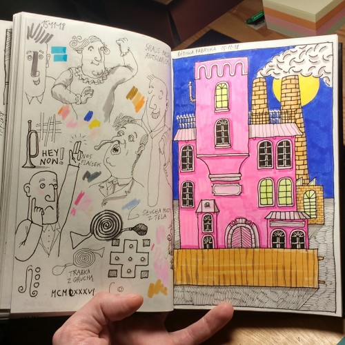
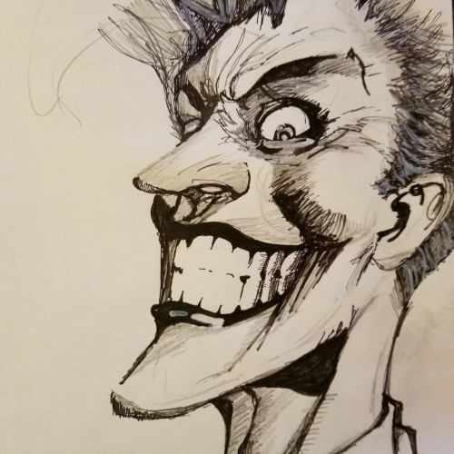
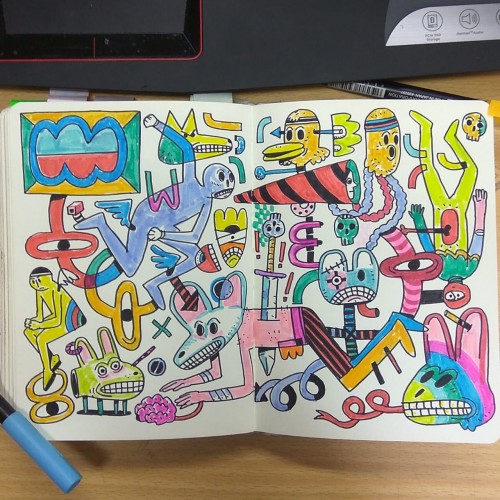
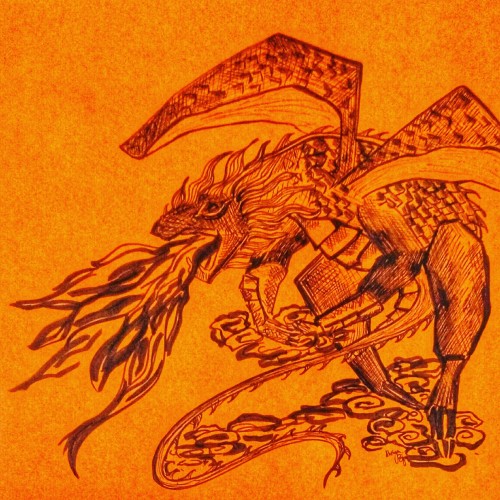
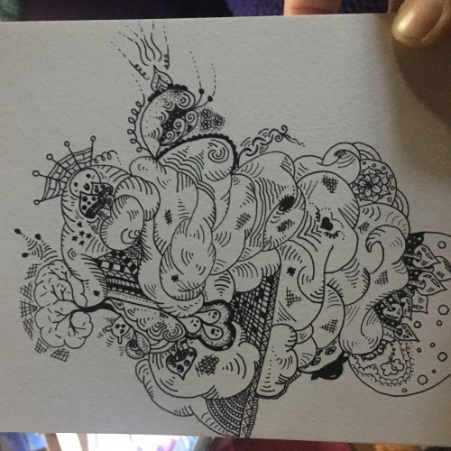
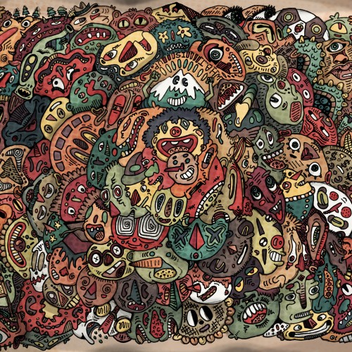
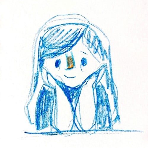
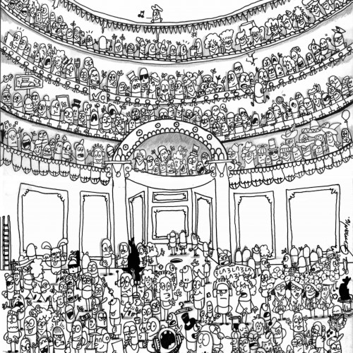
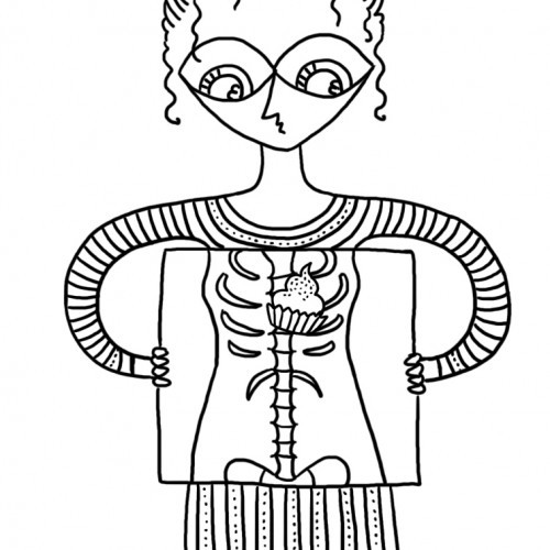
An old-style doodle, with many parts to look at! This took a few days, from the initial drawing, to inking, to uploading to my computer and digitally coloring and adding textures and detail! Lots of fun, and definitely different from my normal doodle-style. Thanks for viewing!
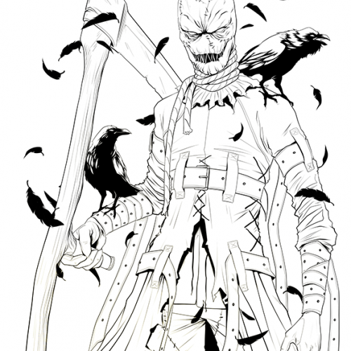
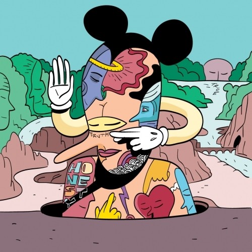
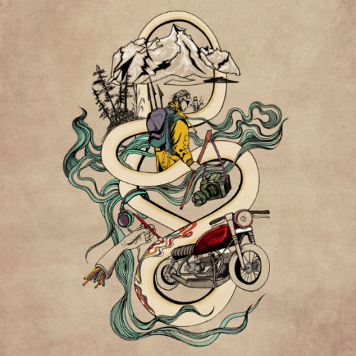
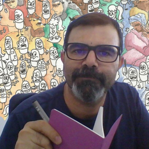
Illustrated this for my Resume, summing up my Identity in a doodle. The things that fuel me as an artist and as a creator, my journey as a Seeker and Explorer.
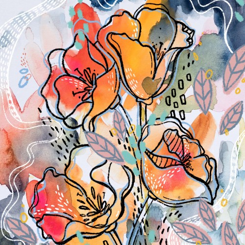
This was my submission to the recent Mother Nature doodle challenge held here. Mixed media using traditional watercolor and digital line art/embellishments. It is now available on Society6 as a print, stationery, and a variety of phone cases.