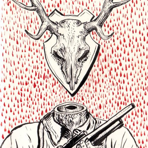
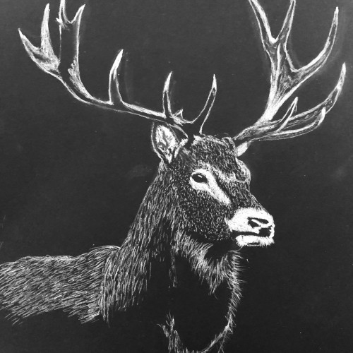
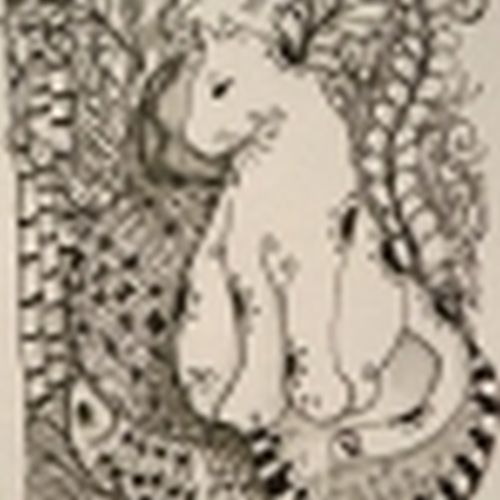
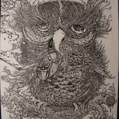
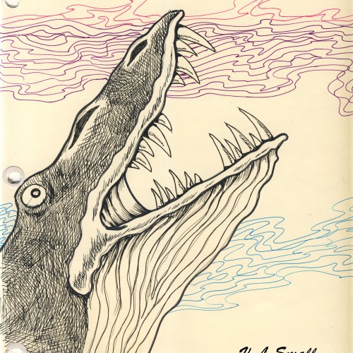
For day 15 the inktober word was weak so I decided to approach the subject of hunting for trophies.
It is not the animal that's weak it's the human that's cruel.
A lot of species become endangered because of our need to kill. We should love and protect all the animals, not put them on walls (real or virtual) only for our pleasure and ego.
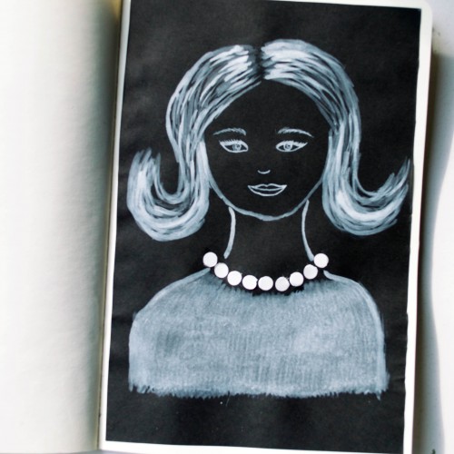
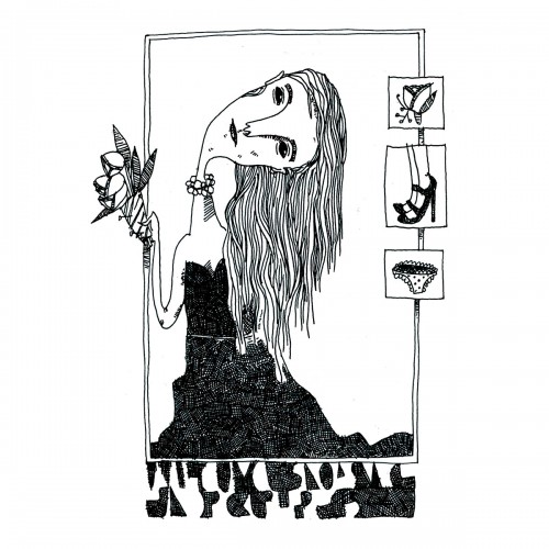
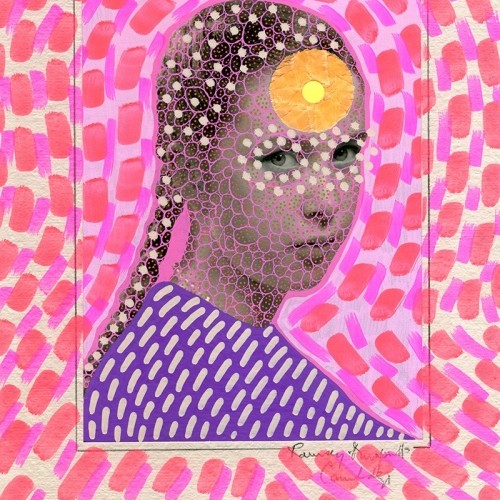
The idea for this portrait came to me when I was looking at a packaging of soap - it was very glossy and it looked like it could look like pearls. As well as the soap packaging, I used white ink mixed with acrylic paint (for opacity) on black paper.
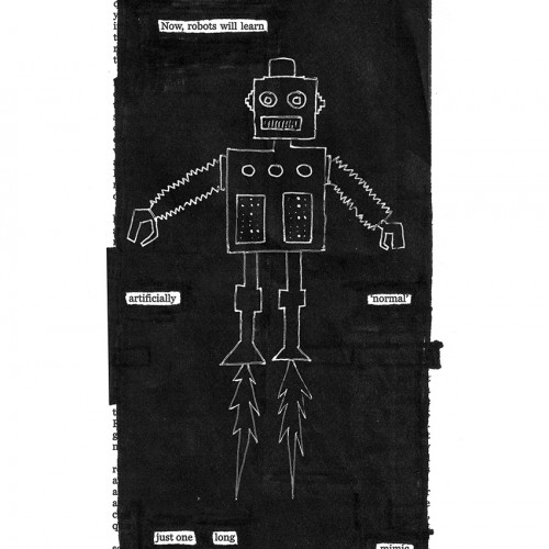
India ink on tissue paper. I had never used ink on this kind of paper before; I really liked the results! There are some folds and wrinkles on the paper that give the pattern some interesting details. The paper is also super absorbing, which plays nicely with the quantities of ink. Since it's very thin, there can easily be overlays between textures. And finally, when trying to use less ink (so that it wouldn't seep through and cause a big dot - the absorbing quality is nice, but it was also somewhat of a challenge!) I used very little ink on the lettering, causing a scratchy, dry look.
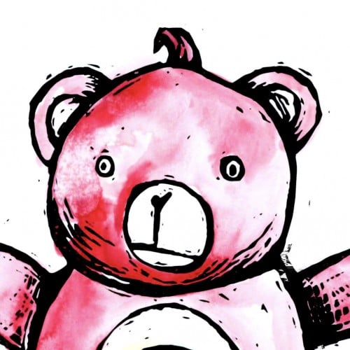
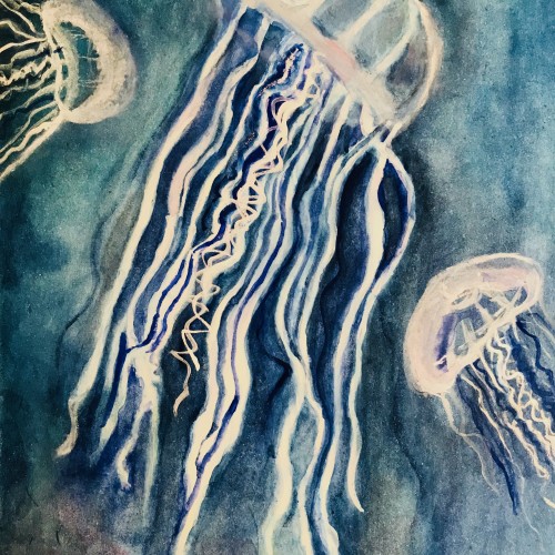
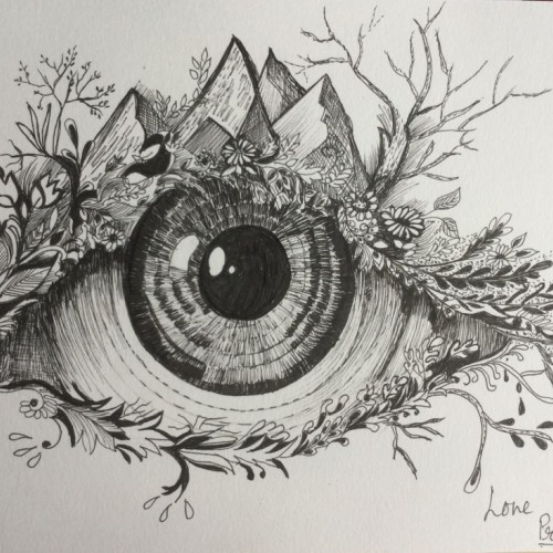
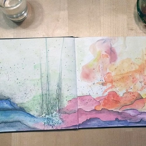
This was my submission to the recent Mother Nature doodle challenge held here. Mixed media using traditional watercolor and digital line art/embellishments. It is now available on Society6 as a print, stationery, and a variety of phone cases.
After my high school boyfriend and I broke up, I went to prom with a group of single friends. While I was in the bathroom, I overheard someone saying, "Leah Budin put in no effort at all." Ouch.
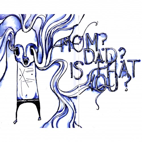
When I was a teen, my grandfather had alzheimers, a failing heart, and half of one lung. He was covered with scars and sometimes muttered at walls.
I was asked to keep an eye on him, briefly, one afternoon, while my grandmother did something else. While I was alone with him, he looked at an empty space right next to me, and whispered: "Mom? Dad? Is that you?"
With the exception of getting hit by a car, that was the most terrifying moment of my life.
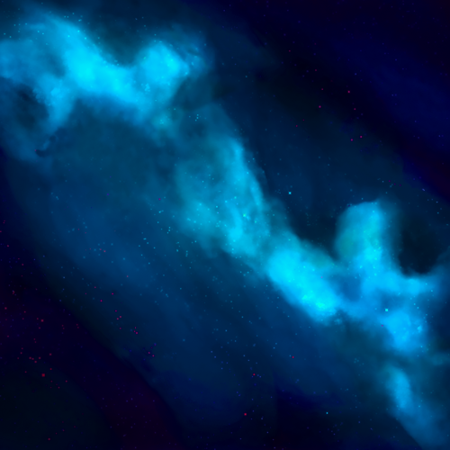
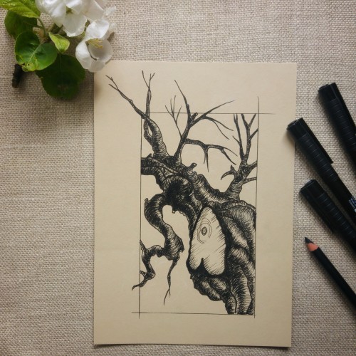
It was supposed to be a blooming cherry tree but somewhere in the proccess it turned toward a scary dead tree like from Sleepy Hollow of Tim Robbins ;)
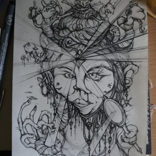
i feel to much focus is put on faces being to aesthetically perfect, or perfection in the media approach to what thats perceived to be. i enjoyed drawing a more imperfect edge to it and the use of the light beams was a cool thing to draw. the meaning was a look at self -adulation and the clamour for attention through various social platforms, being valentines day as well i feel to many people fall into that trap what promotes nothing more than a money making event. this helped form the title of "seduce her" using a medusa as a subject matter.
One of a series of illustrations done for a book of poetry. The poetry was in Dutch so I have no idea what the poems are about! However the designer, the late Baer Cornet liked my work!!
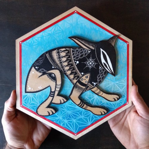
This piece was part of a collective show at Giant Robot Store in Los Angeles celebrating the Year of the dog. More details on my website: https://wolfcatworkshop.com/index.php/portfolio/hexagon-dog-for-giant-robot/
From Sketch to Final Water Coloring Stages, this is a spread from Tide Day! A lot goes into making a good composition, taking into account the center of the image where the binding is, and how to play with size and negative space. One of my favorite things to do is explore contrasting expressions between characters and highlight their emotions through physical stances and expressions. This was a tough challenge with the lack of limbs and the watery context, but Pearl's stubbornness and attitude shines through!
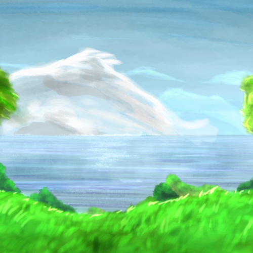
When I read the first book of the "Outlander"-Series by Diana Gabaldon, I was really inspired by the idea of travelling in time through places like Stonhenge. This is what it looks like in my head.