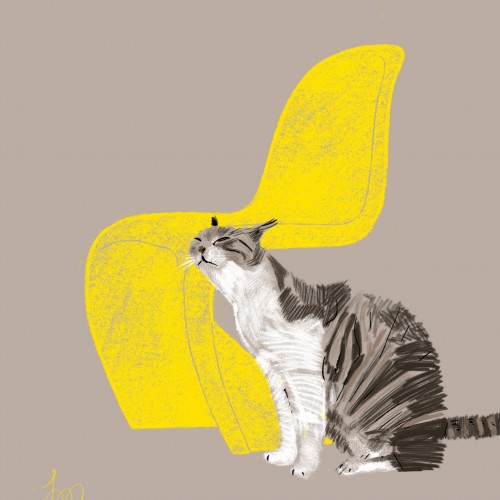
I'm doing a series of illustrations (one a week) combining my love of designer chairs and cats. This weeks chair is the famous Panton. The cat is called Anton ::)
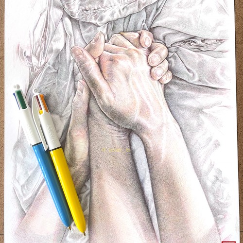
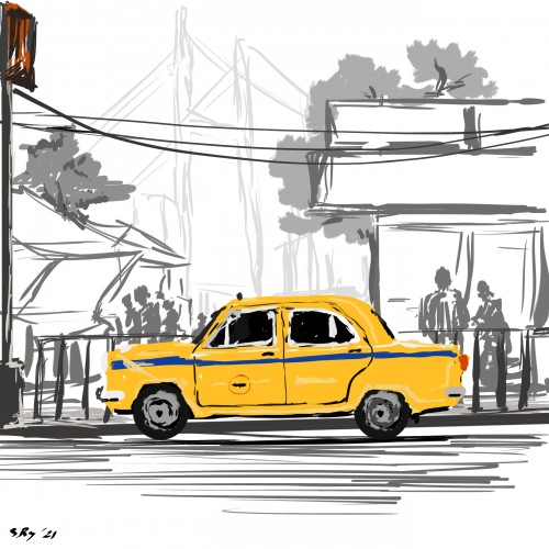
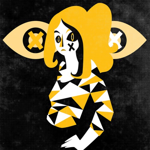
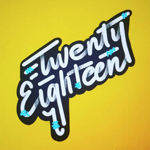
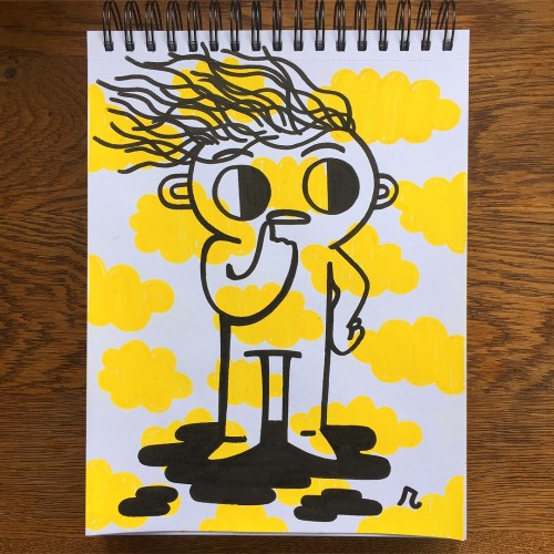
Taken me a while to finish this one - not feeling very focused lately. Also, I restricted myself to using Bic’s yellow ink, which is way more vibrant than the cheap 10-colour ink click pens that I usually use.
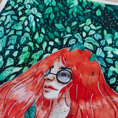
Spent a little time over the Thanksgiving holiday trying out Dr.Ph. Martin's colored inks! I had a little trouble mixing the yellows but for the most part they were a joy to work with. Reference from Unsplash.
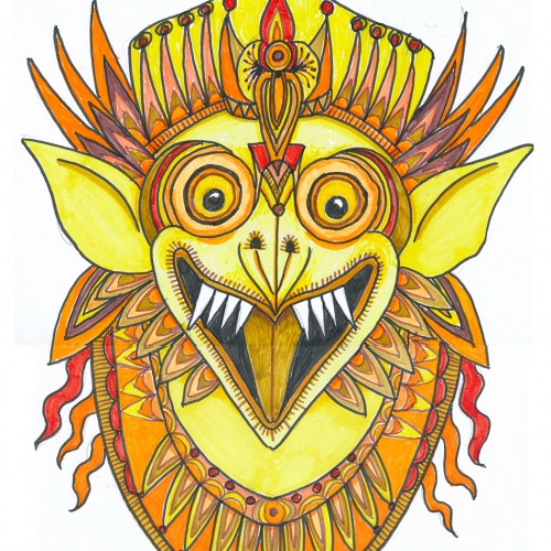
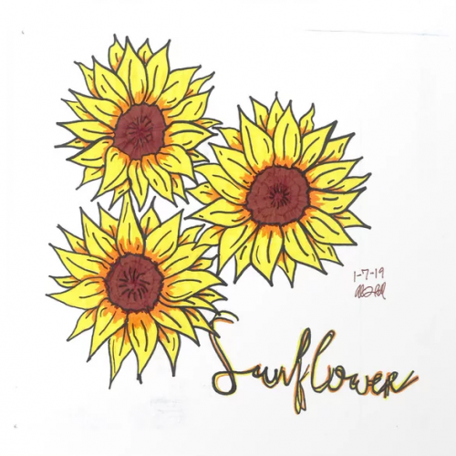
Oh boy, markers (NOT a go-to), least favorite color, and a subject that isn’t on my radar. This was a hard one what with 3 negatives going for it. But, hey, it’s a challenge, right?
Choosing a subject came first….we have a house full of Indonesian masks and sculptures. (My husband studied gamelon music in Indonesia.) Garuda, the “mount” of Vishnu and popular with Balinese artists seemed a good choice, esp. since he can be green, red, yellow or orange.
I rarely choose yellow/orange for anything---artwork, décor, clothing...though I do have a soft spot for sunflowers.
First I drew a bunch of images based on one of our wooden Garuda sculptures and then made a simplified marking pen outline and colored it with markers.
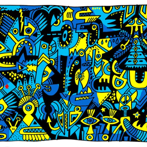
The Color flow of Lightness and Darkness. From Bright Yellow to Midnight Blue. Take a ride into the Dark forest and spot the light. Admiring the beauty in deep forest.
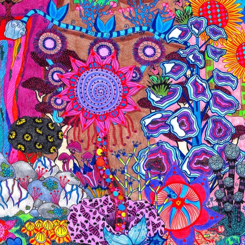
Yet another plant abstract. This one was built around the red outlined flower in the semi-center, and that’s where it gets its name. Colored pencil and pen on paper.
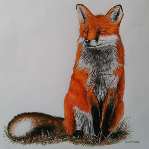
Another little fox drawing. I loved the reference picture and wanted draw a smiling fox. Even was the first time I tried to draw the nice fure... red, orange, yellow, brown, mahogany makes the wonderful red fure which I do love.
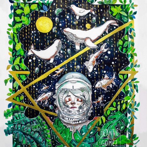
"Beauty of Hope" as one of the original painting I donated to charity and it was auction in exhibit. It was one of my favorite painting so far.
I used koi watercolor and a fabriano 200 gsm paper. Most of the color I used are blue, green, light green and yellow and a bit of orange. The metallic gold paint was one of the color that added flavor to the painting.
Drawn with papermate inkjoy gel pens. For custom commissions reach out to art.by.alisonlove@gmail.com, and check out my facebook page (facebook.com/artbyalisonlove) and society6 shop (society6.com/artbyalisonlove
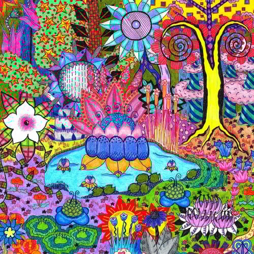
One of my botanical abstracts, this one centered around a pond. Though I will be selling the original locally, the print is available on thousands of clothing and home good products across my many websites. Browse them all here: https://linktr.ee/okhismakingart
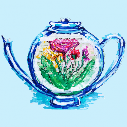
A teapot design features colorful flowers inside. The vibrant hues of pink, yellow, and green stand out, creating a striking contrast with the blue teapot.
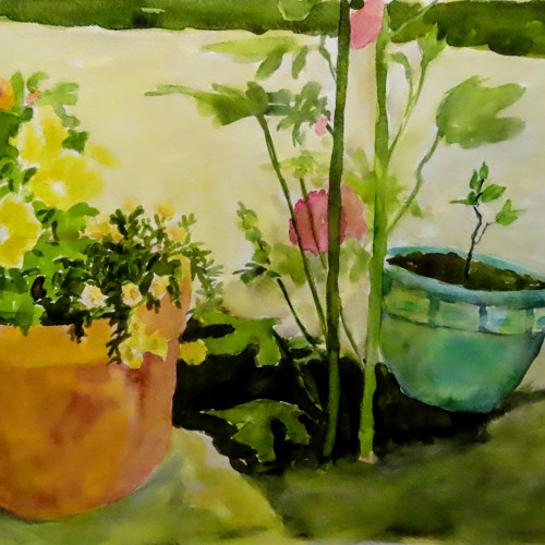
This is the next redo on tap. It's a watercolor painted in about 2006. Likely I'll only change values of the leaves--the lighter ones. And I will try to define the yellow petunias better.
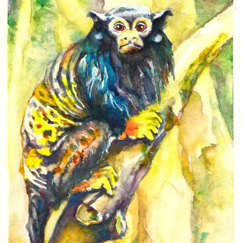
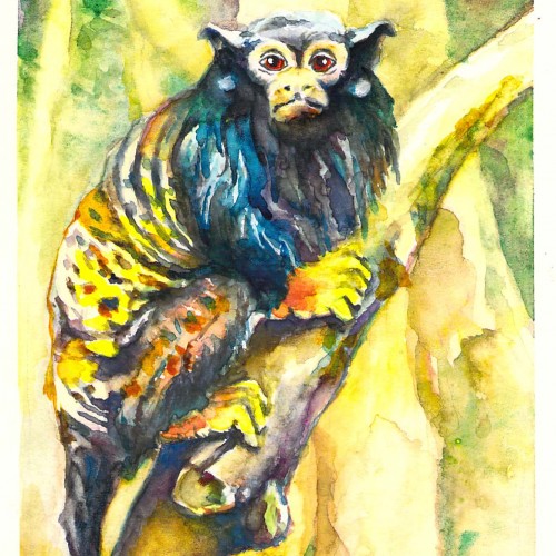
My next monkey watercolor -well, mostly - there is a touch of acrylic paint on the eyes. I do not know why they are called red-handed - since they seem to have yellow hands.