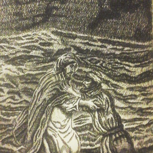
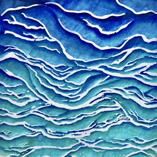
This study is for an upcoming painting about the life of Christ.
The drawing itself took about two weeks’ time of working on it off and on. The
research stage took about two months. This study is attempting to capture the spirit
of being out on the water, walking with Jesus during a storm on the sea of Galilee. I
hope the viewer can feel Peter’s anxiety as he is sinking into the lake as a fierce storm
drains Peter’s faith in his ability to walk on water through the ability the Lord gave
him. I wanted to show how compassionate Jesus is to quickly crouch down to rescue
Peter from drowning and get him back to the safety of the boat with the rest of the
disciples, which is outside of the illustration.
Some people feel that I should have Jesus’s feet visible above the water so people don’t
get the notion that Jesus is sinking in the water too. But if I’d done that, it would have
altered what it would really look like in the natural world, because even if Jesus’s feet
were on top of the water, this might not be visible to the viewer because the waves in
front of Jesus might block the view of his feet.
This illustration makes me think about trying to accomplish a task that the Lord has
called us to do by depending on our own strength instead of the strength of the Holy
Spirit. Then we find ourselves sinking instead of making headway, and we must call
on the Lord to rescue us and put us back on the right track.
(September 22, 2015
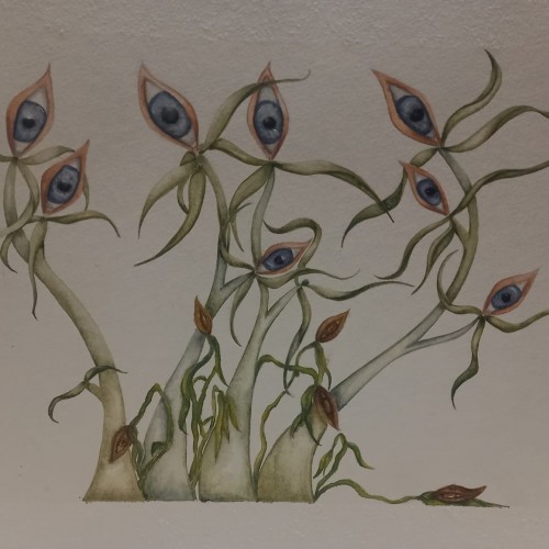
Will it always be like this? Whenever he tries to love me, will it be just an attempt?
This feeling is what I try to represent with the drawing, the tallest and most beautiful flowers are the negative thoughts towards my body and my person; the withered ones are the positive ones, which drown before the greatness and strength of the others.
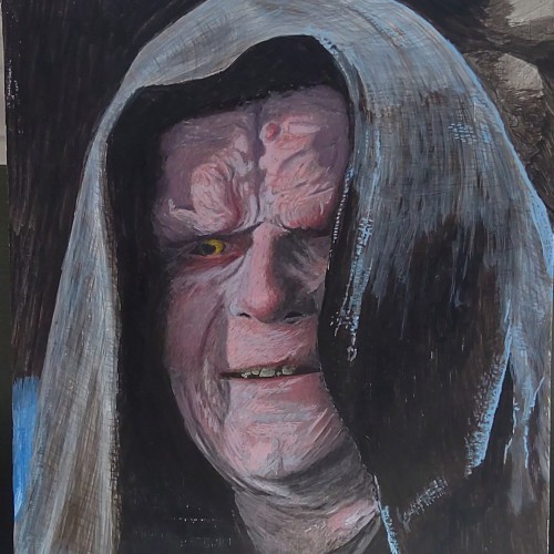
Emperor Palpatine - Egg tempera on panel 9x12. This is my 3rd attempt at egg tempera, and I absolutely love the medium. It is a little tricky to get used too, but it is quite flexible ... despite the textbooks on it that are now over 500 years old.
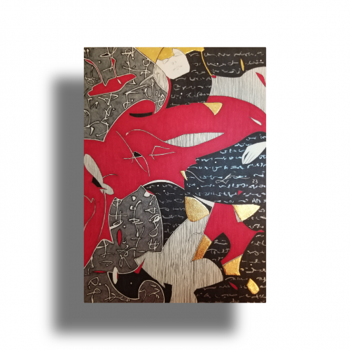
The idea is to show a figure crossing over two ` scripts’ with a bilingual suggestion. By standing in between worlds, we see opposing viewpoints.
Many artists have incorporated typography as symbols in their paintings since the 60s, but no one has attempted to approach lines in this `written’ manner. How different it is are the two writing styles of the East and the West; one with angular lines while the other in a smooth flow! This work juxtaposes the symbolism of cultures – script. At the same time, it questions the need to grasp the full meaning of the script to appreciate the aesthetic flow of calligraphic lines.
It's a second attempt at drawing a landscape with a water element.
I'm not focusing on many details by drawing water. Creating a lot of blurry shapes and lines gives a great reflection effect.
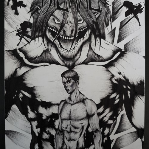
This is the third page of my attempt at 100 heads, this is Ra the sun god from the original Stargate movie. I was gifted a VHS cassette tape from “santa” back in the mid nineties, of which I still have. I watched that movie so many times my parents nearly burned the tape…
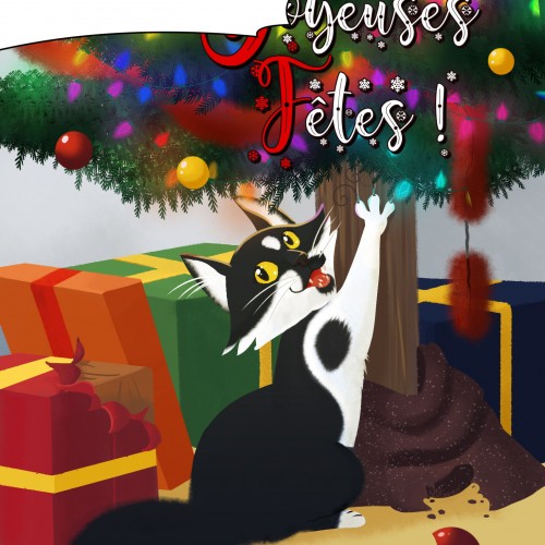
Last year, I got a new menace to my home decor, a kitten named El Sushi Panda Von Wombathaus. Sushi when I need to yell at it, that is a lot. I actually haven't attempted the christmas tree last year because of his Attila-like kitten energy and I'm honestly wondering if I should try this year too
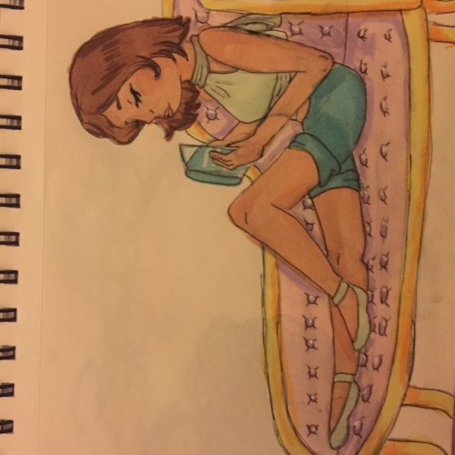
Self explanatory. It's a woman reading a book on a chaise. Also stay tuned for me attempting to keep up with Inktober prompts this October, the first time I'll participate, because I never had the time before. I still don't have the time... but I couldn't wait any longer so here I go.
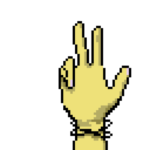
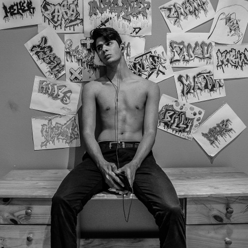
This is only the second time I've done pixel art. (both times were today) This is based on my own hand, which has rather stubby fingers, but I added some lighter touches that make it more feminine than my own. (I rather like my black nails, thank you very much)
One of my assignments asked me to draw a comic book cover using existing comics and manga. This was my third attempt at using ballpoint pen for a drawing, my shading tends to look odd in smaller spaces but I'm trying to work on it
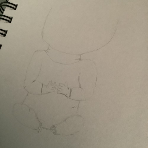
Attempt 3 at drawing a a baby! This one is actually kinda better. I like how it turned out, it’s really light so I may need to retake but attempt 3 is a success!
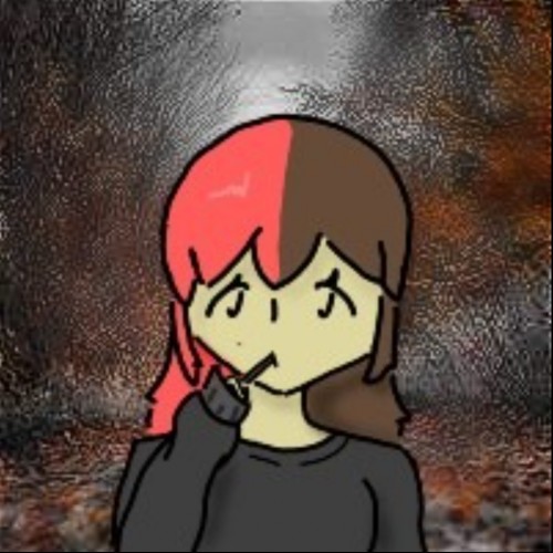
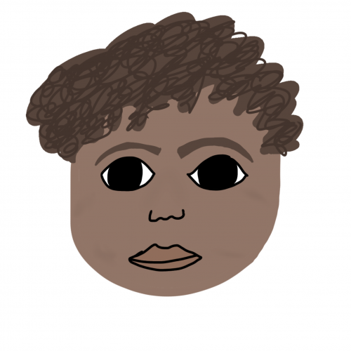
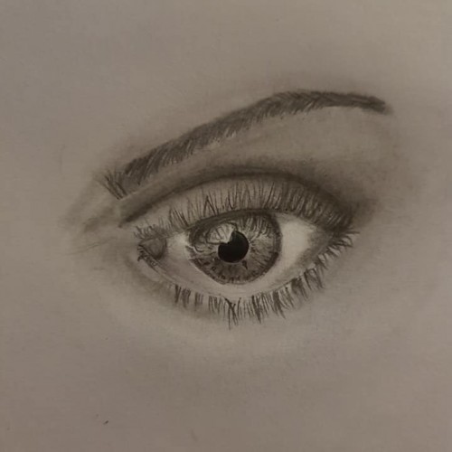
I’m bad at hair yet I chose to attempt curls..oh the irony. What are your thoughts or critique? My main focus was shading and eyes, but feel free to leave your thoughts on this as a whole
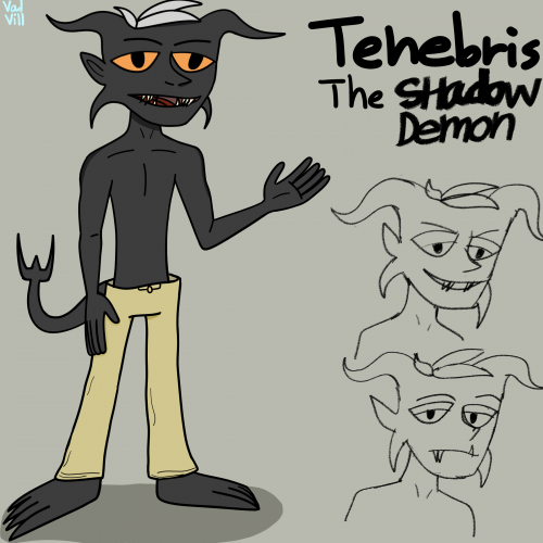
Another Oc who I haven't drawn in a while due to his original design being difficult,Now Tenebris has five fingers and four toes and finally...a tail.he looked more like a grey skinned person than a demon before.he is shirtless since male shadow demons are shirtless but I may give him an open button down shirt instead.Since it was my first attempt,next time I probably will make a reference sheet for him and other ocs.
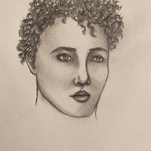
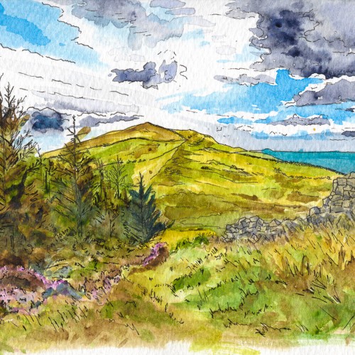
Looking at Trichrug hill from the top of Pen Arthur Forest. This was my first attempt at pen and wash in 2018. I was pleased with it for an initial effort. I struggle to be loose with my art, so this was a step forward. The only thing that really bugs me was my colour choice for the distant hills - it looks more like the sea.
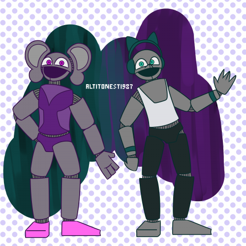
Even though I drew these two with the other three of the Liz Cat's animatronics, they somehow ended up really bad. That's why I didn't put them on the stage with the first three. Nevertheless, they are still part of the 'first batch', which is what I'll call this first iteration of the Liz Cat's animatronics. Drawn with FireAlpaca.
This is an older piece representing an idea that I keep coming back to. This is my second attempt. I'm still not happy with it and will probably try again.