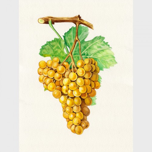
Watercolor of a bunch of grapes after a botanical sketch by the artist Troncy.
This painting was made with gouache on cardboard 400 gr / m² with a height of 32 cm and a width of 24 cm.
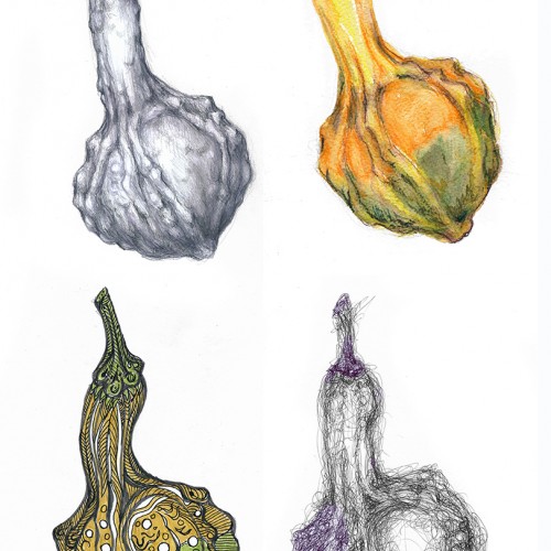
I modified the challenge a wee bit. I didn't use the same paper for the various drawings since I was using (top row, left to right) hard graphite pencils (3H to HB), watercolor pencils, (bottom row, left to right) brush pens and ballpoint pen. These media work best on very different paper textures and moisture absorbing qualities. The second picture shows the object of my study --- and the apparatus I use to hold botanical subjects. "Third hand" tools are very useful and cheap. This one was under $10 and serves my purposes well. Just FYI. (Each drawing/painting was scanned and composited in Photoshop.)
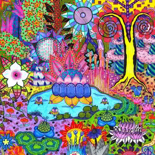
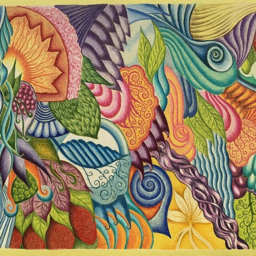
One of my botanical abstracts, this one centered around a pond. Though I will be selling the original locally, the print is available on thousands of clothing and home good products across my many websites. Browse them all here: https://linktr.ee/okhismakingart
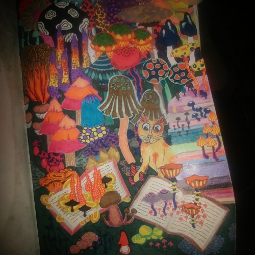
The cat in this doodle is inspired by "The Beast" from a cartoon that ran when I was a kid. The abstract mushrooms are a slight deviation from my usual botanical abstracts.
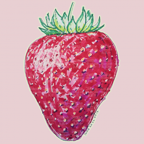
A vibrant, hand-rendered standing strawberry illustration featuring rich textures and expressive marker strokes. This piece captures the organic beauty of summer fruit through a modern, illustrative lens.
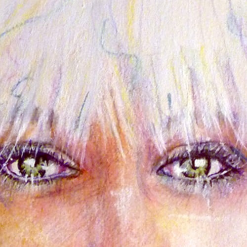
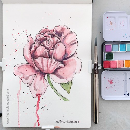
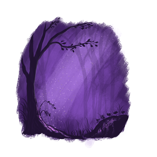
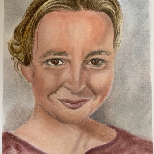
This illustration tells me that I need to push myself forward. I was in my comfort zone while painting. And I didn't go out.
It's an important lesson for me. I'm glad I can analyze it and draw conclusions.
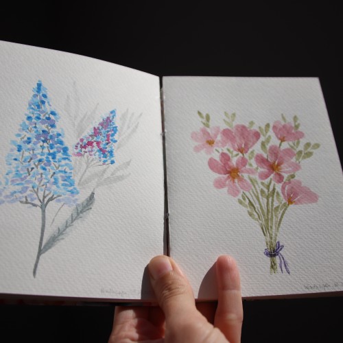
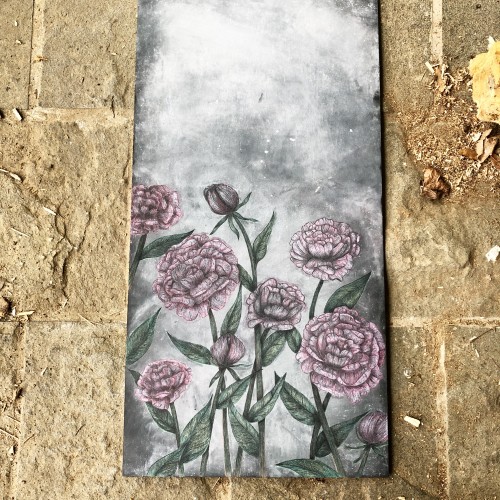
I painted these watercolor florals a few months ago. I love both color pallets, which I used - on the left side cold colors: blue and gray, and on the right side, some warm green and pastel rose.
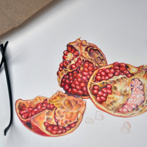
Colored pencil drawing of pomegranates "in progress." Prismacolor and Verithin pencils with some fine lines done with Tombow Irojiten pencils. I like the harder colored pencils for fine detail, but the blending of high wax and oil pencils can't be beat for blending.
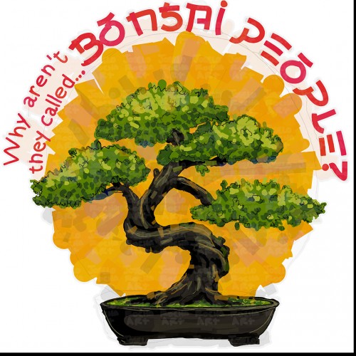
A bonsai tree sits in a black pot against a bright yellow circular background with humorous text surrounding it. The words "Why aren't they called... Bonsai People?" suggest a playful twist on the terms little person, person with dwarfism or person of short stature.
Drawing trees and other landscape elements was my daily routine for the last two months.
For two months, I've been developing my style.
It's essential to create consistently in one style for a long time. It's the way you get to know better:
- yourself,
- what you like,
- what you enjoy.
Inspired by Ruth Wilshaw and her book "Creative Gouache" I tried to get a gouache effect in my digital illustration. I think I did it. I'm nicely surprised with the final look.
That's why experimenting is so astonishing.