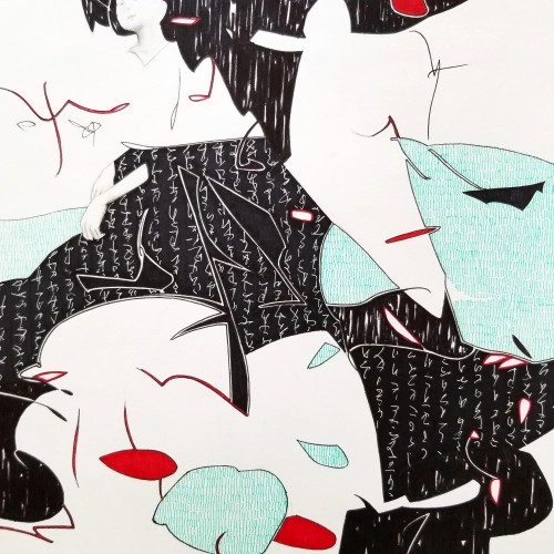
Whether the script in the background is an actual sutra is not the concern, even if it is, would it be readable to most? I question the use of lines in Calligraphy. Without the recognition of the exact words or meaning, can we still appreciate the quality and skills involved? Armed with a Chinese writing foundation, I adapted the use of the eight strokes (the basis of construction to Chinese character). The `writings’ resembles Chinese/Japanese writings but in fact, they are not. I needed a texture. With language as a symbol of culture, by visually adapting these kind of lines endears us to the image.
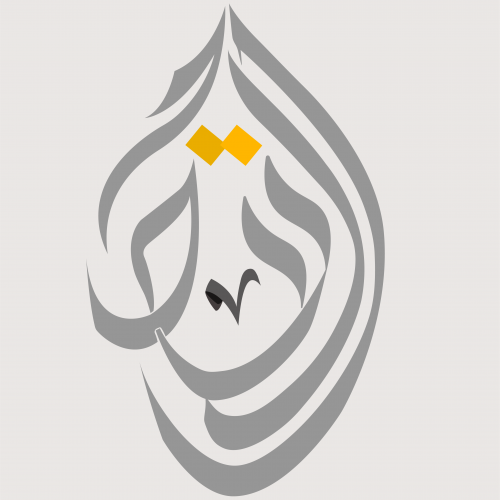
This time I designed a logo using a special style of Arabic calligraphy called "Al-Diwani". This style is distinguished by its flexibility and beauty. Besides its capability to represent and any shape that I want using any words; so I can illustrate and draw anything using this style.
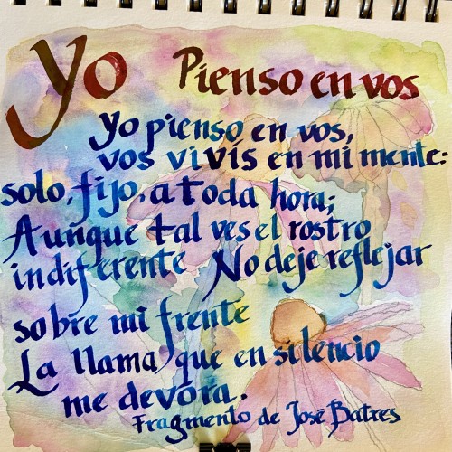
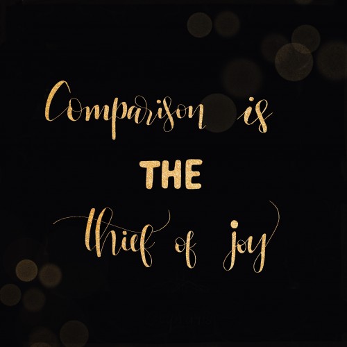
It’s like the first «stand-alone” work (meaning not as a part of the lettering course). Btw I haven’t made it to the faux calligraphy lesson yet being stuck with the serifs. Used the tracing paper on top of the initial sketch.
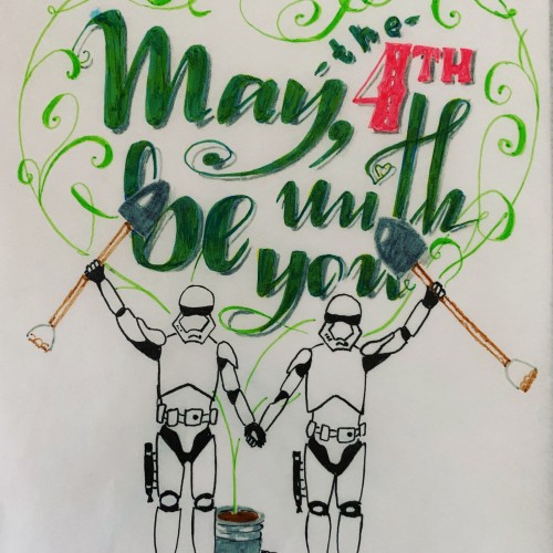
P. S. As for the shovels: in Russia we have long holidays at the beginning of May and that’s when the whole gardening thing starts