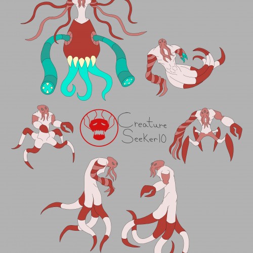
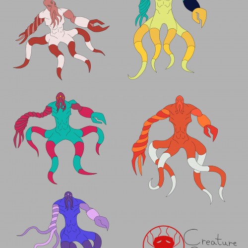
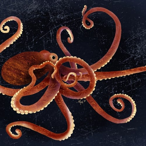
I decided to go with the mimic octopus color palette as the main one. The colors compliment each other nicely, and it doesn't look too busy as a result.
I was trying out different color palettes to see which one I preferred. The top palettes are based off the mimic octopus and the blue-ringed octopus, respectively. The rest aren't inspired by anything, I just thought the colors looked nice.
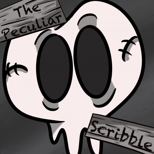
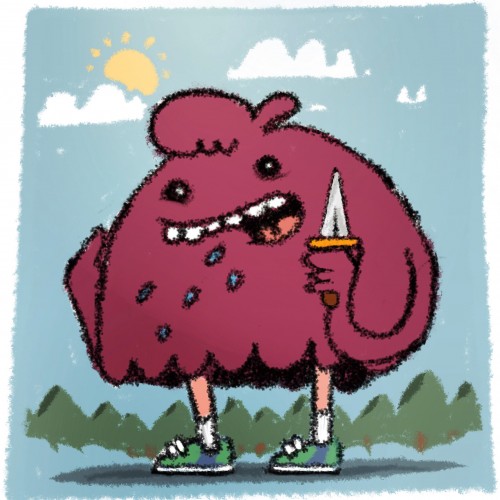
This is a new logo I created for my Webtoon, The Peculiar Scribble. It is about Scribble and his adventures in a place called, The Realm. Scribble is a heartwarming comic that is suitable for all ages. If you would like to read more below is the link to the comic: https://www.webtoons.com/en/challenge/the-pecuilar-scribble/list?title_no=866623
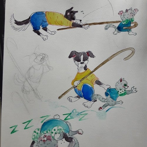
Having younger siblings is 50% about having spoiled rotten playmates and 50% about making sure those little morons dont accidentaly kill themselves. Border collies are so hard to draw antropomorph! Ever noticed how they most of the time keep their head lover than the bum?
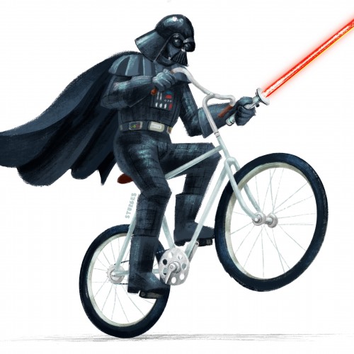
Another Star Wars fan art piece of my all time fav character from Star Wars. Which is telling how impactful his performance was considering he had very little screen time. we are talking just minutes in each film.
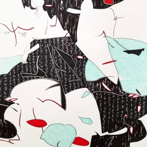
Whether the script in the background is an actual sutra is not the concern, even if it is, would it be readable to most? I question the use of lines in Calligraphy. Without the recognition of the exact words or meaning, can we still appreciate the quality and skills involved? Armed with a Chinese writing foundation, I adapted the use of the eight strokes (the basis of construction to Chinese character). The `writings’ resembles Chinese/Japanese writings but in fact, they are not. I needed a texture. With language as a symbol of culture, by visually adapting these kind of lines endears us to the image.