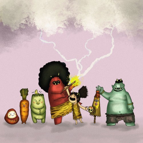
https://youtube.com/shorts/ZK7kLBkX87g?si=3sNsSY0ROVlhMBYo Not my video! This is just the same OC Challenge I did. What should I call this character though.
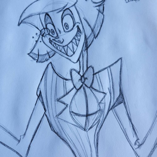
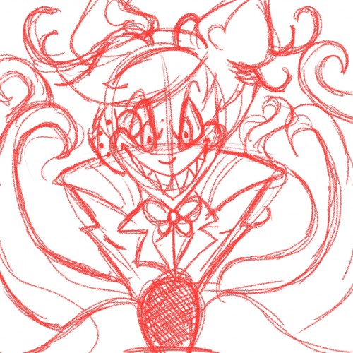
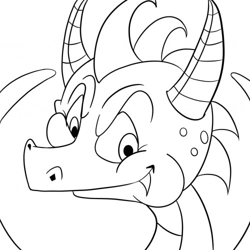
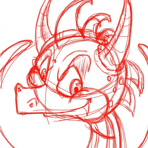
This was a sketch I did the other day. I'm currently working on the digital version. I always sketch all my images before I move to the digital versions. This is my favorite character from Hazbin Hotel.
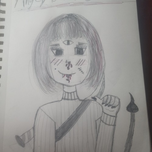
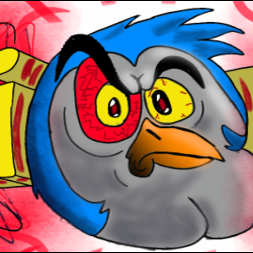
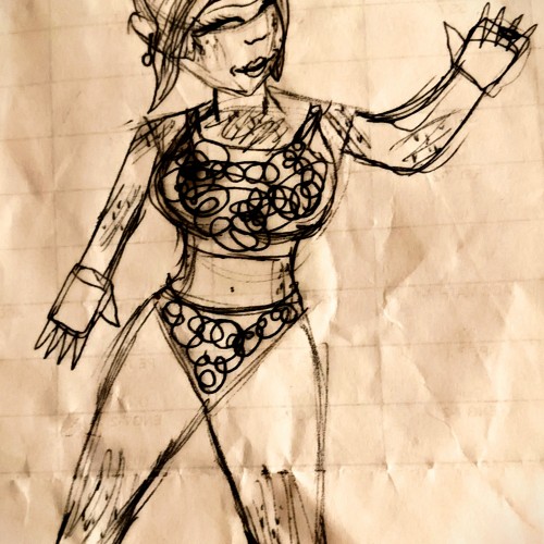
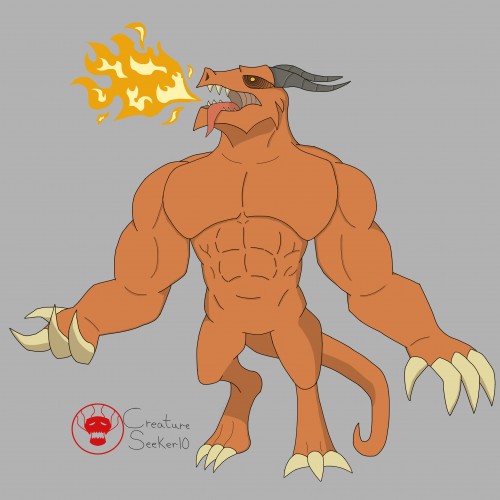
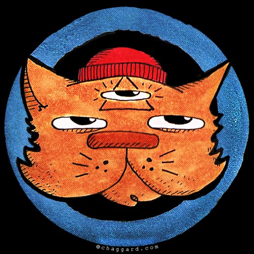
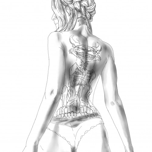
This is a piece of art that I've just done for a friend. Don't try to ask me what it is exactly, because I have crazy friends. he drew a poorly sketched character on a piece of paper, which I doodled over as a layer, so I didn't have much to work with. I was mainly experimenting with Sketchbook's tools, so that's why its kind of all over the place. God gave me the gift of art.....and I'm creating angry bird knock-offs. :]
I wanted to try a drawing that uses a monochromatic color palette. I found the process to be very enjoyable. It can feel limiting at times, working with only one color of varying shades. Specifically when choosing the amount of shades you're working with. It's also a nice alternative when I can't think of a color scheme that uses different colors.
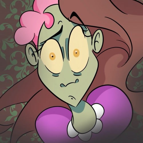
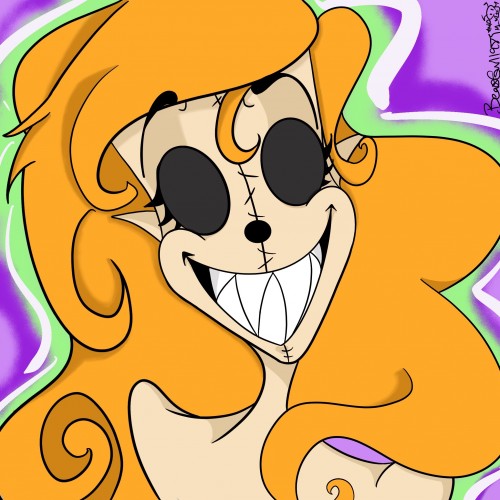
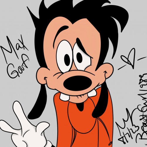
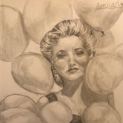
This picture I posted yesterday, the difference is the face- I hated it so much that I decided to fix it then upload it again. This just goes to show how fixing something simple can fix the whole picture. I hope you don't think I have OCD for fixing the face then uploading it again, lol
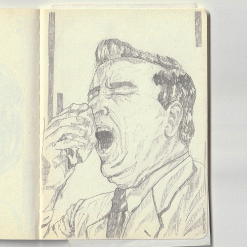
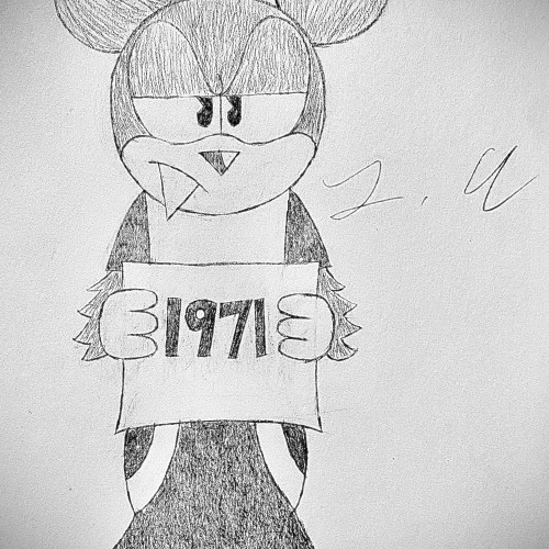
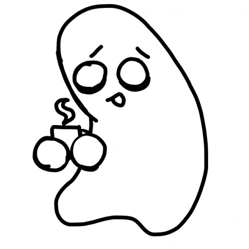
I wanted to do a simple pen sketch, where if I mess up it is permanent. The one drawing type robots can't replace. #DOWN WITH THE ROBOTS, ROBOTS SUCK!!!!#
Another attempt at utilizing varied line density. I think it came out better than the previous attempt, since the lines aren't too thick. I didn't really know what to do with this one, so it kind of feels bland as a result.
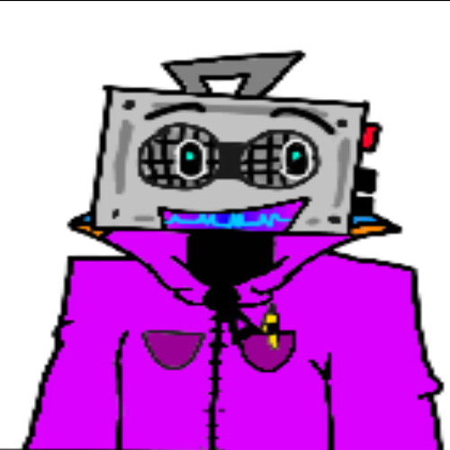
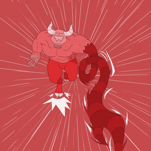
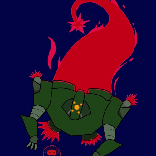
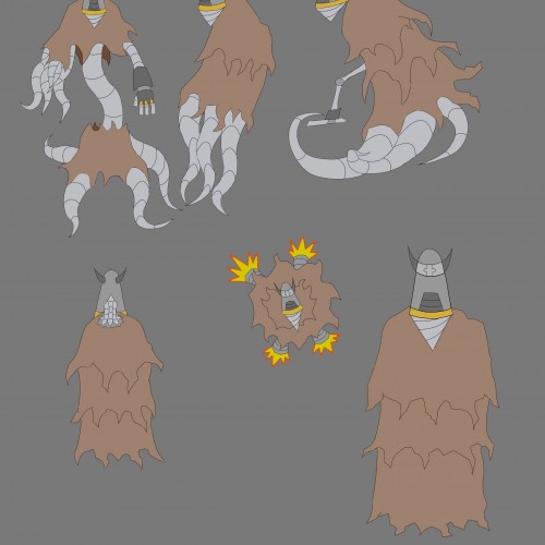
I'm experimenting with line density to help differentiate details from the main outlines. I think I went a bit too thick on the robot's line art. I'm satisfied with how the flame trail came out though.
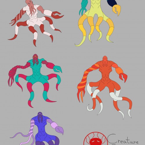
I was trying out different color palettes to see which one I preferred. The top palettes are based off the mimic octopus and the blue-ringed octopus, respectively. The rest aren't inspired by anything, I just thought the colors looked nice.
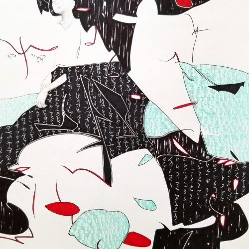
Whether the script in the background is an actual sutra is not the concern, even if it is, would it be readable to most? I question the use of lines in Calligraphy. Without the recognition of the exact words or meaning, can we still appreciate the quality and skills involved? Armed with a Chinese writing foundation, I adapted the use of the eight strokes (the basis of construction to Chinese character). The `writings’ resembles Chinese/Japanese writings but in fact, they are not. I needed a texture. With language as a symbol of culture, by visually adapting these kind of lines endears us to the image.
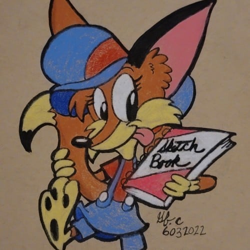
Jung here. Done 2022 with color pencils on 11x17 bristol. Original art is up for sale $150 (shipping fee will apply) USD email me and open for private commissions as well jungmeister4@yahoo.com ALSO My art book is available to purchase. To purchase my art book hit the link.
https://www.artwanted.com/artist.cfm?ArtID=115637&Tab=Books&CPID=1133