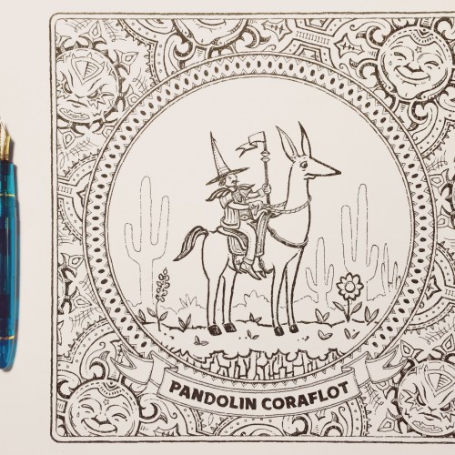
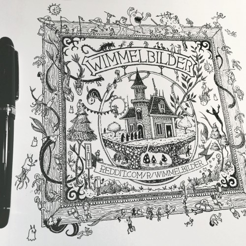
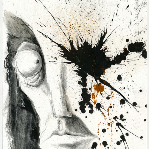
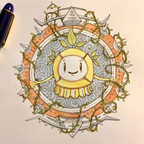
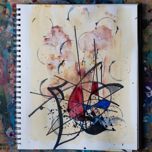
Drawn with a Sailor/Wancher Turquoise 1911L. The M nib on this pen comes to a sharp point which allows for some line variation not from flex but based on how deep the firm nib digs into the watercolor paper. The Noodlers Black ink is a little dry and that contributes to this effect.
The tables were covered in white paper. Crayons, pastels, and smooth sticks waited quietly. Then came Lucy’s glittery purse—her 8-year-old hands had filled it with stones to pass along, one by one, to the strangers around the table.
We traced them. Pushed them. Held them.
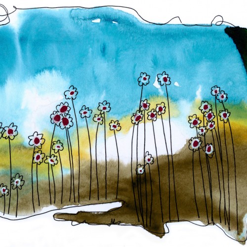
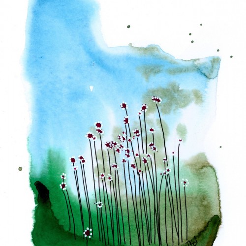
Then we let the colors lead:
-Red for emotion.
-Yellow for curiosity.
-Blue for memory.
Each color came with music, with story, with space.
At the Museum of Wisconsin Art, we made marks not for meaning but for presence.
Thank you to Ann Marie and MOWA for the invitation and trust. And thank you to the participants—some new friends, some old students—for showing up and making lines that listened before they spoke.
4 year old Henry engaged fully with thick applications of watercolor and oil pastels. He said it was a stormy sea with a small boat. This was at the onset of the pandemic, when we were all a bit uncertain and confined to our homes. I was reminded of an insight by Kierkegaard written in the early 1800s: “When the sailor is out on the sea and everything is changing around him, as the waves are continually being born and dying, he does not stare into the depths of these, since they vary. He looks up at the stars. And why? Because they are faithful – as they stand now, they stood for the patriarchs, and will stand for coming generations. By what means then does he conquer changing conditions? Through the eternal: By means of the eternal, one can conquer the future, because the eternal is the foundation of the future.”
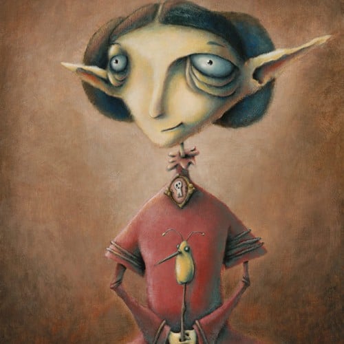
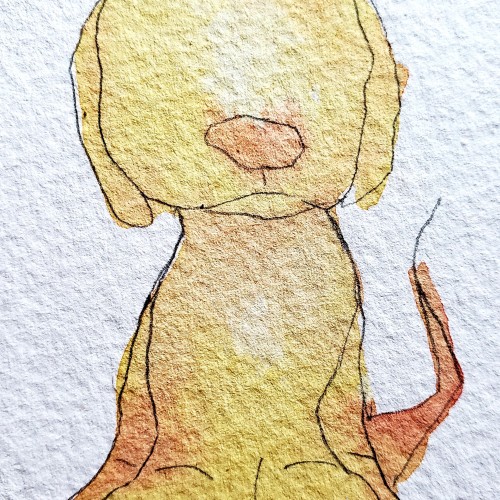
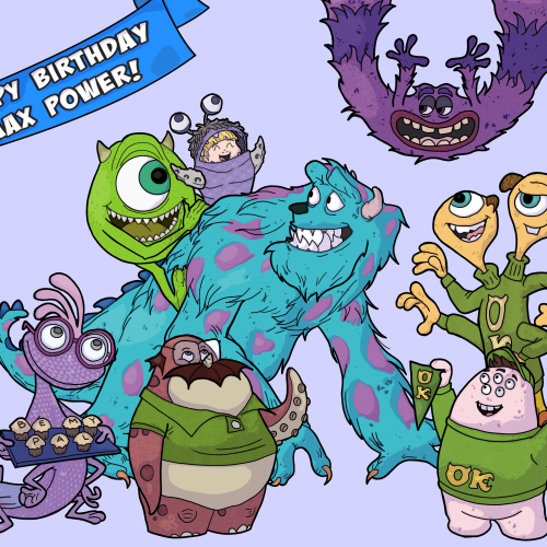
My only niece's 1st birthday was a few days ago. I decided to start a tradition of drawing her every year for her birthday as special uncle presents. Here is her first one. Her favorite movie right now is Monsters University
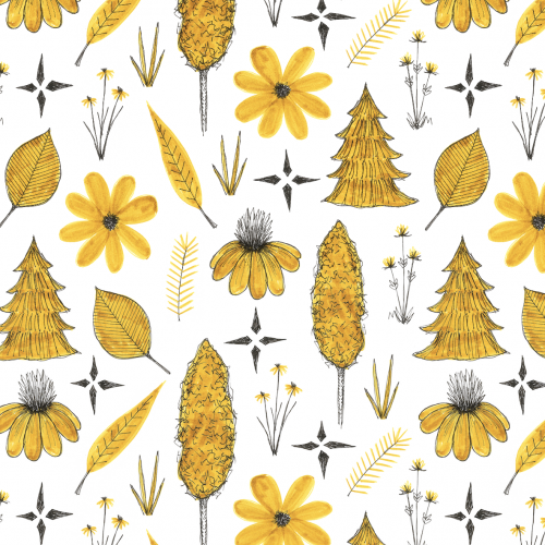
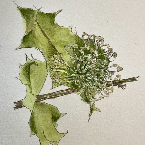
Watercolour painting of a Prickly Hakea. I started drawing different plants last month from the area where I live. This month I am turning them into watercolours, with the Hakea being one of the first.
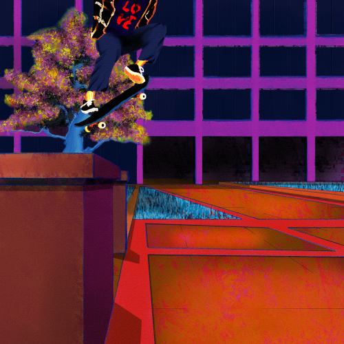
Yet another senseless lynching that has me here with a broken heart. Like my other paintings on this subject, I wanted to focus on life. Tyre was dynamic and energetic, so I wanted to paint him soring. I also wanted to paint him defiant in the face of his oppressors. He was a skater, and they are no strangers to defiance. Thankfully, I found some excellent references to help me with the composition. Aesthetically, I wanted the comp to be modern, colorful, and hopefully impactful. I went for a pop art, illustration, and false-color vibe and minimized blending and refining layer edges. I painted this in Rebelle 6 and Photoshop. Much respect.