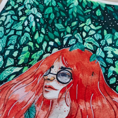
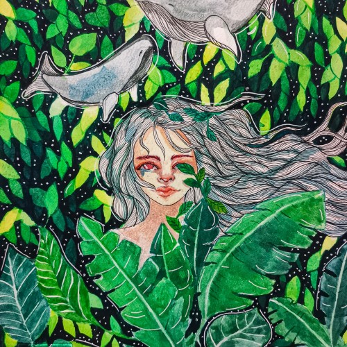
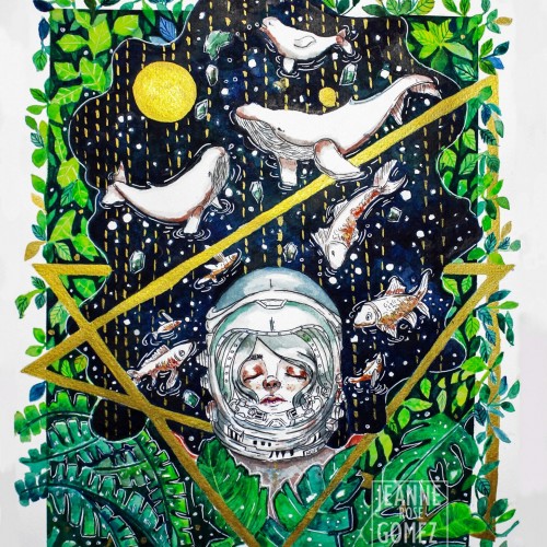
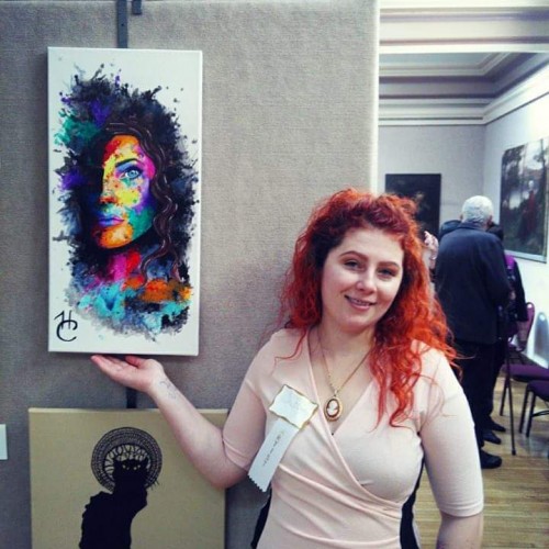
"Beauty of Hope" as one of the original painting I donated to charity and it was auction in exhibit. It was one of my favorite painting so far.
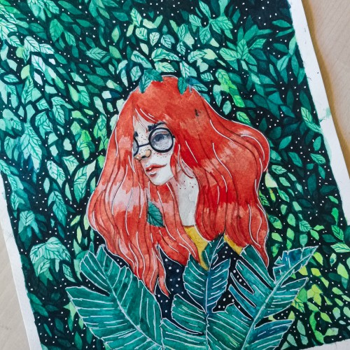
I used koi watercolor and a fabriano 200 gsm paper. Most of the color I used are blue, green, light green and yellow and a bit of orange. The metallic gold paint was one of the color that added flavor to the painting.
Abstract drawing of a structure shaped like a spiral. Colours and shapes added to amplifies the natural movement of the drawing. Raw art, pen and ink on paper.
And most of the time, imperfection is the way to see the balance of life. It's where you see and understand the most beautiful lesson that we will carry upto the end of our existence.
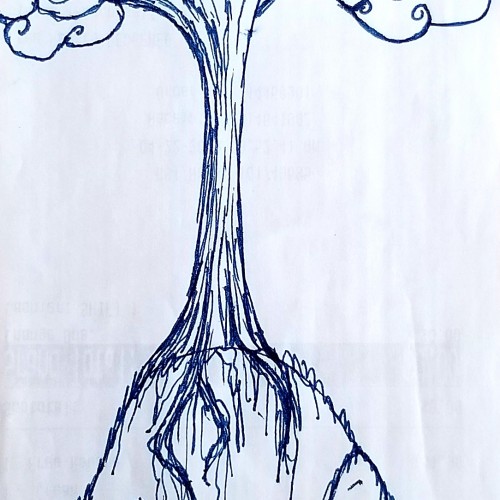
Used a blue pen this time....wanted to add a little coloure. Just trying out a different look for my trees...i kinda like it. Tell me what you think! I would greatly appreciate any feedback on my art, comments, tips, etc.