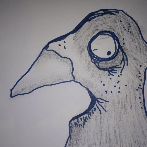
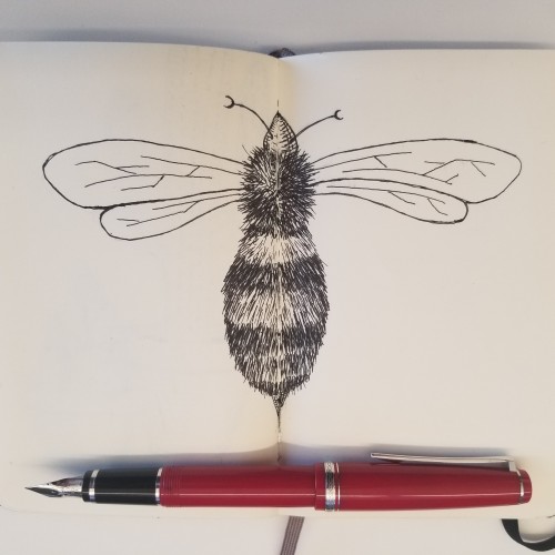
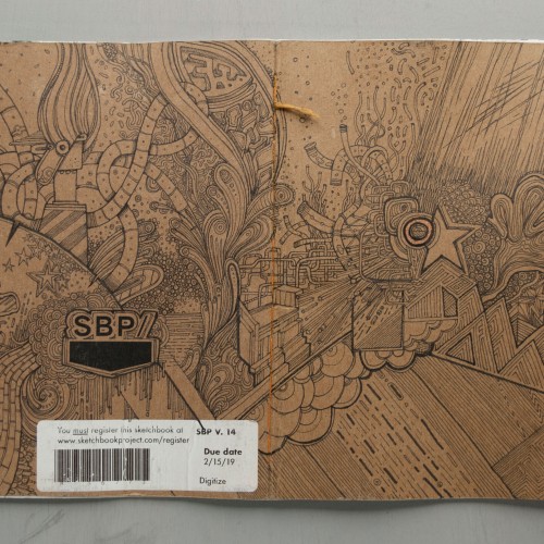
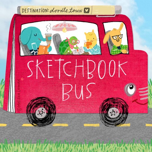
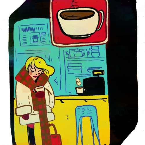
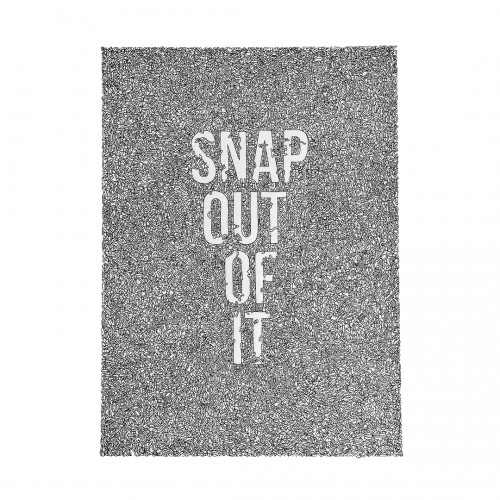
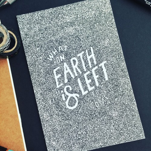
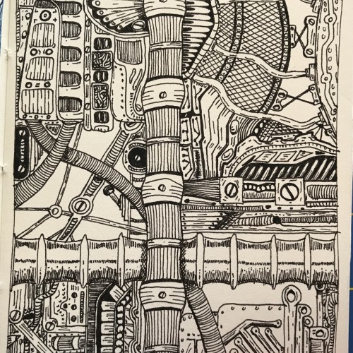
Hooray~ Here's my Sketchbook Bus for the 'Doodle Caravan, Drawing Challenge'. We're stocked with art supplies, good music, lots of coffee and creative friends! Let's enjoy this artistic adventure together! :)
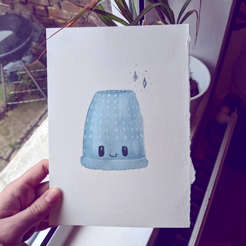
For the doodle-a-day prompt 'kiss' I went for a thimble to keep with my loose 'lost boys' theme! If you don't remember: Wendy offers Peter Pan a kiss and he holds his hands out, he doesn't know what a kiss is. She then hands him a thimble. Pretty cute - stick a cute face on it then it's SUPER CUTE
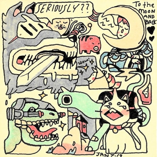
Sticky-note doodle warm-up ft: Wolf-knight, spirit pig, egg you just upset, quiet moon boy, turtle dragon, t-rex with laser cannons, a lighthouse, and friends
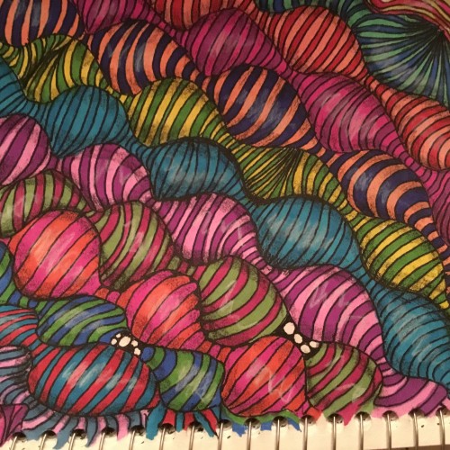
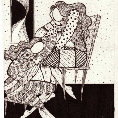
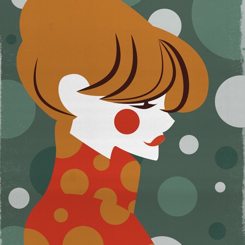
This is a piece I did, based off of a prompt in a daily creating group that I am a member of on Facebook. The theme was Polka Dots (If the title wasn't obvious). Looking forward to trying out DoodleAddicts!