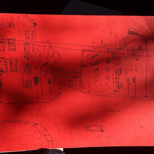
I reach the crossroad, look to the right, and then to the left. Couldn't tell which way to go, downtown had always got me confusing. I crossed the street, the light was red.
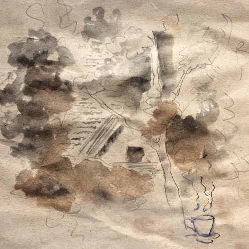
The leaves have grown so much you could barely see the house, as if it's hiding, as if it's not even there. I could only see bits and pieces of it out my kitchen window.
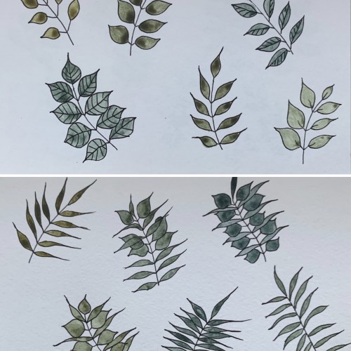
This time, again, two combinations. I believe the hues are very nice and calming. I used yellow ochre as the yellow color (PY 43, PY 1). On the upper part, the cobalt blue (PB 28) is used, on the lower part - it's ultramarine (PB 29).
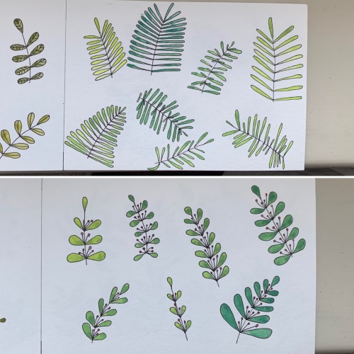
Again, mixing some colors to get greens: 1) cobalt blue (PB 28) plus cadmium lemon (PY 35); 2) ultramarine (PB 28) and cadmium yellow. Didn’t see much difference. In the first case there seem to be more hues, though. Funny, cadmium yellow medium and cadmium lemon have the same label: PY 35
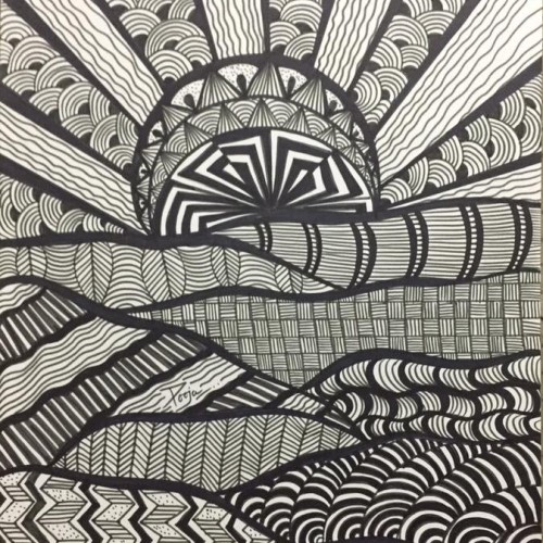
Sunrise looks spectacular in the nature; sunrise looks spectacular in the art.... sunrise looks spectacular in our dreams...because it really is spectacular!