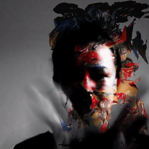
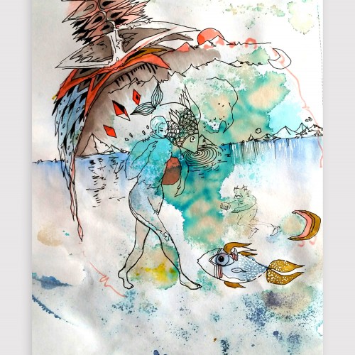
Artwork on "the other side" - playing with the bleed-through from the watercolor and intuitiviely allowing the shapes to arise. Created using watercolor, coffee, ink, graphic pens and unipen
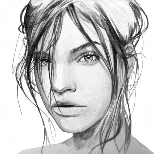
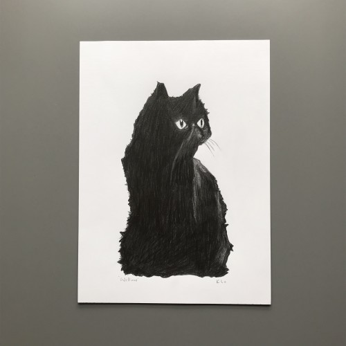
I sketched this black cat drawing as the start of my custom pet portrait service. Graphite, a mechanical pencil and a hb pencil was used on Derwent sketching paper.
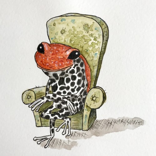
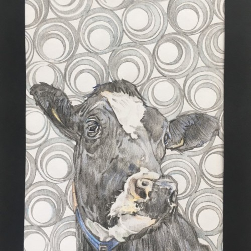
Patternz - Series 3. In this series I'm still sticking with the Patterned backgrounds, but this time they have been carefully chosen to compliment the chosen animal subject, rather than the human portraits of series 1 & 2.
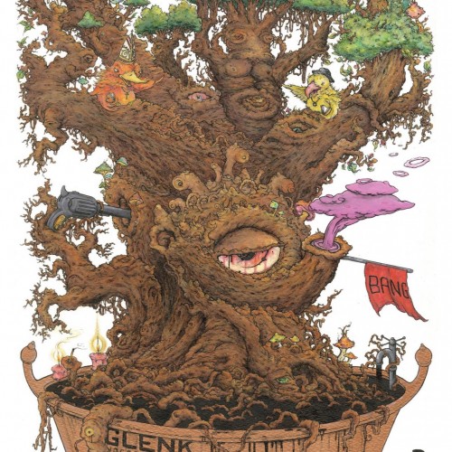
Watercolour crayon, crayon, fineliner and acrylic paint... . . . . . .. ... . ... .. ... . .. ... .. ............ . ... . . The tree is weary crying for some help, its roots are drowning and the taps on full pelt. Its head cant speak the evil, hear the evil, see it. Whilst its occupiers point the fingers at each other and dont even believe it... .. ... . .... . .. .
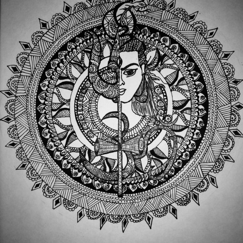
The god of Hindus lordshiva with halfface and half Trishula mandala design. Lord shiva also known as bolenath, eshawara, Parvathi pathi and other names.
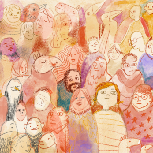
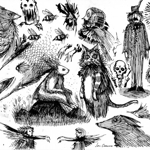
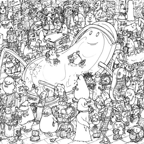
This is part of an ongoing series. This time we pass through The Great Exhibition and meet the different characters there to view art or just to socialise and hang out.
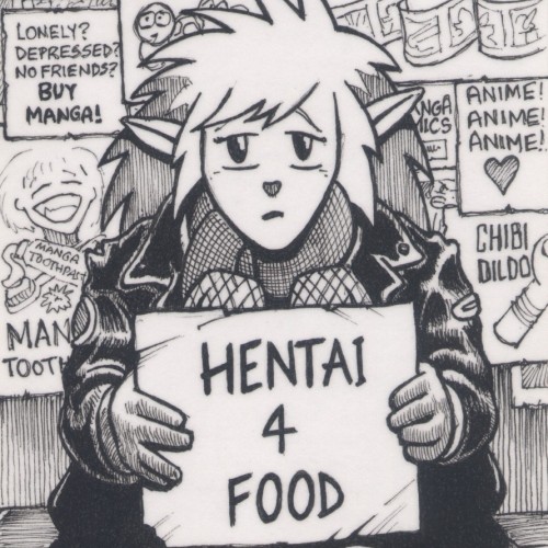
(fineliner pen on a 125mm x 75mm notecard) There was a time when manga and animé were cool, but now it's everywhere and a shadow of its former self, with the stigma of hentai attached to it.
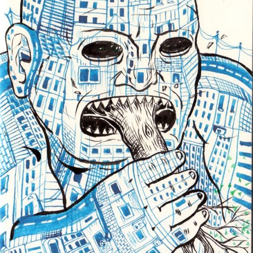
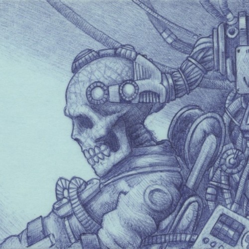
(Blue biro on a 75mm x 125mm post-it note) Verecide (or Vericide) is a word meaning the "killing of reality" by choosing to permanently live in a virtual one.
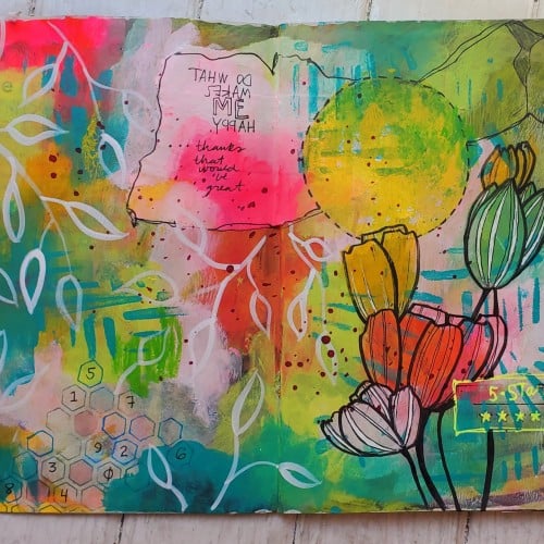
My favorite way to eliminate the often paralyzing fear of "ruining" "good" paper is to just paint on any and all junk mail that comes into my house. Higher end catalogs are great for this, they don't use slick, thin paper (and even that gets used in collage or as a desk cover for other projects) and they're already bound for you. Just add marks! Carry it with you. Scan the pages you like. Cut it up later for making other art. It's "just" junk mail, so there is literally no pressure. I have HUNDREDS of these type of things and I run across them all the time, forgotten, in some old backpack or purse or drawer and it's a treasure to look through them again, and add new marks, paints and words.