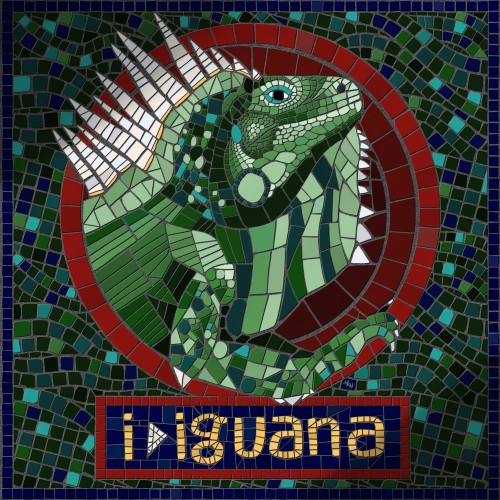
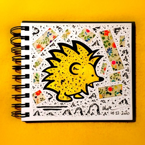
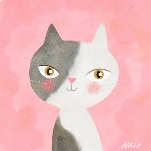
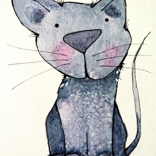
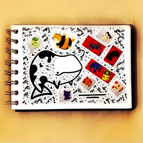
Part of a personal project I'm working on right now, to experiment with unfamiliar art styles and practice lettering skills by drawing animals. I enjoyed this foray into digital mosaic (or fauxsaic as I've seen it called).
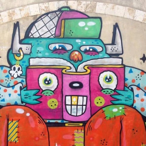
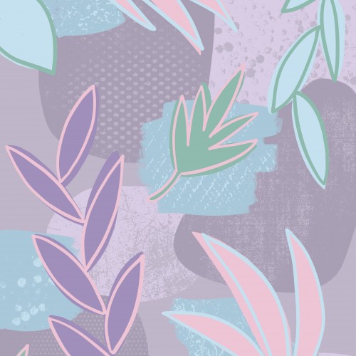
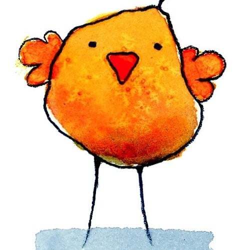
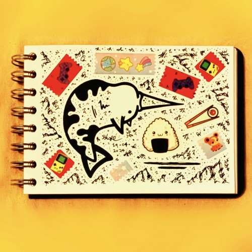
Part of a personal project I'm working on right now, to experiment with unfamiliar art styles and practice lettering skills by drawing animals. This one I limited myself to a 100 pixel x 100 pixel canvas.
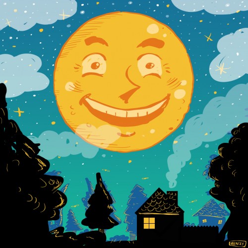
I had something bum me out a little bit today. Nobody’s fault but it is what it is. So I decided to draw this up. I’m ready for fall and fall beers! I love to sit out under the moon once the temperature drops a bit and have some marzen lagers and other fall drinks. I felt like this captured the moment perfectly. I am excited for music fest in @havertownlife havertown tomorrow. I heard @levantebrewing will be pouring at brick and brew so I’ll be there sucking back some suds. I’m glad I forced myself to learn #adobeillustrator I’ve come a long way. Since then I have been able to help other artists that don’t use Illustrator or vectors and I am pretty proud of that, because when I was in their place it always felt like a huge struggle.
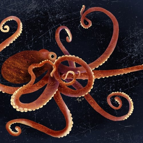
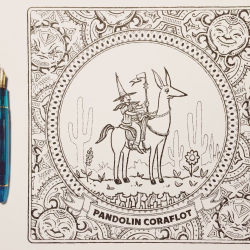
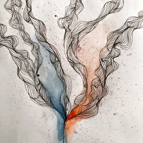
Drawn with a Sailor/Wancher Turquoise 1911L. The M nib on this pen comes to a sharp point which allows for some line variation not from flex but based on how deep the firm nib digs into the watercolor paper. The Noodlers Black ink is a little dry and that contributes to this effect.
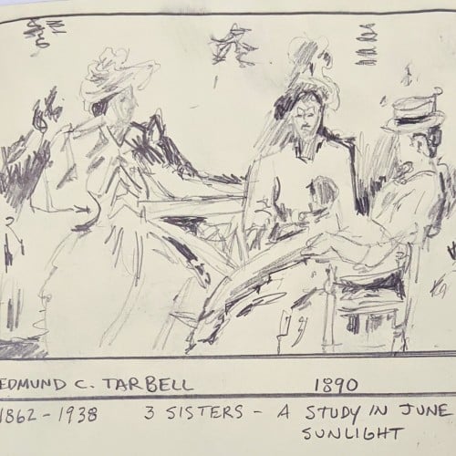
This quick sketch of an impressionist painting is a reminder to me of how we cannot see anything until we are taught to see it. I was enjoying the painting because of the way Tarbell captured light, when a man and his wife joined me. The man said to his wife: "This is a wonderful painting, but I wonder whose lap the baby is on.". I was shocked because I was not able to see the baby till he mentioned that there was one. I noticed that it was indeed difficult to tell whose lap it was on. It was a transformative and humbling experience.
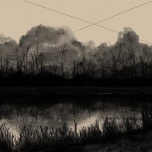
Cont. to work on BnW illustrations, I wanted to focus on making the reflections have a realistic quality. I struggle with clouds, but I felt I was most refined here. My BnW's seem to have so much more life and expression than my paintings. I'd love to hear your thoughts.
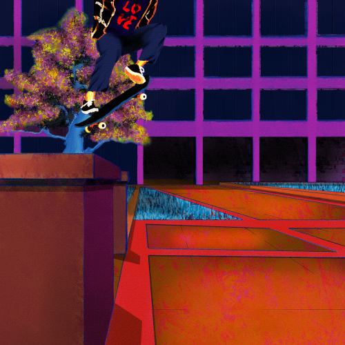
Yet another senseless lynching that has me here with a broken heart. Like my other paintings on this subject, I wanted to focus on life. Tyre was dynamic and energetic, so I wanted to paint him soring. I also wanted to paint him defiant in the face of his oppressors. He was a skater, and they are no strangers to defiance. Thankfully, I found some excellent references to help me with the composition. Aesthetically, I wanted the comp to be modern, colorful, and hopefully impactful. I went for a pop art, illustration, and false-color vibe and minimized blending and refining layer edges. I painted this in Rebelle 6 and Photoshop. Much respect.
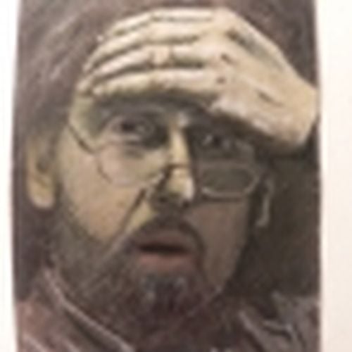
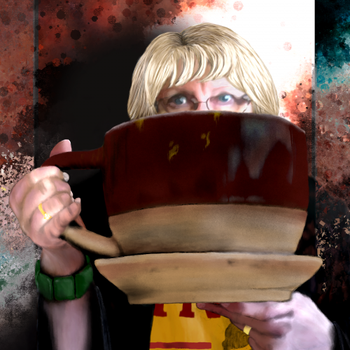
I finally finished this piece for my Aunt. It was based on a goofy picture she sent me. I am pleased with the depth I achieved and can see improvements. I am not most experienced with portraits or anatomy/characters.
Finally got round to watching Hunt For The Wilderpeople, after eons of procrastinating over doing so, and was well chuffed at how great it was! Gave me some much needed inspiration for some art as well, always a bonus.
Can see what the Deadpool 2 guys saw in Julian Dennison that’s for sure, and of course Sam Neill was brilliant as well. Can’t be forgetting Taika Waititi either for directing it! Excellent job from all in my opinion :)
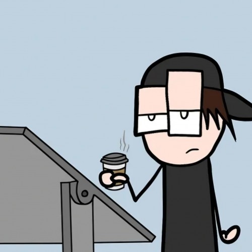
I do browse some weird things on places like Youtube, without a doubt! Definitely in the search of inspiration 9 out of 10 times though (as you can see)...