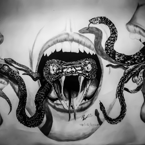
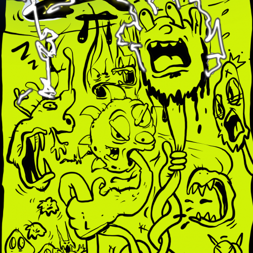
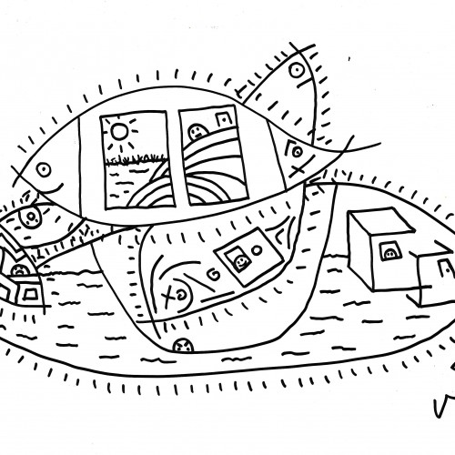
I did this artwork for a public art exhibition called "Home is where the Art is". Initially the drawing was supposed to just be a open mouth with a snake coming out of it but I felt that it lacked a story and a strong enough message so I drew the other snakes on and added the 2 other faces. The story behind this image is entirely up to the viewer but my take on it was that different people react differently to certain information, my main focus was the distribution of secrets and since many teenager refer to people that let their secrets loose as snakes I thought why not depict it in that form. The drawing displays three reactions to learning another's secret, one passes the secret on to another, the other defends it ferociously in your face but lets it slip loose when nobodies looking and the other receives the information and holds onto it
The logo is for a medical supplies company. I hope you like it. The name of the company is written in English and Arabic at the same time. You can read it from left to right in English, and from right to left in Arabic. I will leave it to you to guess the name of the company. Besides, I also hope that you can find the word in Arabic. I am so excited to see your comments.
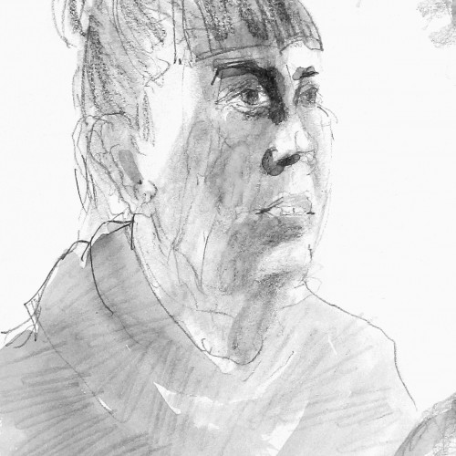
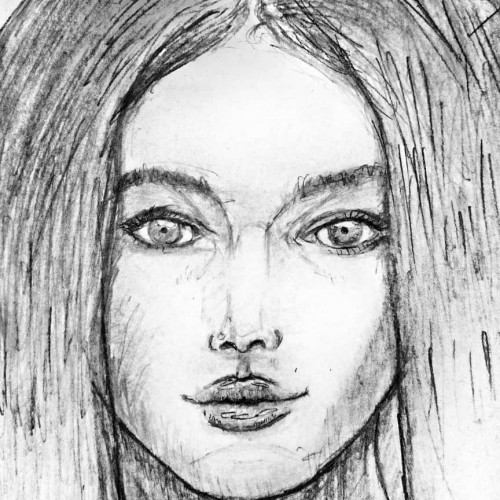
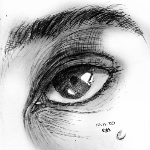
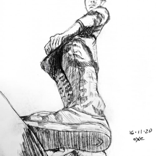
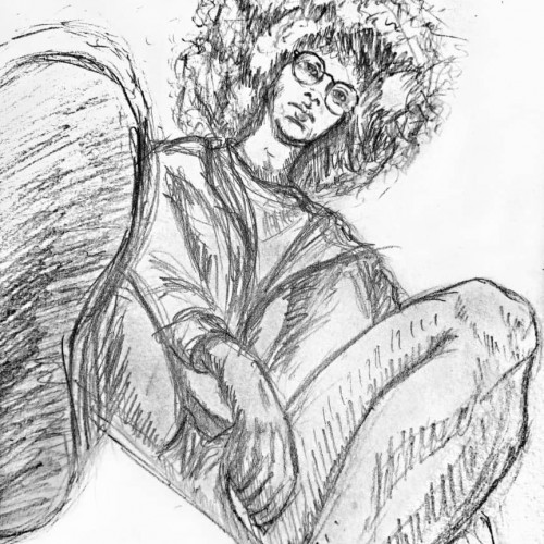
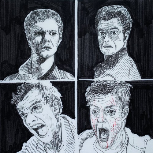
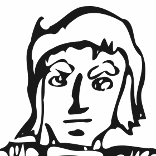
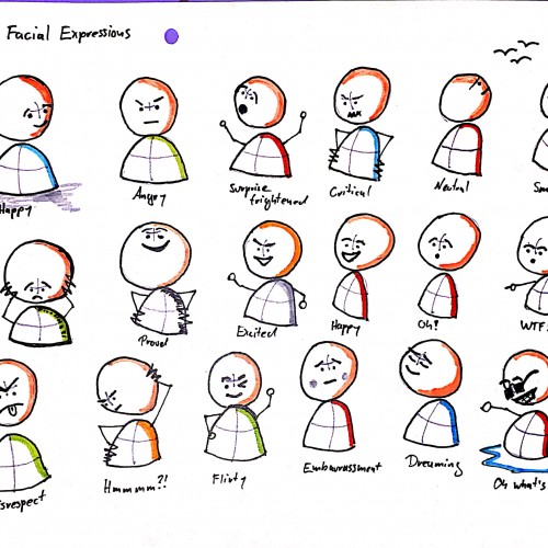
Sketching expression is important to me. I think this one succeeded. More often I miss the mark. Guess that is the price paid for sticking with art through thick and thin.
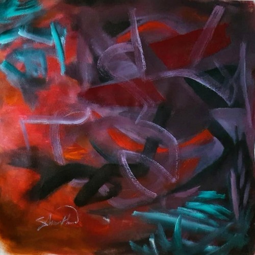
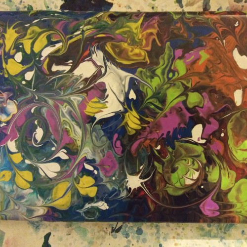
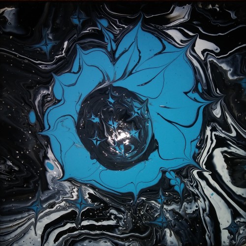
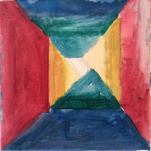
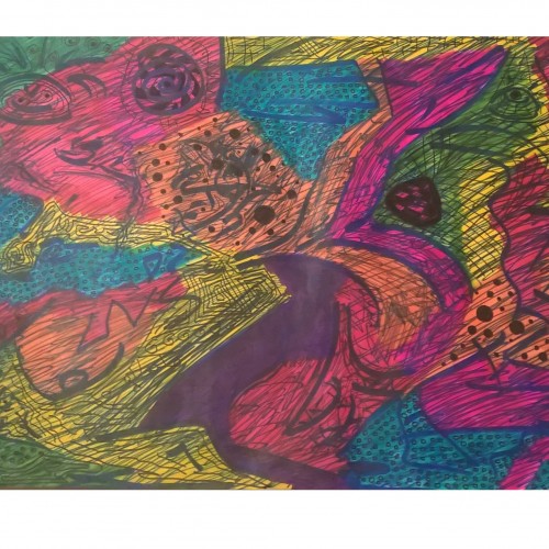
Another pouring piece. As always, started out going about it one way, and sure enough, it turned into a whole other thing. I like to think its meant to be. What do you think?
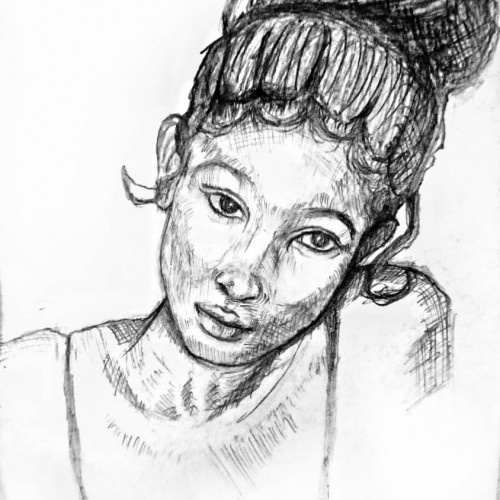
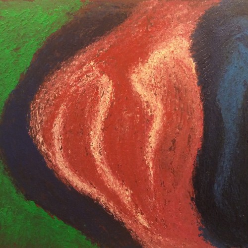
I was honestly doing something else, and turned it into this, unsatisfied with how it was, someone told me this looks very maternal which gave me a bit of a new appreciation for it. What do you think?
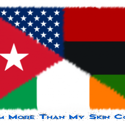
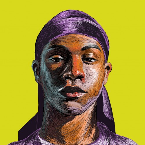
When we look at each other, all we see is their outward appearance. However, we are all much more than that. We are all more than the color of our skin. I am black, but I am also Cuban, American, African American, and Irish. I am more than my skin color.
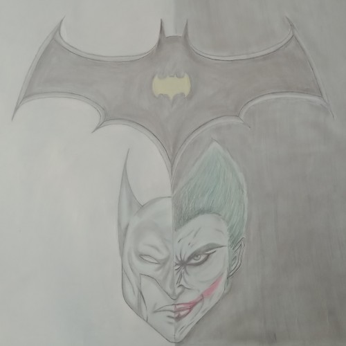
A couple of months ago, my English teacher asked us to make a film review of any type of film. So, we picked up this one. Then, I tried to make a poster for the film using a pencil and some colors. I hope you enjoy it....