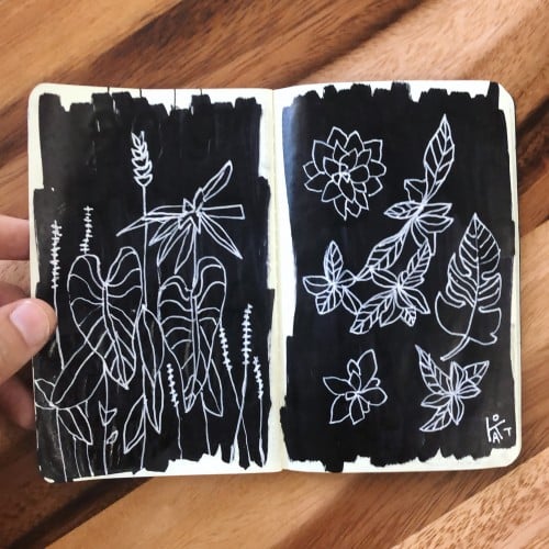
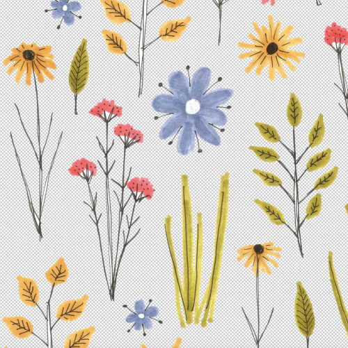
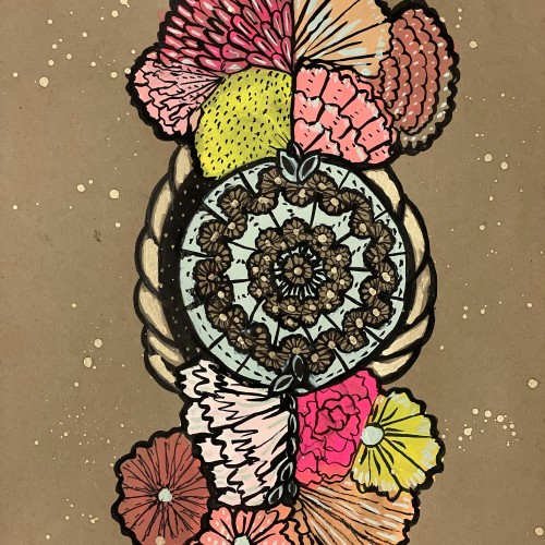
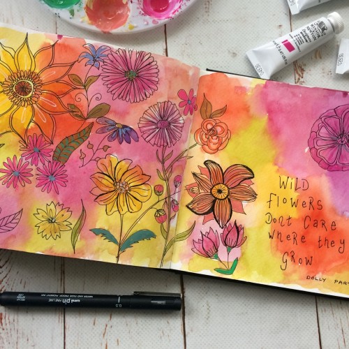
When I was planning this pattern I really wanted it to have a dark background. I built it in photoshop using hand drawn marker flowers but when I try to place them on a dark background it looks ridiculous!
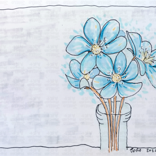
A delicate, hand-drawn study of the Blue Liverflower (Hepatica), capturing the first signs of spring. This design features breezy blue petals, energetic linework, and a minimalist vase, blending a classic botanical feel with a modern, sketchy illustrative style. Perfect for those who love the quiet beauty of forest wildflowers and cottagecore-inspired art.
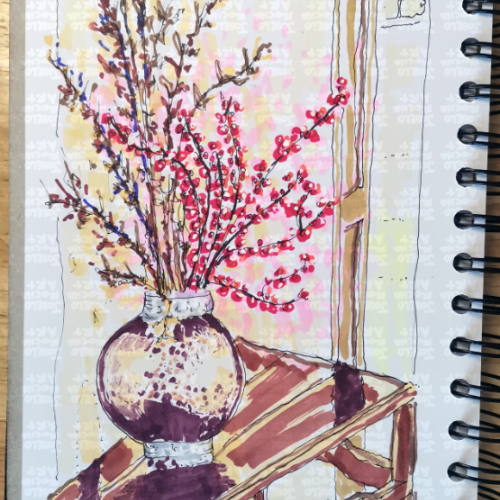
A vibrant exploration of color and line, this piece captures the ephemeral beauty of red plum blossoms in a textured, contemporary sketch style. Perfect for those who appreciate the intersection of traditional botanical themes and modern, expressive artistry.
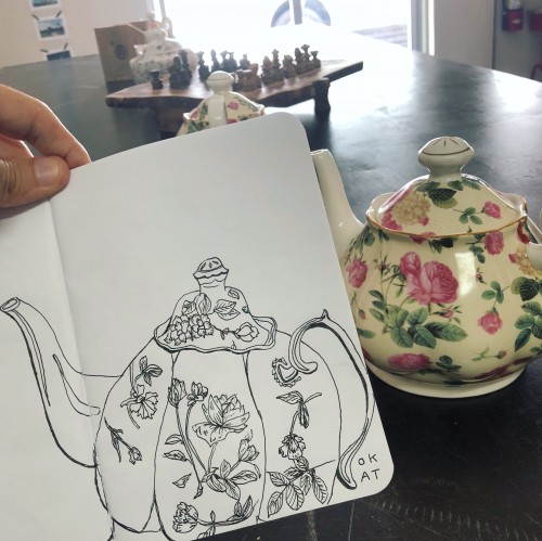
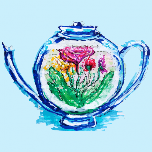
A teapot design features colorful flowers inside. The vibrant hues of pink, yellow, and green stand out, creating a striking contrast with the blue teapot.
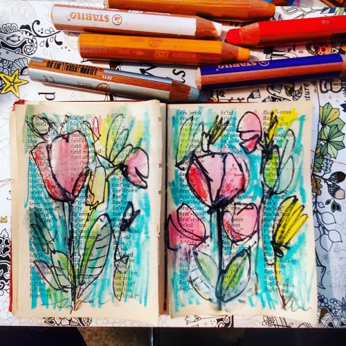
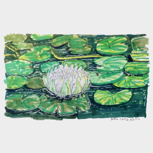
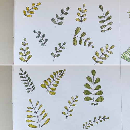
For some reason I tried some floral drawings, of different shapes, and I also used mixtures of different colors to produce hues of green. The first page - it’s a mix of the cobalt blue (PB 28) and cadmium yellow medium (PY 35). On the second one there is ultramarine (PB 29) for the blue color and the same yellow paint. To me, it seems the difference is very little but I’ve got the color closest to the ‘normal’ green using Cobalt rather than ultramarines. The latter gave either to yellowish to olive hues or too blueysh