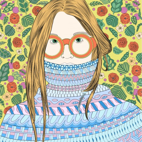
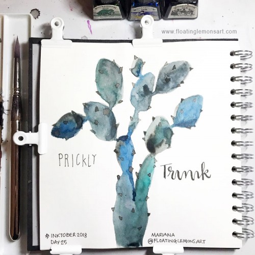
One of my girls with lots of patterns. The girl keeps in blue and purple and the background and sunglasses is kept in green, orange end yellow tones. I have always had a hard time using less color and this is my practice in keeping a more stringent color theme.
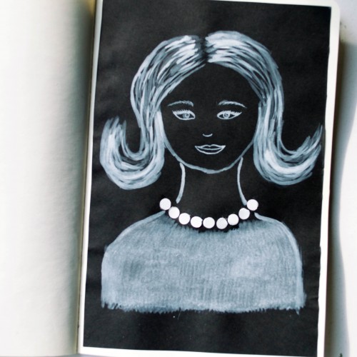
The idea for this portrait came to me when I was looking at a packaging of soap - it was very glossy and it looked like it could look like pearls. As well as the soap packaging, I used white ink mixed with acrylic paint (for opacity) on black paper.
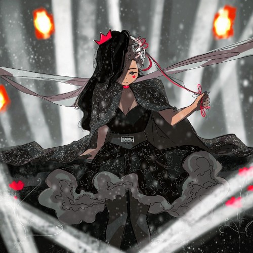
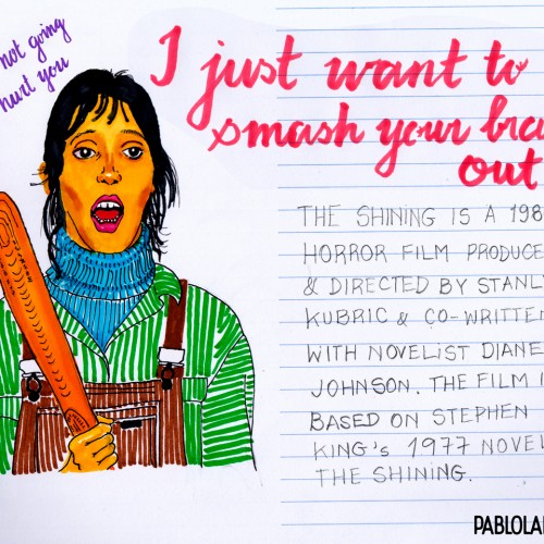
Happy Halloween: Illustration of Wendy Torrance from The Shining.
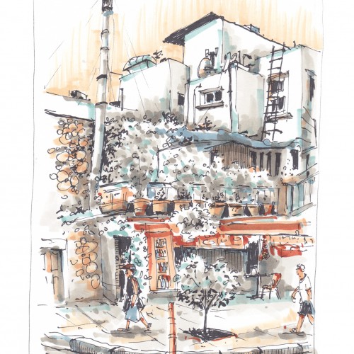
Technique:
Markers & some digital edition
Paper: my notebook Tilibra, couché, 150 g/m
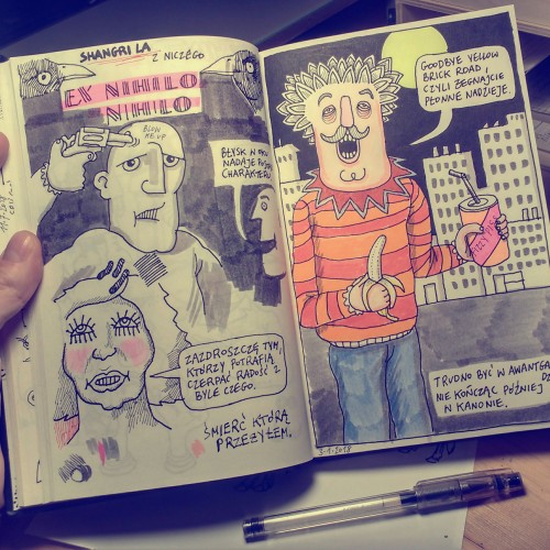
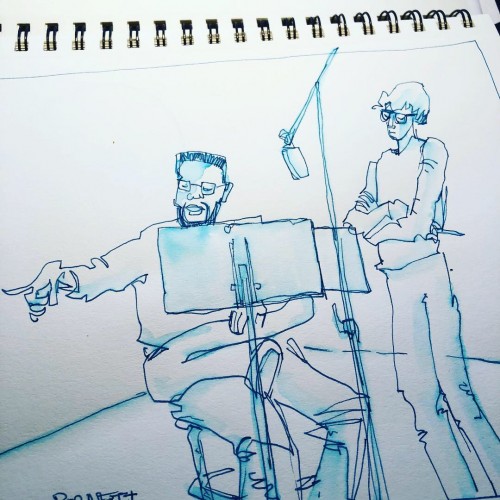
Another batch of sketches from my time in the album recording session earlier this week. Noodler’s ink blue loaded in my fountain pen, then applying a bit of water with a water brush. I like the bleeding that occurs.
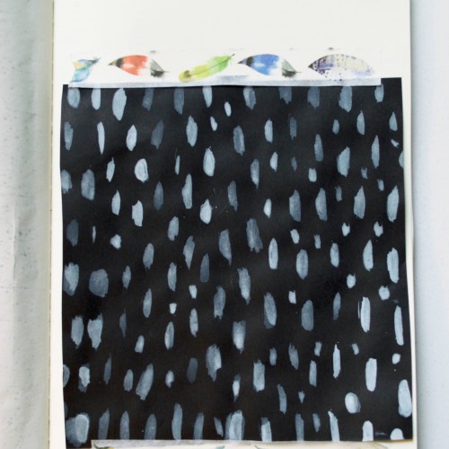
India ink on tissue paper. I had never used ink on this kind of paper before; I really liked the results! There are some folds and wrinkles on the paper that give the pattern some interesting details. The paper is also super absorbing, which plays nicely with the quantities of ink. Since it's very thin, there can easily be overlays between textures. And finally, when trying to use less ink (so that it wouldn't seep through and cause a big dot - the absorbing quality is nice, but it was also somewhat of a challenge!) I used very little ink on the lettering, causing a scratchy, dry look.