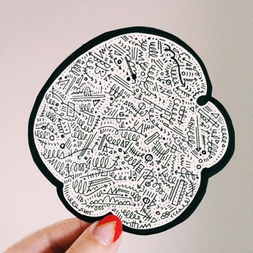
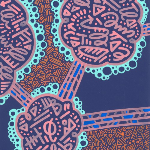
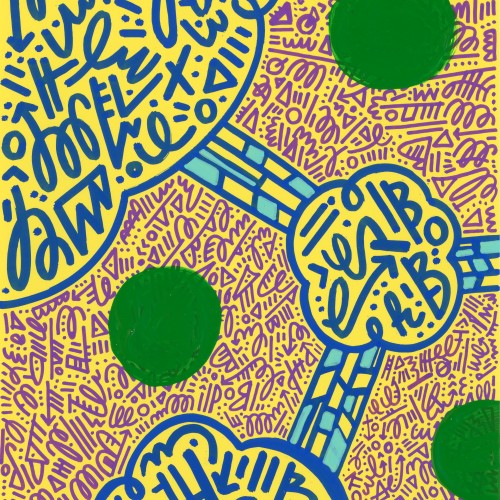
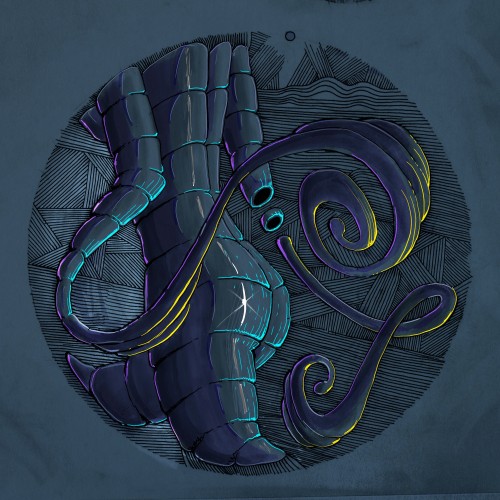
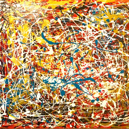
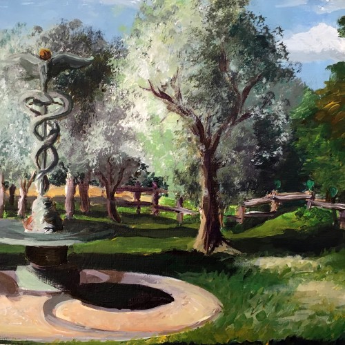
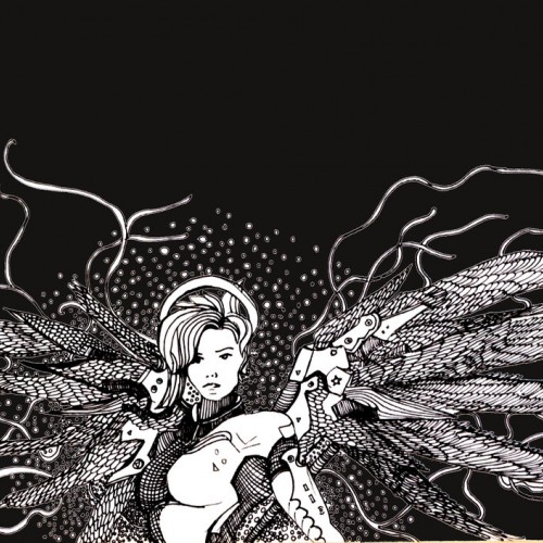
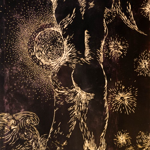
I’m fascinated in how something may make you feel. For instance, I’m deeply moved by images of outer space from the Hubble space telescope, but I do not try to recreate those photographs in my work. What does not exist in those photos, is how they may make us feel. This is why you won’t see any “realism” in my art. When we send astronauts to space, they can discuss factually what is happening, but what truly moves human beings is when astronauts describe how they felt while they were there. So, I choose to express how I feel, as opposed to illustrate what I see.
I’m fascinated in how something may make you feel. For instance, I’m deeply moved by images of outer space from the Hubble space telescope, but I do not try to recreate those photographs in my work. What does not exist in those photos, is how they may make us feel. This is why you won’t see any “realism” in my art. When we send astronauts to space, they can discuss factually what is happening, but what truly moves human beings is when astronauts describe how they felt while they were there. So, I choose to express how I feel, as opposed to illustrate what I see.
dear little universe ///
even just a tiny bit / and you / open up. /
peer out into the nightless
sky /
feel the stars, that /
“you, dear little universe” /
are always coursing /
through
your
veins.
— Neon Spencer
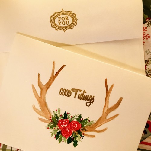
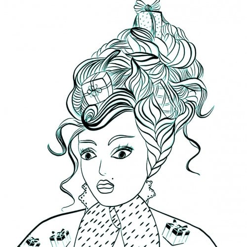
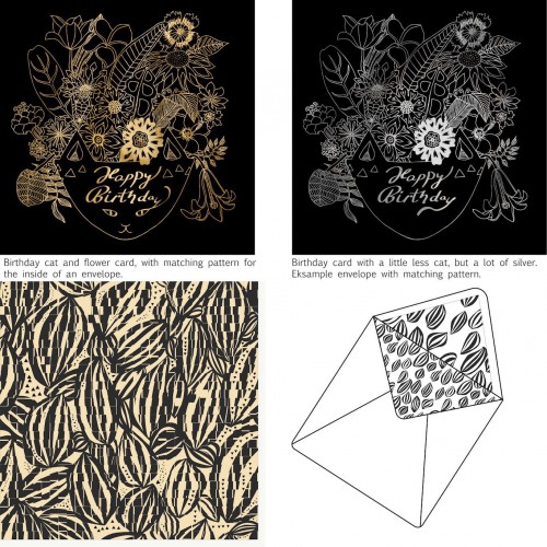
Things people like, cats and flower. Here combined in a gold foil exclusive birthday card. I am trying out different styles for cards with matching patterns. The hope is to sell it and become full time card, placement and surface designer. I just craw all the time and forget about selling. Now I need to get into business and act some more. Do you think it has a chance, and do you even have an idea of where to sell it?
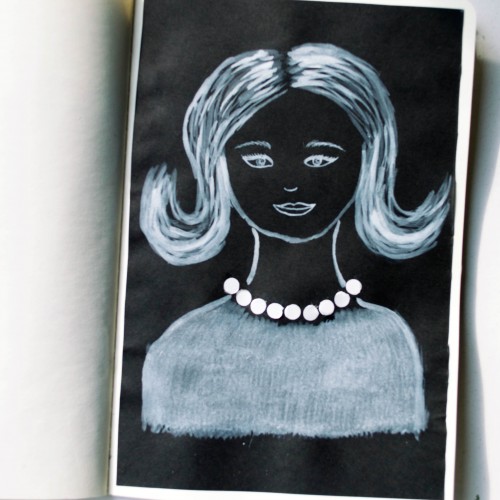
The idea for this portrait came to me when I was looking at a packaging of soap - it was very glossy and it looked like it could look like pearls. As well as the soap packaging, I used white ink mixed with acrylic paint (for opacity) on black paper.
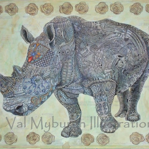
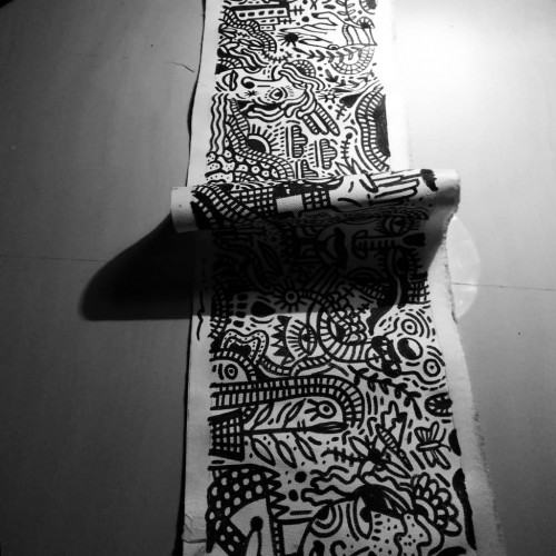
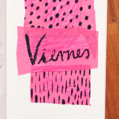
India ink on tissue paper. I had never used ink on this kind of paper before; I really liked the results! There are some folds and wrinkles on the paper that give the pattern some interesting details. The paper is also super absorbing, which plays nicely with the quantities of ink. Since it's very thin, there can easily be overlays between textures. And finally, when trying to use less ink (so that it wouldn't seep through and cause a big dot - the absorbing quality is nice, but it was also somewhat of a challenge!) I used very little ink on the lettering, causing a scratchy, dry look.
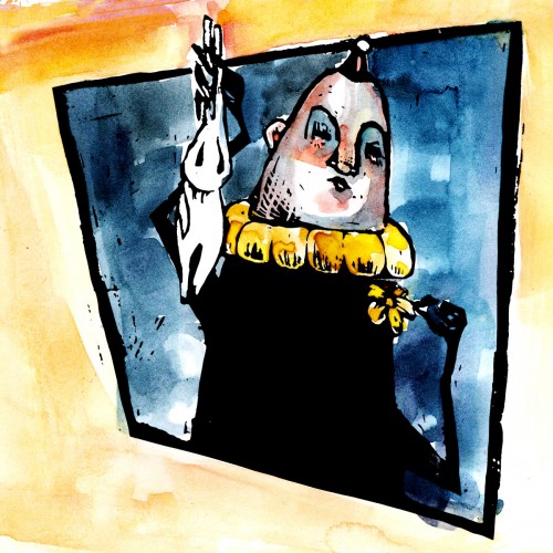
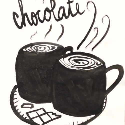
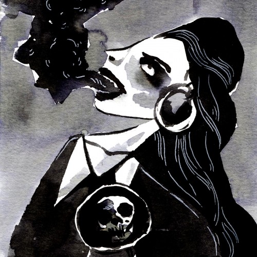
Here are more Inktober paintings! My sketchbook is getting crinkly when I turn the pages from all this ink. I love that sound. It echoes the sound of crunchy leaves outside. Ah, fall. HALLOWEEN FOREVER.
Here are 5 #Inktober paintings. I've been painting every single night and loving it. I think that my high school art teacher might have been right when he said doing a daily painting was key to his being an artist.