A cartographic representation of the experience of moving to a new city in a foreign land. This work, dubbed as 'Introspectionism', provides the viewer with a snapshot over time of the inner workings of the process of the strange becoming slowly more familiar and the foreign becoming Home.
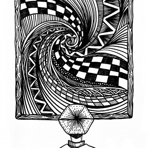
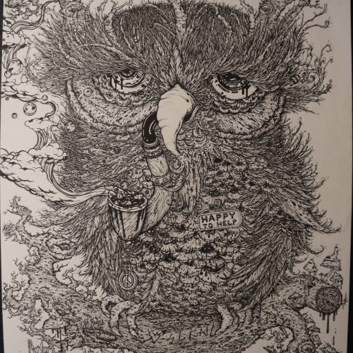
“Whirlwind 5”, an original drawing. Micron pens on archival paper. Size: 5” x 7”. Title, signature and date in the back of the drawing. This drawing is the 5th in a series of drawings that were posted over a period of 100 days. The original post date on this drawing was September 5, 2020.
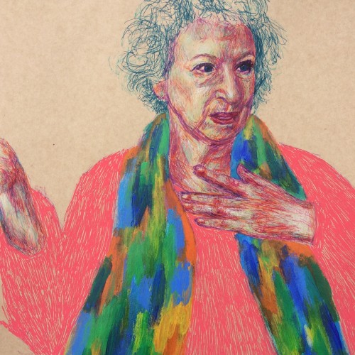
This is another way of working that I really like. Fine liners and chalk (colour) pencils were predominantly used, with a quick smothering of acrylics for her scarf and coarse posca pen marks for the jumper :). About the subject, Handmaid's Tale was one of those rare books that I read more than once growing up and it stayed with me, hence why I decided to draw Margaret Atwood (not seen the series yet though but I hear good things!). I accidentally had her hand cut out while penning the figure - still working on my scale and composition!
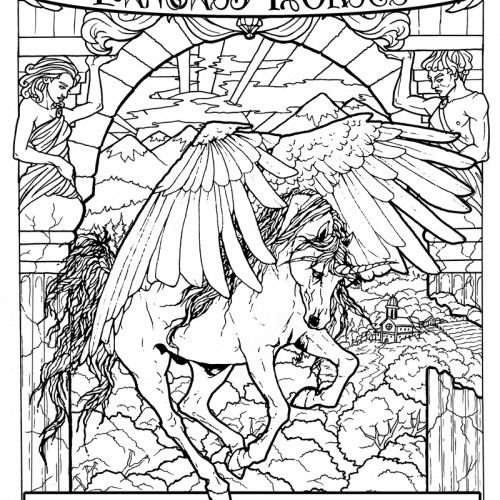
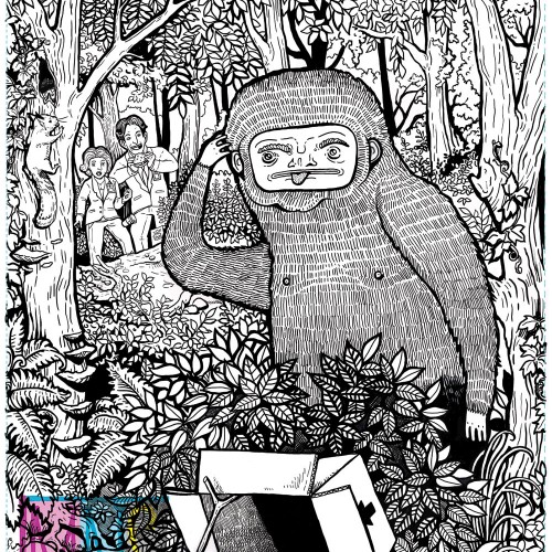
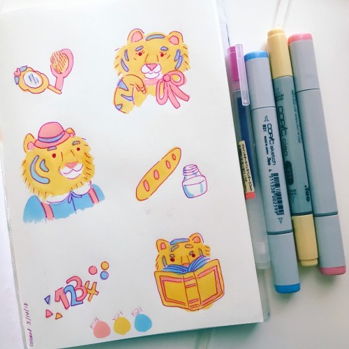
This is my current project! A coloring book! It will be released through Amazon this November. If you'd like to stay apprised of progress follow me on instagram: @fyre.heart
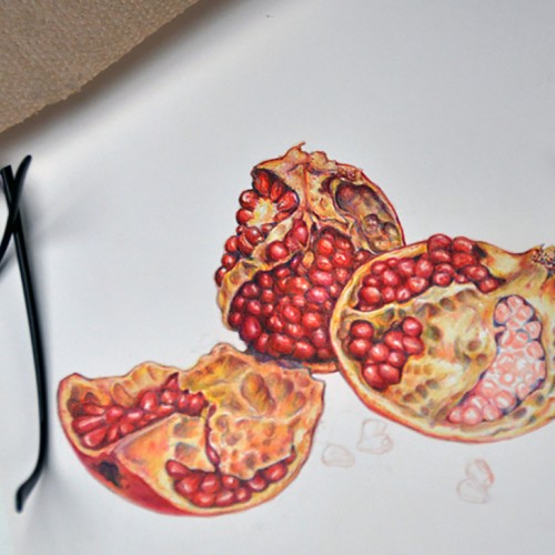
Colored pencil drawing of pomegranates "in progress." Prismacolor and Verithin pencils with some fine lines done with Tombow Irojiten pencils. I like the harder colored pencils for fine detail, but the blending of high wax and oil pencils can't be beat for blending.
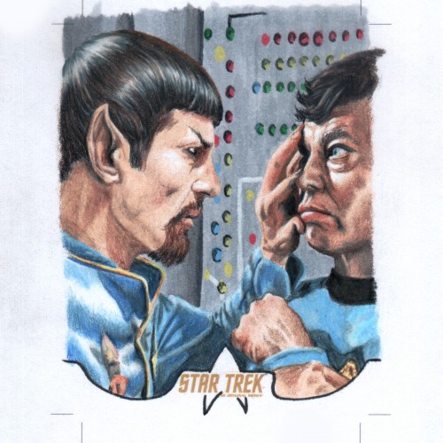
Here's a traditional art sketch card, produced on a 4 X 5 inch blank licensed card. The cut lines are set at 2.5 X 2.3 standard trading card size. Artwork is Copic marker and Prismacolor colored pencil. This card was created as a random insert for the 2018 Rittenhouse Archives Star Trek Captains collection Card series. See more at Sketchcardsandcovers.com
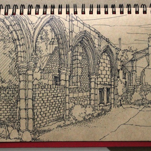
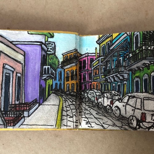
This is one of the pages of my handmade picture book (made w/ watercolor paper, watercolor paint, color pencils, and pen & ink). I really wanted to focus on illustrating the beauty of the architecture and vibrant colors of the buildings.
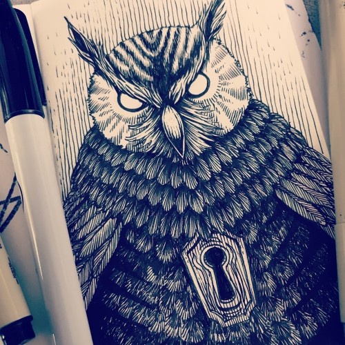
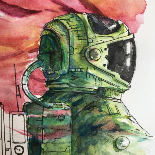
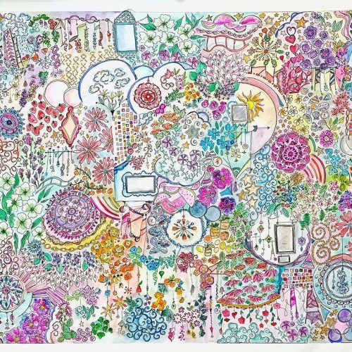
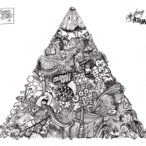
Whew!!! About 50 hours of work split evenly over line work and color. I think it’s finished ( famous last words)! I’ll check on it again in a few days for any final details... and get some good camera shots instead of phone camera. .... but I’m happy!
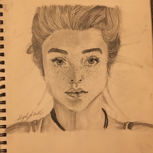
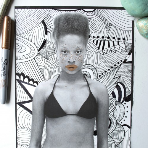
I found a Gap ad in a 90s Vanity Fair magazine; the background was completely white, perfect for doodling a background on it. I also highlighted the woman's freckles and lips with a bronze Sharpie.