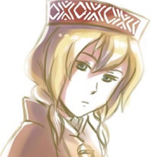
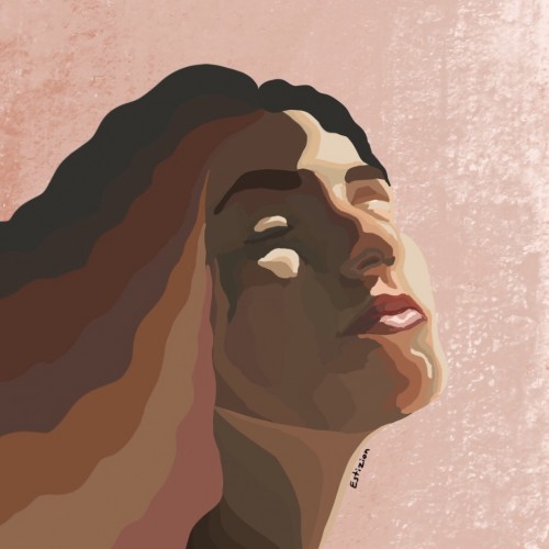
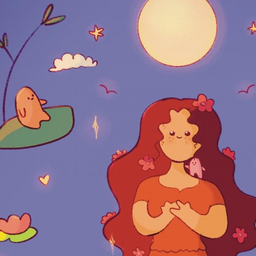
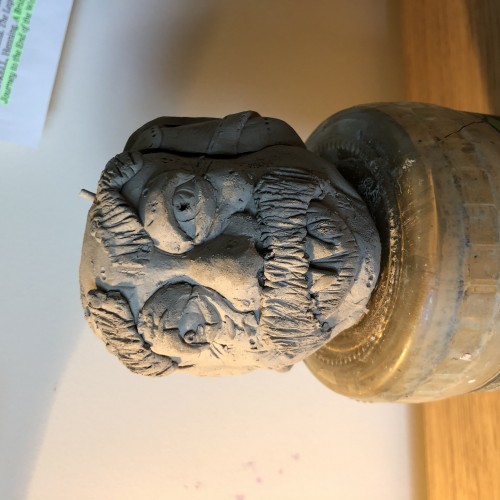
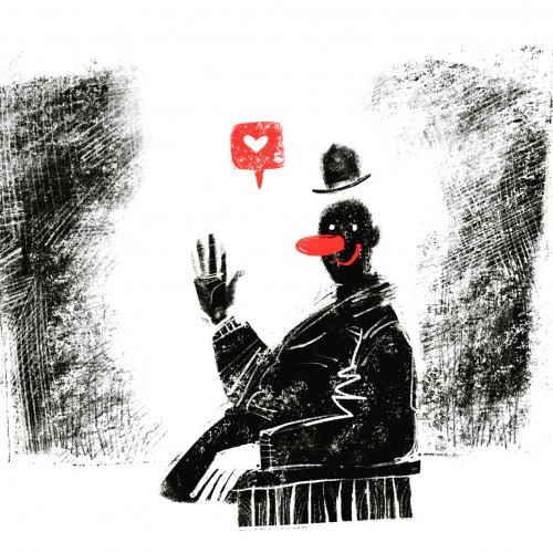
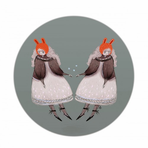
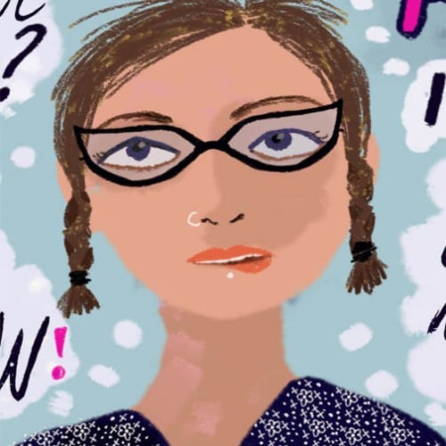
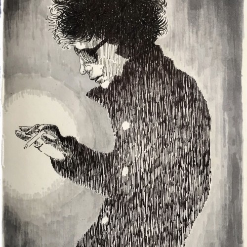
I have a Webtoon called The Peculiar Scribble. I am completely redoing and rebooting the series. The series only has one chapter at the moment. But I didn't like the start of it, so I'm giving the chapter and the rest of the series a fresh new start. I will hope to have the whole chapter posted to Webtoon by the end of the month. This is a sneak peek of the comic cover art. This character means a lot to me and comes from the very depths of my black inky soul.
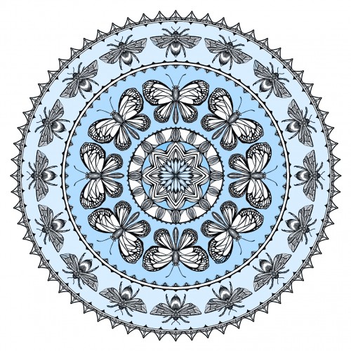
What's more comforting than a summer day with butterflies flitting and bumblebees tumbling amonst the flowers in the meadow? My husband felt that blue was most comforting for him. Me, I liked the salmon. The mandala is drawn in Spirality...which takes the designated "wedge" and repeats it around the circle. Colored in Photoshop (given there is a 20 min. time given for this challenge---otherwise, I would have colored it by hand).
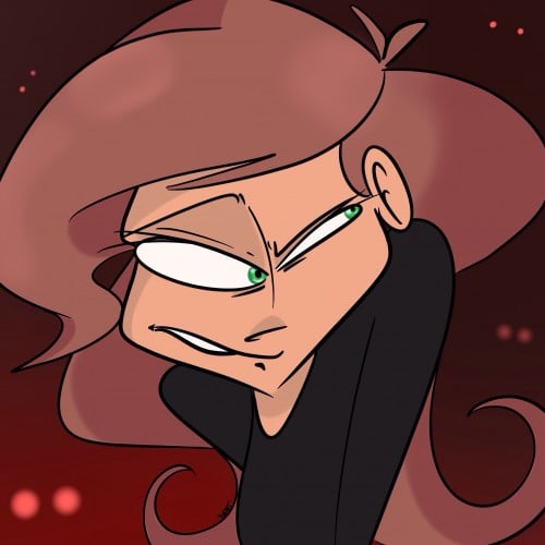
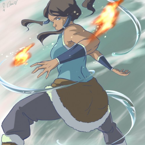
Re-watching the series now. Really liked the general concept, visual character design and the action scenes. It even inspired me to make an AMV about Korra >> https://www.youtube.com/watch?v=-TIidatQrw8
It was nice and refreshing to see a (physically) strong rebellious female character, something different from a usual portrayal of female characters. However something went down the hill and I'm struggling to go past the 1st season hehe.
I know, Korra and the whole series are quite controversial and I understand why, but as a female myself I was inspired by this badass female character (well, as I explained, until some point, but nonetheless). Anyways, hope you enjoy my drawing ^^
Program used: Paint Tool SAI
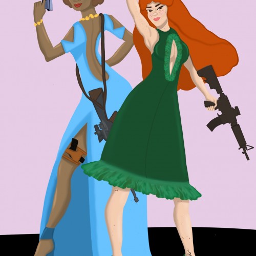
This artwork was requested by @lanahyawnuwuw. You asked for people in dresses, I give you people in dresses! Except now I want someone to use this for a movie. I can just imagine one of the trailer scenes: a guy talking to someone and says “what are they gonna do? They’re just girls with guns.” And he proceeds to get shot by one of them who comes into the room. Someone please make this into a movie.
My first venture into artist grade colouring pencils - and I'm smitten! I never thought I could achieve such boldness and blendability with them! I'm still getting used to them and will think about choosing smoother paper with less tooth next time. The texture and weight was more for the water-based gouache along with alcohol inks (which are very unforgiving to even primed heavy paper!). Apologies for the unevenness of lighting between the 2 sides of paper; will correct that when I'm making proper image files.
hey there☘️
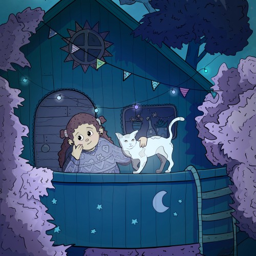
while taking a walk in the forest i came across a little treehouse. it inspired me to draw this one. i love to look at the stars at night and drawing this reminds me of the times where i looked at the beautiful night sky in france some years ago.✨
have a lovely day :)
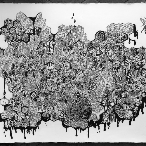
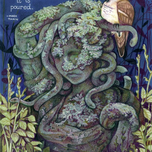
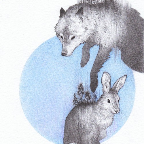
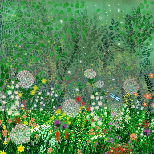
Sensuality, power and fertility - meditative layers and tangles of flowers, weeds, and grasses. A bee emerges, free! Ultimately a positive message of hope!
Pastels...I've never been a huge fan of working with them, mainly because I can never seem to get them to blend or move the way I want. I think this turned out okay; it's not the worst it could've been...not the best. It was fun to try, considering the fact that I rarely try new mediums, and it got my mind off everything I've been worrying about. Anyway, enjoy.
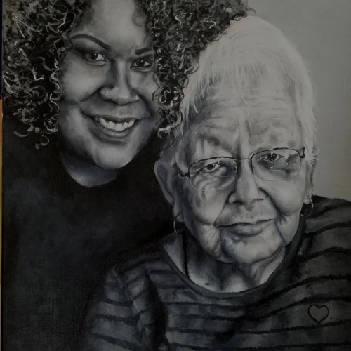
Fairly recently I was "commissioned" to paint a picture of my cousin and grandmother. I'm pretty happy with how it turned out, but painting this was a bit of a challenge. There were definitely moments where I stopped painting and completely hated how it looked/became frustrated with myself, and I wouldn't work on it for days. I felt an odd pressure attached to making this... or maybe I'm crazy. 16x20, acrylic.
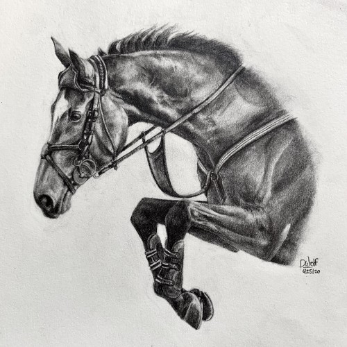
I’m finally done! ‘Veronique‘ is done in pencil, on Medium 80 lb drawing paper. She took me about 8 hours to complete. If you are interested in purchasing prints, please visit my website at this link:
https://imagineitvirtual.wixsite.com/sedonaequineart and contact me. Any opinions or advice would be greatly appreciated!
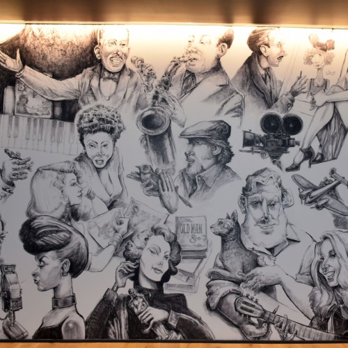
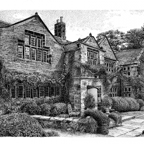
I had a wonderful time creating this commision for a Kansas City Personalities wall mural installed in a downtown KC apartment building. The wall measures roughly 12’ x 20’. These were all hand drawn graphite and charcoal drawings that I scanned into my mac and delivered digitally. The file was then enlarged and applied to the wall surface.
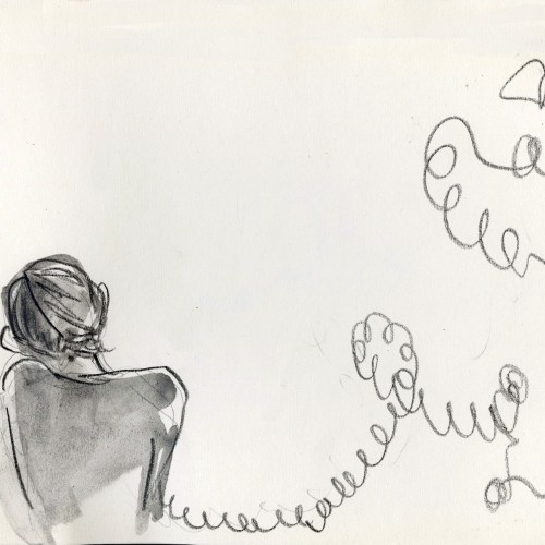
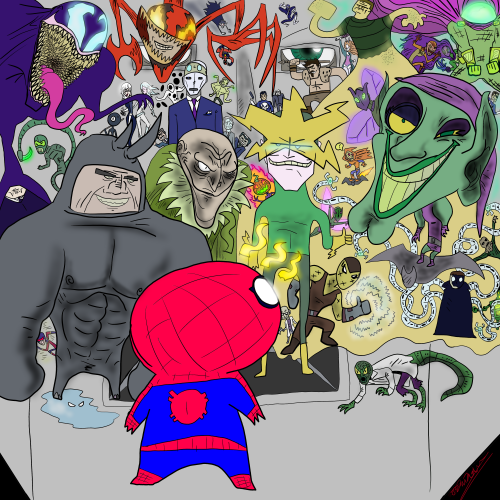
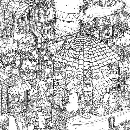
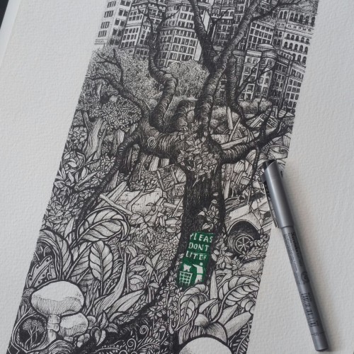
This is part of a broader idea for a big busy city teeming with different characters. Some of those characters will travel deeper through this city and through different lands. Eventually they get back to where they started from.
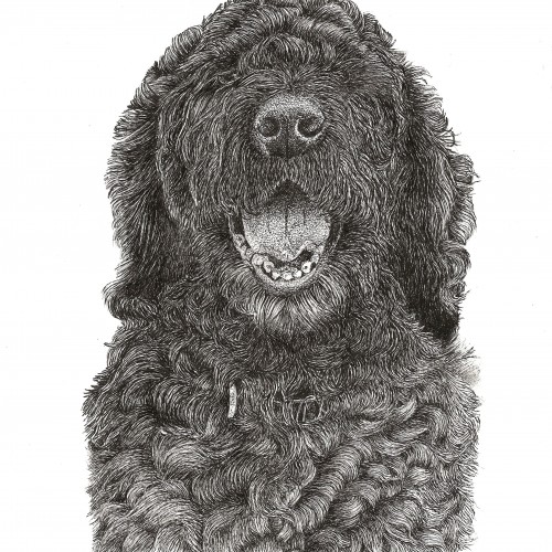
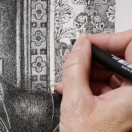
I have been working on this A3 double 'Pets in a Portrait' and I can't share the finished piece until after christmas as it will be a gift. I'm so chuffed with it, so heres some sneaky peaks that don't give too much away!