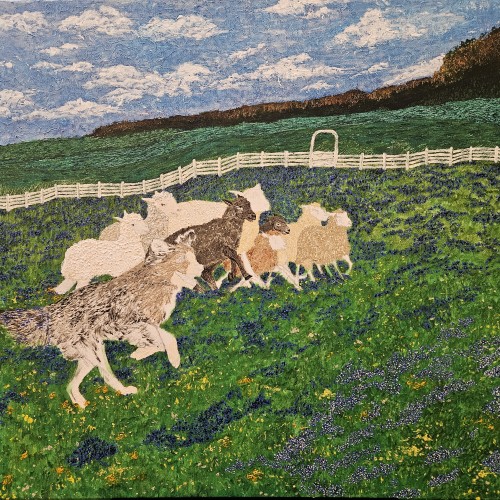
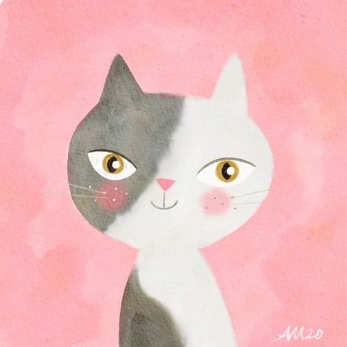
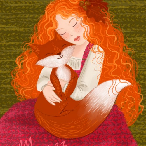
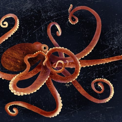
Only just some more white dots on the blue and then the animals then a signature then the finishing gloss then let it dry and ship out after getting paid of course
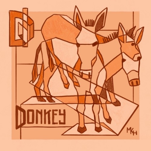
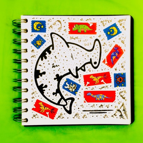
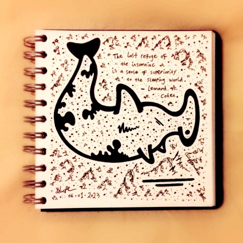
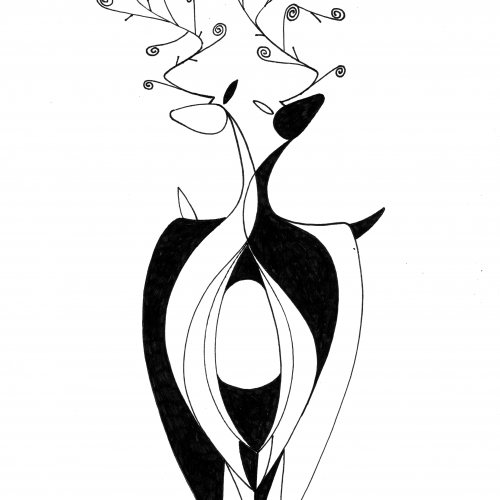
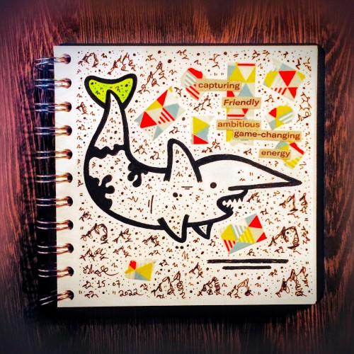
Part of a personal project I'm working on right now, to experiment with unfamiliar art styles and practice lettering skills by drawing animals. This is my first foray into cubism-inspired artwork (definitely don't claim to be an expert on actual cubism)--it was way more fun than I expected! I think I'll be trying some more...
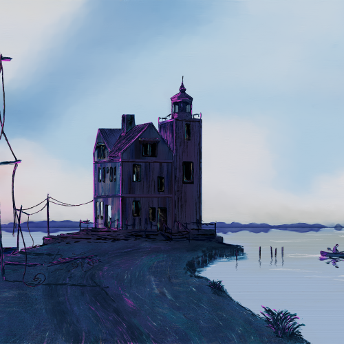
I was going for a surreal and moody feeling—dystopian, sort of not. Per usual, my inspirations are pretty noticeable. I am starting to get more comfortable being stylized. I am trying to put emotion in my landscapes. I used Rebelle 6
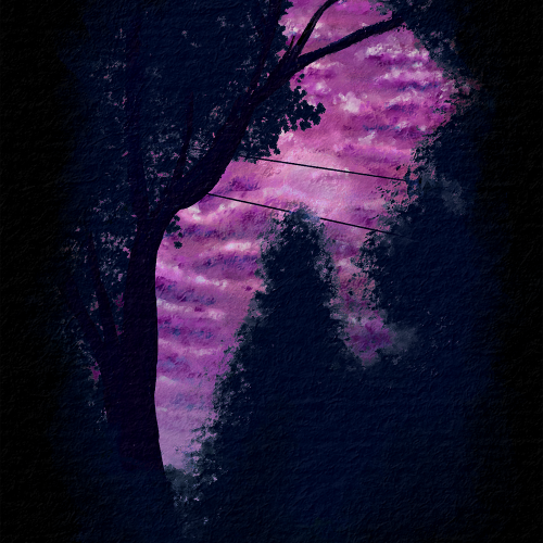
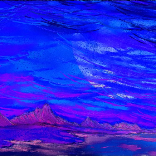
I was working on nighttime or dark themes and trying to get more contrast than the last piece I made. I wanted to also work on atmospheric perspective and depth with the clouds. Overall, I am pretty happy with the outcome. This is from a reference picture my husband took from our backyard. Painted with Rebelle 6 Pro.
I want the composition to be thoughtful but on the sad side. My skill practice was brush strokes and blending (but not overdoing the blending) as I try to figure out how I stylize as an artist. Still working in the realm of realism and proportions as I am a newbie, but wanna flex into stylization a bit more. I did this through Rebelle 5, which is absolutely amazing, IMO.
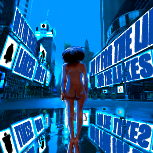
Take it how you want. You either give everything to social media, or it takes everything from you. In the end, you are left naked and hollow. I wanted to make this a simple composition at its core. The image is more about the message.
Times Square took forever to put together, I think the perspective is off just a bit. Overall, I think I did well with shading and depth. I am also improving on drawing/painting the human form. I wish I could trust in shapes and form and go a bit more abstract, but I think that will come with experience.
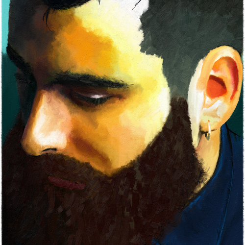
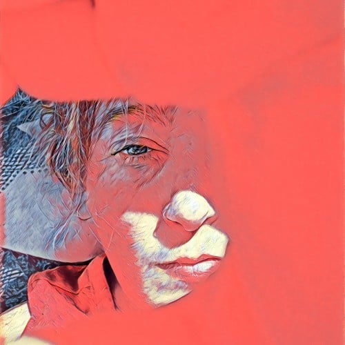
Before I got into digital painting, I was putting together digital collages. I love digital collages, but most of them are a bit too literal/pop art for me. No diss on pop art; I create a lot in that style. But, I wanted to make a smoother, more blended collage for my profile pic.
Phew! What a fortnight it's been here. Been engaging more in my photography as of late, but the day-job's had me on 'go' mode all Easter quite frankly. Thank the maker for those moments to yourself when you can just.. well, indulge really.
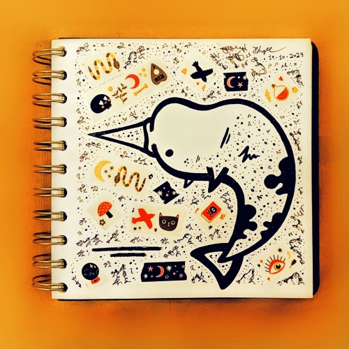
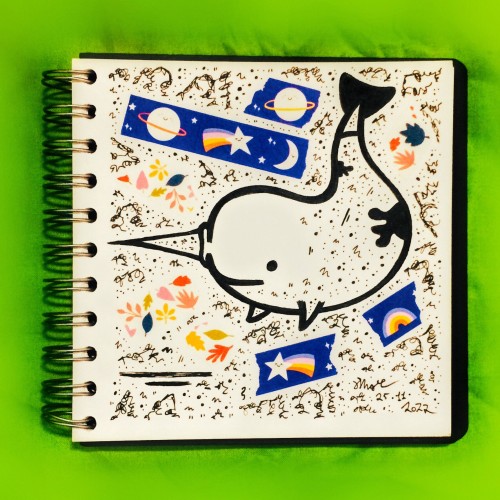
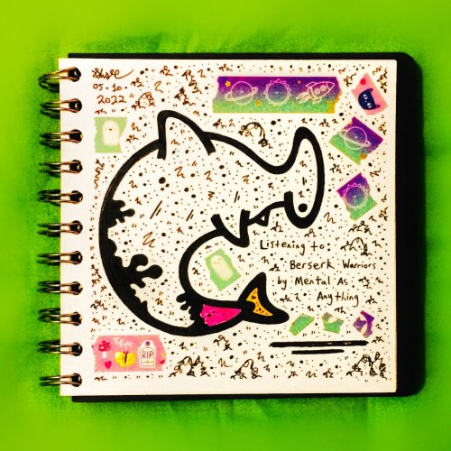
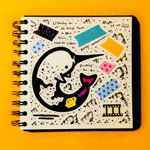
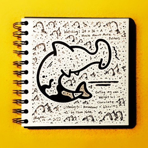
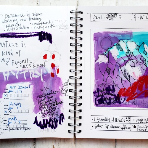
I do generally put pen (or some kind of tool), to paper (or some kind of surface), every day, but I'm really TRYING to do it purposefully in one singular location (journal). Here is a successful attempt from that particular day. I'm also super lazy, which means I never go up to my actual studio and only use what's out on my computer desk. (Including the "waste" page because I often like it as much/more.)
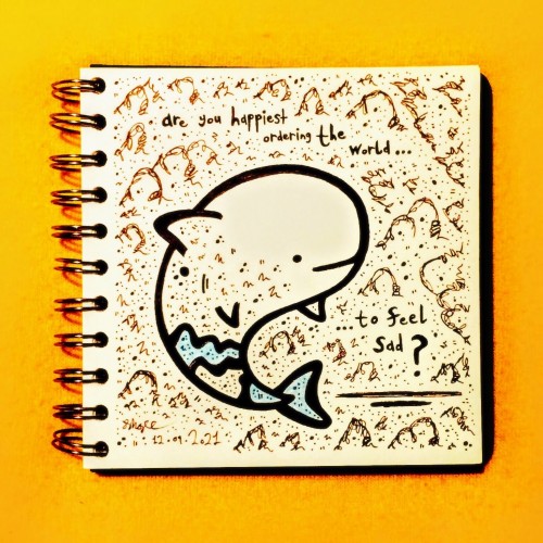
Some folks in this world tend to get a kick out of their more negative impulses and for all sorts of trivial reasons. Had to crank out something in response to my thoughts on the matter here! On a lighter note, any excuse to draw an irrawaddy dolphin is a good one...:)
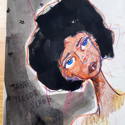
My husband is finishing "...just one more episode of Law & Order: SVU" but Jane needs sleep... (shared notebook with my grandkids, hence the always-present random marks.)