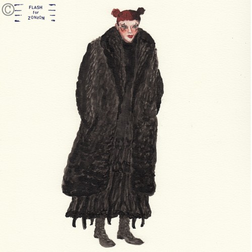
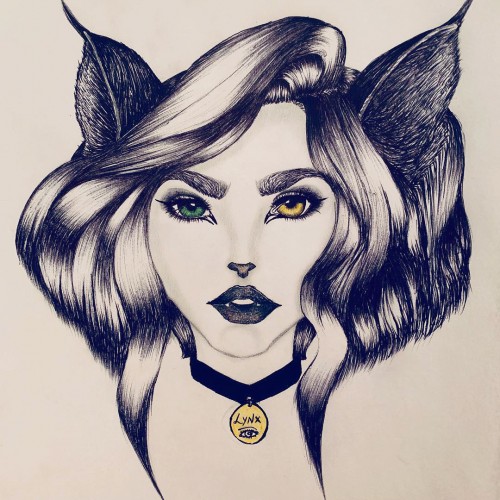
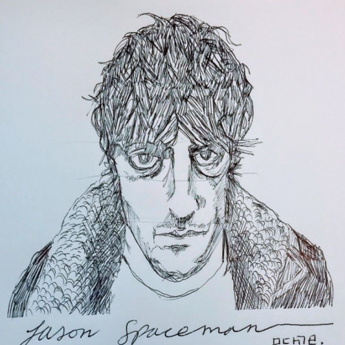
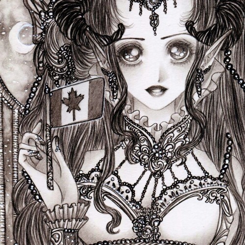
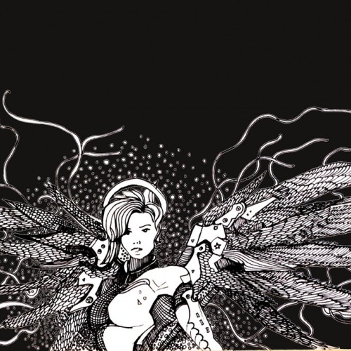
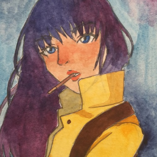
Isn’t this girl something! The eye makeup and the amount and volume of black colour really turned my head. Fur and layers. Red and black hair. Something to draw with ink!
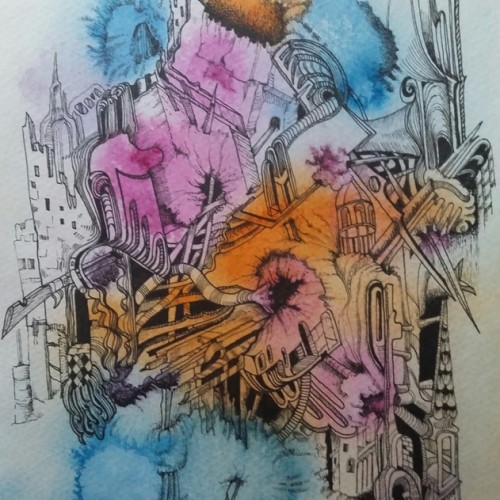
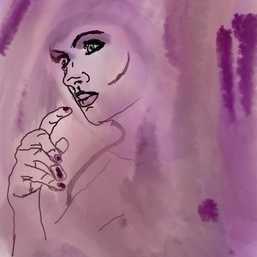
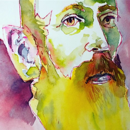
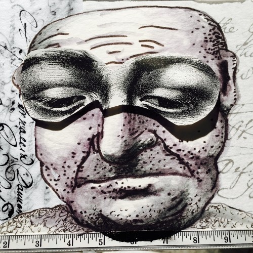
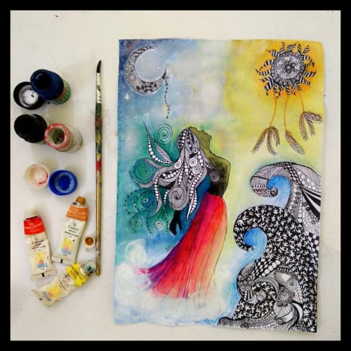
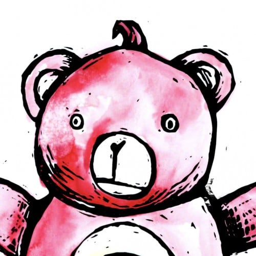
Experimenting today with an oil transfer drawing technique. The red and purple lines are oil drawn/transferred to hot press 140 pound watercolor paper with watercolor applied. The oil resists the watercolor.
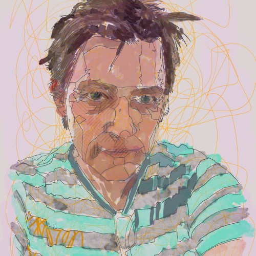
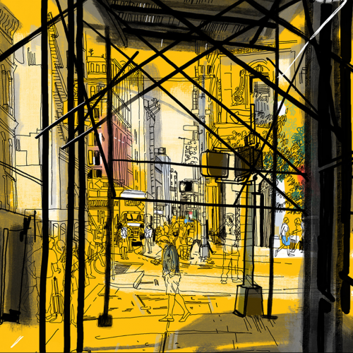
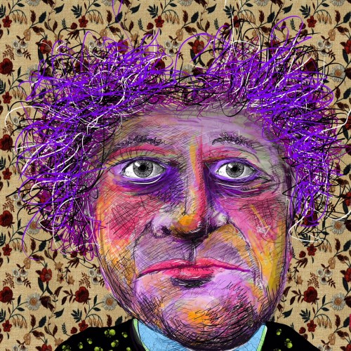
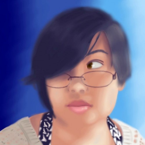
Hey guys, hope yall had a great weekend! I couldn't resist doing another iPad drawing on using the Sketch Create plug-in this weekend.
I think its awesome that you don’t even need to buy app to do drawings like this-Simply get this Edge extension!
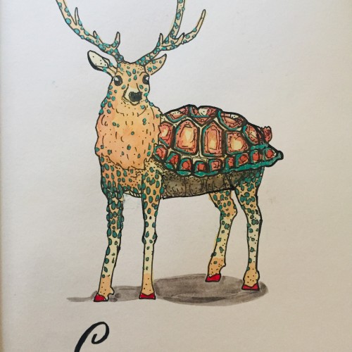
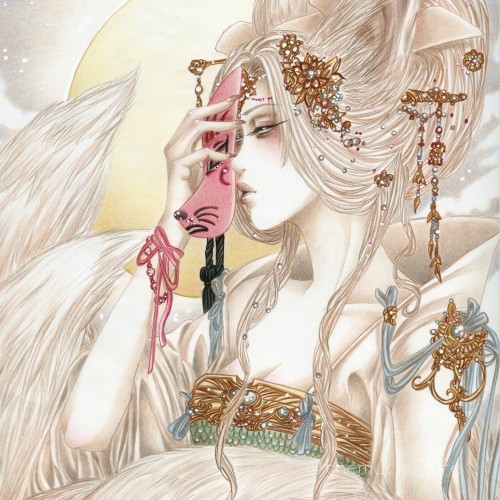
This was part of a collaboration I did with another wonderful artist over on YouTube. We picked the theme of our favourite folklore characters to draw.
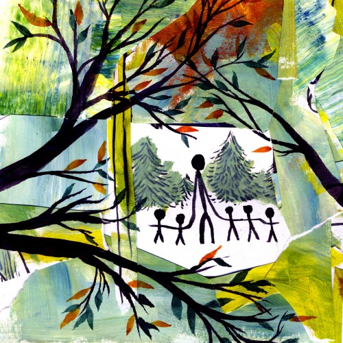
Romping through the woods, I happened upon a faerie ring of Slenderman and his acolyte children. I stepped back slowly. I didn't want crunching branches to give me away.
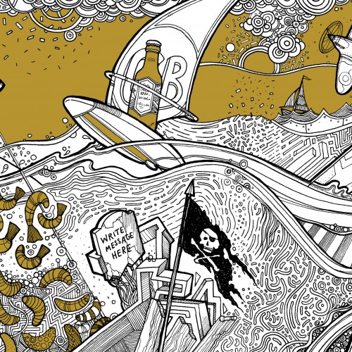
Beer Label design incorporating lots of local facts/things to do with the area it's brewed in. Sailing, windsurfing, big lake, spitfire plane, invading shrimps, highland cattle, sunken church, snakes, beer swilling octopus (ok I made that one up).