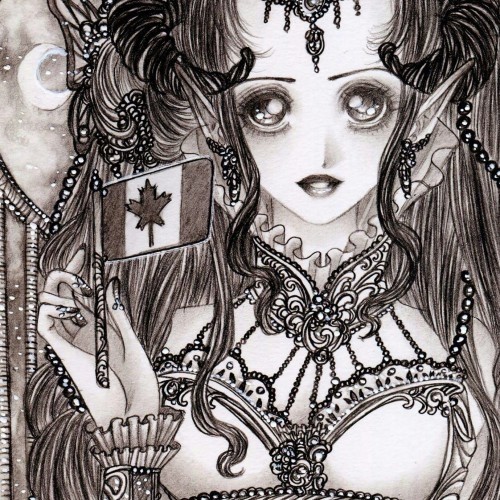
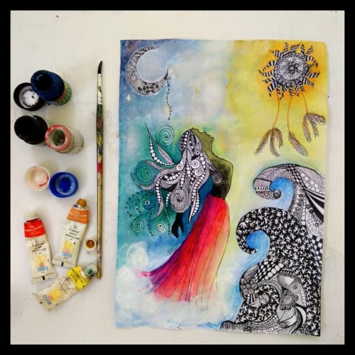
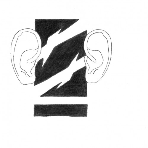
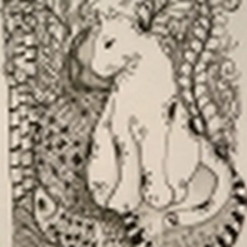
This was part of a collaboration I did with another wonderful artist over on YouTube. We picked the theme of our favourite folklore characters to draw.
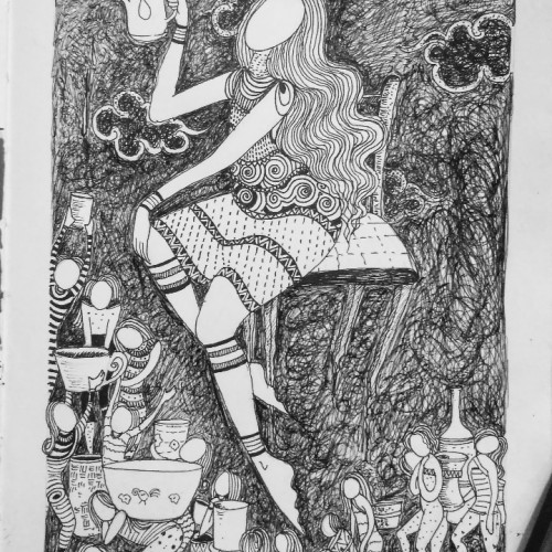
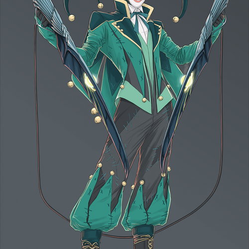
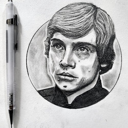
Just some time wasters I did. I would explain it, but it would require me to go into way too much comic nerd information. Its essentially a comic character that I redesigned (no its not the Joker). I really love concept art, and character design. I'm really not good at it, but I delve into it periodically for fun.
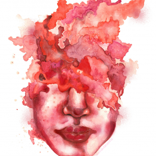
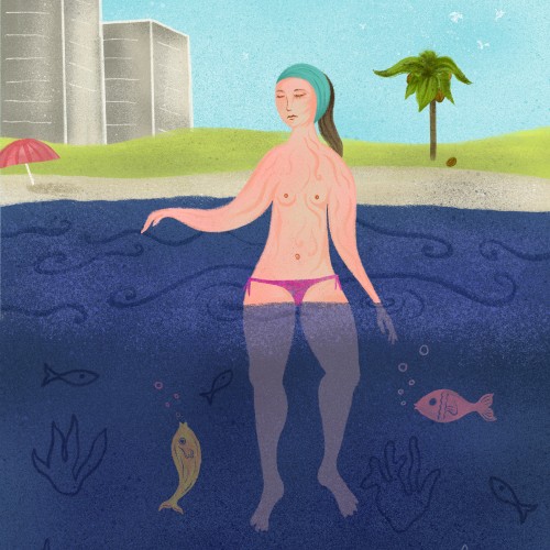
I’m fascinated in how something may make you feel. For instance, I’m deeply moved by images of outer space from the Hubble space telescope, but I do not try to recreate those photographs in my work. What does not exist in those photos, is how they may make us feel. This is why you won’t see any “realism” in my art. When we send astronauts to space, they can discuss factually what is happening, but what truly moves human beings is when astronauts describe how they felt while they were there. So, I choose to express how I feel, as opposed to illustrate what I see.
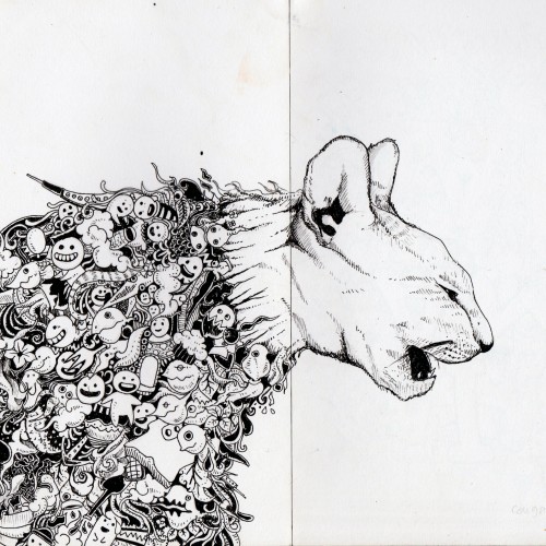
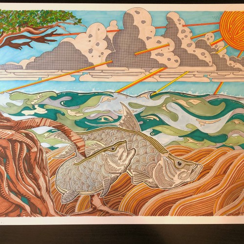
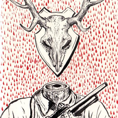
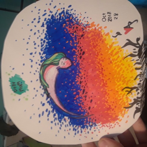
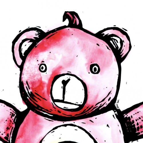
For day 15 the inktober word was weak so I decided to approach the subject of hunting for trophies.
It is not the animal that's weak it's the human that's cruel.
A lot of species become endangered because of our need to kill. We should love and protect all the animals, not put them on walls (real or virtual) only for our pleasure and ego.
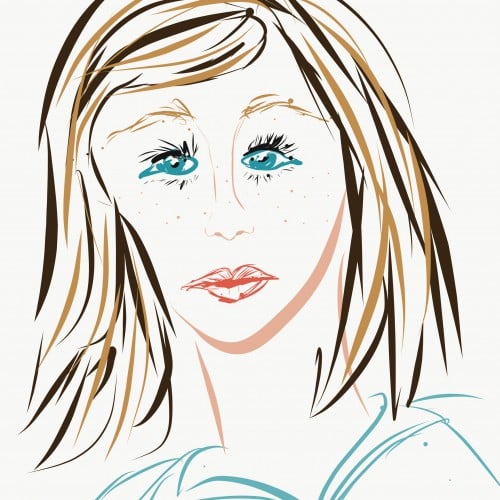
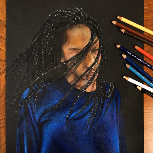
First time trying Digital Art and now I know why digital artists love their medium because they know how to use the software and can do so much with it.
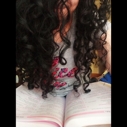
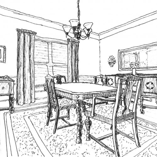
Our Dining Room is my favorite room in the house. Every family meal we eat at home happens there - breakfast, lunch, and dinner. Meal times are our sacred family time to share our day, our thoughts, our struggles, our successes, etc. We do have a breakfast area. But aside from homework, projects, or reading the newspaper, the breakfast area doesn't get much use unless needed for overflow from the dining room when we have visitors.
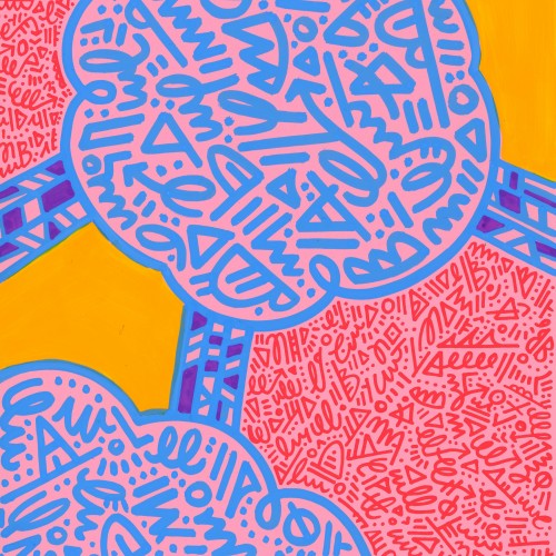
India ink on tissue paper. I had never used ink on this kind of paper before; I really liked the results! There are some folds and wrinkles on the paper that give the pattern some interesting details. The paper is also super absorbing, which plays nicely with the quantities of ink. Since it's very thin, there can easily be overlays between textures. And finally, when trying to use less ink (so that it wouldn't seep through and cause a big dot - the absorbing quality is nice, but it was also somewhat of a challenge!) I used very little ink on the lettering, causing a scratchy, dry look.
After my high school boyfriend and I broke up, I went to prom with a group of single friends. While I was in the bathroom, I overheard someone saying, "Leah Budin put in no effort at all." Ouch.
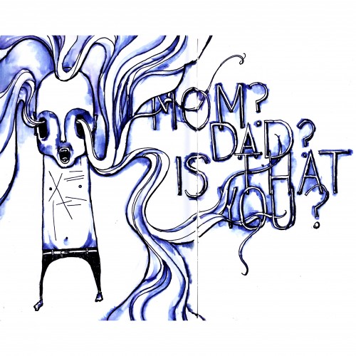
When I was a teen, my grandfather had alzheimers, a failing heart, and half of one lung. He was covered with scars and sometimes muttered at walls.
I was asked to keep an eye on him, briefly, one afternoon, while my grandmother did something else. While I was alone with him, he looked at an empty space right next to me, and whispered: "Mom? Dad? Is that you?"
With the exception of getting hit by a car, that was the most terrifying moment of my life.