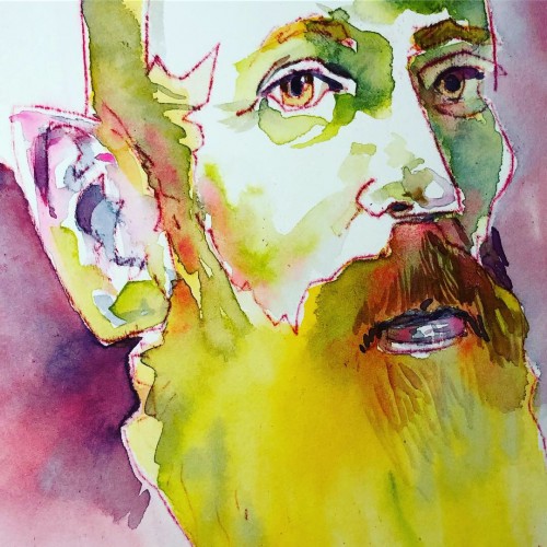
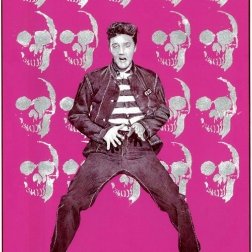
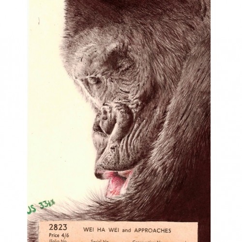
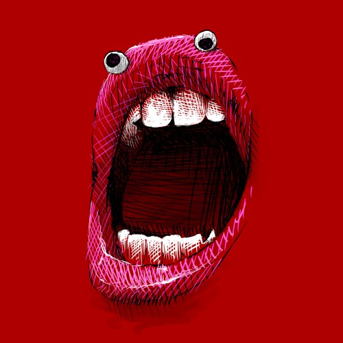
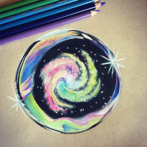
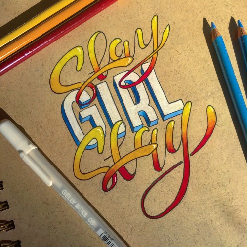
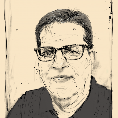
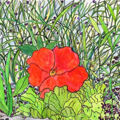
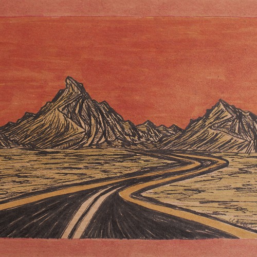
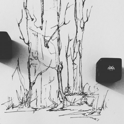
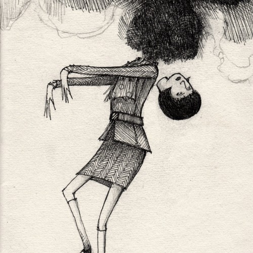
Experimenting today with an oil transfer drawing technique. The red and purple lines are oil drawn/transferred to hot press 140 pound watercolor paper with watercolor applied. The oil resists the watercolor.
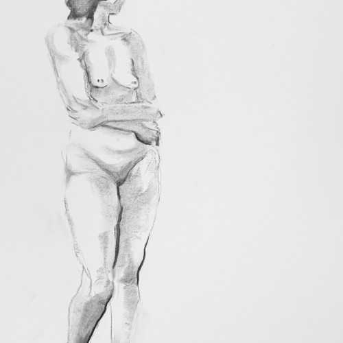
Well, I'm joining the Tumblr exodus, which is unfortunate because that's where I post all my sketches! Oh well. Hello DoodleAddicts! This was half of a recent assignment for a figure drawing 2 class, to draw our model in high key lighting. :) Time: 30 mins x 2 Medium: Charcoal on Paper
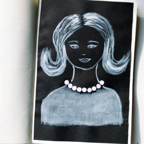
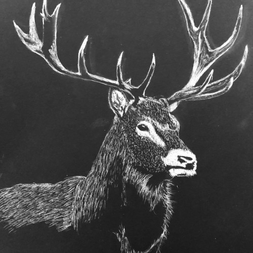
The idea for this portrait came to me when I was looking at a packaging of soap - it was very glossy and it looked like it could look like pearls. As well as the soap packaging, I used white ink mixed with acrylic paint (for opacity) on black paper.
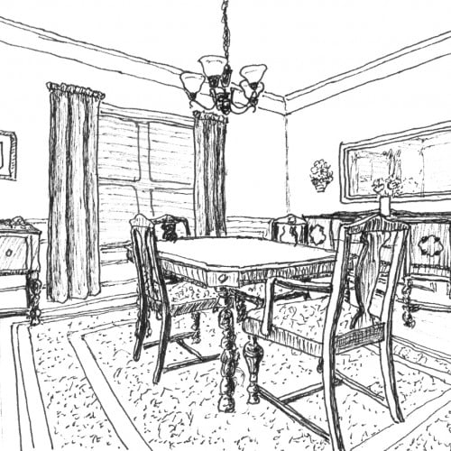
Our Dining Room is my favorite room in the house. Every family meal we eat at home happens there - breakfast, lunch, and dinner. Meal times are our sacred family time to share our day, our thoughts, our struggles, our successes, etc. We do have a breakfast area. But aside from homework, projects, or reading the newspaper, the breakfast area doesn't get much use unless needed for overflow from the dining room when we have visitors.
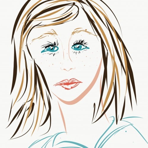
Happy Halloween: Illustration of Wendy Torrance from The Shining.
Technique:
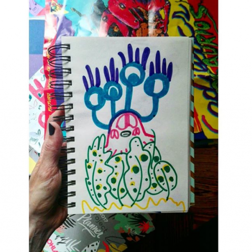
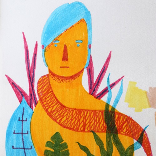
Markers & some digital edition
Paper: my notebook Tilibra, couché, 150 g/m
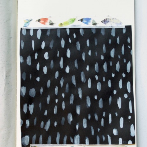
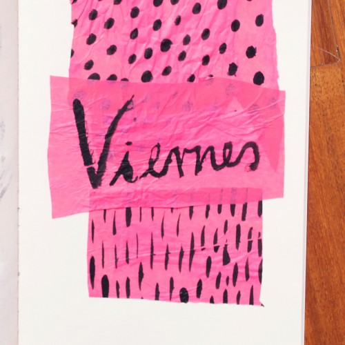
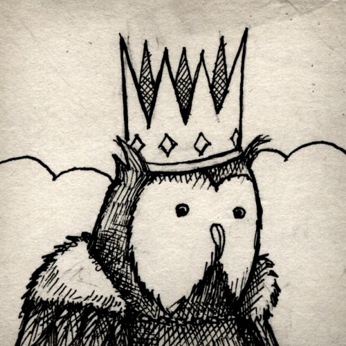
India ink on tissue paper. I had never used ink on this kind of paper before; I really liked the results! There are some folds and wrinkles on the paper that give the pattern some interesting details. The paper is also super absorbing, which plays nicely with the quantities of ink. Since it's very thin, there can easily be overlays between textures. And finally, when trying to use less ink (so that it wouldn't seep through and cause a big dot - the absorbing quality is nice, but it was also somewhat of a challenge!) I used very little ink on the lettering, causing a scratchy, dry look.