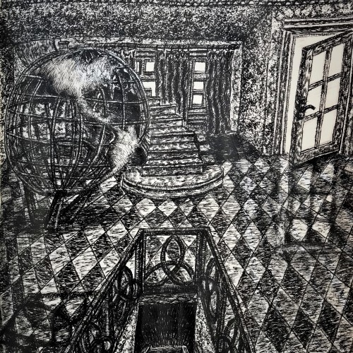
Title: Windows to the Soul
Medium: Ink on sketch Book Paper
Size: 10” X 14”
Year: 01/09/2020
This Illustration is a pulmonary design/study for a future painting. Theme was born from a poem I wrote a couple years ago, by the same title. The main massage is that Christians are to be windows that Jesus Christs can shine His light of, Love, truth, mercy, salvation, hope, new life, in to a darkened world by the power of sin.
The power of sin is what subjects all creation under destruction, suffer, death, decay. The Devil, and countless fallen angel use these tools to destroy the human race.
Christians Have victory, through faith in Christ, from being a salves to sin, they have obtain adoption into God’s family, and removed from the coming damnation that is for the rebellious angels and the humans. Christian still are still temped to commit sin, and still make bad choices.
Christian’s sin, hinder their effectiveness to be a witnesses for God’s kingdom, their short comings are like black drapes, that hang in a widow, that hinder the sunlight from brightening and warming a dark cold room.
The massage communicated by symbolism
The stair well leading down with the railing around it:
The railing: The 3 petal flower is a Keltic symbol for the trinity of God.
The railing around the stair well: Represents, God’s desire that none should perish but to repent.
It also represents that people go to hell by their own choice, through their deliberate rebellious living against God. No ne accidently end up on the wrong side of the railroad tracks.
The Stairs going down: Represents sinful humanity that is separated from a holy God.
Without a spiritual intervention, we all have one destination that is the lake of fire, which is the finale judgement for sin.
The open glass pane door: Represents God wants humanity to except his invitation to commune with Him, receive the new life He offers to provide for them.
The stair case without railings: Represents the path to TheHeaven, which must me travailed by faith.
The partly open drapes hanging in the Picture widow. Represent sin that try to prevent the light of truth to penetrate the darkness of deception.
The railing with the fishes and crosses: This represent the Heavenly destination of Christian. It also stand for Christian being God’s Life guard. While living in the world, their mission is to take the salvation message into all the world.
The second Floor open door, the entrance filled with light:
This represents the entrance to Heaven.
The globe sculpture represents a world needing to be repossessed, from the power of the curse of sin. By the hand of God, it will made new, absent of rebellious angel and humans. Absent from destruction, suffering, death, decay.
Stephen J. Vattimo 1/10/2020