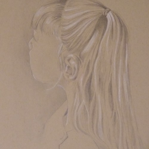
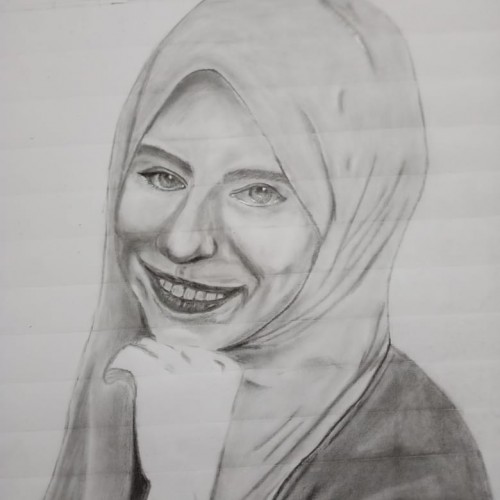
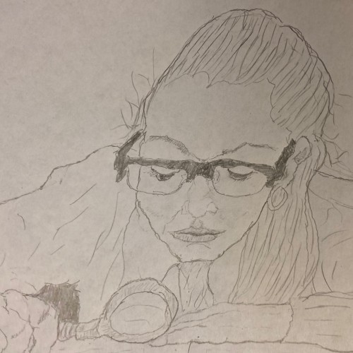
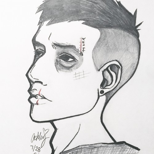
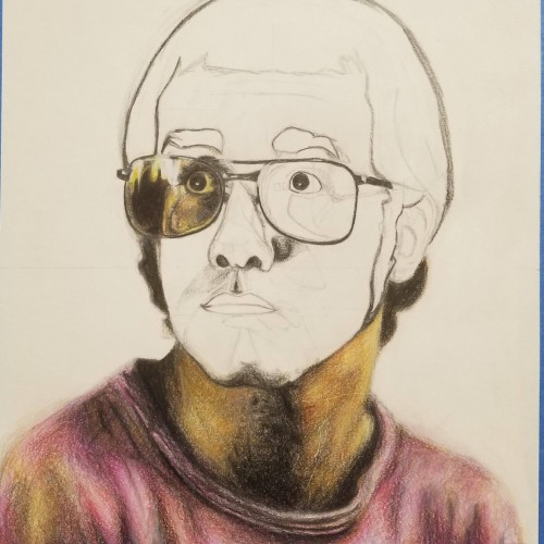
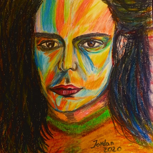
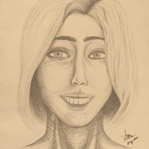
The first time I tried to draw a portrait. It was more than a year now since I have finished this photo. I know that the portrait is not that perfect, but I really enjoyed making it and I have learned a lot.
This time I designed a logo using a special style of Arabic calligraphy called "Al-Diwani". This style is distinguished by its flexibility and beauty. Besides its capability to represent and any shape that I want using any words; so I can illustrate and draw anything using this style.
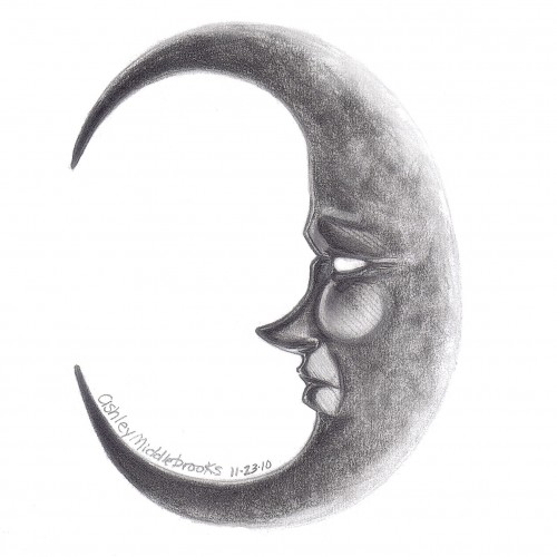
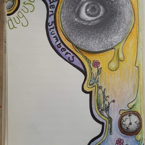
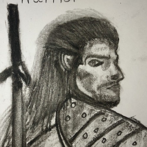
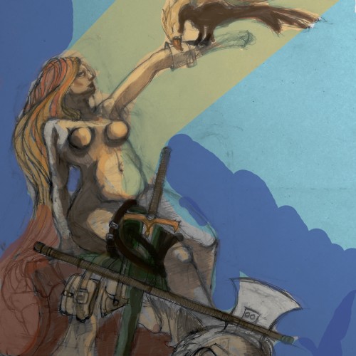
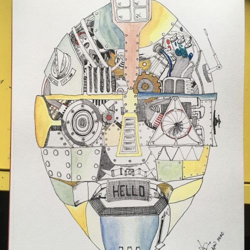
I know this is simpler and a quicker piece, but this is the drawing for my August journal. I started doing these back in March, with each month's drawing being based off a song. This month is "Golden Slumbers" by the Beatles, July was "Tower of Babel" by Elton John. (The pencil sketch eye I previously posted is indeed now in my journal.)
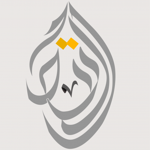
The Kufi writing style is one of the most charming and strongest styles in Arabic Calligraphy. It is used here to illustrate the word "Allah" with some additional curves to maintain and clarify the beauty of this word. Besides some Islamic drawings which surround the word "Allah". This illustration firstly was made on paper with a pencil, then I converted it to digital art using Adobe Illustrator.
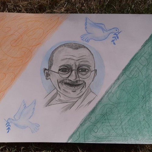
A piece of a pencil drawing for Mahatma Gandhi on the center of the Indian flag as a background. The two birds represent the peace that Gandhi brought to India.
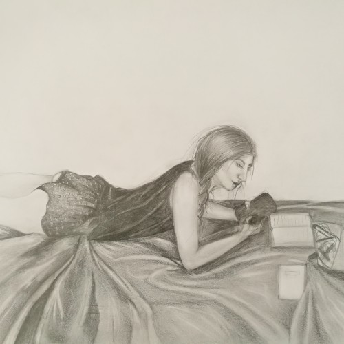
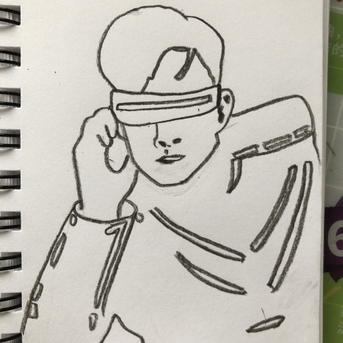
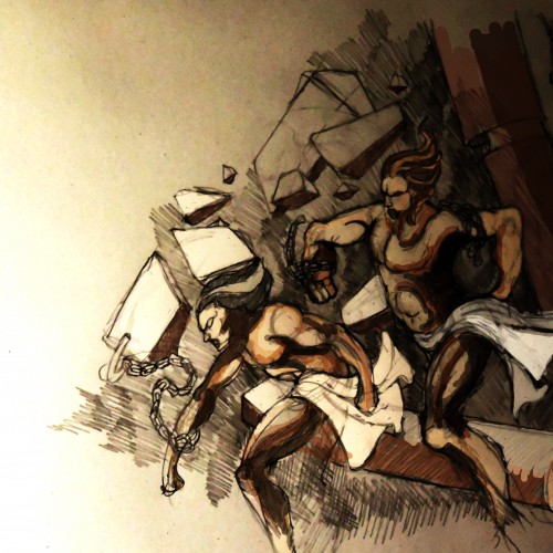
Another progress photo for your viewing. Hopefully I'll have this finished soon, but I'm very much enjoying drawing this while listening to my records... (Feedback is very much welcome!)
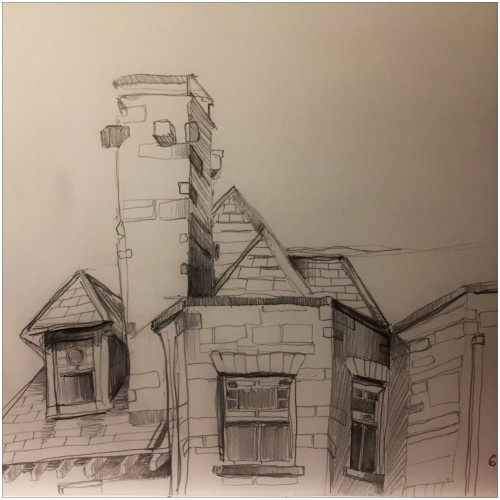
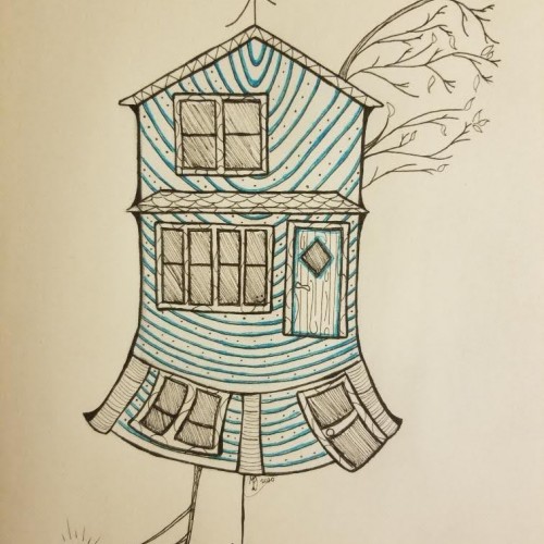
Here's a doodle of my house. (I feel like this looks a bit different than what I usually do.) This is an homage to my 100+ year old house that has had many generations live in it. The bottom section is overly curved because, in reality, the center of the house is sinking and everything rolls towards the middle. A lot of character for a little house.
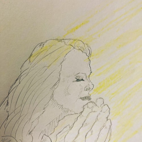
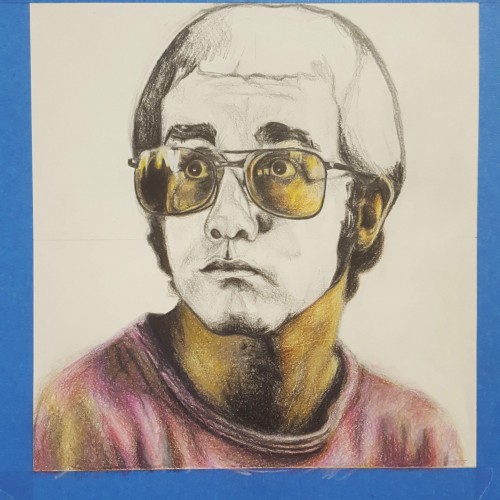
I figured I'd post a progress picture of the Elton John drawing I started 2-ish weeks ago. I'm coloring it based off the album booklet (from 'Don't Shoot Me I'm Only the Piano Player'), so the colors in the actual picture are a bit more yellow/orange (just in case you were questioning the color choices). This has been a project I really enjoy; it's pretty relaxing.
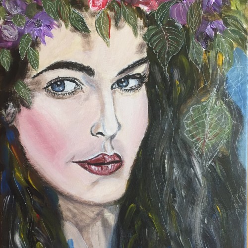
I am not the original creator of this, but I decided to give it a try, to see if I had the skills for the challenge. What do you artists think? Do you think I nailed it?


![[COMMISSION] - Pencil Sketch Eris #2](/images/uploads/square/30999_anlee_1594860079.jpg)