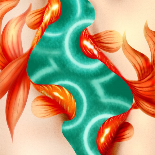
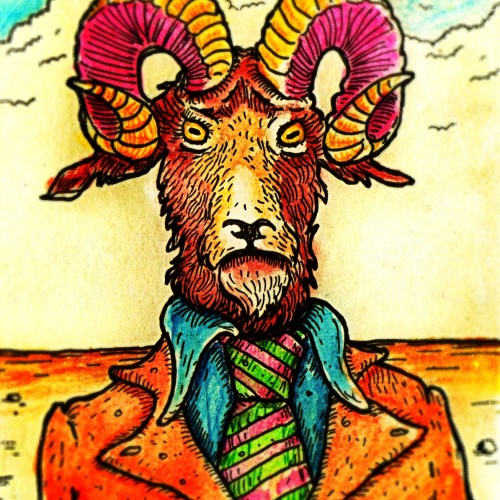
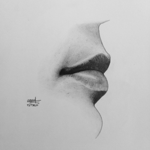
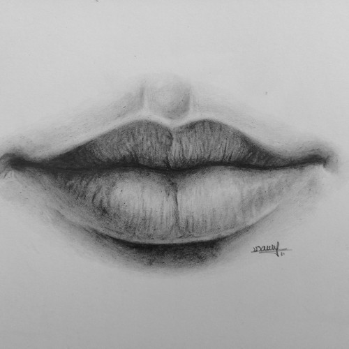
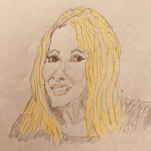
at first I wanted to draw this on paper with colour pencils but I didn't have all the necessary colours so I switched over to digital. making the lips look like goldfish wasn't my initial intention but I like how it came out in the end
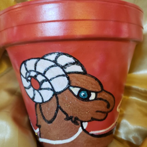
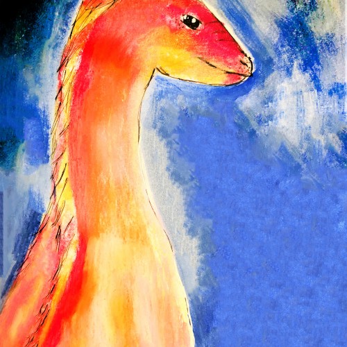
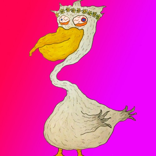
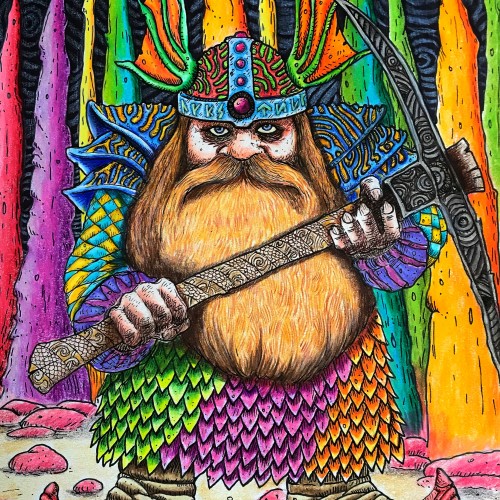
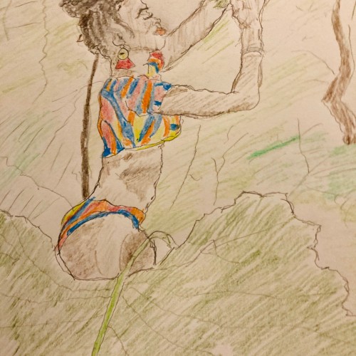
I wanted to draw a crowned animal with a crest on top of its head. Originally , this was colored with colored pencils but I didn't like how it looked so I tried to save it by painting over it with acrylic paint.
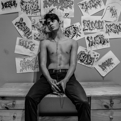
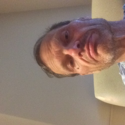
Binge-watched “Bridgerton” last weekend and paid the price for it all day Saturday. The drawing is based on my wife's picture of me on the couch sleeping off my bad decision. HB, 2B Staedtler mechanical pencils on 8.5” x 11” acid-free sketchbook.
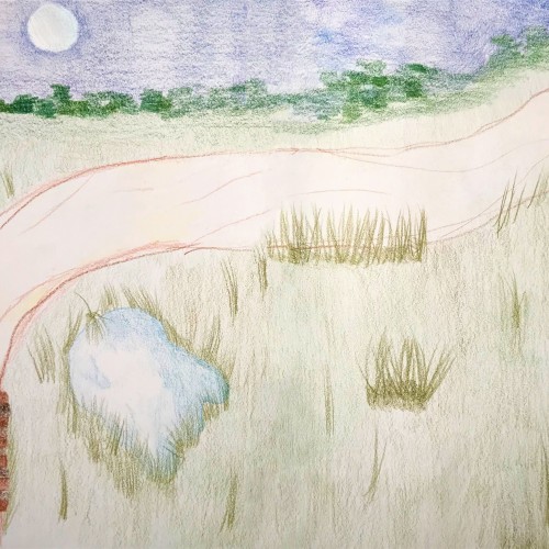
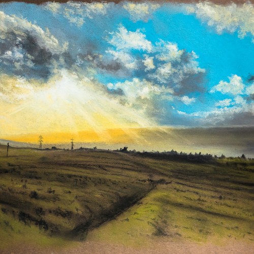
I first bought some cheap soft pastels back in 2018 and did a couple of sketches. I bought a nice set of Rembrandt pastels a few months later — didn't use them. I bought some pastel pads, none if which seemed right. September 2020, I bought a couple more sets of bargain pastels and tried a couple of pieces — no good, still couldn't bring myself to use them. Jess bought me pastel pencils for Christmas — I was too scared to use them. I even bought a pad of Pastelmat which is supposed to be THE paper to use for pastel paintings in January. I was too scared to use that as well!
FINALLY, after a few unsuccessful attempts at working with watercolour (brush issues), I cast aside my fear and thought I'd mess around with pastels. Some time later, and this was the result. I've finally broken through my pastel fear-barrier.
I've got to say, I love soft pastels and I'm excited about doing more pieces in this medium.
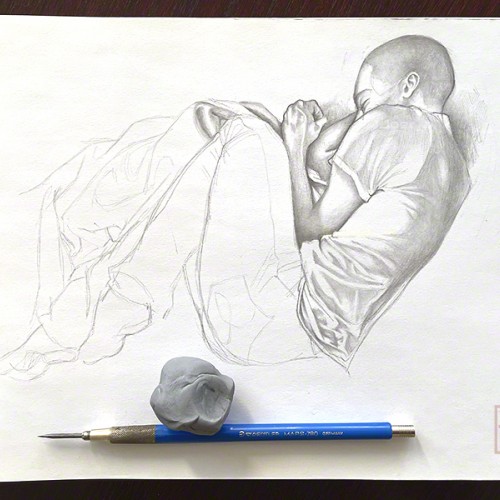
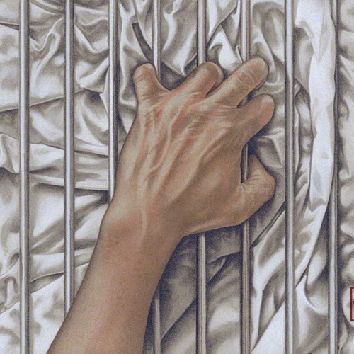
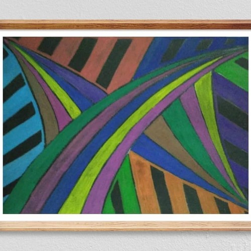
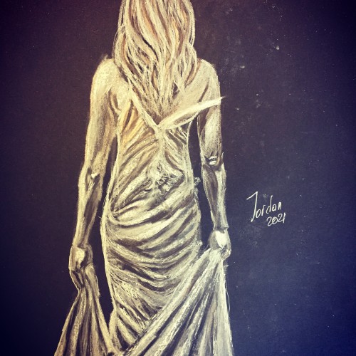
Some LGBTQ+ members of the community can’t openly love who they want to love, so the bars represent that barrier. The fabric, with all its complex folds and creases represents sensuality, desire and love. Love, in all its forms is a complex thing of beauty.-------------
The companion piece to my previous post ‘Ecstasy.’ Agony and Ecstasy were always meant to be a diptych. The issue for me is that there is a two-year gap between the completion of the two - there is a noticeable difference in the the way both were drawn.
Faber Castell pastel pencils, Black and White Generals charcoal pencils on 9” x 12” Strathmore Toned Grey sketchbook paper.
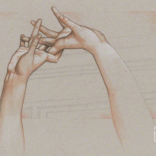
Pastel pencil study of the intertwined hands of the Ambrogio Borghi sculpture, Chioma di Berenice. Faber Castell pastel pencils, Black and White Generals charcoal pencils on 9” x 12” Strathmore Toned Grey sketchbook paper.
From a snap of me sitting in the waiting room. Pencil, Charcoal Pencil, Pastel Pencils and white Prismacolor pencil on 9” x 12” Strathmore Toned Grey sketchbook paper.
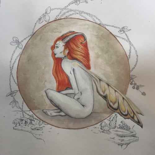
My first venture into artist grade colouring pencils - and I'm smitten! I never thought I could achieve such boldness and blendability with them! I'm still getting used to them and will think about choosing smoother paper with less tooth next time. The texture and weight was more for the water-based gouache along with alcohol inks (which are very unforgiving to even primed heavy paper!). Apologies for the unevenness of lighting between the 2 sides of paper; will correct that when I'm making proper image files.
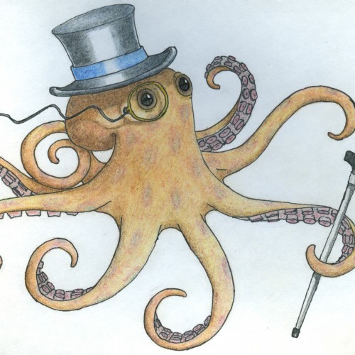
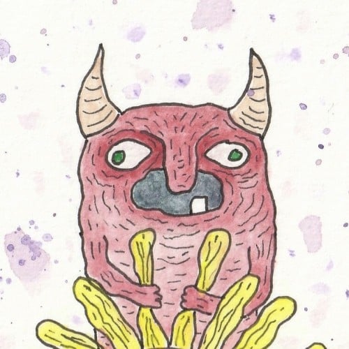
This is more of a test than anything, but I thought this would be go a good one to test uploading with. I basically just created this character from my head. If you're interested in the materials I used, I created it with a basic watercolor set using a wet on wet technique for the background, A sharpie outline, and the color on the character was created by using Prismacolor colored pencils.