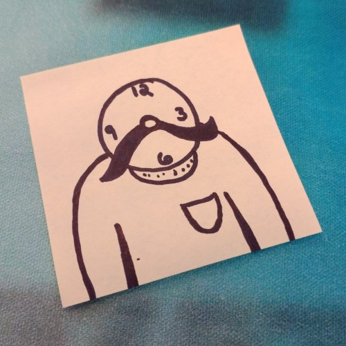
(Blue biro on a 75mm x 125mm post-it note) Verecide (or Vericide) is a word meaning the "killing of reality" by choosing to permanently live in a virtual one.
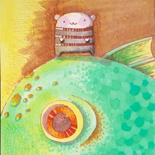
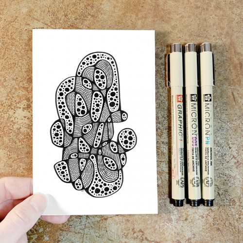
Here is one of 3 illustrations I made for customizable postcards, available for purchase at @cava.galeria
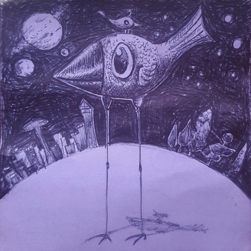
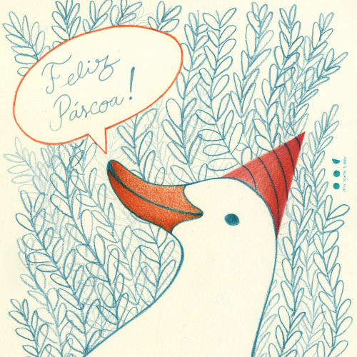
I wanted to make another silly #goose with a fun #hat
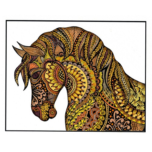
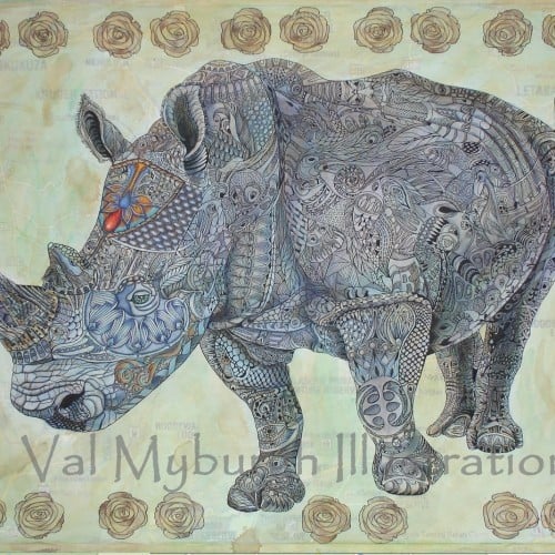
I printed my black and white zentangle drawing on marker paper and colored it with alcohol markers. At first it was a bit to garish with too much contrast, so I painted a warm grey over the whole piece. That gave me what I was looking for. Of course, THEN I completely undermined that with making a bunch of wild colored ones (two shown here) by playing with them in Photoshop. I shall be using this (along with my Zentangle koi posted la while back) for printing blank cards that we sell for charitable (mostly foodbanks) organizations.
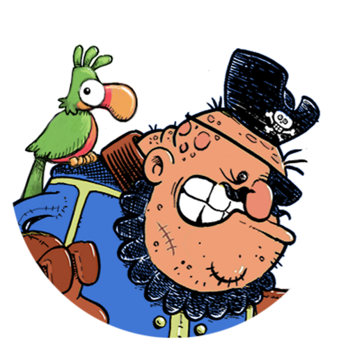
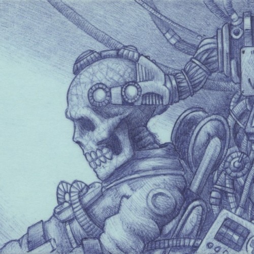
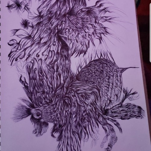
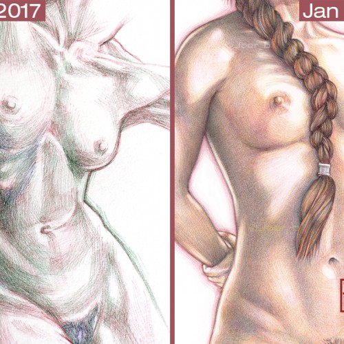
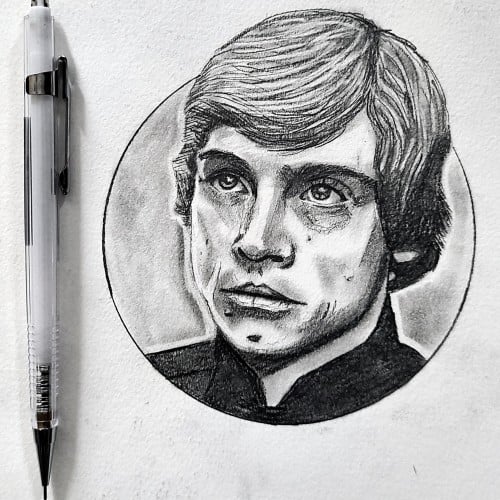
I’m often asked about my Bic pen drawings and how I do them. It starts with a good foundational drawing, the ballpoint pen part is just trying to colour within the lines. I try to do my best to explain the process, but the best way to show my progress is by posting my efforts to master pen drawings over the span of 3 or so years. I have been doodling/drawing with ballpoint pens as far back as I can remember - they were cheap, readily available and always lying around the house. It wasn’t until I was bored during a particularly long team meeting-conference call (around 2016-17) that I started to think about the possibilities of ballpoint pens as serious portrait illustration tools. My first experiments with full colour ink portrait drawings were rather crude, but that’s the point of learning new techniques—as long as the curiosity and the love of drawing is there, you can transfer that skill and passion into any medium. Remember, the most exquisite drawings and paintings you see didn’t materialise fully formed, they started out as failed experiments. Failure after failure after failure. It’s important to remember this when you get discouraged (I've failed spectacularly over the years). The only difference between the accomplished artist and the beginner is hundreds of hours of practice. Talent can only get you so far. It’s the hard work that you do behind the scenes that makes your work look effortless. Keep doodling. Keep learning. Stay curious.
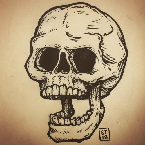
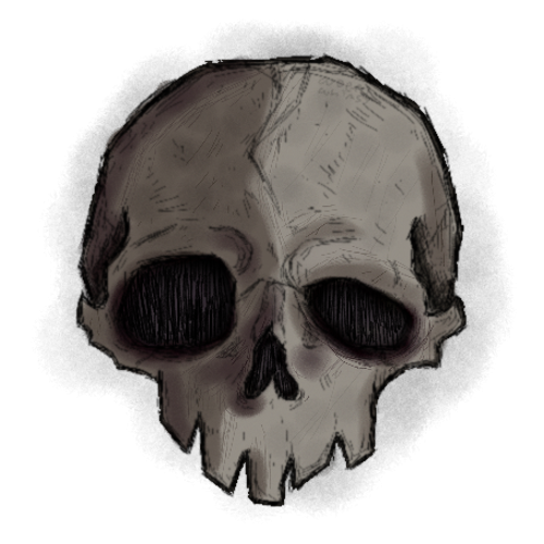
I have a little Moleskine (3.5 x 5.5) notebook that I only draw skulls in. I started in November of 2013 and I do one whenever the urge strikes me. It's not like a skull-a-day thing but sometimes I do get into a period where I will draw one every day for a while then I won't draw any for months. I even lost it for a while and was very sad. I think the longest gap between pages has been a year. This is the most recent skull, drawn on 05.28.2018. Most of them are posted on my Instagram but you have to scroll back a ways to get at the bulk of them.
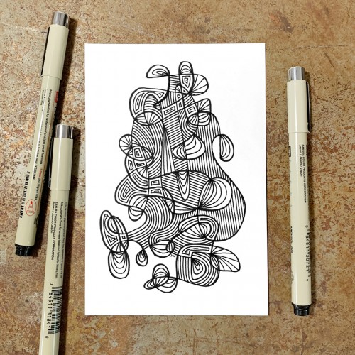
"Whirlwind 22”, an original drawing. Micron pens on archival paper. Size: 4” x 6”. Title, signature, and date in the back of the drawing. This drawing is the 22nd in a series of drawings posted over a period of 100 days. The original post date on this drawing was September 22, 2020.
“Whirlwind 9”, an original drawing. Micron pens on archival paper. Size: 4” x 6”. Title, signature, and date in the back of the drawing. This drawing is the 9th in a series of drawings posted over a period of 100 days. The original post date on this drawing was September 9, 2020.
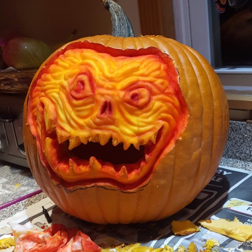
Here's the second pumpkin I carved (I did find the sketch, so I posted that in there too). Both carvings were really fun and very time consuming. I'm usually not good with 3D models or sculptures, but carving pumpkins seems to work out.
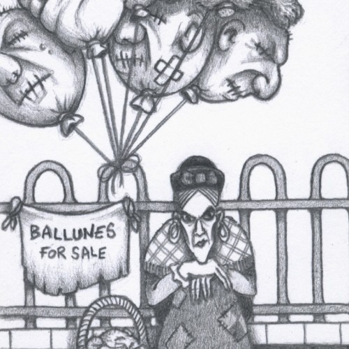
私のパトレオンで利用可能な印刷可能で着色デザイン | Printable and coloring design available on my Patreon | Diseño imprimible y para colorear disponible en mi Patreón: https://www.patreon.com/posts/chu-yin-kitei-134803356
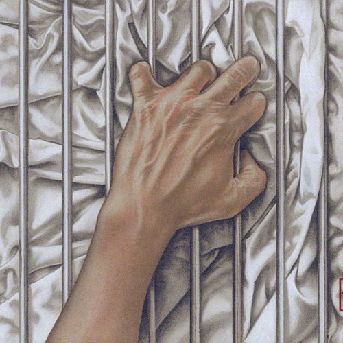
Some LGBTQ+ members of the community can’t openly love who they want to love, so the bars represent that barrier. The fabric, with all its complex folds and creases represents sensuality, desire and love. Love, in all its forms is a complex thing of beauty.-------------
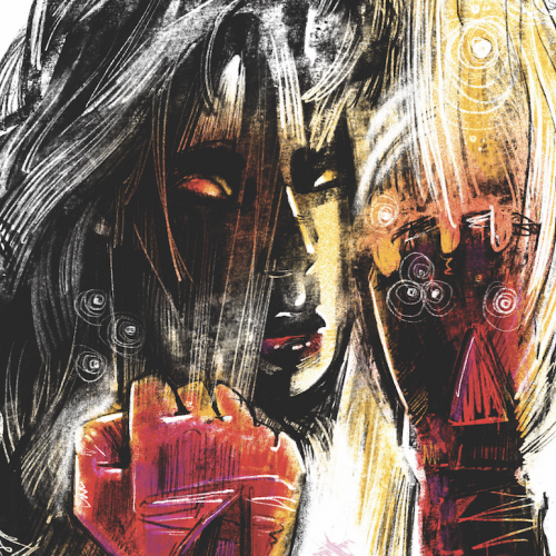
The companion piece to my previous post ‘Ecstasy.’ Agony and Ecstasy were always meant to be a diptych. The issue for me is that there is a two-year gap between the completion of the two - there is a noticeable difference in the the way both were drawn.
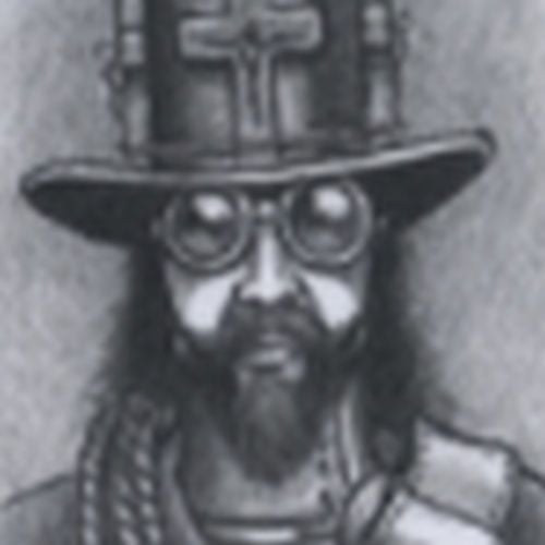
Faber Castell pastel pencils, Black and White Generals charcoal pencils on 9” x 12” Strathmore Toned Grey sketchbook paper.