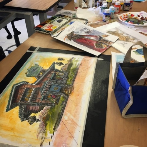
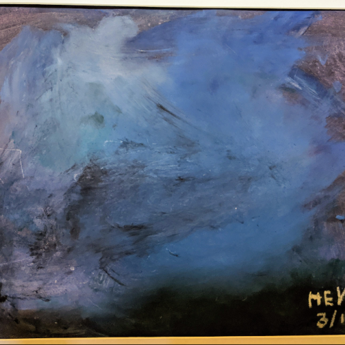
Class demos in my "Sketching for Animators and Illustrators" class. The building in the foreground is a students sketch I xeroxed and went over with acrylics. This is about a half hour in. We also looked at brush-pen and watercolor. I'm doing a summer ver
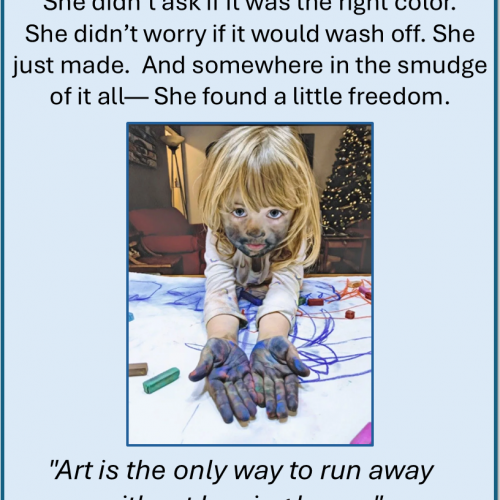
The tables were covered in white paper. Crayons, pastels, and smooth sticks waited quietly. Then came Lucy’s glittery purse—her 8-year-old hands had filled it with stones to pass along, one by one, to the strangers around the table.
We traced them. Pushed them. Held them.
Then we let the colors lead:
-Red for emotion.
-Yellow for curiosity.
-Blue for memory.
Each color came with music, with story, with space.
At the Museum of Wisconsin Art, we made marks not for meaning but for presence.
Thank you to Ann Marie and MOWA for the invitation and trust. And thank you to the participants—some new friends, some old students—for showing up and making lines that listened before they spoke.
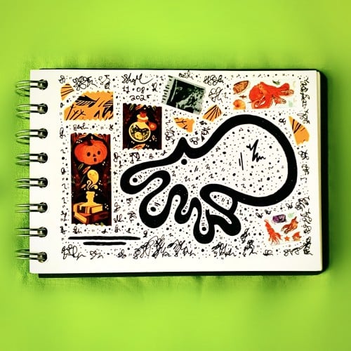
I had this bizarre dream recently that I saw some
maniac driving in circles around my neighbourhood in what looked like a Reliant Robin, ready to crash into whatever they could at any given moment… yes, my mind (awake or asleep) works in weird ways but it gives me ideas so, hurray?
4 year old Henry engaged fully with thick applications of watercolor and oil pastels. He said it was a stormy sea with a small boat. This was at the onset of the pandemic, when we were all a bit uncertain and confined to our homes. I was reminded of an insight by Kierkegaard written in the early 1800s: “When the sailor is out on the sea and everything is changing around him, as the waves are continually being born and dying, he does not stare into the depths of these, since they vary. He looks up at the stars. And why? Because they are faithful – as they stand now, they stood for the patriarchs, and will stand for coming generations. By what means then does he conquer changing conditions? Through the eternal: By means of the eternal, one can conquer the future, because the eternal is the foundation of the future.”
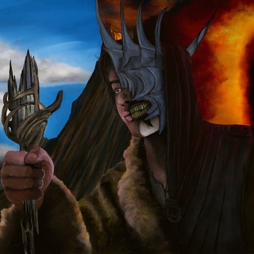
Lord of the Rings: The Rings of Power fanart. Theo imagined as the Mouth of Sauron with Mount Doom and the Eye of Sauron in the background. I went for a painterly feel but a decent amount of detail. Lemme know if you like it.
Finally got round to watching Hunt For The Wilderpeople, after eons of procrastinating over doing so, and was well chuffed at how great it was! Gave me some much needed inspiration for some art as well, always a bonus.
Can see what the Deadpool 2 guys saw in Julian Dennison that’s for sure, and of course Sam Neill was brilliant as well. Can’t be forgetting Taika Waititi either for directing it! Excellent job from all in my opinion :)
Sleep well David Bowie, and thanks for all the inspiration! Saw this comment on one of Iggy Pop’s music videos via YouTube and had to create something based around it, spelling mistakes and all...
this is a little piece of my entry for a poster design contest. I've always avoided doing figurative drawing - personal or animal. so this is a big step for me. I combined marker art and a painted background, assembled in photoshop.
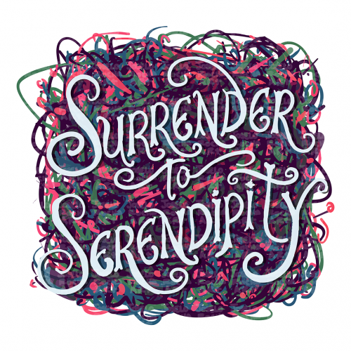
A vibrant and playful typography design with swirling colors surrounds the phrase 'Surrender to Serendipity'. The intricate lettering is set against an abstract pattern, giving it a dynamic and lively feel.
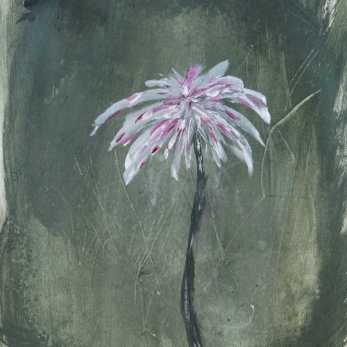
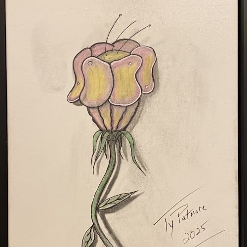
A captivating exploration of form, this work features an imaginative flower with a distinctive, almost sculptural head. The smooth, folded petals suggest a soft resilience, like a fleshy, protective helmet, while delicate antennae reach tentatively toward the light. The long, winding stem and minimal leaves anchor the drawing, creating a strong vertical movement. Rendered in a mix of colored pencil and graphite, the piece uses subtle shading to give the subject a remarkable three-dimensional quality, making it pop against the neutral background.
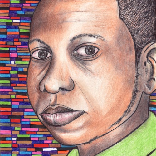
Elias Rosenshaw 8/29/2025
Mixed media on toned tan paper.
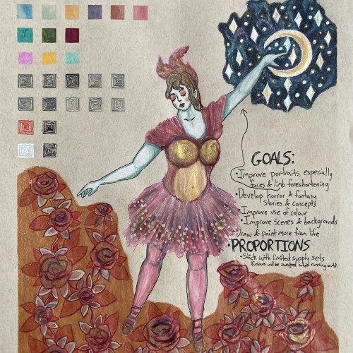
Starting next week, I'm going back to college. I'm very excited for my courses, especially art & writing. It will be a great opportunity to explore my curiosities, improve my art skills, and grow as a person. I will share my art assignments if my instructors allow it. I would also like to write a little about each piece, which may be required for my assignments anyway.
Lately, I've been inspired by fantasy & fairytale artwork. I think fantasy & horror will make good focuses for my pre-BFA portfolio. This was a little experiment with a fairytale aesthetic. One of my goals is to use limited art supply sets & swap out colours as they run out. I feel the first colours I picked out fit with aesthetic well.
I'm proud of this drawing, especially the dress & the night sky. However, I can see some areas that I should've done differently. I'm not happy with the proportions & foreshortening of the limbs. Also, I shouldn't have used a background colour for the flowers. I added the colour to cover up a smear from the watercolour. I should avoid making large areas of solid colour, especially with my coloured pencils. I am learning & improving.
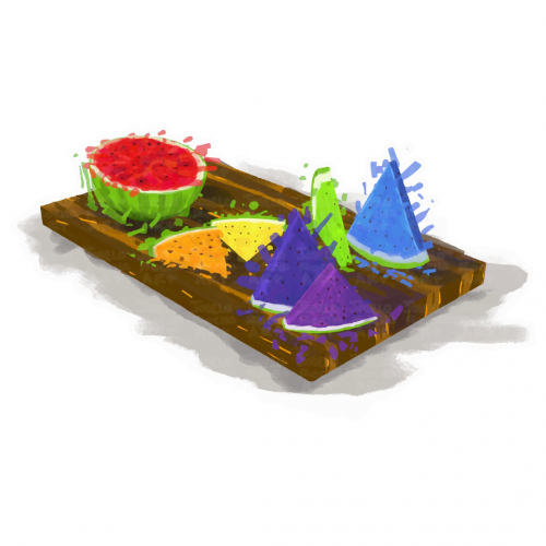
A vibrant assortment of rainbow watermelon slices is arranged on a wooden serving board, featuring colorful triangular and round shapes. The contrasting colors against the neutral background create a lively and appetizing display.
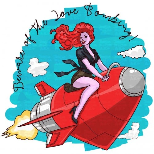
A woman with flowing red hair rides a bright red heart shaped rocket surrounded by fluffy clouds in a clear blue sky. The text reads: Beware of the love bombing!
this was just a fun little doodle I did of a pretty plant I saw. it was absolutely stunning and the bright salmon/rose/red flowers just POPPED! this was a nice leisure time doodle to do in between some other projects of mine. I find my happy place sometimes being taking care of my plants, taking pictures of pretty trees and plants, walking around a plant nursery, and now drawing beautiful plants I see.
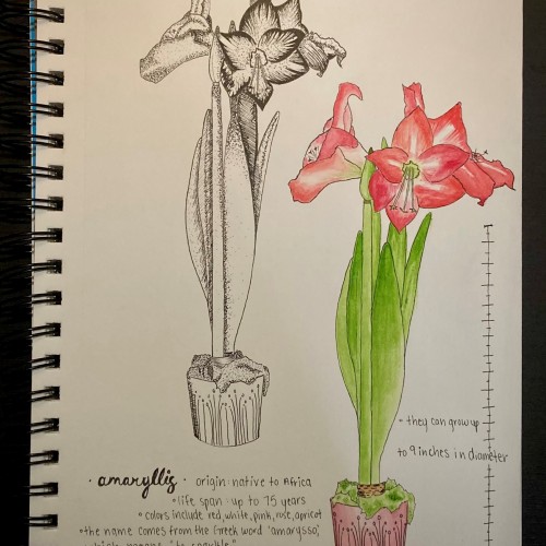
my favorite fact I learned about the amaryllis was that is comes from the Greek word amarysso, which means “to sparkle” or “to shine”, as this plant does indeed sparkle and with its magnificent flowers when it blooms.
I enjoyed mixing mediums and doing one as a graphic doodle with my Micron pens and the other with watercolors - it was a good study for me seeing the detail come to life by lines/dots and then come to life by colors/shadowing colors.
I'm in immense emotional inconsistency and I miss this person so much. -I remember painting this in the month of October... around sunset, at the terrace with cheap acrylics and 1 paint brush on a foamy material that comes with jeans or cloths.. I made this in appreciation of a person i love..
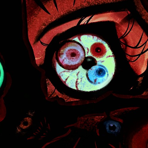
"Like maggots in a dog's carcass, they fill me, my children..."
A cosmic being known as "The Sleeper", "The Ugly", but most often he is proudly called "The Father".
"Like maggots in a dog's carcass, they fill me, my children..."
A cosmic being known as "The Sleeper", "The Ugly", but most often he is proudly called "The Father".
I SWEAR I made him before I knew about Barbatos.
Anyway, The Father sleeps deep beneath Gotham and unwittingly poisons the city and its population with his toxic aura. He is known to his cult as the God of Madness and Chaos. He simply cannot control his influence on those around, which makes him a villain of a tragic fate. I figured his existence would be a good enough explanation for why Gotham is such a rotten piece of society, with very creative supervillains who loves to be so extra and why they not executed horribly for everything they've done. The cult of his worshippers is quite old and includes a huge number of people trying to keep him asleep, because if he wakes up and gets out of his prison, it will be the end of the city, and maybe not only the city...
I should point out: he's not actually a god, he's an alien, and he's not the embodiment of "chaos and madness" - he's a cosmic horror, most likely mentally ill and therefore his aura is toxic. He didn't create the villains or Batman, but his aura affected the environment in which they were created.