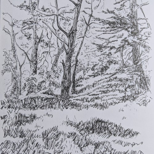
The silver lining of this shelter in place is my daily afternoon walk to put my son down for a nap in his stroller. In our previously scheduled life, he would fall asleep on the drive home from school. These are non native eucalyptus and my beloved favorite tree, a Monterey pine, on a shady side trail of Golden Gate Park.
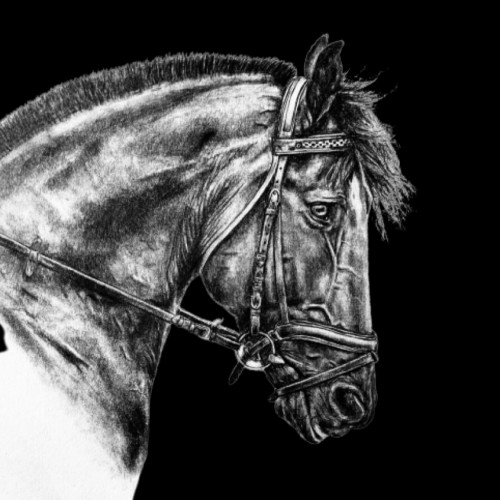
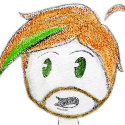
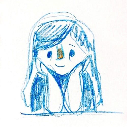
All Done! I’m pretty happy with how it turned out, but a few of the proportions are way off... but oh well. And I absolutely suck at manes(hair) soooo ya. Also I was curious, I’m thinking about getting some prints made of my artwork to sell, do any of you think you or someone you know would be interested in prints? Just curious, thanks! Hope you all are healthy and well! Photo by: Photography by Kelly and Kelly
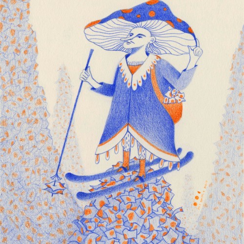
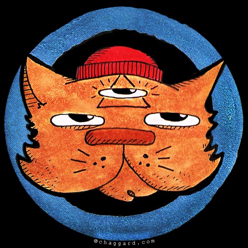
This is my #dirtymushroomlikeskier of #transmundanetuesdays (prompt by @carsonellis) I made some time ago.
What a fun challenge! This mister is cleaning mountains of dirty papers.
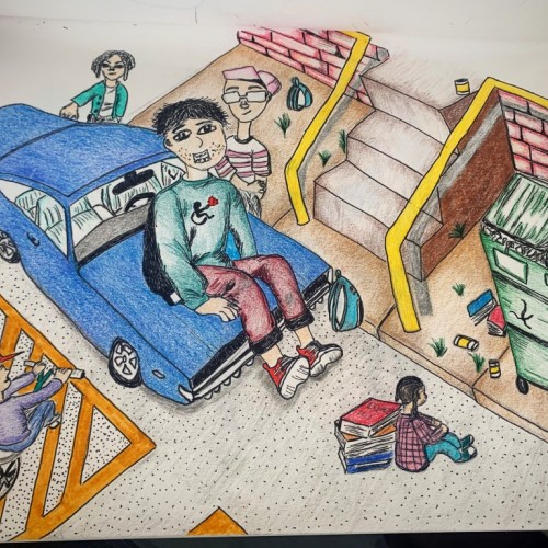
He has no idea how he got there though.
And most of the time, imperfection is the way to see the balance of life. It's where you see and understand the most beautiful lesson that we will carry upto the end of our existence.
Drawings I made for a commission of the five stages of the Walking Wall installation by Andy Goldsworthy at the Nelson-Atkins Museum of Art in Kansas City. What an inspiring journey to walk and watch it move.
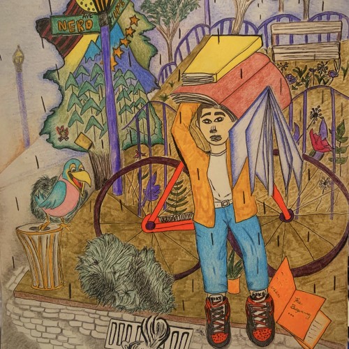
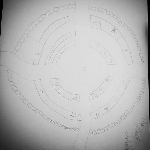
This is a town I designed for my game, it's placed at the edges of No Man's Land. A place filled with wild magic and time is broken. I'm sorry I haven't gotten to uploading in a while it's busy season at work.
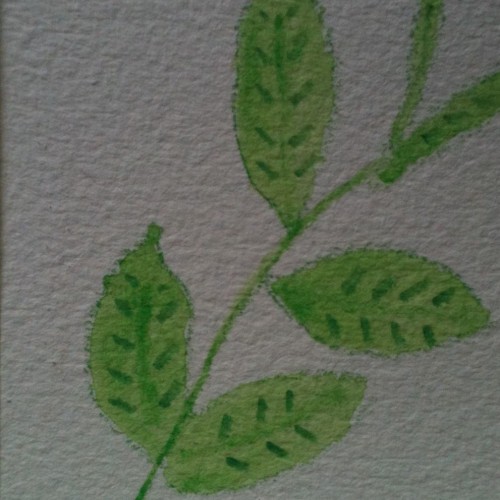
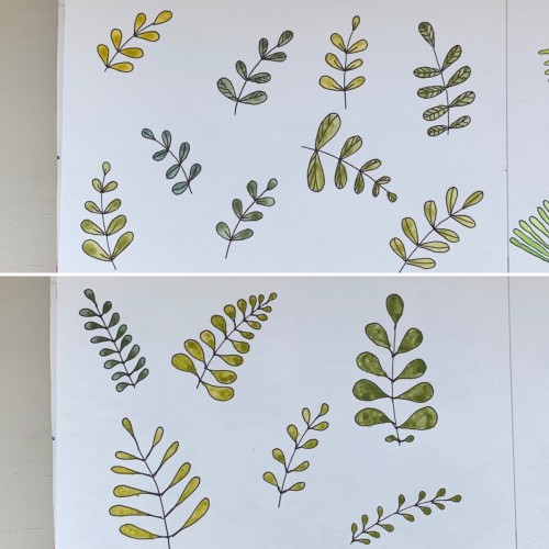
For some reason I tried some floral drawings, of different shapes, and I also used mixtures of different colors to produce hues of green. The first page - it’s a mix of the cobalt blue (PB 28) and cadmium yellow medium (PY 35). On the second one there is ultramarine (PB 29) for the blue color and the same yellow paint. To me, it seems the difference is very little but I’ve got the color closest to the ‘normal’ green using Cobalt rather than ultramarines. The latter gave either to yellowish to olive hues or too blueysh
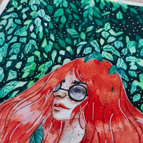
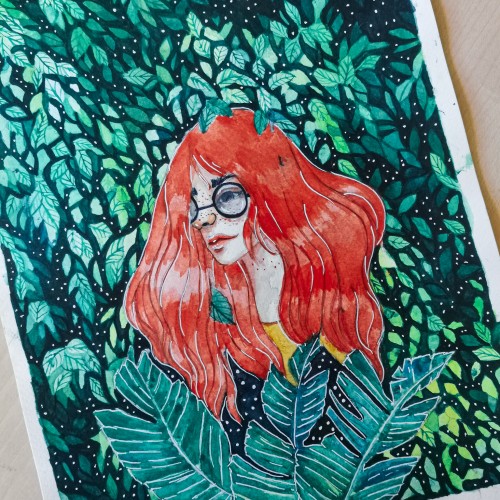
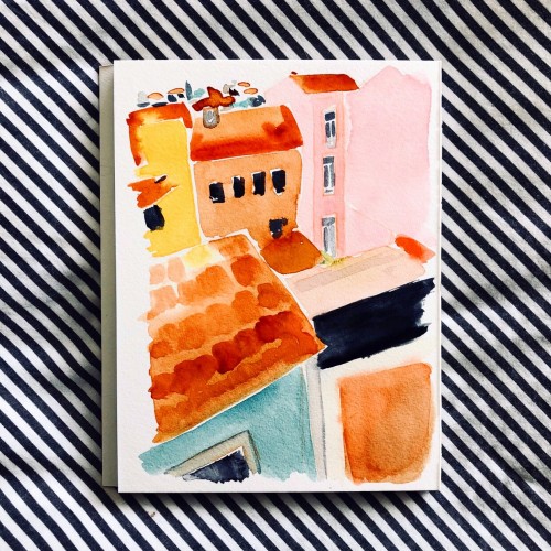
Another wobbly neighborhood. Focusing on color and composition and leaving behind perfect perfective and detail. Ultimately, putting fun first in my personal work moving forward.
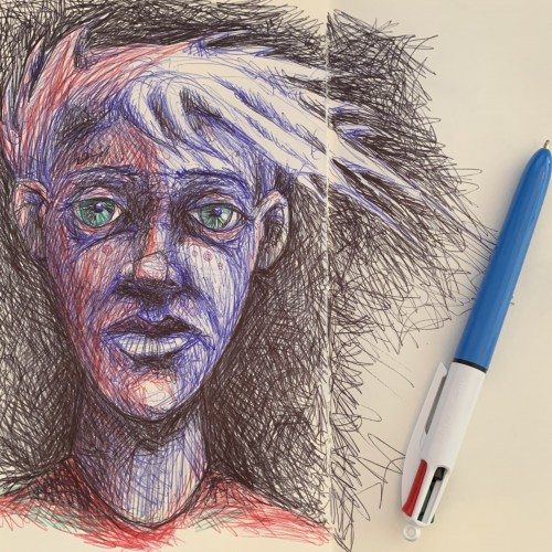
"Sometimes everything seems so far away. Sometimes even breathing is hard."
thes
-
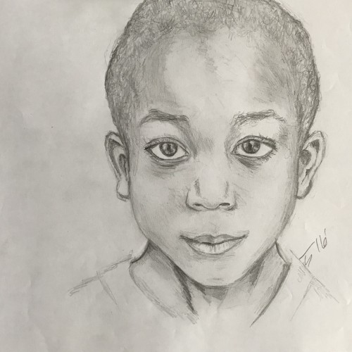
0.3mm led, white led, eraser
-
Videos:
https://www.youtube.com/apricotjams
https://www.instagram.com/_apricotjams
-
Podcast:
https://www.apricotjamspodcast.com
Available Everywhere
-
Business Inquiries & Paypal Donation:
apricotjamspodcast@gmail.com
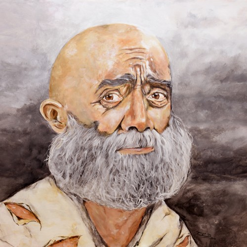
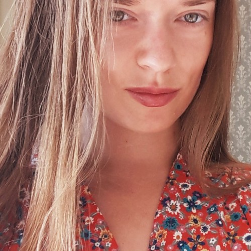
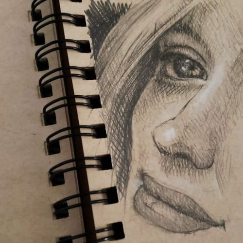
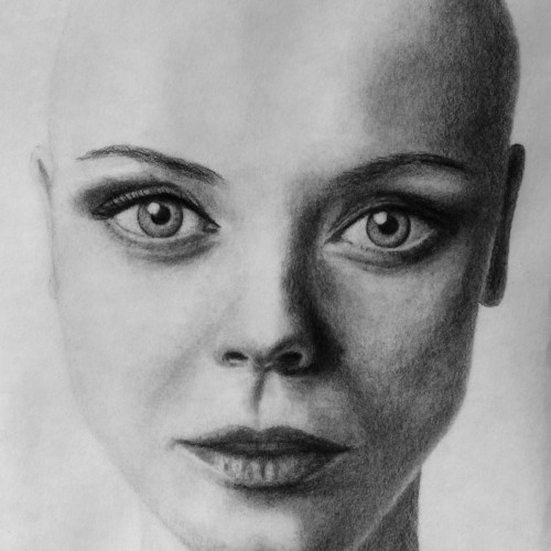
Lead pencils F,B-B7, kneatable- ,normal-, pencil eraser, paper stomps, tissue on A3 bamboo fibre rag paper. Choose to draw her bald, for no particular reason. Zoom in for full detail. Photographed in the sunlight with the canon 28 mm f/1.8 prime lens. Photoshop for greysteps contrast-boost and cropping. Like if you dare. Or else post some critique. Just some try to imagine Christina bald. Realistic? Still doodling? Her eyes are like dominating the whole draw... kind of unreal, isn´t it?