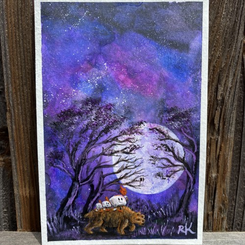
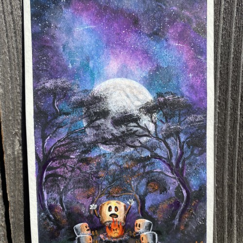
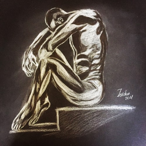
A little 4x6 painting study to start the day off. “The Grizzly Guide” gives these ‘Mallows a ride through the creepy forest in the dead of night. Check out the time lapse video on my Instagram page.
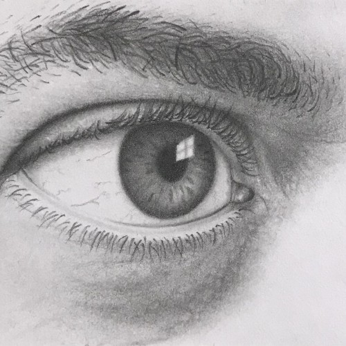
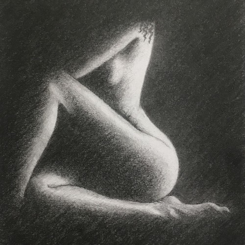
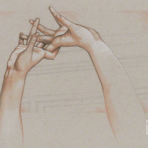
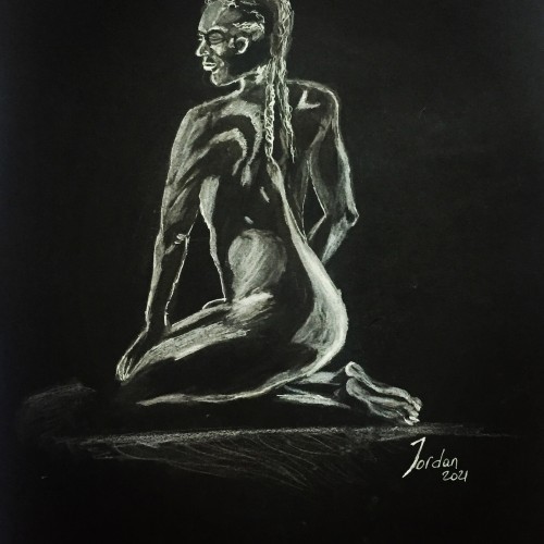
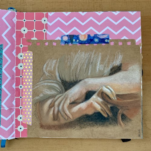
Pastel pencil study of the intertwined hands of the Ambrogio Borghi sculpture, Chioma di Berenice. Faber Castell pastel pencils, Black and White Generals charcoal pencils on 9” x 12” Strathmore Toned Grey sketchbook paper.
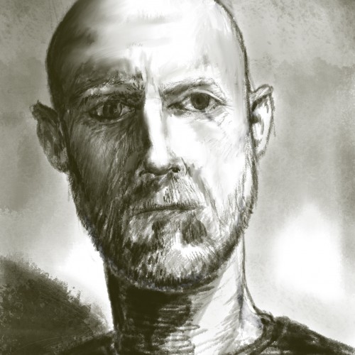
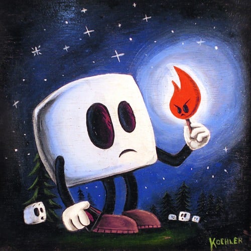
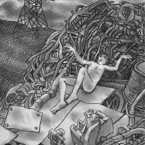
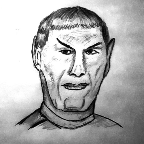
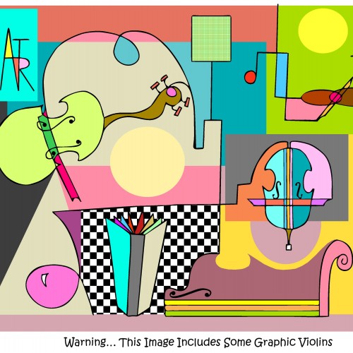
Whenever i hear the word 'graphic' on the news, my mind goes to art rather than the abrupt visual they feel needs a warning [Which i guess is a courtesy for some folks who just might not be able to handle such a site & prefer to look away.] Well, luckily, I'm not Pollyanna about this... As a creative, it is nearly impossible to hear that word 'graphic' & not flex my creative muscle & treat it w an alternative visual thot... 24/6! [I take Sundays off.] I was never fortunate enuf to attend college or to study graphic arts. But I actually think that this is a skill & craft of immense talent. To create aesthetic colors & shapes & beauty & what seems like using the most simplistic of techniques yet w the greatest of impact is simply mesmerizing to me. Why that color? Why that shape? & yet... it works!!!! So here is my attempt to simulate such a masterful profession but w a bit of humor.
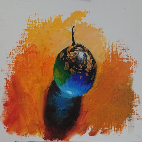
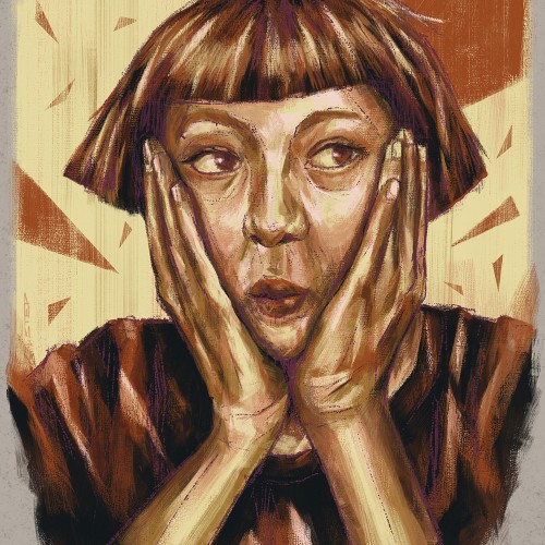
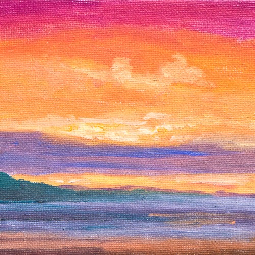
A colour study for a larger piece. Unfortunately with the larger piece, I screwed up with the thick over thin rule and consequently, the paint cracked after a few months. Frustrated at having to start it again, but lesson learnt.