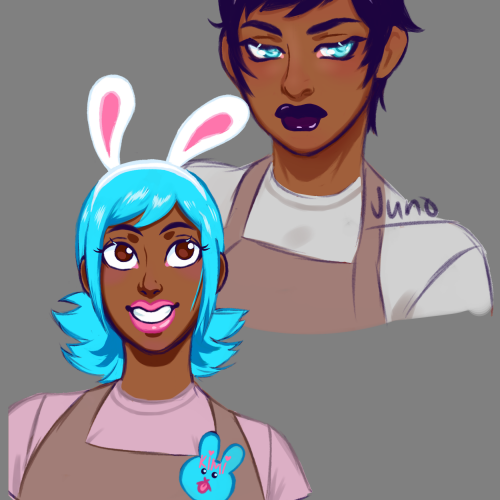
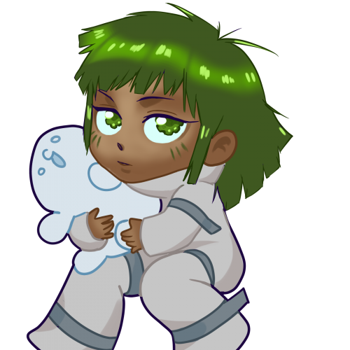
Their designs are based on a game. I pushed the avatars and made them sisters named Juno and Kimi cousins of my oc Daphne. They are still a WIP I'm pondering on the voices, hairstyles, and initial designs.
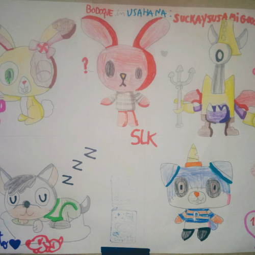
the drawings of this occasion are
1. a drawing of Buttercream Sundae from Littler pet shop
2. Juan Carlos Bodoque in the style of U*SA*HA*NA
3. jamzy as red from Warioware
4. Mario Hugo sleeping on a pillow
5. puppycorn as an mhs student.
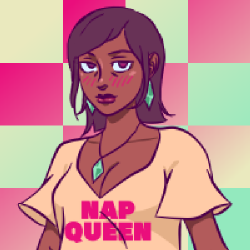
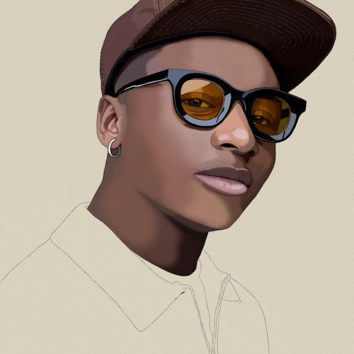
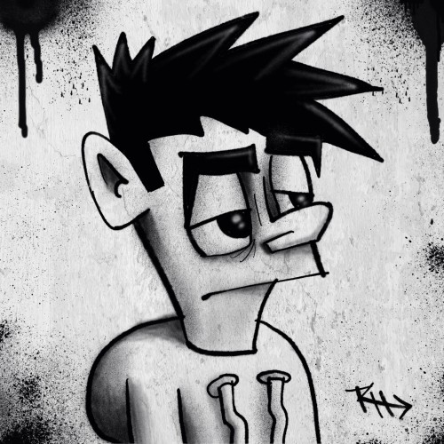
Model Portrait Art by Oz Galeano
Instagram:
https://www.instagram.com/arte_ozgaleano/
Comissions:
https://www.fiverr.com/s/6WzyVL
Donations:
https://www.paypal.com/paypalme/ozgaleano
Youtube:
https://www.youtube.com/@OzGaleano/videos
Patreon:
https://www.patreon.com/Ozgaleano
Shop:
https://www.inprnt.com/gallery/ozgaleano/
TIK TOK:
https://www.tiktok.com/@oz_galeano
Behance:
https://www.behance.net/ozgaleano
KO-FI:
https://ko-fi.com/ozgaleano/commissions
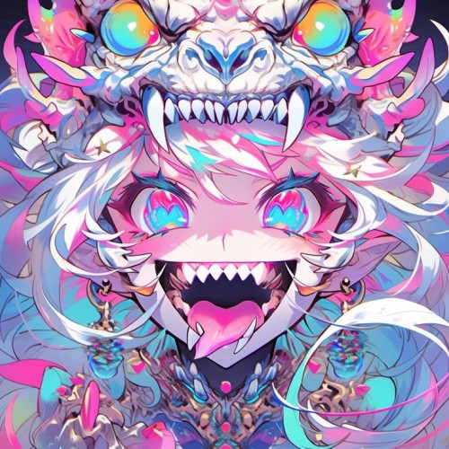
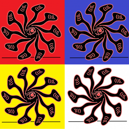
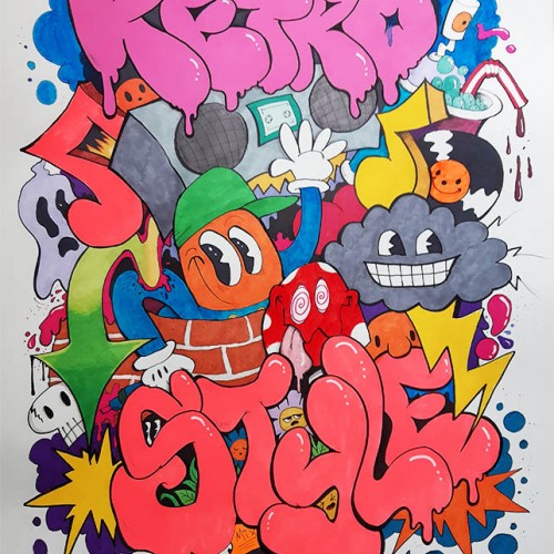
The image shows a stylized, colorful graphic design of a multi-legged creature resembling an octopus or squid, presented in a pop art style with vibrant red, blue, yellow and white color variations.
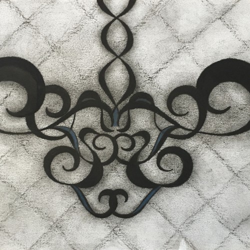
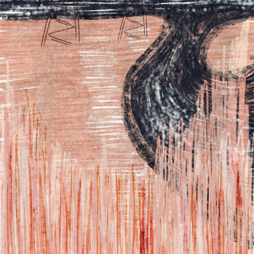
Here’s a charcoal drawing of a design. Of course, I have a plethora of curvatures that range from narrow to wide in some areas. The curvatures are mirror images when comparing the left from the right. They come together to form the shape of a chandelier hanging from the ceiling. Some may even view the drawing as being similar to the pelvic area of a female. A dark blue is highlighted on the drawing to add more charm. Finally, the background is a lattice style with a light smear.
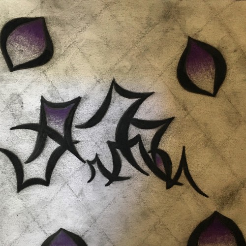
This is a charcoal drawing with a hint of purple to add some charm. The purple is only included in the enclosed curvatures. I gave it a lattice style background with a moderate smear. I prefer to use a lattice style background in my charcoal drawings because it adds character. Concerning meaning, it’s whatever you feel when you look at it.
The idea is to show a figure crossing over two ` scripts’ with a bilingual suggestion. By standing in between worlds, we see opposing viewpoints.
Many artists have incorporated typography as symbols in their paintings since the 60s, but no one has attempted to approach lines in this `written’ manner. How different it is are the two writing styles of the East and the West; one with angular lines while the other in a smooth flow! This work juxtaposes the symbolism of cultures – script. At the same time, it questions the need to grasp the full meaning of the script to appreciate the aesthetic flow of calligraphic lines.
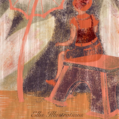
This is another illustration with someone just sitting outside enjoying the day or night. This is not someone existing it’s just some female character. Great to make this more elaborate in terms of styles while adding beautiful effects.
One of my Swirly Designs, illustrated with different tools such as Graphite, Aquarelle, Ink Pens and Ai & Tablet. Sometimes sheer Vectorillustration/design.
.
Urh.-Nr:1811955
.
Copyright by Carolina Matthes
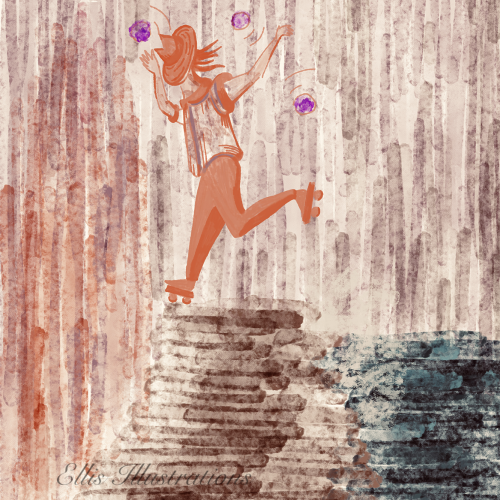
Another beautiful illustration for today! This is someone playing near the shore on a windy day with some waves and rocky style beaches. The weather seems odd to be out and about outside and this woman keeps her balance courageously against the streams of cold, while her hat is covering her face only because of the stormy weather, she still seems to know what she is doing while she seems to be enjoying this! Another little story for today with another scenery!
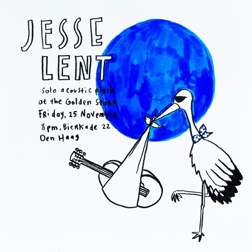
I created a series of mini-flyer to promote Jesse Lent's show. The show venue becomes the inspiration and the series was produced with hand-drawing line-marker style with one punchy bold color.