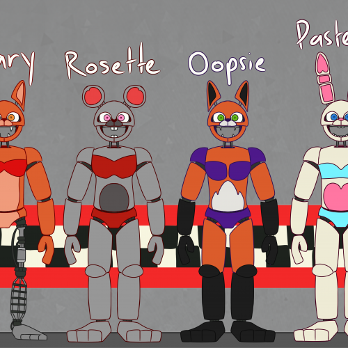
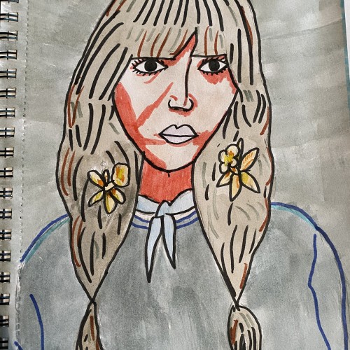
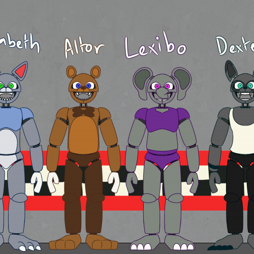
I had so much fun drawing the concept art for the Liz Cat's crew, that I decided to make all the other Altitone animatronics (including a smaller Dellusion) as these more kid-friendly designs! They aren't quite canon, though, because the real Liz Cat's cast only had five animatronics: Elizabeth, Preistor, Altor, Lexibo, and Dexter. Drawn with FireAlpaca.
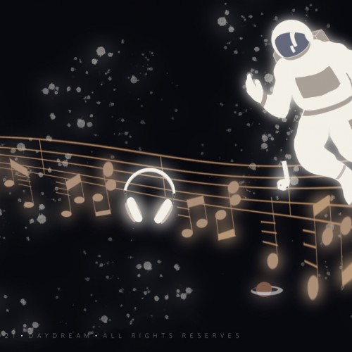
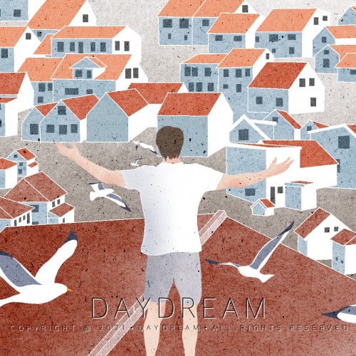
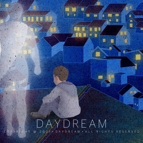
When I grew up, I found that most of the time I was a supporting role in this world. Then at least in my own world, I'm still me, I'm my own superhero.
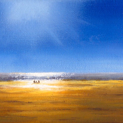
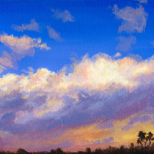
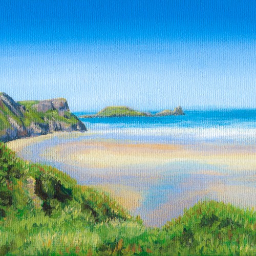
This little acrylic was inspired by the autumn morning skies over Penrhos. My partner and I lived with her parents for a time while we renovated our first house. I used to hang out the 3rd floor window in the mornings to take reference shots of the skies.
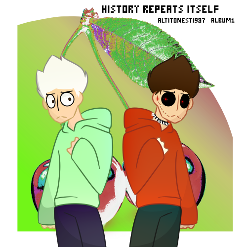
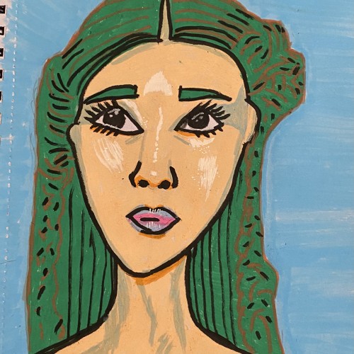
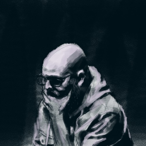
I've began to make a whole load of album covers. They don't quite correspond to an actual playlist, but they're their own thing. Each album has lore behind it, but I'm not giving it away. It's your job to try and figure things out; like a little puzzle. Drawn with FireAlpaca.
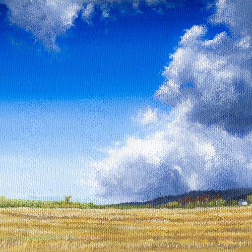
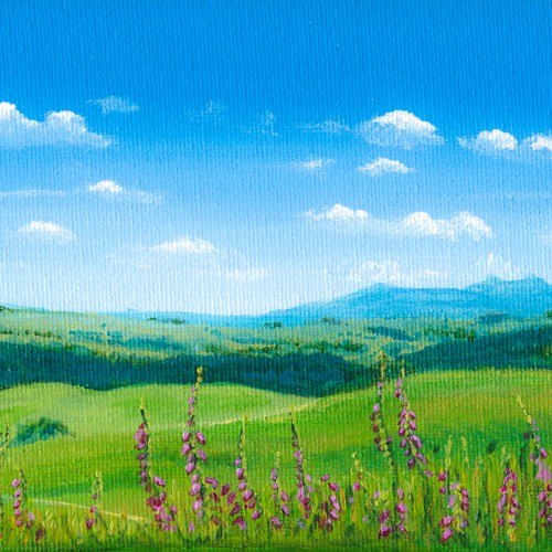
I started painting with acrylics again towards the end of 2018. On 4x6" canvas wraps, they were so small, but so much fun to paint. I was pleased with this one except for the fact the magentas for the foxgloves weren't as vibrant as I hoped. The location that inspired it is Irfon Forest in Mid-Wales. I can't imagine it's a particularly touristy spot, but it's an absolute hidden gem with extensive views over the Brecon Beacons.
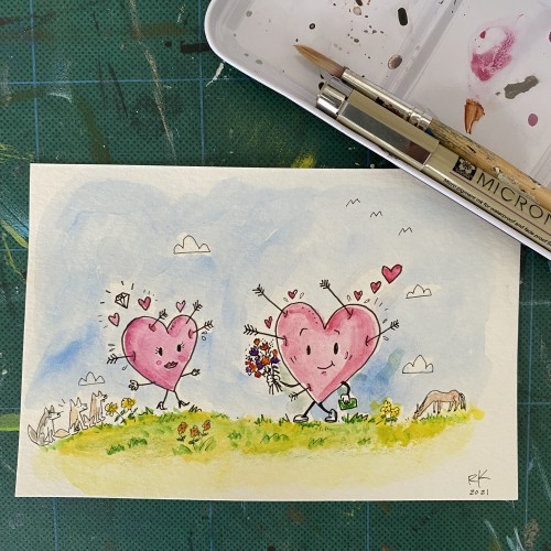
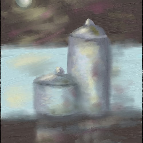
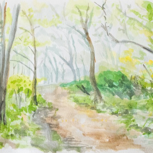
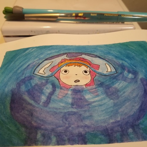
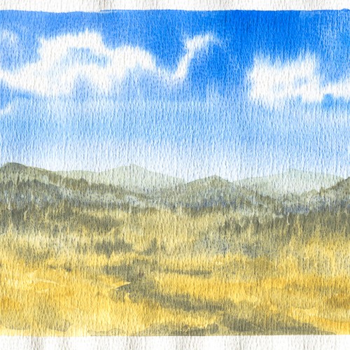
In late 2018, I started trying to be a bit more playful with art and experiment. This was a quick watercolour sketch I did. I'd like to revisit this one as a full watercolour painting.
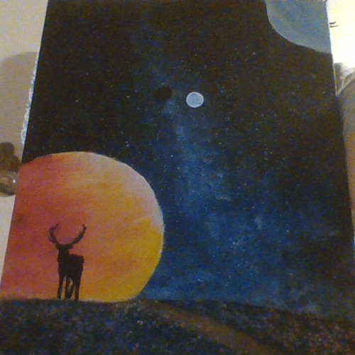
When I was a child, whenever I was alone or lonely, I would fantasize about having super powers and being able to fly out into the universe and do anything. In my own world, I will always be the protagonist in my own story, guarding the lights of thousands of homes, world peace.
My first venture into artist grade colouring pencils - and I'm smitten! I never thought I could achieve such boldness and blendability with them! I'm still getting used to them and will think about choosing smoother paper with less tooth next time. The texture and weight was more for the water-based gouache along with alcohol inks (which are very unforgiving to even primed heavy paper!). Apologies for the unevenness of lighting between the 2 sides of paper; will correct that when I'm making proper image files.
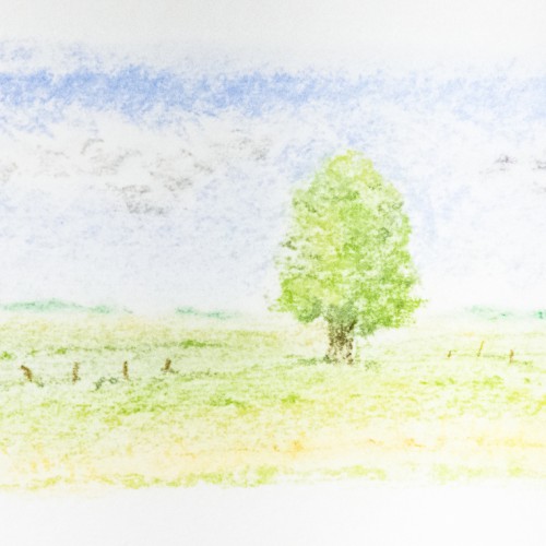
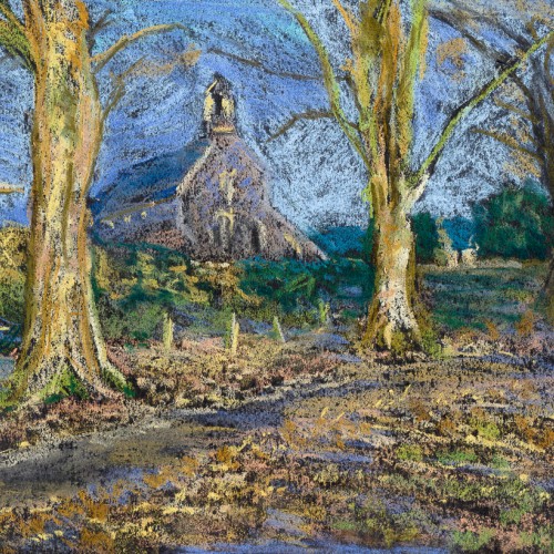
In late 2018, after some time not doing any artwork, I really wanted to get back into it. I fancied doing something different and invested in some soft pastels. This was my first go with them and it was a hell of a learning curve about how they adhere to the paper, and how they blend. I'm not really sure the pastels I was using were soft enough for the look I wanted, but I like how loose this one turned out.
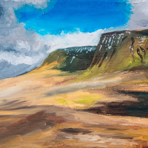
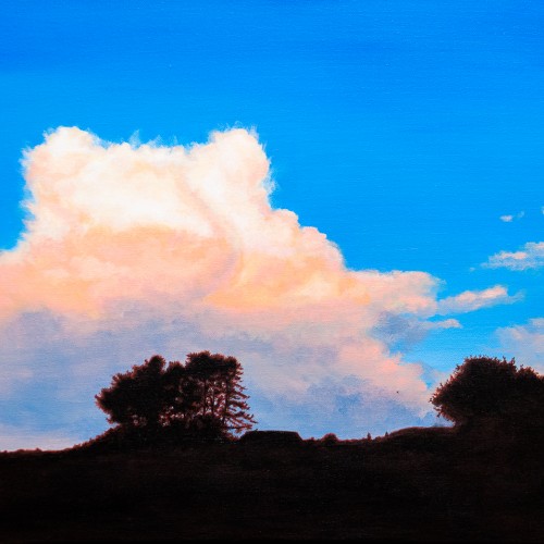
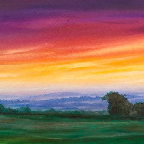
One of my early oils from 2017. I was still getting used to the medium. I liked how the oils worked well for the misty distant hills, and I used glazing for the first time on the clouds.
I got a pack of loose watercolour paper from eBay in 2018. The side this was painted on had a really strange pitted texture on it. I thought it might be interesting but I didn't like the way the paint gathered in the pits. I just use it for sketching and testing colours these days.
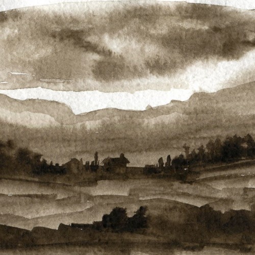
Daler Rowney and Winsor Newton do a watercolour called Sepia. I absolutely love the tone of the Rowney one and had a play with it here. I'd really like to do a proper sepia painting some day.