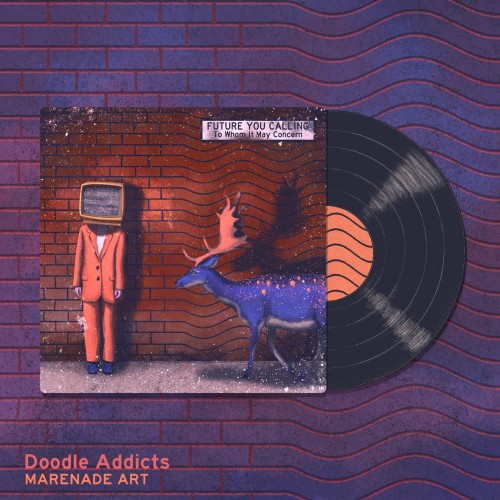
My submission for the Doodle Addicts album cover challenge. Thank you so much for the votes, I appreciate them all! Here's the original description for the submission: Future you calling is a group that mixes electronic pop and rock with some vintage and retro vibes thrown in the mix. To Whom It May Concern is their newest album. It's like that strange record that you once found on the slightly shady flea market that closed down after one month. You wish you had bought it back then, so now is your chance to repair the damage and get this album instead. It's almost the same. We promise. (Future you calling is an invented band. I'm not musically skilled enough to make the band reality but I can always imagine how their albums would look like if existed. This illustration was painted in Photoshop using reference photos found on Pexels.)
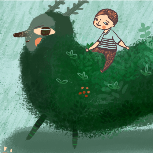
Drawing trees and other landscape elements was my daily routine for the last two months.
For two months, I've been developing my style.
It's essential to create consistently in one style for a long time. It's the way you get to know better:
- yourself,
- what you like,
- what you enjoy.
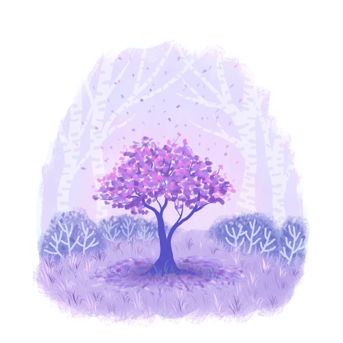
Drawing florals in the landscape scenery was a pleasure I gave myself on Friday afternoon.
Just a relaxing and creative process without any expectations is something every artist needs.
Give yourself a bit of pleasure today
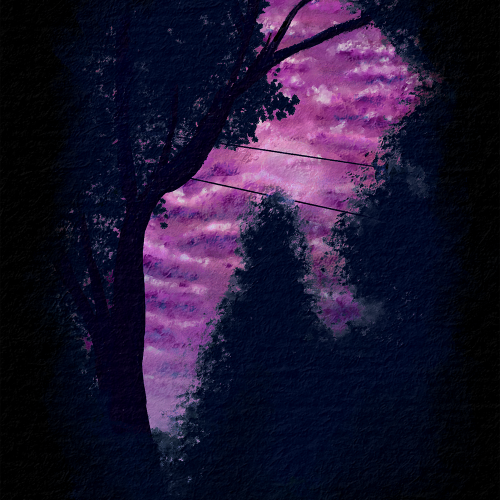
I was working on nighttime or dark themes and trying to get more contrast than the last piece I made. I wanted to also work on atmospheric perspective and depth with the clouds. Overall, I am pretty happy with the outcome. This is from a reference picture my husband took from our backyard. Painted with Rebelle 6 Pro.
It's a quick digital recreation of my last gouache painting.
And I don't like it very much.
- I had trouble finding a good brush for painting leaves on the top of the tree.
- There is no magic like in traditional art.
- I didn't enjoy drawing as much as painting with gouache.
- I couldn't peel off the tape when I was done.
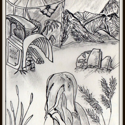
Crosshatching was used to build up the shadows. It's probably my favourite drawing technique. Works best with pen and ink. This is the cover image for one of my children's picture books.
I changed the composition, types of silhouettes, and background texture a few times.
I didn't have any expectations about the finished work. It was a creative flow with many changes. I think the creative process looks like this.
Don't be afraid to try.
If you make your art digitally, it's simple. You can:
- create a new layer,
- use shortcut Ctrl+Z.
In traditional art, it depends on the art supplies you use. Sometimes you can try more times. Sometimes you need to start again.
But any attempt is better than giving up.
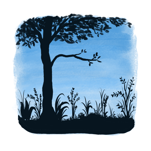
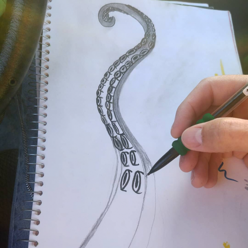
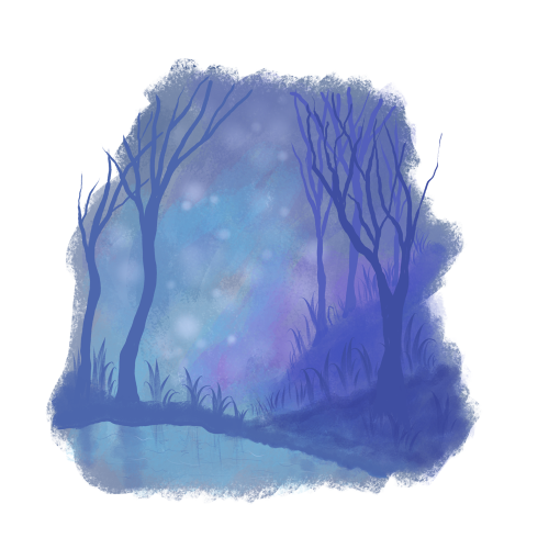
Drawing water with reflections was a new challenge for me.
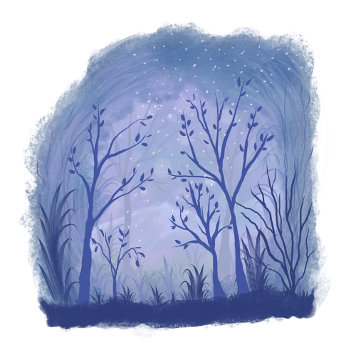
I decided to use a less saturated color palette. It looks like a foggy atmosphere around the forest. Something different
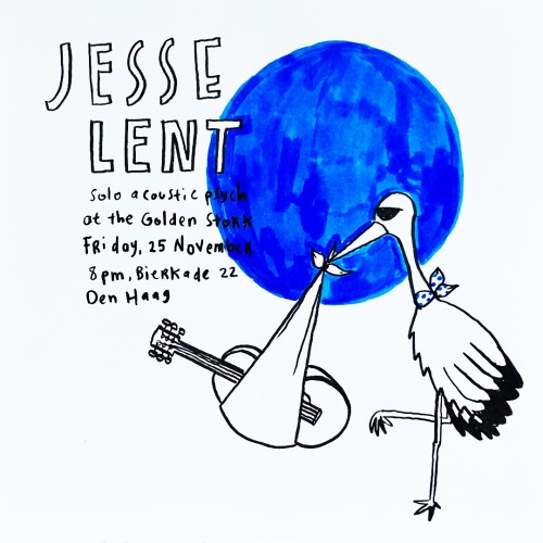
I created a series of mini-flyer to promote Jesse Lent's show. The show venue becomes the inspiration and the series was produced with hand-drawing line-marker style with one punchy bold color.
BEING GREEDY CHOKES ANANSI From Favorite Folktales around the world by Jane Yolen. One time, Anansi lived in a country that had a queen who was also a witch. And she decreed that whoever used the word five would fall down dead, because that was her secret name, and she didn’t want anyone using it. Now, Buh Anansi was a clever fellow, and a hungry one too. Things were especially bad because there was a famine, so Anansi made a little house for himself by the side of the river near where everyone came to get water. And when anybody came to get water, he would call out to them, “I beg you to tell me how many yam hills I have here. I can’t count very well.” So, one by one he thought they would come up and say, “One, two, three, four, five,” and they would fall down dead. Then Anansi would take them and corn them in his barrel and eat them, and that way he would have lots of food in hungry times and in times of plenty.
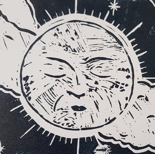
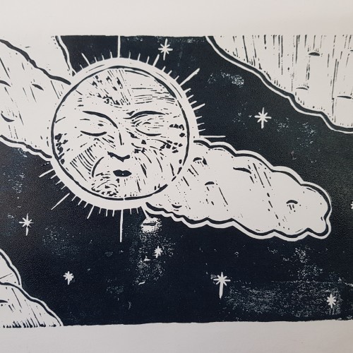
A lino print that I made early art therapy. This was my second lino cut, after my practice cut, and the third I've done in my life. There are mistakes but I'm.still super happy with the outcome.
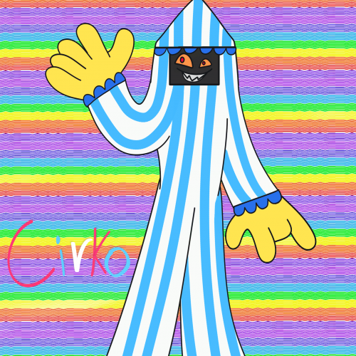
I just saw a circus tent and thought:Hmm I can make a demon oc out of it and behold!I didn't use the classic red and white colors mainly because I'm not a fan of red I did use blue however.I was going to give him circle eyes but then Fiore Pazzo (the flower demon has them) so I used different shaped eyes instead,one bigger than the other to emphasize his insanity.he and him have very similar personalities although cirko is a little smarter than him.both of them love collecting the souls of children the star demon (glistles) enjoys playing with children rather than to torment them.
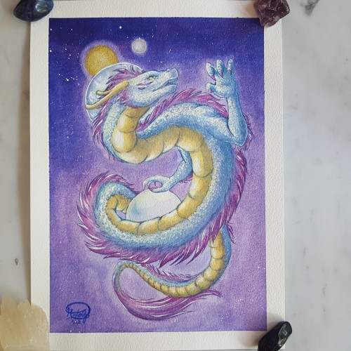
This is the second painting of my dragon series, and it was actually the moment at which I decided to make it a series. It was at the beginning of this year when I was trying to decide on a topic for a series to exhibit. I had gone through quite a few subject matters and even started researching on one of them, when I got really mad at a relative's attitude and just felt the need to paint a dragon. And with a second finished dragon piece in hand, I said: "This is it. I'm gonna make a series on dragons."
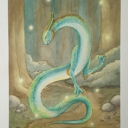
This is the first painting I made for a series on dragons that I hope to exhibit this year at my local art museum. It's a 26x36 cm watercolour painting on cotton paper. I took the concept from a Chinese god who was in charge of the pearl of creation, and turned it into a dragon with that very same pearl.
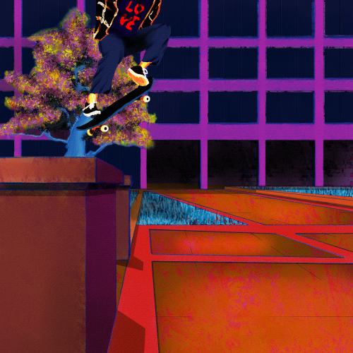
Yet another senseless lynching that has me here with a broken heart. Like my other paintings on this subject, I wanted to focus on life. Tyre was dynamic and energetic, so I wanted to paint him soring. I also wanted to paint him defiant in the face of his oppressors. He was a skater, and they are no strangers to defiance. Thankfully, I found some excellent references to help me with the composition. Aesthetically, I wanted the comp to be modern, colorful, and hopefully impactful. I went for a pop art, illustration, and false-color vibe and minimized blending and refining layer edges. I painted this in Rebelle 6 and Photoshop. Much respect.
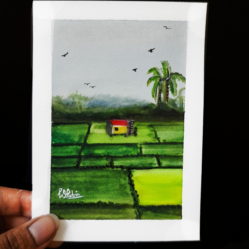
Actually I saw this scene when I was traveling in bus early morning. In the foggy outskirts of city. I spotted this farm. I loved the one small patch of farm with Greeny patch.
Couldn't paint the fog, but tried to give the sky a feel of foggy.