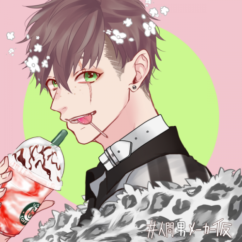
After a year of drawing pretty much nothing due to artblock/burnout that came after a few years of battling my mind to be able to draw, this drawing marked me finally being able to return to art this November 2023 with a fresh mindset of less perfectionisim and more focus on my own enjoyment of the process. I had a limited timespan to work on this, a gift for my grandmother's 80th birthday, as I only began the process the day before I needed to email it across. Compared to the months it has typically taken me to finish anything in more recent years, this presented an extra motivation to abandon "perfect" in favour of "good enough". It's not as detailed as some of my prior works, but given the limited timespan and that I'm out of practice I am nonetheless happy with the result. As usual, I combined a graphite and ink drawing with digital colour+shading.
Hi, this work is NOT done and I would like to finish it soon. If your wondering the light pink is known as "king" and the light grey one is known as "dyson". These two are known for being best friends and go on many adventures together. Eerrmmmm!! Thanks for viewing!!!!!!!! :3
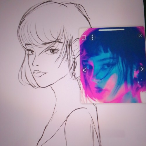
Hi just joined the community and i watch alot of digital paintings and I'm a big fan of this digital painter who goes by the name of samdoesart and want to adapt his style into my work so some help with the colouring would be greatly appreciated. Thank you!
So I worked on this, using an older pic I drew from a few years ago, and am honestly happy with the results. this has got to be one of my most favorite DIGITAL drawings I've done. God be with you and guide you on your own drawings with your own talents.
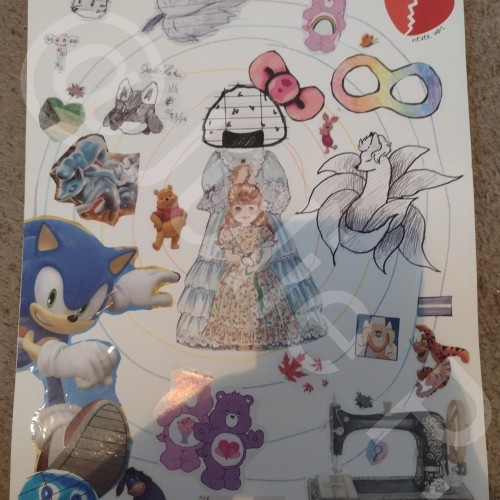
One of the other bits of art I'll sometimes do is collage building. I admit to recycling bits of everyday things from candy wrappers and ramen noodles lids to packaging information for later use. I do use a bit of my own artwork but that's not really the focal point and therefore, it's being excluded from tags.
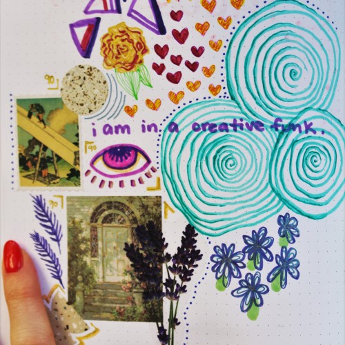
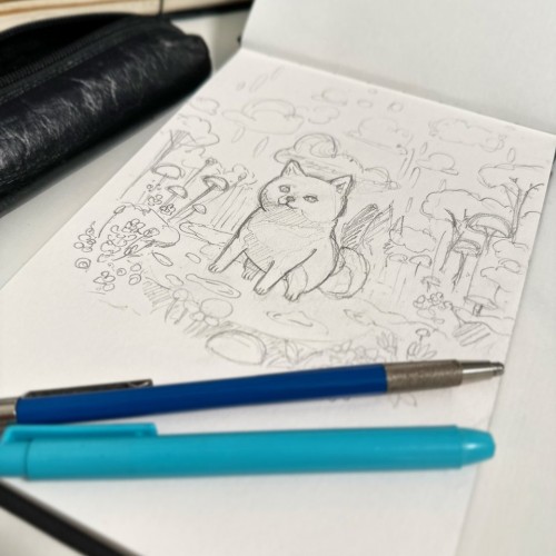
sometimes my head doesn't work right and art doesn't look like art. sometimes i like to simply draw and doodle and not have a plan nor a color scheme. this is an example of that type of in-the-moment artwork sketch in my sketchbook. it includes marker and ink drawings, stickers, and random pieces of scrapbooking materials
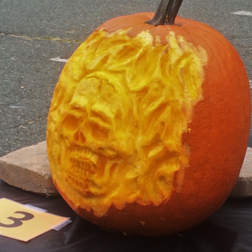
This is a 3D pumpkin I carved at The Phoenixville Pa. Pumpkin Festival,for the experts carver's completion. This was my first time using the clay sculpting tool to carve with. I used the wood carving tool method for about eight years. The use of the clay tool give the carver more control to be able to do more detail . the wood carving method is chiseling away the pumpkin flesh where the clay sculpting tools method you scrape way the flesh.
This the second pumpkin carving contest I have participated in in less then 5 day apart.
Now that I have found a method and tools that work far better than my old ones, less see if my pumpkin carving skills can catch up to my artistic skills.
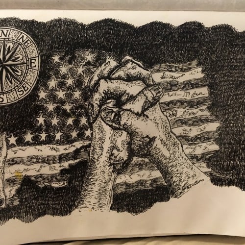
Written by Stephen J. Vattimo
Oct 24,2015
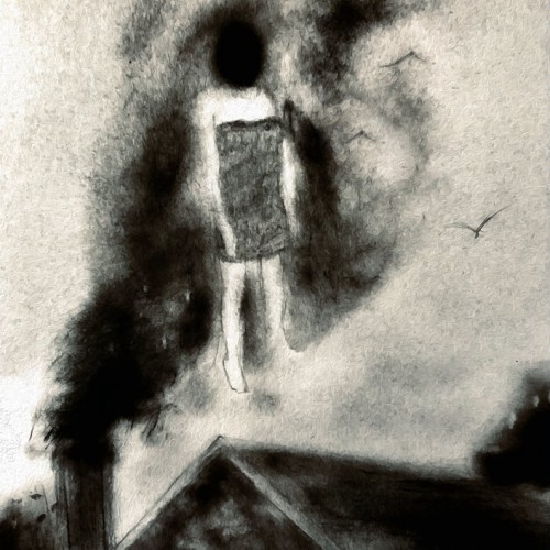
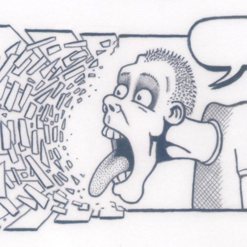
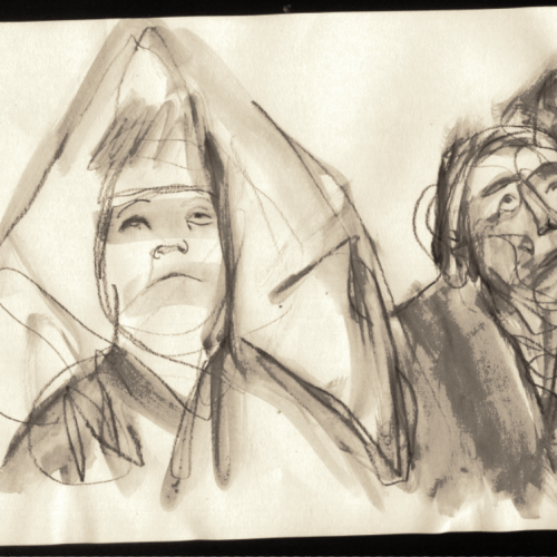
(2B pencil on 132mm x 86mm paper) I did think of writing something in the speech bubble but decided it worked best as a kind of "silent scream" so I left it blank.
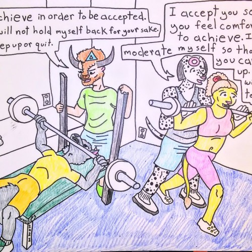
I highly recommend the book, Gender and Competition: How Men and Women Approach Work and Play Differently, by Kathleen J. DeBoer.
In it, among other things, she elucidates that those with a conceptually masculine perspective (regardless of sex) are drawn to thinking of the world in hierarchies, which I have represented here with a triangle in the mind of the spotter on the left. She elaborates that those with a conceptually feminine perspective (again, regardless of sex) are draw to thinking of the world in webs, which I have represented here with a circle.
Those that think more masculine-ly are more likely to expect beginners in a sport or field to prove themselves in the group. They will often not "hold their punches" (i.e. curb their ability) to make newcomers comfortable. All members of the group are expected to "earn their keep," in a sense. When a member of the group exceeds expectations, they move up in the hierarchy.
Contrary to that, those that think more feminine-ly likely show acceptance and approval to beginners in order to foster an environment in which they will perform. They will often adjust their skills so that newcomers can more readily "keep up." When a member of the group exceeds expectations, they are expected to raise the status of the group as a whole. The playing field is "flattened" in that sense.
I am not advocating for either perspective, but I will share that I have a more conceptually feminine perspective, and that I have previously left groups whose members have a more masculine perspective.
Kathleen's book really helped me personally to understand the motivations of people that I genuinely did not understand prior to reading the book. It put a lot into perspective for me, and I hold fewer grudges these days.
Cheers, fam~
With our adorable Shiba, Kaiju, as my inspiration, I've started working on initial sketches.
The next step is to determine the perfect color palette before beginning the actual painting.
Though I typically prefer to work with oil paints, it's been a considerable time since I last indulged in painting.
So, I've decided to use acrylics this time around. I'm thrilled to start this new painting!
Some people do not even begin to comprehend the meaning of the words "irony" or "hypocrisy."
Let's try hard to not be those people, okay? Trust me, you have faults, too. Same as everybody.
Perspective is largely subjective~
(I drew this with a sharpie. No pencilwork. I don't want to color it.)
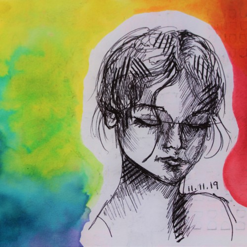
This is a colorful mixed media artwork using a black ballpoint pen complemented with a rainbow gradient painted with watercolor paints. I created this artwork on November 11, which is why it's titled "Angel Numbers."
This is the first work conceptualized and created by Katrina Greidanus in the Anime character design project in the famous Anime Studio and I used PaintTool SAI to be able to create it and then I published it on Doodle Addicts on February 25, 2022 as a souvenir.
Contact Information:
Artist: Katrina Greidanus
Email: trungtriluao.vpbq@hotmail.com
NOTE: This work is exclusively posted on three platforms: Facebook, Artpal and Doodle Addicts. Works posted on other platforms or not under my name are all fake.
DO NOT COPY MY WORK!
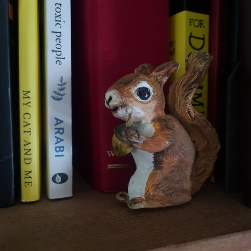
More air clay work. Water colour paint. I have a resident squirrel, who I have named Melanie. She left an acorn in my garden and now I have a little oak tree.
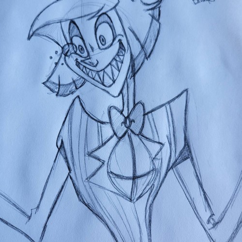
This was a sketch I did the other day. I'm currently working on the digital version. I always sketch all my images before I move to the digital versions. This is my favorite character from Hazbin Hotel.
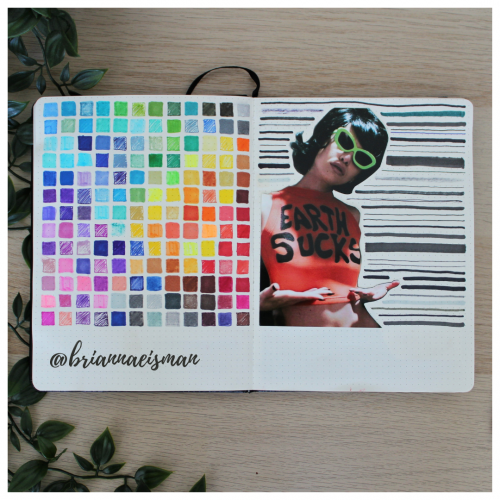
About once a year I set aside a page in my sketchbook, or bullet journal, to do a marker test. I go through every pen I own including Sharpies, highlighters, Bic Permanent Markers, Crayola markers, Stabilo pens, Expo dry erase markers and everything in between. I document the quality and determine whether to keep or toss the utensil. I find it’s easy to collect art materials, especially when you’re like me and switch mediums regularly. It’s important to know that when I reach for a certain pen or marker, it’s going to work the way I want it to. I do keep a page at the back of my sketchbook open for testing mediums, but it’s an important part of the process of creating art to go with the flow and just draw.
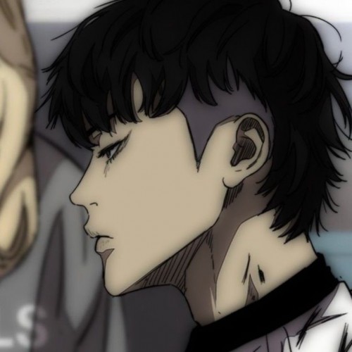
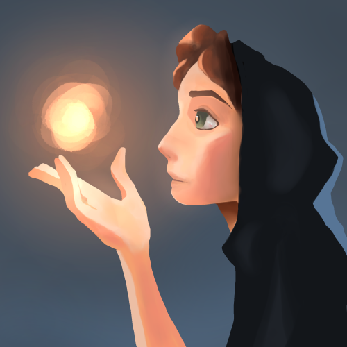
A painting I just finished to work on lighting, inspired by a painting done by SamDoesArts. This one was especially fun because I haven’t worked with layer effects for lighting in a little while and liked the way this turned out.
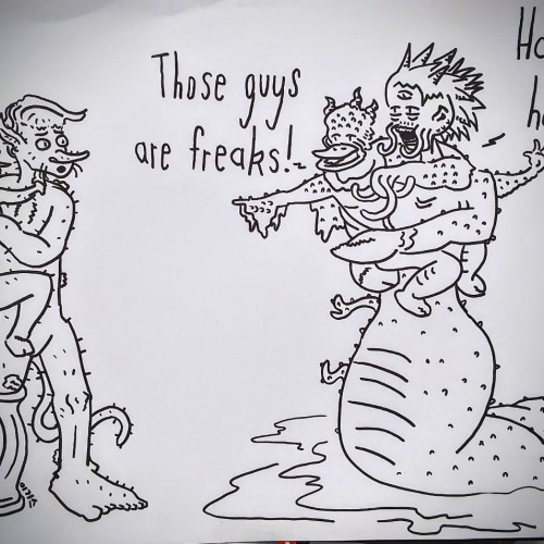
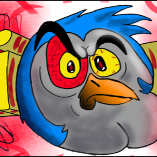
This is a piece of art that I've just done for a friend. Don't try to ask me what it is exactly, because I have crazy friends. he drew a poorly sketched character on a piece of paper, which I doodled over as a layer, so I didn't have much to work with. I was mainly experimenting with Sketchbook's tools, so that's why its kind of all over the place. God gave me the gift of art.....and I'm creating angry bird knock-offs. :]
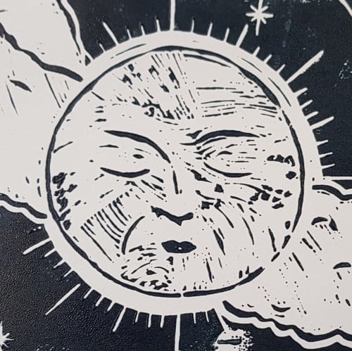
I wanted to try a drawing that uses a monochromatic color palette. I found the process to be very enjoyable. It can feel limiting at times, working with only one color of varying shades. Specifically when choosing the amount of shades you're working with. It's also a nice alternative when I can't think of a color scheme that uses different colors.