@Rayedrgn It’s strange, but in all my experimenting with different ink pen brands (Micron, Faber-Castell, Staedtler, Rotring, Pilot, etc.), I found that the ones I liked the most was from the cheaper brands—Bic and those novelty 10-ink click pens. I use the Bic 4 colour click pen (red, blue, green black) because the colours have a certain ‘warmth.’ I’ve tried the limited availability Bic4 that contains yellow and other pastel colours, but found that the yellow is more ‘acidic’ looking. When I finally found the right pens, I needed to nail down the technique of laying down the colours in a way that made them look dimensional instead of flat. This involved laying down the red layer first, then green and finally the yellow (occasionally blue). I rarely use black, instead relying on the rich, muddy brown that results in overlapping red, green and yellow.
@JoerB Awesome advice! Thank you so much for taking the time to explain it to me. It is crazy how there is so much more that goes into it instead of just finding colors that look good when held side by side you also have to figure out how to apply them correctly so that they look good on paper as well. It is certainly challenging but the results can be mind blowing as seen in your work. On the note of the inks not being that good of quality maybe it would be favorable to laminate some of your favorite works to protect them that way. Not sure what the effect is of long term lamination on various artworks though.
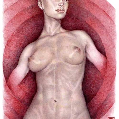
Imani standing akimbo. 2022, Ballpoint pen on 9" x 12" archival paper.
151
2
0
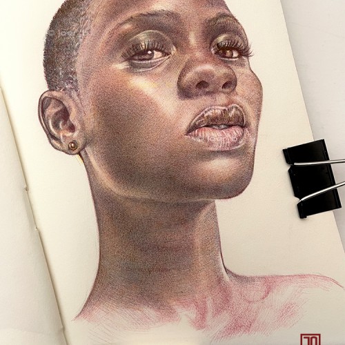
2023, Ballpoint pen on 5” x 8” acid free Moleskine sketchbook paper, Adobe Photoshop. First sketchbook drawing of 2024! Based on a photo of a model in a makeup company advert.
483
8
0
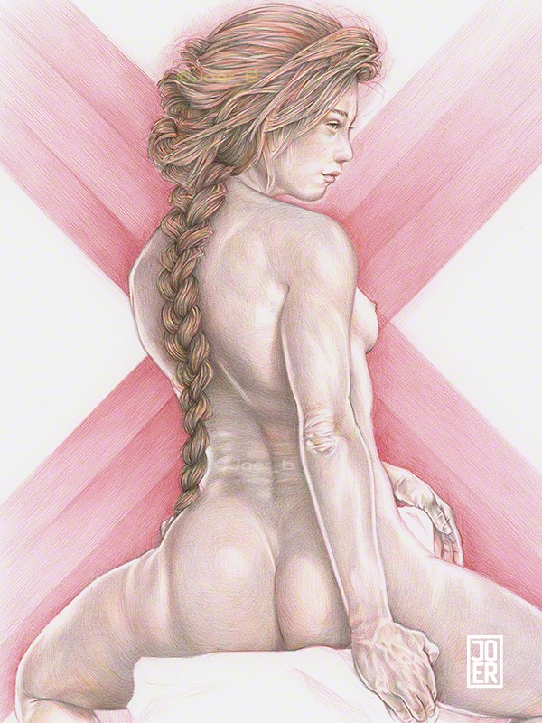
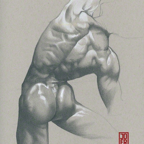
I enjoy drawing the forms of the back. Especially when classically lit.
Pencil, Charcoal Pencil, Pastel Pencils and white Prismacolor pencil on 9” x 12” Strathmore Toned Grey sketchbook paper.
256
8
0
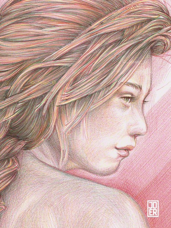
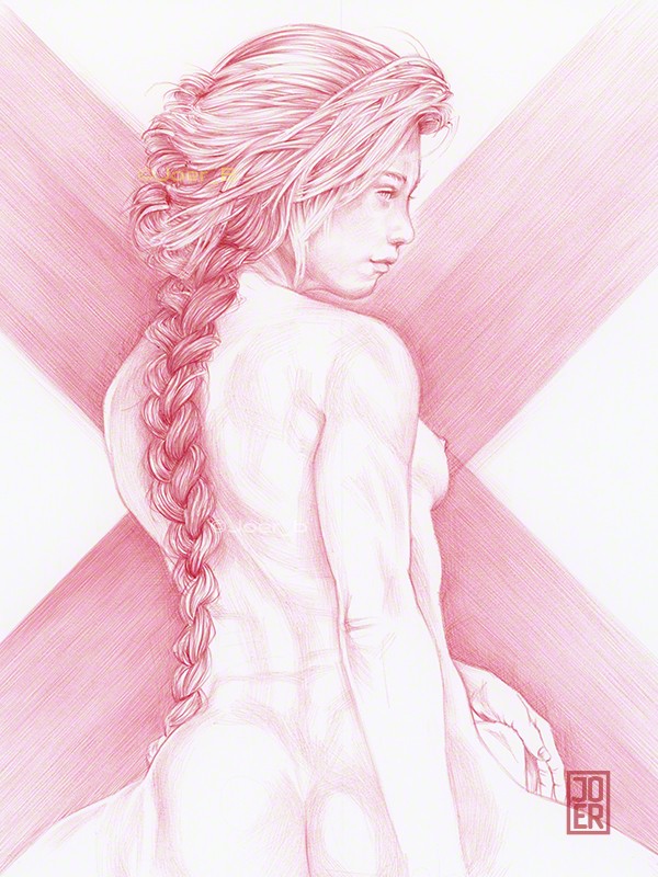
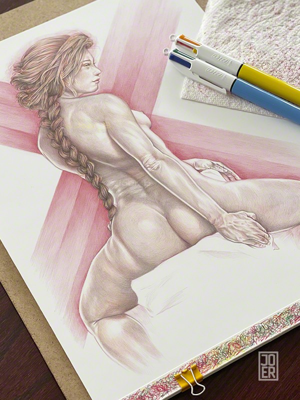
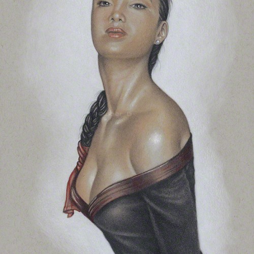
A drawing of Amy with her hair braided and tied with a red silk sash.
370
5
1
Add Doodle Addicts to your home screen to not miss an update!

7 Comments
Caroline Renee (@CarolineRenee)
I love the detailed pen strokes. Nice work!
Joer_B (@JoerB)
@CarolineRenee Thank you! It took several tries to get the technique down, but it was worth all the effort.
Suzette (@Rayedrgn)
Can't believe you do this with pen, that's amazing!
Joer_B (@JoerB)
@Rayedrgn Thanks! The only drawback is that Bic pens aren't technically 'archival' quality inks.
Suzette (@Rayedrgn)
@JoerB I have been trying to experiment with different brands of ink pens and I am having the hardest time trying to get it to look good.
Joer_B (@JoerB)
@Rayedrgn It’s strange, but in all my experimenting with different ink pen brands (Micron, Faber-Castell, Staedtler, Rotring, Pilot, etc.), I found that the ones I liked the most was from the cheaper brands—Bic and those novelty 10-ink click pens. I use the Bic 4 colour click pen (red, blue, green black) because the colours have a certain ‘warmth.’ I’ve tried the limited availability Bic4 that contains yellow and other pastel colours, but found that the yellow is more ‘acidic’ looking. When I finally found the right pens, I needed to nail down the technique of laying down the colours in a way that made them look dimensional instead of flat. This involved laying down the red layer first, then green and finally the yellow (occasionally blue). I rarely use black, instead relying on the rich, muddy brown that results in overlapping red, green and yellow.
Suzette (@Rayedrgn)
@JoerB Awesome advice! Thank you so much for taking the time to explain it to me. It is crazy how there is so much more that goes into it instead of just finding colors that look good when held side by side you also have to figure out how to apply them correctly so that they look good on paper as well. It is certainly challenging but the results can be mind blowing as seen in your work. On the note of the inks not being that good of quality maybe it would be favorable to laminate some of your favorite works to protect them that way. Not sure what the effect is of long term lamination on various artworks though.