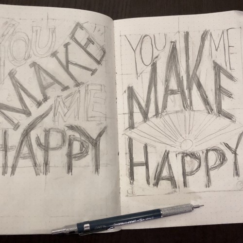
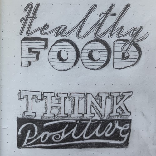
More sketches for my hand lettering classes I’m taking
10
3
0
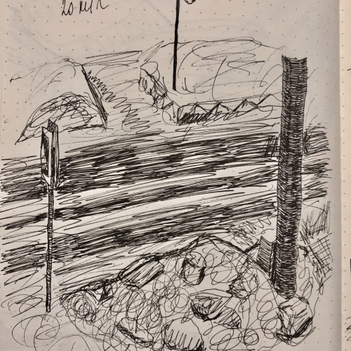
A quick sketch
10
3
0
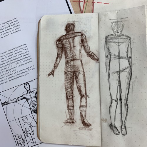
Last time on my drawing class
10
3
0
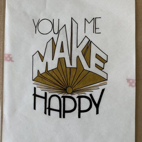
A part of the last class from my lettering course (which I’ve almost failed to pass). The only okayish sketches for the works were not being checked anymore and I didn’t redraw anything. Now it’s time to my own project yah!
8
3
0
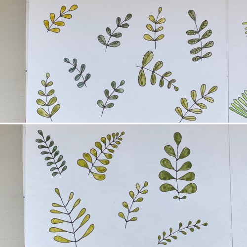
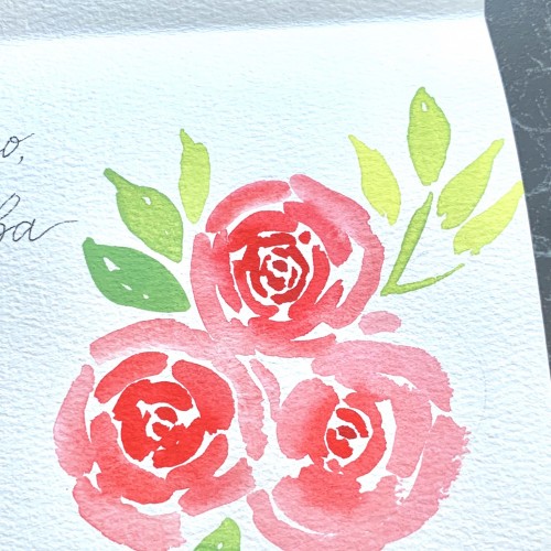
For some reason I tried some floral drawings, of different shapes, and I also used mixtures of different colors to produce hues of green. The first page - it’s a mix of the cobalt blue (PB 28) and cadmium yellow medium (PY 35). On the second one there is ultramarine (PB 29) for the blue color and the same yellow paint. To me, it seems the difference is very little but I’ve got the color closest to the ‘normal’ green using Cobalt rather than ultramarines. The latter gave either to yellowish to olive hues or too blueysh
10
3
2
11
3
0
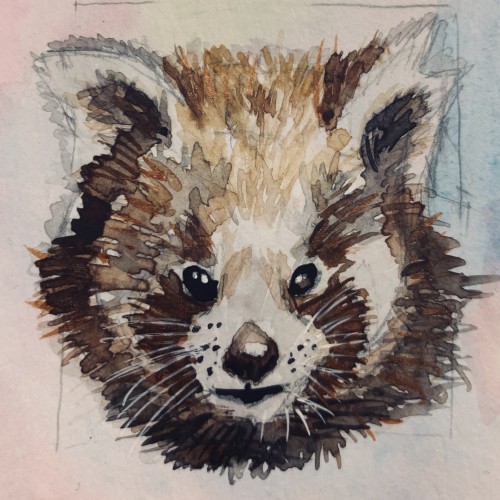
8
3
0
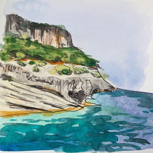
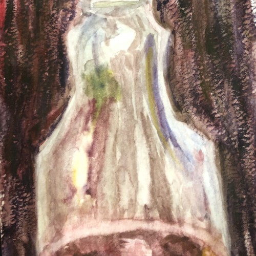
One of my October favorites which I haven’t finished yet
8
3
0
Started studying more or less regularly. That is, every day
5
3
0
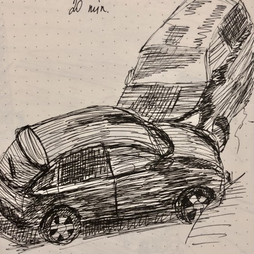
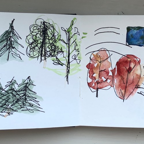
It’s impressive what a couple minutes abstract sketch is capable of. Ink (Pigma Graphic 1) and watercolor on plain paper.
10
3
0
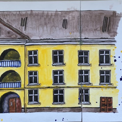
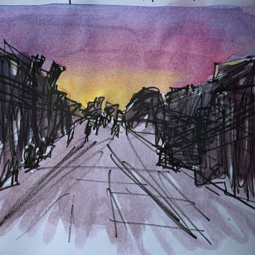
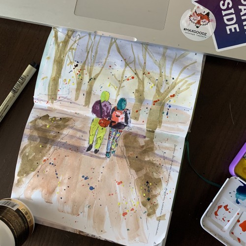
Spring in St. Petersburg. Several years ago. It’s actually an exercise where you need to add something extra to your urban scene, like splashes of stamps
P.s my laptop also got some splashes alright
9
3
0
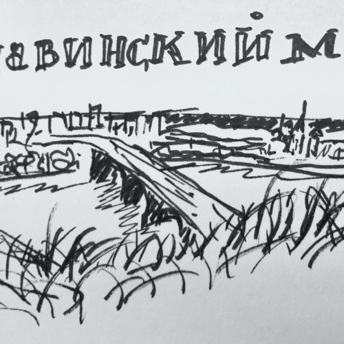
It’s for a mini-challenge on Instagram. Too bad can’t take a better shot
11
2
0
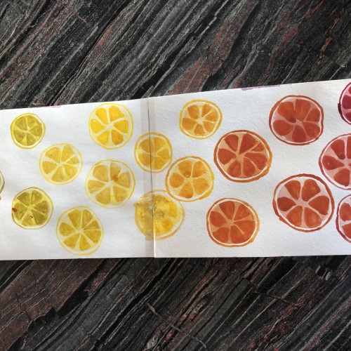
Exploring the opportunities of my only three colors: ultramarine deep (pb29), cadmium yellow medium (py35) and madder lake red light (pr187)
P.s. and my waterbrush too
8
2
0
6
2
0
The complete first task of my lettering course. I thought maybe wait for the critique and refining it it before uploading here. Yet the suggested changes would make a whole different work.
4
2
0
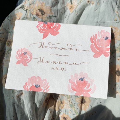
Proud of it. It says “Nadezhda and Maksim” which are the Russian names. The wife’s name is Nadezhda meaning Hope. The husband’s name is the same as Maxim.
3
2
0
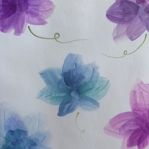
Tried out some layerish-style flowers using the alcohol markers. Not sure weather I like the result or not, but it’s definitely worth mastering the medium for the effects are rather cool. In theory... Unfortunately the camera sharpens the image and the flowers are more soft and blurry in reality. They look rather fancy and mysterious on the opposite side, too.
9
2
0
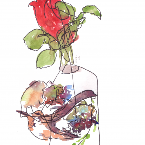
A blind drawing exercise supported by some inking and watercolor. I guess, the best piece so far