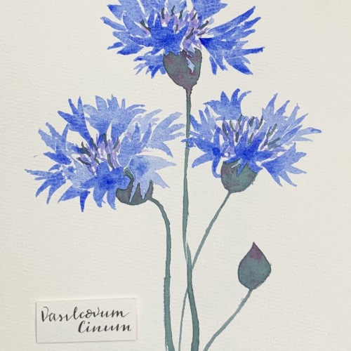
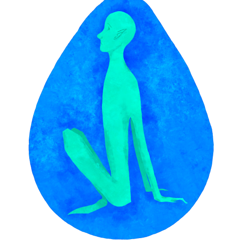
This would be incomplete without the final piece. Don’t mind the caption, it’s not supposed to make any sense.
11
7
0
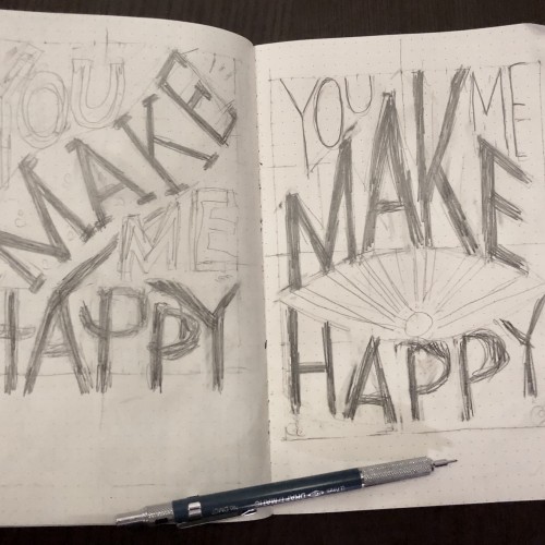
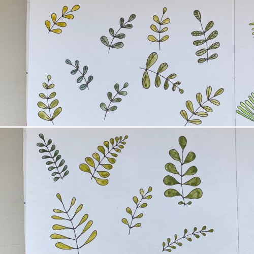
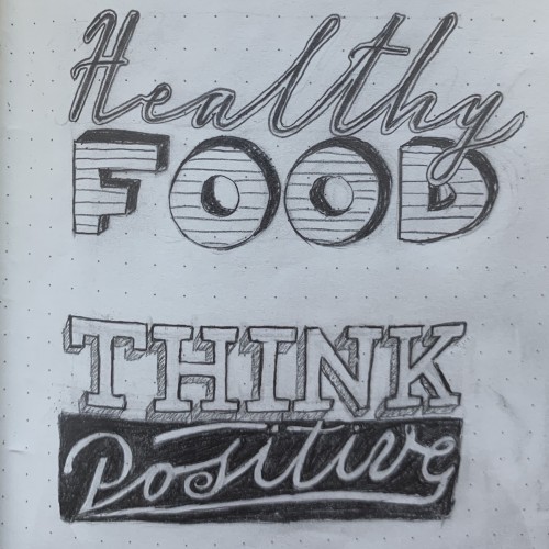
More sketches for my hand lettering classes I’m taking
10
3
0
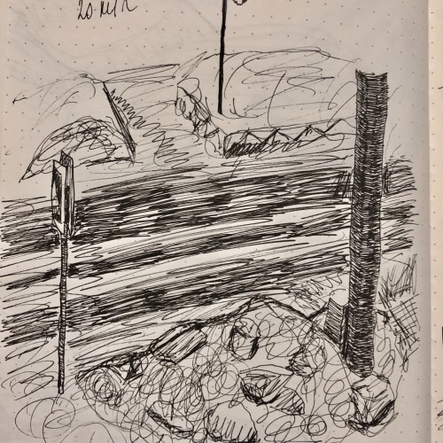
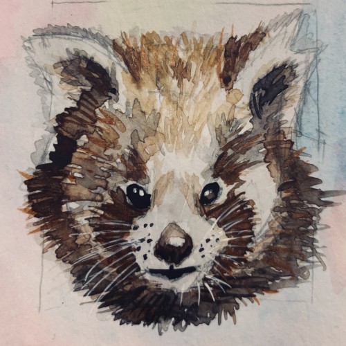
A quick sketch
10
3
0
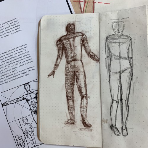
Last time on my drawing class
10
3
0
Alcohol markers
10
1
0
A blind drawing exercise supported by some inking and watercolor. I guess, the best piece so far
10
2
0
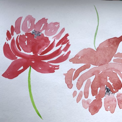
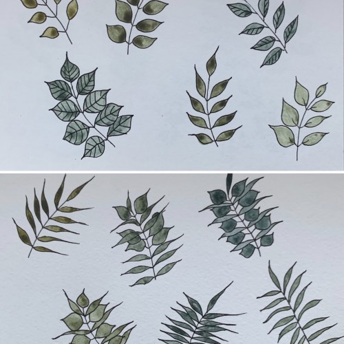
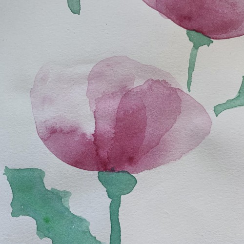
For some reason I tried some floral drawings, of different shapes, and I also used mixtures of different colors to produce hues of green. The first page - it’s a mix of the cobalt blue (PB 28) and cadmium yellow medium (PY 35). On the second one there is ultramarine (PB 29) for the blue color and the same yellow paint. To me, it seems the difference is very little but I’ve got the color closest to the ‘normal’ green using Cobalt rather than ultramarines. The latter gave either to yellowish to olive hues or too blueysh
10
3
2
It’s impressive what a couple minutes abstract sketch is capable of. Ink (Pigma Graphic 1) and watercolor on plain paper.
10
3
0
A study for a gift card
9
5
0
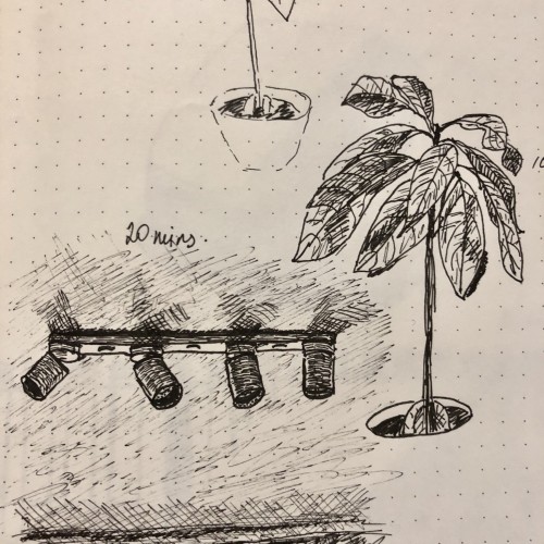
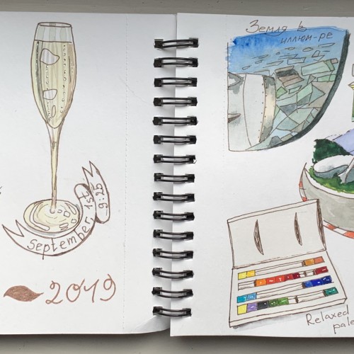
Quick random sketches
9
1
0
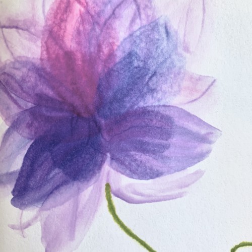
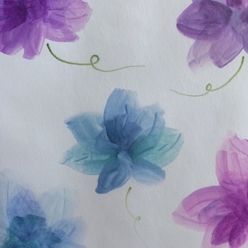
Tried out some layerish-style flowers using the alcohol markers. Not sure weather I like the result or not, but it’s definitely worth mastering the medium for the effects are rather cool. In theory... Unfortunately the camera sharpens the image and the flowers are more soft and blurry in reality. They look rather fancy and mysterious on the opposite side, too.
9
2
0
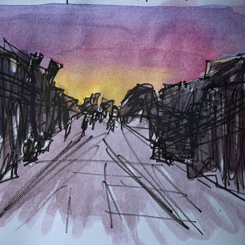
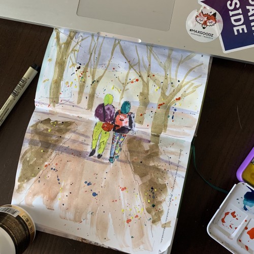
Spring in St. Petersburg. Several years ago. It’s actually an exercise where you need to add something extra to your urban scene, like splashes of stamps
P.s my laptop also got some splashes alright
9
3
0
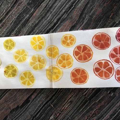
Exploring the opportunities of my only three colors: ultramarine deep (pb29), cadmium yellow medium (py35) and madder lake red light (pr187)
P.s. and my waterbrush too
8
2
0
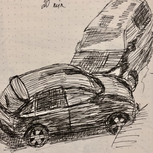
Our car locked by somebody else
8
3
0
A part of the last class from my lettering course (which I’ve almost failed to pass). The only okayish sketches for the works were not being checked anymore and I didn’t redraw anything. Now it’s time to my own project yah!
8
3
0
This time, again, two combinations. I believe the hues are very nice and calming. I used yellow ochre as the yellow color (PY 43, PY 1). On the upper part, the cobalt blue (PB 28) is used, on the lower part - it's ultramarine (PB 29).
8
2
0
8
3
0
8
1
0
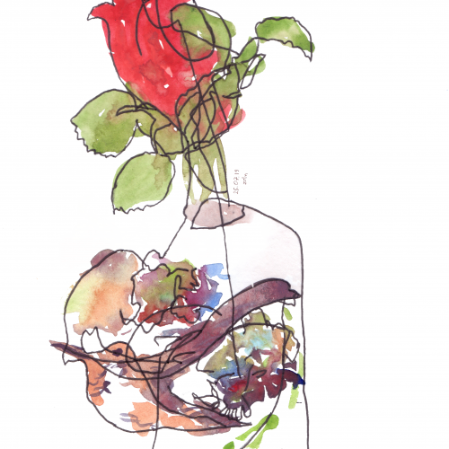
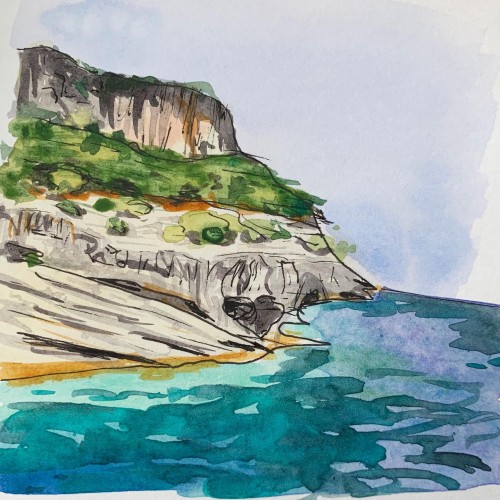
One of my October favorites which I haven’t finished yet
8
3
0
It was an exercise to get to know the Procreate app a bit