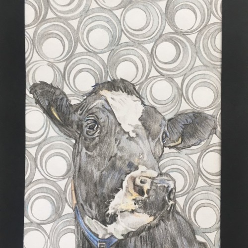
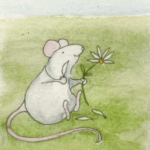
Patternz - Series 3. In this series I'm still sticking with the Patterned backgrounds, but this time they have been carefully chosen to compliment the chosen animal subject, rather than the human portraits of series 1 & 2.
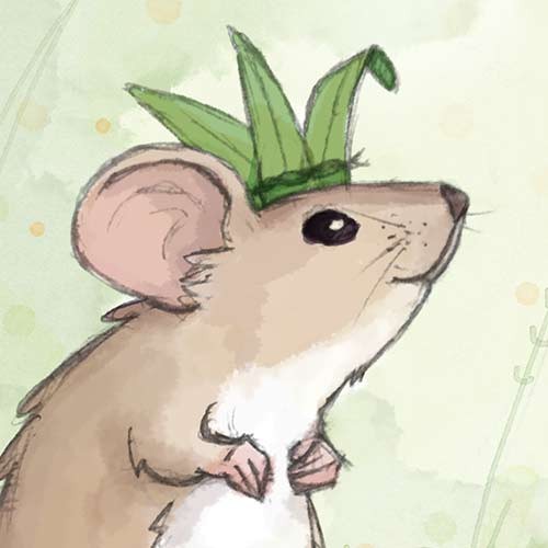
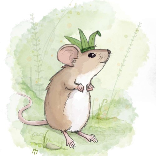
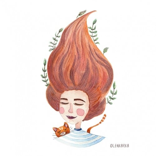
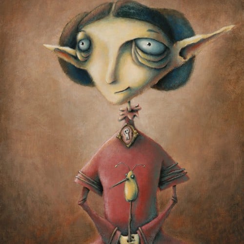
Pencil with digital color. This is character development for a book + coloring book I'm working on. Reed is also my mascot for the time being. Patreon link to the project is in my profile.
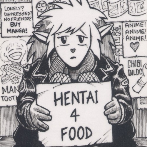
(fineliner pen on a 125mm x 75mm notecard) There was a time when manga and animé were cool, but now it's everywhere and a shadow of its former self, with the stigma of hentai attached to it.
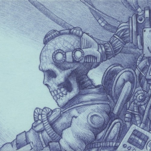
(Blue biro on a 75mm x 125mm post-it note) Verecide (or Vericide) is a word meaning the "killing of reality" by choosing to permanently live in a virtual one.
Here is one of 3 illustrations I made for customizable postcards, available for purchase at @cava.galeria
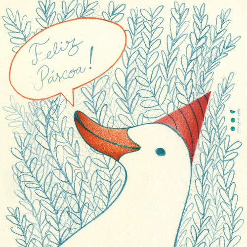
I wanted to make another silly #goose with a fun #hat
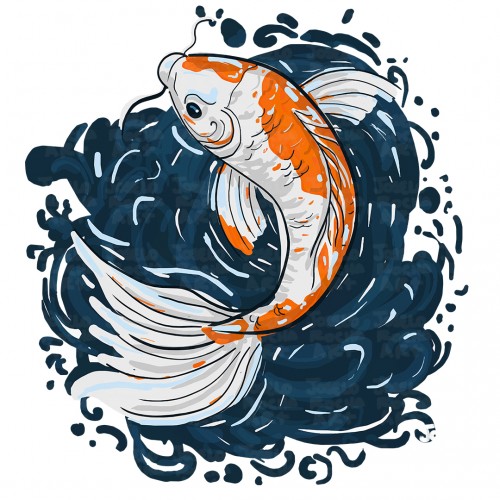
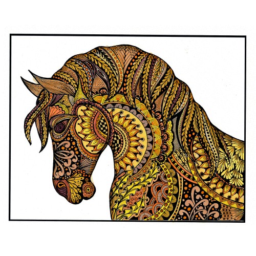
I printed my black and white zentangle drawing on marker paper and colored it with alcohol markers. At first it was a bit to garish with too much contrast, so I painted a warm grey over the whole piece. That gave me what I was looking for. Of course, THEN I completely undermined that with making a bunch of wild colored ones (two shown here) by playing with them in Photoshop. I shall be using this (along with my Zentangle koi posted la while back) for printing blank cards that we sell for charitable (mostly foodbanks) organizations.
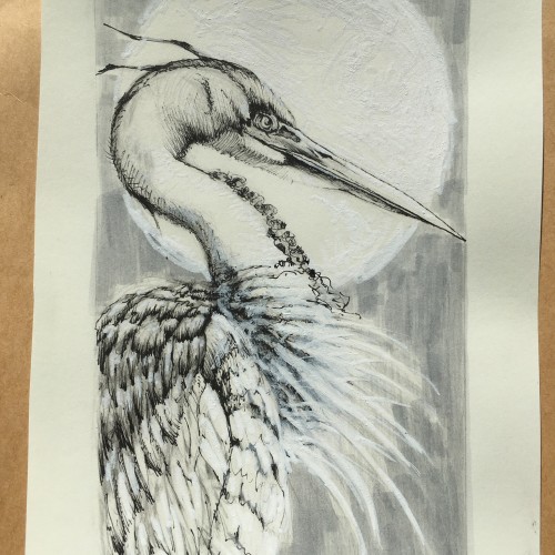
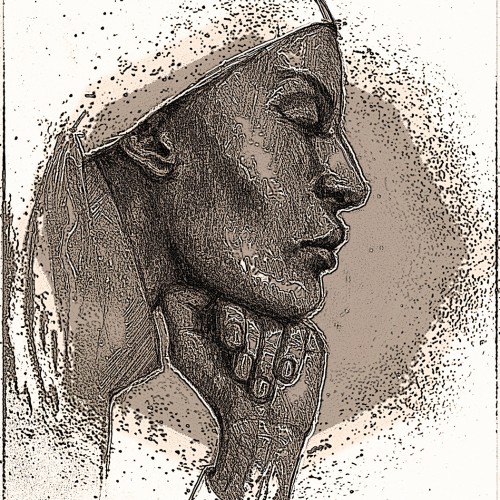
This started as a pencil drawing (see the 2nd image) that I scanned and put into Photoshop. I tried various filters including: Smudge, Ink Outline, some Splatter, changed the Exposure and added a Sepia Photo Filter. After a couple of hours of playing (I’m not very knowledgeable about digital possibilities and just use trial and error) I ended up with a dramatic image with which I am quite happy. The reference was a magazine advertisement.
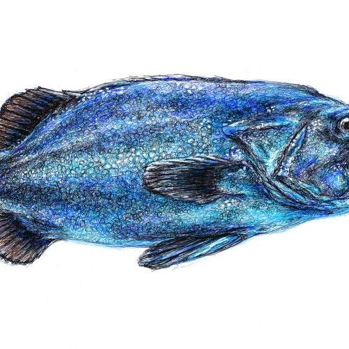
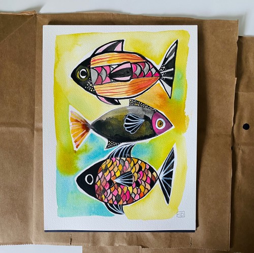
I was looking at what Pixabay might offer as inspiration, and found this fish. Perfect for a ballpoint pen drawing. The incompleted drawing in the second photo was taken before the final "glaze" of little scribbles of turquoise pen across almost the whole surface. It was a happy accident that made for a shimmery, iridescent fishy quality.
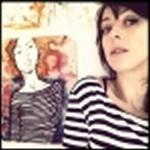
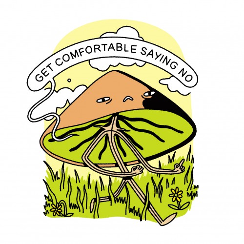
I've spent recent lockdown days watching far too many Youtube videos about attachment styles and honestly it makes a lot of sense. Here is a little message for my anxious preoccupied self
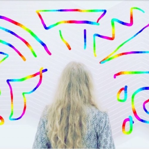
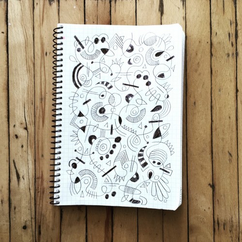
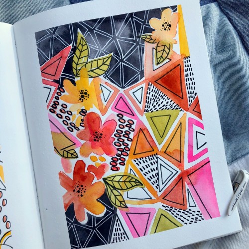
I've been experimenting with colour pallets and line width. Also trying to do LESS - my natural tendency is to add everything so cutting back is quite hard, but I think works better.