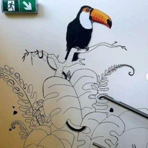
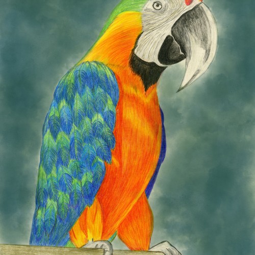
The implementation of the project for the Akademos kindergarten in Poznań has ended. The idea behind the project was to create a jungle staircase in which children will be able to cover something new every day while walking down the corridor. Many animals, reptiles and insects are hidden in the thicket of plants. So that the number of details and small elements does not overwhelm the space, we used a black and white combination with small colorful accents, which are also to stimulate the imagination of children. Realistically painted birds are an additional decorative element, which can be a background for photo sessions.
Many thanks to @czapski.gallery for providing colorful paints, as well as to the kindergarten team who supported the activities.
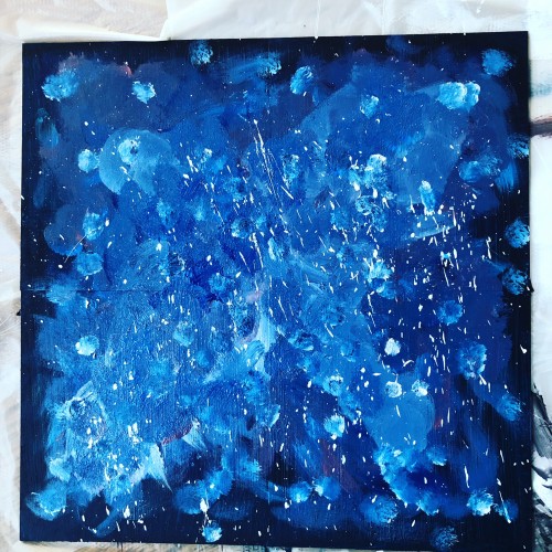
I’ve decided to try doing a galaxy painting again, I really like doing the first one. Honestly, I think the first one was better than the second one,which is weird but I’ve definitely learned a lot doing the second one like how I want to layer down the paint and what the background should look like. This is another 4, 6 x 6 painting like I did before; I’m gonna try doing planets again on each board, i want to get better at this.
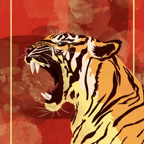
In celebration of Year of the Tiger, I illustrated this Tiger with vector shapes and then shades the shapes with a variety of pixel brushes. Then I doodled some abstract brush strokes as the background with a red and gold color theme.
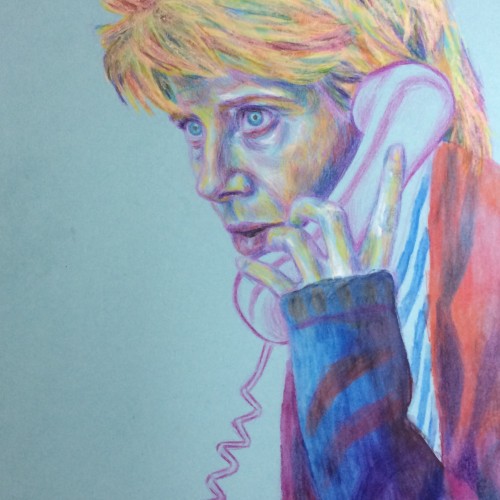
This was Emma Thompson in one of my favourite films, Stranger Than Fiction - she is brilliant! I used just colouring pencils in this one to try out a soft, harmonious look, on the background of blue A4 card. I quite like the relationship between the foreground and background in this piece; had the background been white, I don't think it would have worked as well.
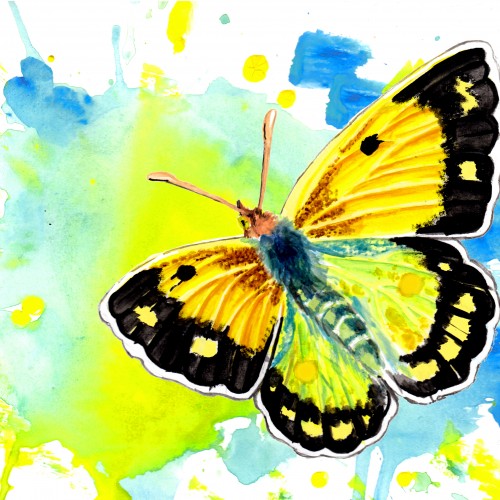
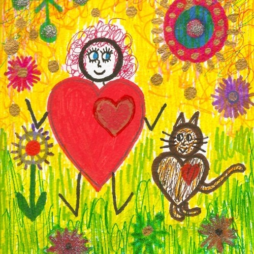
butterfly #4: The Clouded Yellow.
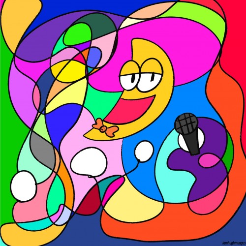
The hardest part here is the background! It would be too easy just to paint a cloud...I have about 5-6 different backgrounds, but only uploading one here is my fav of the bunch
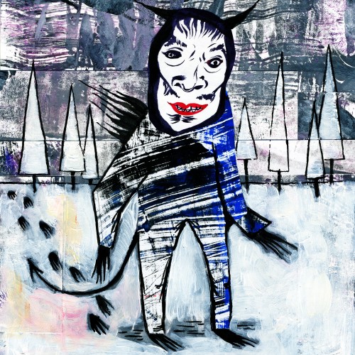
I collaged "Krampus is Coming For You" together with my own monoprints as well as one of my drawings of Japanese Noh masks that I cut out of an old sketchbook. For the second piece, I had a drawing of Marie Antoinette as an ice cream cone, so I gave her a dress, put a background of my monoprints on her, etc. Then I added more cherries, and the circle reminded me of a clock, so I inked in the arms accordingly.
Patternz - Series 3. In this series I'm still sticking with the Patterned backgrounds, but this time they have been carefully chosen to compliment the chosen animal subject, rather than the human portraits of series 1 & 2.
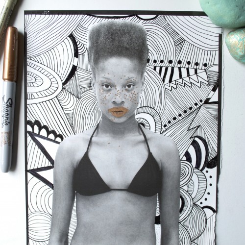
I found a Gap ad in a 90s Vanity Fair magazine; the background was completely white, perfect for doodling a background on it. I also highlighted the woman's freckles and lips with a bronze Sharpie.
This piece began as a multi-colored abstract . . . but it was nowhere . . . nothing . . . and had no essence. So, I tried to take it in the direction of a landscape . . . and that was horrible. I gave the entire piece a whitewash using a white acrylic paint pen. And then the idea popped into my head to Doodle over the colored background. The title reflects the fact that the piece only came to life with the addition of the Doodles . . .
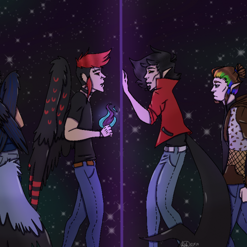
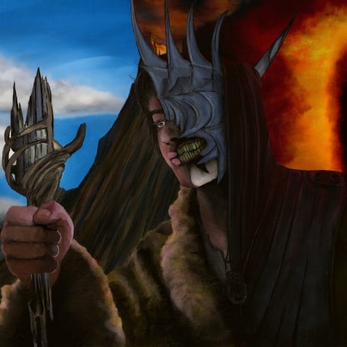
Lord of the Rings: The Rings of Power fanart. Theo imagined as the Mouth of Sauron with Mount Doom and the Eye of Sauron in the background. I went for a painterly feel but a decent amount of detail. Lemme know if you like it.
Zahra Sedighi-Hamedani sits in prison in Iran, sentenced to death for being a lesbian. Digitally painted with pencil brushes and textured overlays to produce a watercolor-type image. Shading tones and background are meant to represent the Kurdish flag.
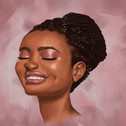
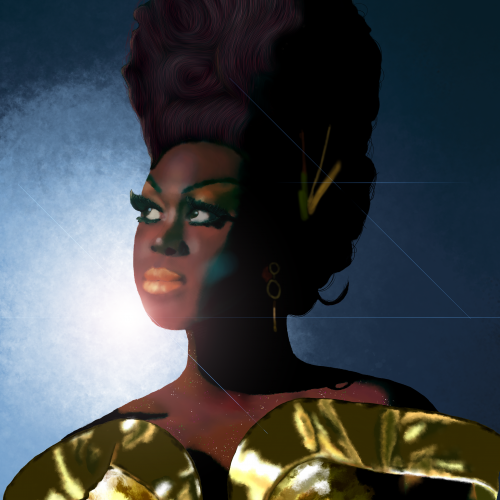
Bob the Drag Queen is a legendary performer and personality. She is one of my favorite people. I kept the composition simple to focus on shading and facial dimensions. I paid close attention to not lightening her skin tone and respecting her heritage but also contrasting the gold dress and blue background.