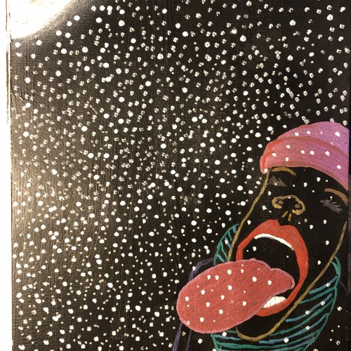
Prompt task. Acrylic paint background, with acrylic markers. I used to love watching snow fall at night and catching snowflakes on my tongue with my kids.
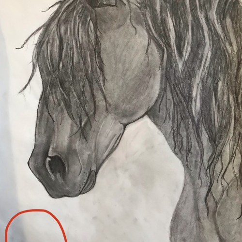
I would like to place a red rose somewhere in the vicinity of the red circle. Should I make the background darker than the Friesian, lighter (grey-ish) than the Friesian, or keep it how it is? Any opinions/comments would be very helpful.
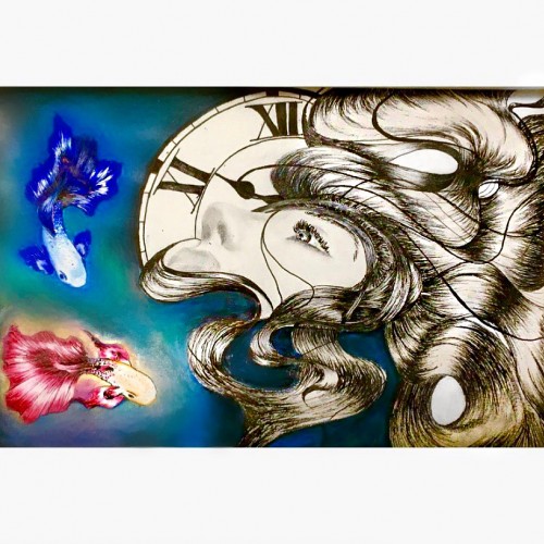
In this photo I drew two Betta fish, a clock and a female in a dark background. Drawing this picture was more of a self expression. The two betta fish expressed conflict; the clock expressed running out of time and the female I guess would represent myself. I was in a dark period while drawing this, but happy to say, I’ve managed to pull through my obstacles =)
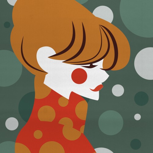
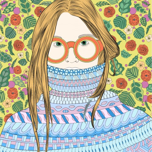
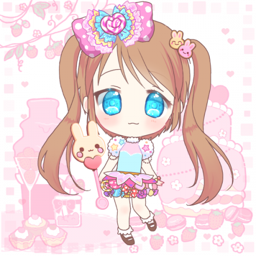
One of my girls with lots of patterns. The girl keeps in blue and purple and the background and sunglasses is kept in green, orange end yellow tones. I have always had a hard time using less color and this is my practice in keeping a more stringent color theme.
Inspired by nature. Background layer of the pages are covered by Greenpeace's newsletter papers and used mixed technique with acrylic, ecoline and markers.
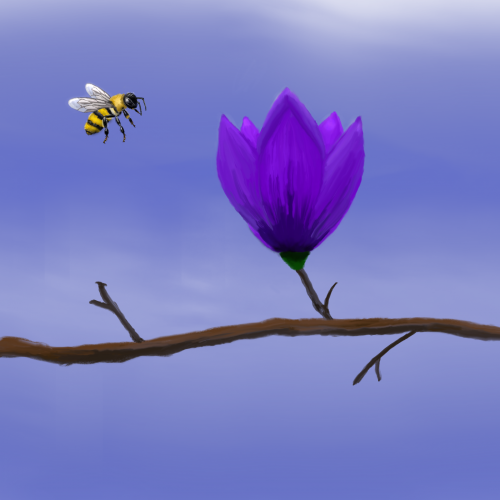
There are practice excercises on Youtube for the sketchbook app. It was just for the flower, which
I didn't quite get it right and I changed the background and added the bee. I am actually proud of the bee. That's breakfast.
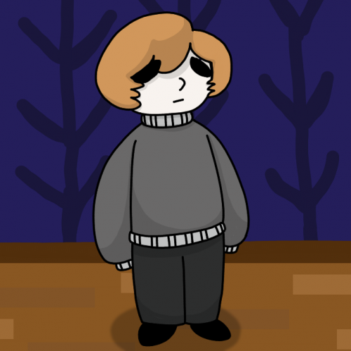
I'm considering starting a little comic with this little guy. Prepare to never see it exist. Also, backgrounds are hard and I didn't do all that much but it looks good!
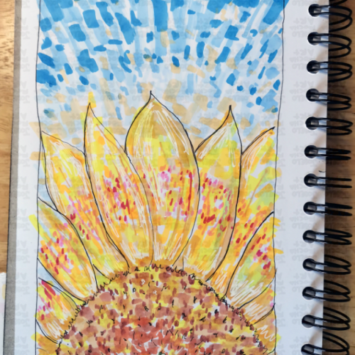
A vibrant, hand-drawn sunflower illustration featuring bold marker strokes and a rhythmic, blue-sky background. This piece captures the energy of a summer day through an impressionistic lens, blending warm yellows and oranges with cool, textured blues.
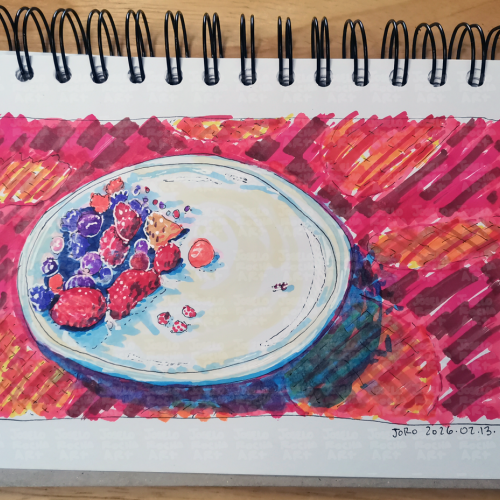
A vibrant fruit bowl filled with a variety of colorful mix of red fruits like strawberries, blueberries, and raspberries. The bright, bold colors create a striking contrast against the background.
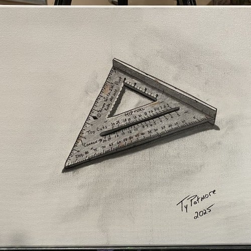
This piece continues my ongoing tool series, focusing on objects shaped by use, precision, and repetition. The speed square—an essential instrument of measurement and accuracy—is rendered with attention to wear, markings, and subtle imperfections left by time and handling.
Isolated against a minimal background, the tool becomes both subject and symbol: a quiet reflection on structure, angles, and the human need to measure and make sense of the physical world. Like the others in this series, it honors everyday labor and the overlooked beauty found in functional objects.
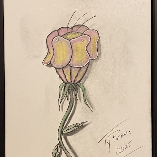
A captivating exploration of form, this work features an imaginative flower with a distinctive, almost sculptural head. The smooth, folded petals suggest a soft resilience, like a fleshy, protective helmet, while delicate antennae reach tentatively toward the light. The long, winding stem and minimal leaves anchor the drawing, creating a strong vertical movement. Rendered in a mix of colored pencil and graphite, the piece uses subtle shading to give the subject a remarkable three-dimensional quality, making it pop against the neutral background.
Elias Rosenshaw 8/29/2025
Mixed media on toned tan paper.
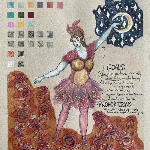
Starting next week, I'm going back to college. I'm very excited for my courses, especially art & writing. It will be a great opportunity to explore my curiosities, improve my art skills, and grow as a person. I will share my art assignments if my instructors allow it. I would also like to write a little about each piece, which may be required for my assignments anyway.
Lately, I've been inspired by fantasy & fairytale artwork. I think fantasy & horror will make good focuses for my pre-BFA portfolio. This was a little experiment with a fairytale aesthetic. One of my goals is to use limited art supply sets & swap out colours as they run out. I feel the first colours I picked out fit with aesthetic well.
I'm proud of this drawing, especially the dress & the night sky. However, I can see some areas that I should've done differently. I'm not happy with the proportions & foreshortening of the limbs. Also, I shouldn't have used a background colour for the flowers. I added the colour to cover up a smear from the watercolour. I should avoid making large areas of solid colour, especially with my coloured pencils. I am learning & improving.
So I'm calling this part 2 of the cover concept since I need to do the background as well. But I'm still pondering that, I just wanted to put an update on here.
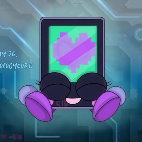
For Julesthetic Day 26, today's aesthetic is techcore.
For this day, I decided to make this little mosh pit based on a cell phone with various apps on a tech background
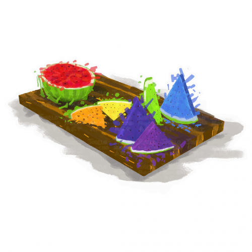
A vibrant assortment of rainbow watermelon slices is arranged on a wooden serving board, featuring colorful triangular and round shapes. The contrasting colors against the neutral background create a lively and appetizing display.
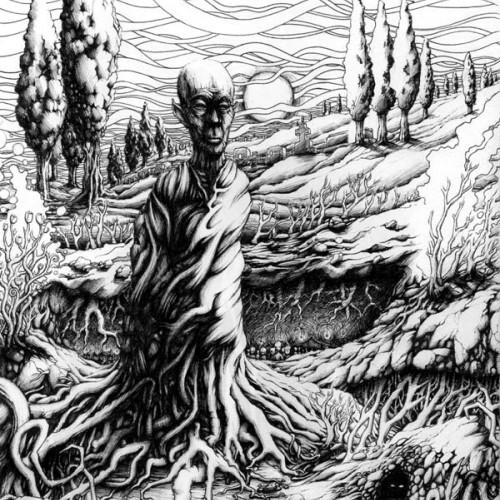
This captivating ink drawing features a fantasy character standing still, deeply rooted to the earth and seamlessly merged with nature. Surrounded by a complex web of trees and plants, the figure embodies the essence of the natural world. In the background, a mesmerizing sunset casts a warm glow over abstract waves of clouds, creating a harmonious blend of light and shadow. This artwork symbolizes the profound connection between humanity and the environment, inviting viewers to reflect on the beauty of nature.
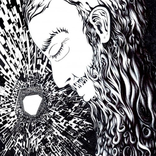
This black and white ink drawing portrays an aged man with a beard lost in deep contemplation within a futuristic spaceship setting. The subtle hints of sadness on his face are contrasted against the vastness of space, where the Milky Way is barely visible in the background. The artwork evokes feelings of isolation and reflection, inviting viewers to ponder the human experience amidst the cosmos.
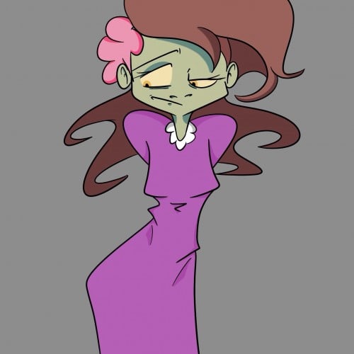
3 of 5, She's a witch character I revived. I scrapped her as an MC because her old designs were too hard to replicate and her character background took over the story I wanted her in. She has a seven-pointed star on her forehead that glows when using and detecting magic.