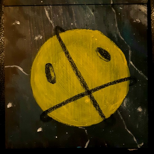
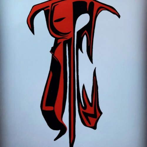
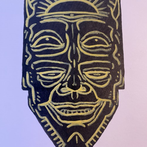
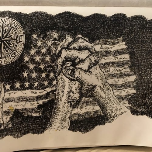
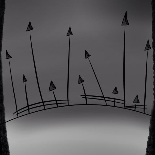
So I'm calling this part 2 of the cover concept since I need to do the background as well. But I'm still pondering that, I just wanted to put an update on here.
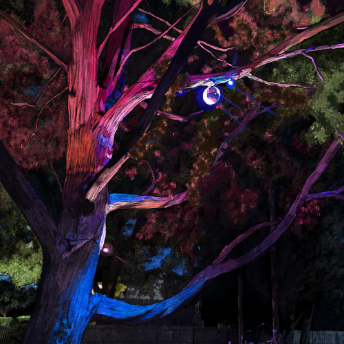
I am amazed summer after summer seeing this tree and garden grow. I started this with a blue background and a black layer that I punched through, and from there, I painted layer by layer from the back to the front. I like the realism I got, but I kept to a painterly feel using oil brushes.
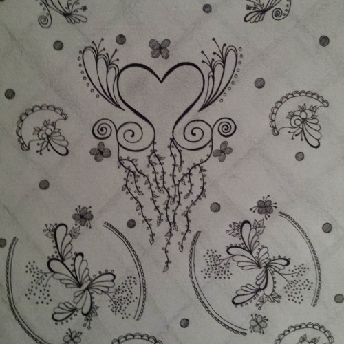
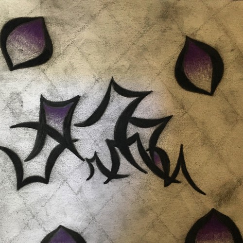
I love this design pattern. It gives a feminine touch...a fresh and clean feel. It’s uniform and repetitive pattern gives it a functional flow as well as an elegant look. I used familiar shapes in a way to make a statement of agreement. I love the background as well. It’s white and lightly smeared to give it a more stylish look. Also, the background is a subtle lattice style to add more sophistication.
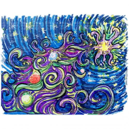
A colorful and dynamic scene depicts a Cosmic Christmas Tree with swirling galaxies and stars against a dark background. The vibrant colors blend together to create an impression of movement and energy in space.
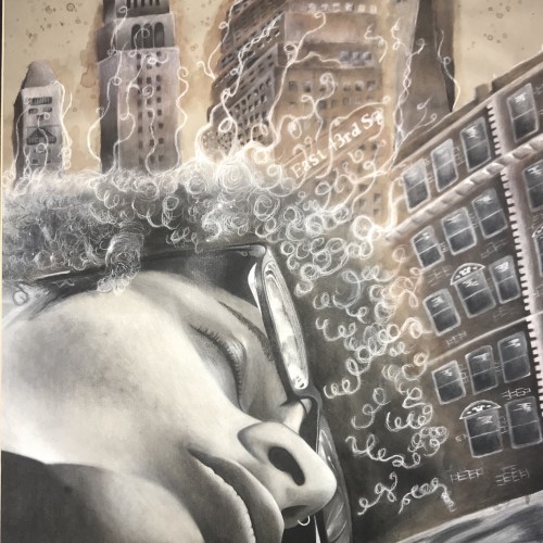
This right here is a self portrait of me “sleeping” And in the background there are some buildings from New York that I took pictures of and they are made of Coffee and Charcoal
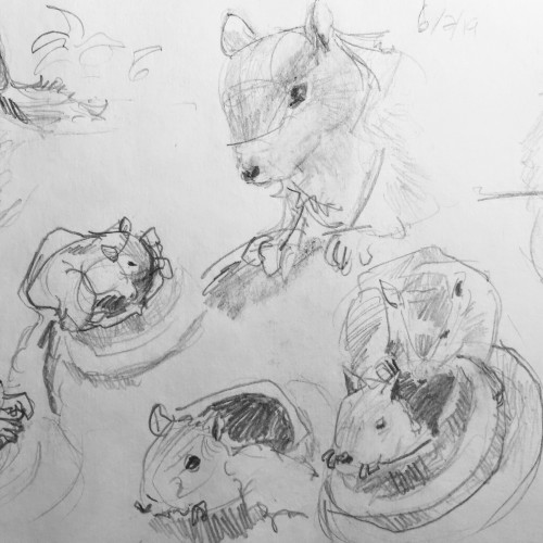
Spotted these two squirrels while out walking during spring 2018. The highly entertaining pair were exceptionally easy to photograph. NOTE: I'm working on how to make a better digital image of my artwork. Will get there--sorry for the gray background.
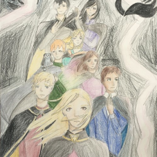
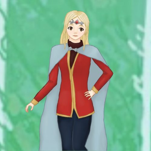
This is something I made for someone else, just a little drawing of Sophie Foster from KotLC as a Councilor. I did not draw the background, it's actually a small section from the KotLC official councilor art (by Laura Hollingsworth). Anyway I hope you like it!
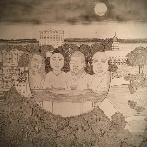
Today is my brother’s birthday...love him dearly! From left to right (husband, my brother in law, my brother, my cousin)...background is the city of Macon, Ga.
I decided to start drawing planets on top of the Galaxy background I drew a couple days ago. I'm doing 4 planets in total and then do a big reveal later. As I continue to do this 1 a day, 365 drawing challenge I'm starting to realize that I need to have more time in the day to think of ideas and what to draw next. I went on coolers.com to think of a color scheme. I saw the colors but I could not figure out where to place them b4 the deadline, so I couldn't really use it. I need to be better than this in the future
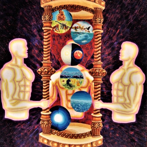
I painted this illustration to publicly proclaim the biblical account of a six (literal) days creation by the Holy Trinity to be the true account of the origin of all things that have been, are now, and will exist. I believe the evolution theories have many holes in them and lack sound evidence to declare evolution as the true account of the origin of all matter. I believe schools should teach both theories, and let the student decide which is truth for themselves.
The three figures of light that are holding the hourglass represent the Trinity—the Father, the Son, the Holy Spirit—Who together created all things. The background of the painting is supposed to illustrate that the Trinity created all things from nothing. The hourglass is supposed to appear to be made of pure gold, representing a creation without corruption and decay, which would later be part of the curse the creation would be subjected to because of man’s sin.
The top and bottom bases of the hourglass have the icon of the moon and sun six times to represent the six days of creation.
The six spheres floating inside the hourglass represent the six (literal) days and what was created on each day. The first day, God separated the darkness from the light. This sphere is placed at the bottom of the hourglass because sand in an hourglass always flows down.
The second day, God separated the sky from the sea. This is represented in the sphere located at the bottom right of the hourglass.
The third day, God separated the land from the waters, represented in the top half of the sphere. The bottom part represents the plant life that was created on the same day.
The fourth day, God created outer space: every star and planet. God mentions the sun was created to light the earth by day and the moon to light the earth by night. This is represented in the sphere located at the top middle of the hourglass.
1514
The fifth day, God created the creatures of the air and the creatures of the water. This is represented in the sphere located in the top right of the hourglass.
The sixth day, God created both the land creatures and man. This sphere is located in the top left of the hourglass.
(October 28, 2017)
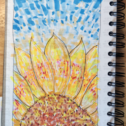
A vibrant, hand-drawn sunflower illustration featuring bold marker strokes and a rhythmic, blue-sky background. This piece captures the energy of a summer day through an impressionistic lens, blending warm yellows and oranges with cool, textured blues.
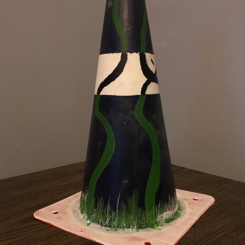
I’m gonna start reading more on human proportions and the human anatomy and how to draw it so for today I have some cones from when I was trying to teach my brother how to drive. I first painted the entire cone in two coats of gesso and then afterwords I painted the background first, put on a clear gesso and then a painted on the vines. I was trying to go for a positive space negative space look I do have other cones so I hope to try doing more of this in the future but for today this is what I made. #365daysofart #workinprogress #painting
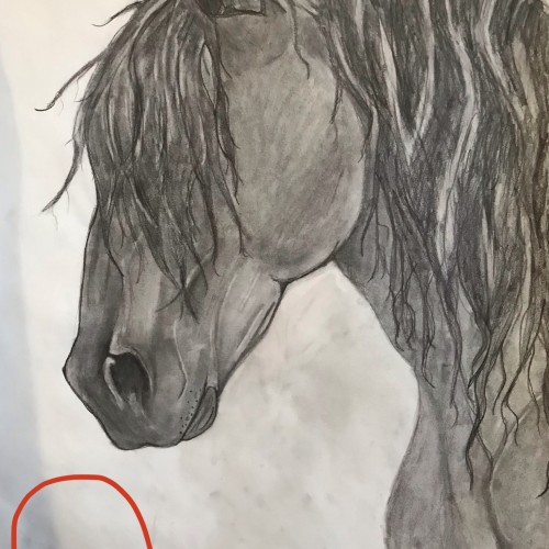
This is the finished drawing. It took me about 6 hours over the course of two days. I decided to just lightly shade the background so my finger prints didn’t show so much. I was afraid that going darker would make the horse blend in too much. I’m happy with how it turned out! Done in charcoal, marker, colored pencil, and pencils.
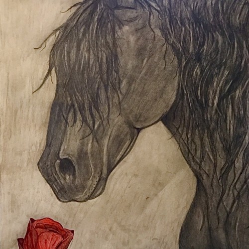
I would like to place a red rose somewhere in the vicinity of the red circle. Should I make the background darker than the Friesian, lighter (grey-ish) than the Friesian, or keep it how it is? Any opinions/comments would be very helpful.
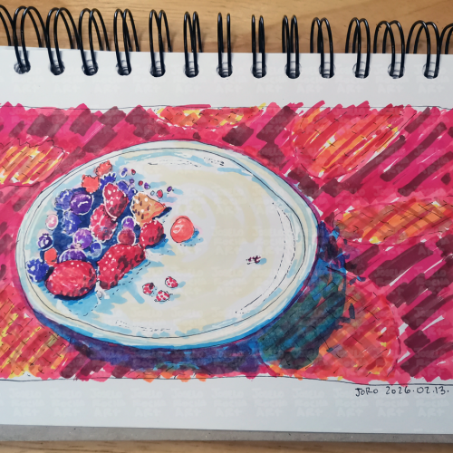
A vibrant fruit bowl filled with a variety of colorful mix of red fruits like strawberries, blueberries, and raspberries. The bright, bold colors create a striking contrast against the background.
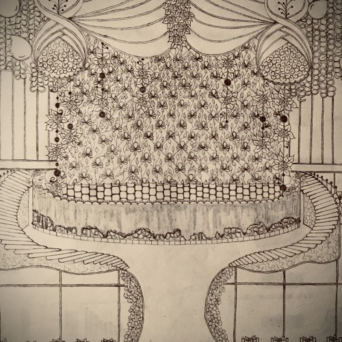
This is a charcoal drawing with a hint of purple to add some charm. The purple is only included in the enclosed curvatures. I gave it a lattice style background with a moderate smear. I prefer to use a lattice style background in my charcoal drawings because it adds character. Concerning meaning, it’s whatever you feel when you look at it.
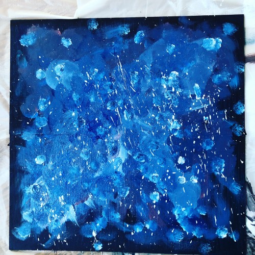
I’ve decided to try doing a galaxy painting again, I really like doing the first one. Honestly, I think the first one was better than the second one,which is weird but I’ve definitely learned a lot doing the second one like how I want to layer down the paint and what the background should look like. This is another 4, 6 x 6 painting like I did before; I’m gonna try doing planets again on each board, i want to get better at this.
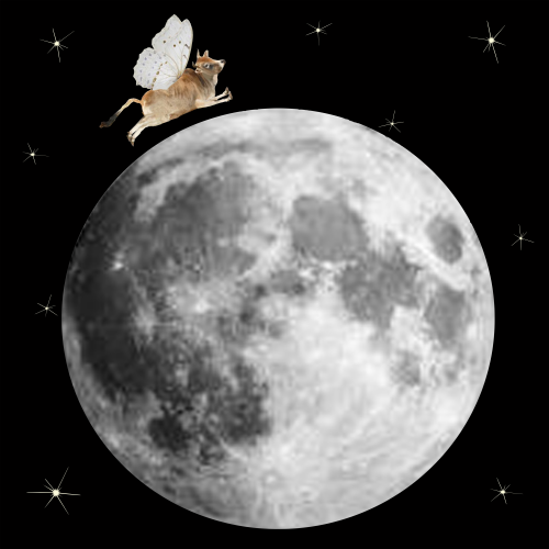
A cow thinks he can jump over the moon, so he's leapt and employed wings to succeed. Moral of the story: Believe in yourself. If you believe you will succeed, the chances are very likely you will.