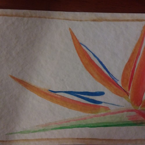
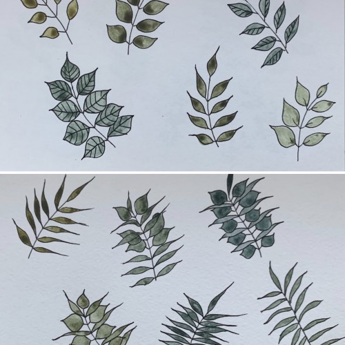
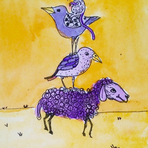
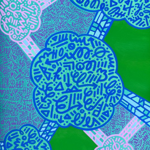
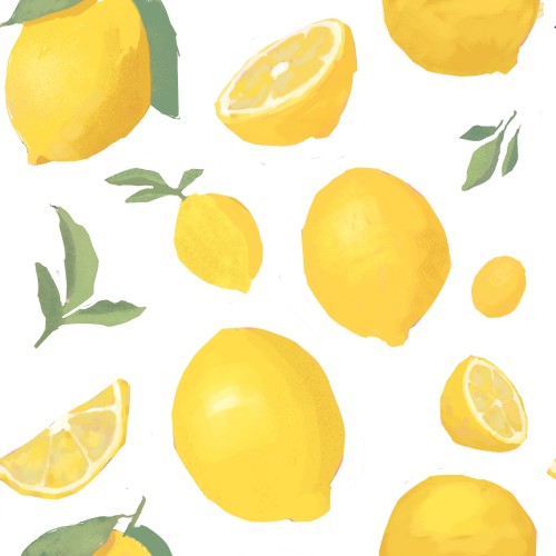
This time, again, two combinations. I believe the hues are very nice and calming. I used yellow ochre as the yellow color (PY 43, PY 1). On the upper part, the cobalt blue (PB 28) is used, on the lower part - it's ultramarine (PB 29).
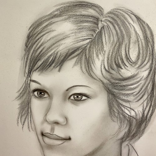
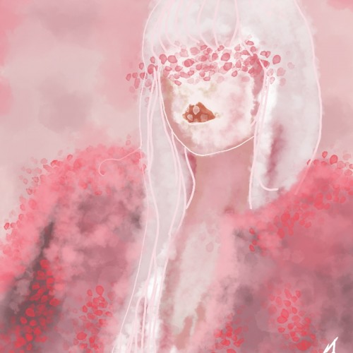
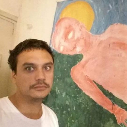
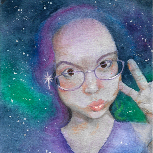
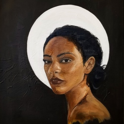
Eve is a continuation on my series of portraits. This piece represents my maturing technique and style as I begin to experiment with creamy consistencies. The painting displayed my ability to capture facial expressions.
My trip to Paris, France influenced my painting style. I was struck by the realism and drama depicted in various compositions, but also the lack of diversity. This piece is named "Eve" questioning whether the holy subjects depicted in European art were, in fact, part of a different race altogether.
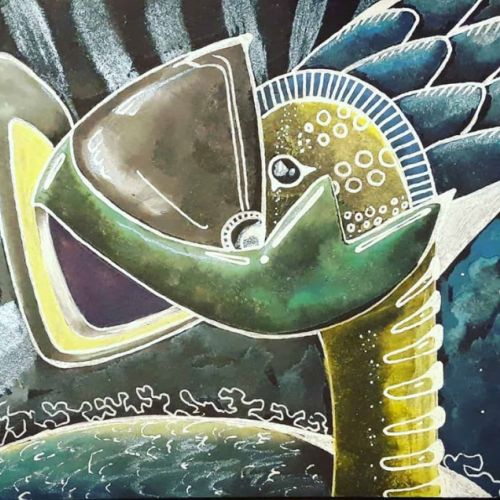
I’m fascinated in how something may make you feel. For instance, I’m deeply moved by images of outer space from the Hubble space telescope, but I do not try to recreate those photographs in my work. What does not exist in those photos, is how they may make us feel. This is why you won’t see any “realism” in my art. When we send astronauts to space, they can discuss factually what is happening, but what truly moves human beings is when astronauts describe how they felt while they were there. So, I choose to express how I feel, as opposed to illustrate what I see.
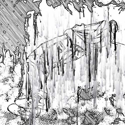
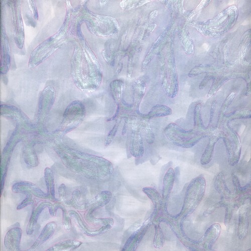
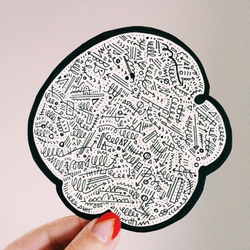
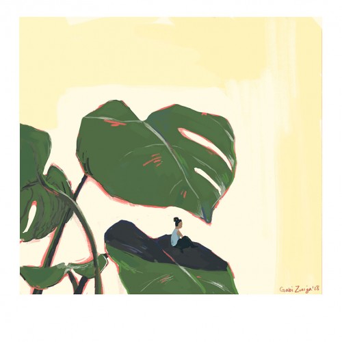
gabizuniga.com | @gabizuniga - It's funny how a warmup did to take a break from my usual work turns into a piece I actually really like. This represents how I often need to take a break from my own overthinking to clear my head and function.