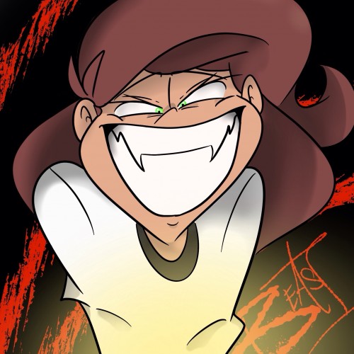
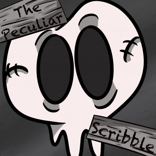
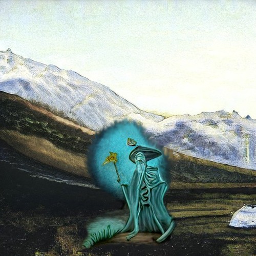
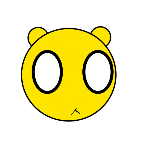
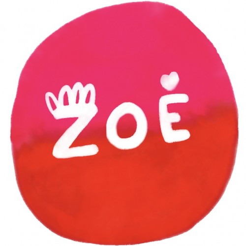
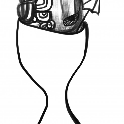
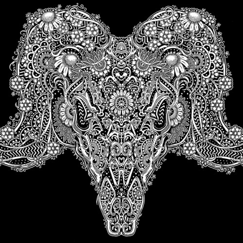
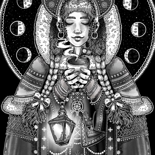
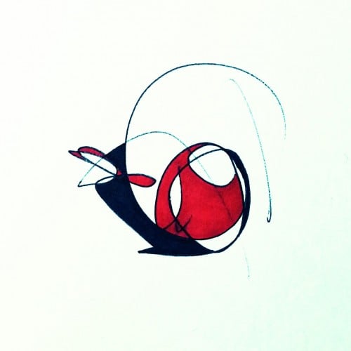
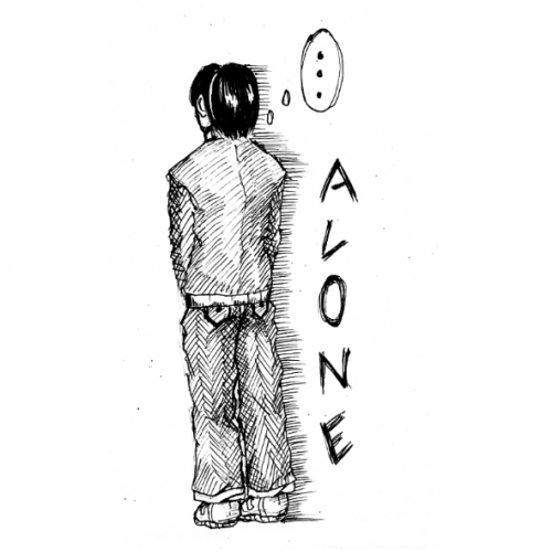
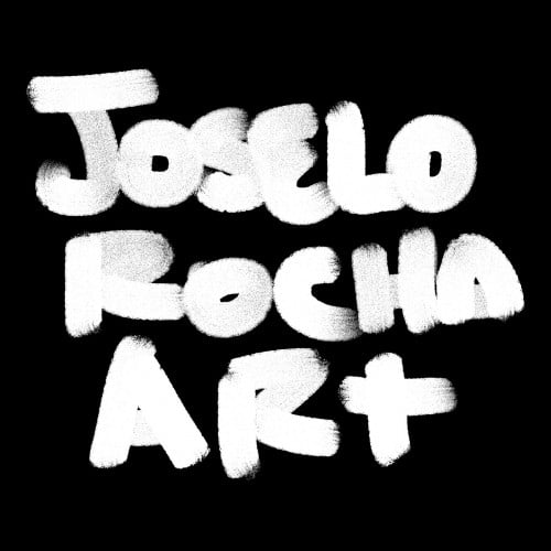
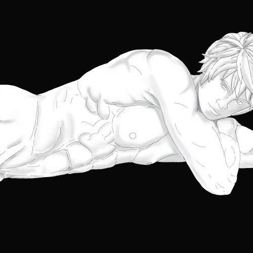
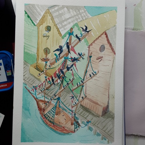
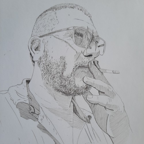
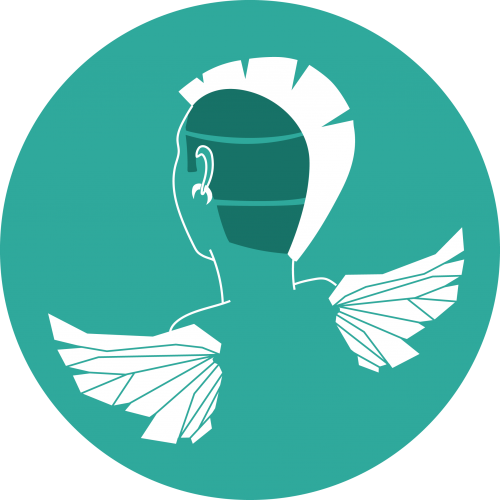
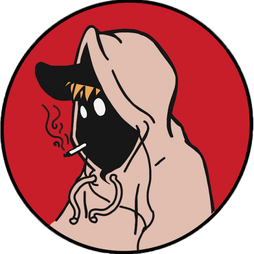
This is a new logo I created for my Webtoon, The Peculiar Scribble. It is about Scribble and his adventures in a place called, The Realm. Scribble is a heartwarming comic that is suitable for all ages. If you would like to read more below is the link to the comic: https://www.webtoons.com/en/challenge/the-pecuilar-scribble/list?title_no=866623
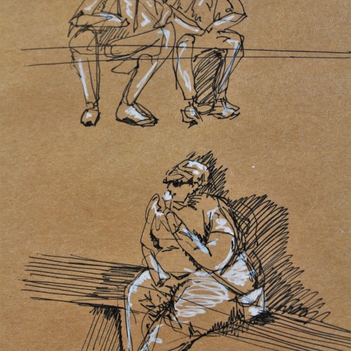
These are some gesture drawing sketches I did in ink with white pen highlights on brown paper. I was in Europe and sitting around a fountain watching people go about their lives. This was a really fun figure study and I think people make for great works of art.
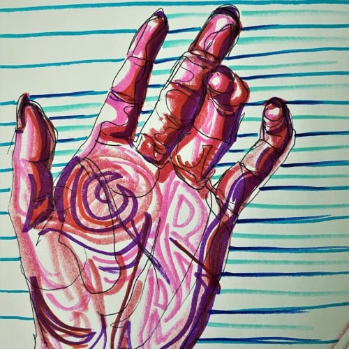
Pop art ink drawing in red, pink, and violet hues. The subject is the palm of a hand and curled fingers. The background has blue, green, and turquoise stripes contrasting the colors of the hand. This artistic drawing style uses non local color to create form in the palm hand drawing.
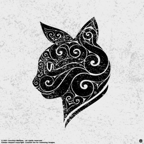
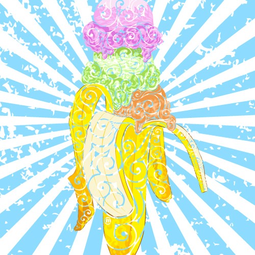
One of my Swirly Designs, illustrated with different tools such as Graphite, Aquarelle, Ink Pens and Ai & Tablet. Sometimes sheer Vectorillustration/design.
.
Urh.-Nr:1811955
.
Copyright by Carolina Matthes
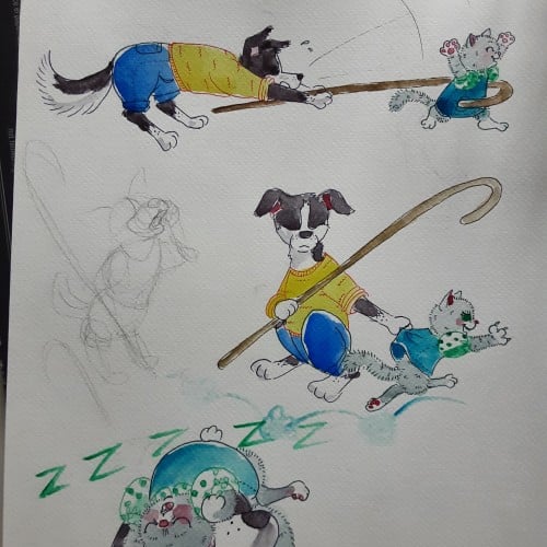
Having younger siblings is 50% about having spoiled rotten playmates and 50% about making sure those little morons dont accidentaly kill themselves. Border collies are so hard to draw antropomorph! Ever noticed how they most of the time keep their head lover than the bum?
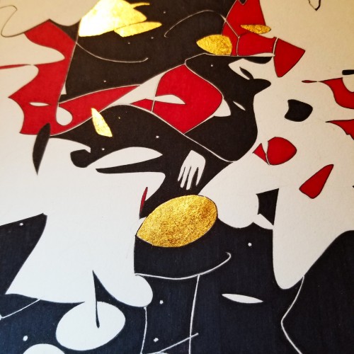
Since the dawn of l’automatisme, the floating shapes of Miro and Klee were praised as musical suggestions. Unlike the Masters, my groundwork of flowing lines speaks melody and rhythm from a musical score perspective. The flow of lines ties the art elements into a composition. It also reflects a concept from Chinese paintings, which says, ` as a line moves into the invisible, the idea continues.’
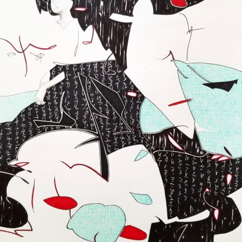
Whether the script in the background is an actual sutra is not the concern, even if it is, would it be readable to most? I question the use of lines in Calligraphy. Without the recognition of the exact words or meaning, can we still appreciate the quality and skills involved? Armed with a Chinese writing foundation, I adapted the use of the eight strokes (the basis of construction to Chinese character). The `writings’ resembles Chinese/Japanese writings but in fact, they are not. I needed a texture. With language as a symbol of culture, by visually adapting these kind of lines endears us to the image.
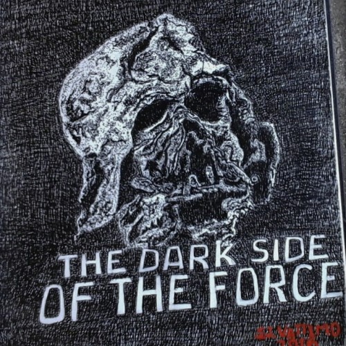
This is my study of the destroyed Darth Vader mask.from the movie Star Wars, "The Force Awakens. This ink rendering was my design for the pumpkin carving contest held every year at The Chadds Ford Pa Historical Society headquarter.
I chose to do this mask because it illustrates what is the ultimate destination for all who chose to live in the darkness of sin,in stead of living in the the light of righteousness.
The mask belong to the villain Darth Vader , who die while trying to force his son to join the dark side of the force. So I thought the destroyed mask over the letters "The Dark Side Of The Force." reflect the Biblical principle " Sin gives birth to death."
Written by Stephen J.Vattimo
Oct 24,2016