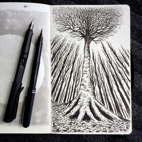
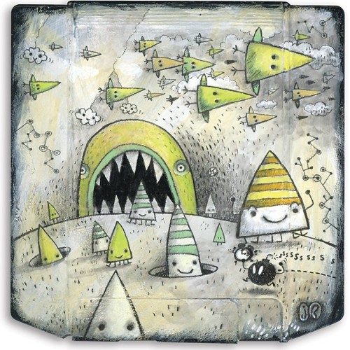
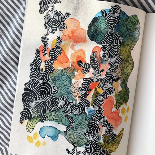
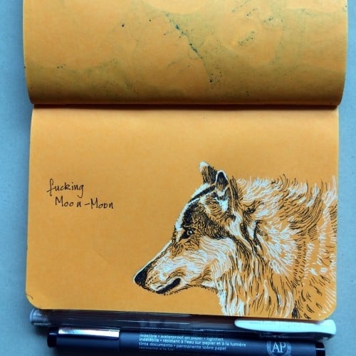
I intended to do quick little spot illustrations for Inktober this year, but nooooooo! Now Jimmy is drowning in digital ink and lots of doodle details. This was way too much fun to go simple. I also included the original sketch this time.
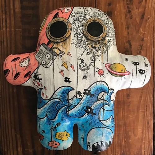
Here is my submission to the 10th anniversary Plushform show at Rotofugi Gallery. I was invited by Shawn @shawnimals to participate in this fun show. He is the creator of the Plushform DIY plush figure being customized by 40 artists at Rotofugi, a designer toy store gallery in Chicago. The original Plushform show was in 2008. I was waiting for their official announcement before posting my final so I could link people to the site for more info. I was told they are working on it and will announce soon. This will be for sale at the show.
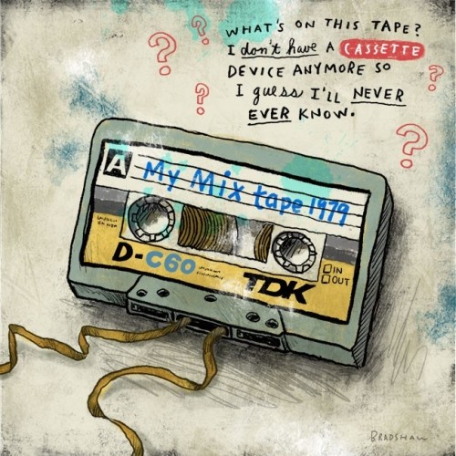
Painted Zip disk. Mixed media. I love old retro stuff and found rejected objects. It's hard to believe how fast zip, floppy, jaz, etc. disks became yesterdays technology. It's about time these old disks found a new purpose and some respect.
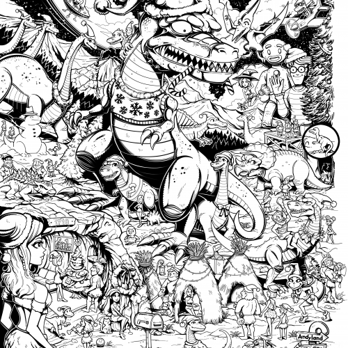
#25 Christmas Art Contest - I'm pretty sure I drew this in 2023 if I'm not mistaken. It was for a Christmas art contest at magma.com and drawn directly on their website using an iPad pro. And well, although I met all the requirements I didn't place in the top four. The rules stated that we had to pair up with another member from the website art community to draw a Christmas themed picture relating to anything from our childhood. What you see is only half the picture. My project-partner Andy added his portion to the collaboration, but I removed his pen strokes just for my website. That's why on the right side of the picture the Christmas tree and edge appear unfinished.
This image is huge, like 5000 pixels. This website will resize the image losing details, but if you would like to zoom-in to a higher resolution, try this link to get a closer look. Safe link to mega-upload file storage:
https://mega.nz/file/vqoXGIgD#bx6hdvKVKX8__hfBAYEVtp49NESS26w4iudrlM-oI_4
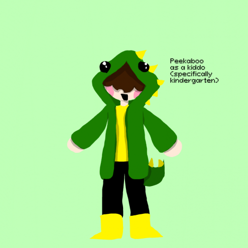
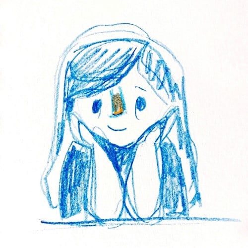
Hey Boos! This is me in kindergarten. I decided to make different eras of my life. Dino Nugget is me in kindergarten (I was misaken for a boy all the time), then there is Princess who is me in 1st and 2nd grade (I was a feral demon in a princess dress what then), then Hoodie Kid (me in 5th and 6th grade), and lastly Bell Bottom who is me in 7th grade (she wont make an appearance until I make a big change in my style cause she's me currently) anyway this is just a little project for fun.
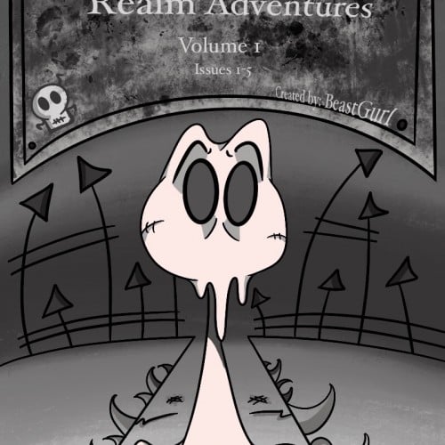
I have a Webtoon called The Peculiar Scribble. I am completely redoing and rebooting the series. The series only has one chapter at the moment. But I didn't like the start of it, so I'm giving the chapter and the rest of the series a fresh new start. I will hope to have the whole chapter posted to Webtoon by the end of the month. This is a sneak peek of the comic cover art. This character means a lot to me and comes from the very depths of my black inky soul.
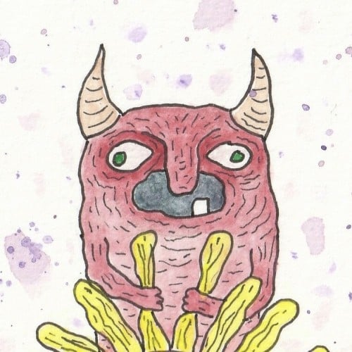
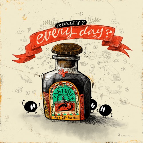
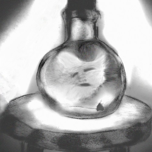
Captured spirits in bottles are typically used when summoning demons. The type of spirit captured depends on the demon you wish to conjure and is used as currency or an "exchange" for the demons services. This spirit is an average "lost soul" and can be used to summon Balaam, the demon of greed. {Work of Fiction!} ♡♡♡
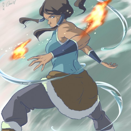
Re-watching the series now. Really liked the general concept, visual character design and the action scenes. It even inspired me to make an AMV about Korra >> https://www.youtube.com/watch?v=-TIidatQrw8
It was nice and refreshing to see a (physically) strong rebellious female character, something different from a usual portrayal of female characters. However something went down the hill and I'm struggling to go past the 1st season hehe.
I know, Korra and the whole series are quite controversial and I understand why, but as a female myself I was inspired by this badass female character (well, as I explained, until some point, but nonetheless). Anyways, hope you enjoy my drawing ^^
Program used: Paint Tool SAI
My first venture into artist grade colouring pencils - and I'm smitten! I never thought I could achieve such boldness and blendability with them! I'm still getting used to them and will think about choosing smoother paper with less tooth next time. The texture and weight was more for the water-based gouache along with alcohol inks (which are very unforgiving to even primed heavy paper!). Apologies for the unevenness of lighting between the 2 sides of paper; will correct that when I'm making proper image files.
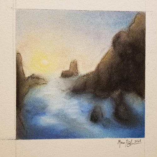
Pastels...I've never been a huge fan of working with them, mainly because I can never seem to get them to blend or move the way I want. I think this turned out okay; it's not the worst it could've been...not the best. It was fun to try, considering the fact that I rarely try new mediums, and it got my mind off everything I've been worrying about. Anyway, enjoy.
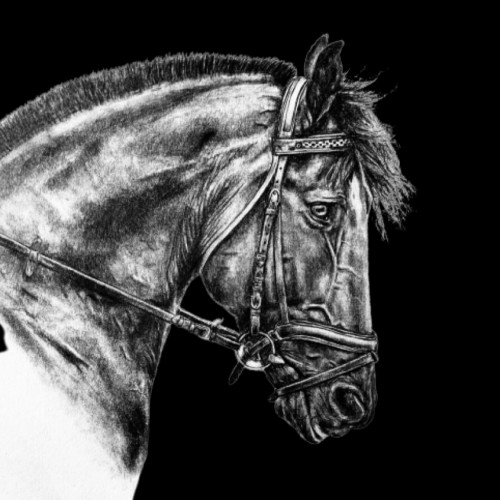
I’m finally done! ‘Veronique‘ is done in pencil, on Medium 80 lb drawing paper. She took me about 8 hours to complete. If you are interested in purchasing prints, please visit my website at this link:
https://imagineitvirtual.wixsite.com/sedonaequineart and contact me. Any opinions or advice would be greatly appreciated!
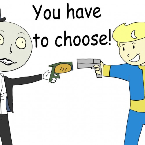
And then one of them gets shot, and Ellie says, "You know you didn't have to do that, right? But that's okay, you just keep being you!" ... Be that Unplanned Variable! Be the Hope Colonist, and play Outer Worlds by Obsidian today!!!!
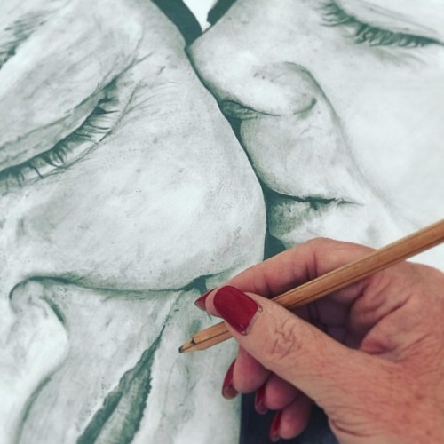
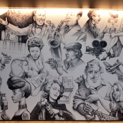
I had a wonderful time creating this commision for a Kansas City Personalities wall mural installed in a downtown KC apartment building. The wall measures roughly 12’ x 20’. These were all hand drawn graphite and charcoal drawings that I scanned into my mac and delivered digitally. The file was then enlarged and applied to the wall surface.
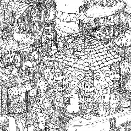
This is part of a broader idea for a big busy city teeming with different characters. Some of those characters will travel deeper through this city and through different lands. Eventually they get back to where they started from.