Previous
Next
logo logo
logo logo
  • Discover Art
    • Trending
    • Most Recent
    • Most Faves
    • Most Views
    • Curated Galleries
  • Drawing Challenges
    • See All Challenges
  • Drawing Prompts
  • Artists
    • Most Popular
    • Most Recent
    • Available For Hire
    • Artist Spotlight
  • More
    • Marketplace
    • Art Discussions
    • Resources
    • News + Blog
Login
Most Relevant
Select an option
  • Most Relevant
  • Most Faves
  • Most Views
  • Most Comments
  • Most Recent
SEARCH RESULTS FOR

colors

PK PK
Enlarge
Light the lamp of hope

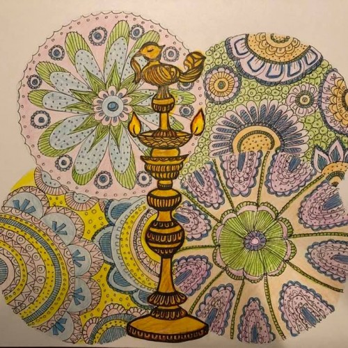
The picture has a traditional south indian lamp with 'Rangolis' in the background. The lamp is lit for prayer, good health, hope and prosperity. The 'Rangolis' are beautiful patterns filled with colors which are drawn outside our homes. The pictures symbolizes hope, health and prosperity in our lives.

  • 16
  • 3
  • 0
Marie Ysabelle Marie Ysabelle
Enlarge
Liquid sunset

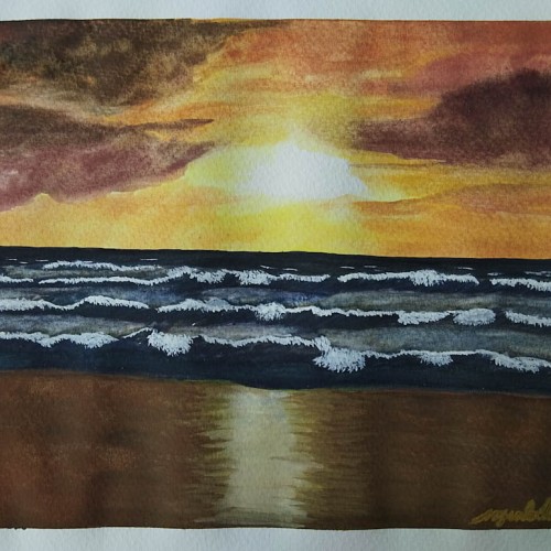
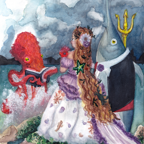
It was the first time I tried using a Fabriano 200 gsm cold pressed watercolor paper. And I had learned different techniques in watercolors through the process of creating this painting. It was also fun painting the waves. Thank you, Maria Raczynska.

  • 38
  • 3
  • 0
César Camilo Julián Caballero César Camilo Julián Caballero
Enlarge
Yellow Crab

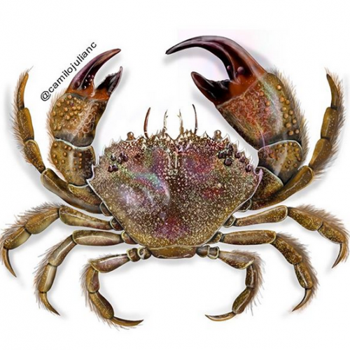
Yellow Crab (Eriphia verrucosa) is typically brownish green or brownish red in colour with yellow spots. It has very strong, asymmetric chelipeds, the larger ones typycally bering rounded tuberbles in front of the upper articulation of the carpus. More like this on: https://www.instagram.com/camilojulianc/

  • 460
  • 3
  • 0
Kladdpapper Kladdpapper
Enlarge
Kitten clothing

Experimenting with colors and design

  • 13
  • 3
  • 1
Marlon Boettger Marlon Boettger
Enlarge
Revenge Of The Pirate Princess

I used a page from an old whaler's logbook as a backdrop for this illustration.

  • 13
  • 3
  • 0
Tamasuki Tamasuki
Enlarge
Cherry Blossom Themed Character

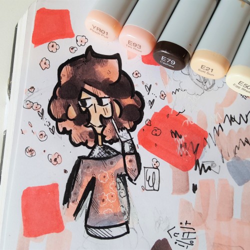
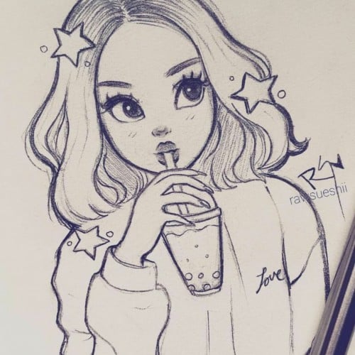
This is a drawing I did not too long ago, I think the pink and brown were blended nicely together in the piece. I use Copic markers, Microns, gel pens, and Ohuhu markers. I really enjoyed the theme of this character, (cherry blossoms) I think I was able to show the colors nicely together in the artwork.

  • 21
  • 3
  • 2
Olivia Reckert Olivia Reckert
Enlarge
Banana Cupcake

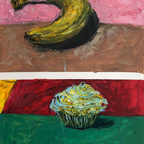
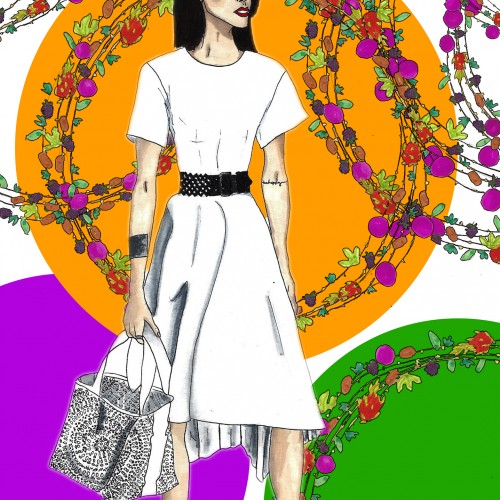
This is a 19 in by 24 in oil painting on Bristol paper. I love this piece because of the textures and the bright but muted colors. I did this in 2019 in the spring at the Fashion Institute of Technology. The professor always pronounced "fruit" in a very bazaar way. It was a great class overall.

  • 9
  • 3
  • 0
J.J. J.J.
Enlarge
Fall Colors
1/3

Sharing how lovely and vibrant fall colors can be...

  • 21
  • 3
  • 0
Grey Grey
Enlarge
COVID-19 AWARENESS

This is to show that how relentlessly our doctors and hospital staffs are giving their best to save our lives :')

  • 29
  • 3
  • 2
Corby Canie Corby Canie
Enlarge
The Seawife

Watercolour painting, 2020.

  • 16
  • 3
  • 0
Maja Rasic Maja Rasic
Enlarge
Capricorn

Quick sketch with ink and watercolors, A5 size.

  • 91
  • 3
  • 4
Jeff Brown Jeff Brown
Enlarge
Abstract

Still experimenting with colors

  • 13
  • 3
  • 0
omar sayed darwesh omar sayed darwesh
Enlarge
Posing

An ink colors sketch for a different angle pose

  • 18
  • 3
  • 0
Mr Chilli Mr Chilli
Enlarge
Martian Marvin, Beer edition

I had so much fun creating this custom beer poster. The colors, the planets, the shoes. I hope everyone enjoys.

  • 31
  • 3
  • 0
Steve Steve
Enlarge
Together in Autumn

This is a watercolor portrait of a couple locked in a lovely pose wearing autumn colors.

  • 13
  • 3
  • 0
Steven Witcher Steven Witcher
Enlarge
Headless Horseman

Ink, alcohol marker, and watercolor on bristol of the infamous Headless Hessian Horseman who terrorized old Ichabod Crane in Sleepy Hollow.

  • 6
  • 3
  • 0
Hadas Hadas
Enlarge
2.Public Enemy

"I got so much trouble on my mind, Refuse to lose. Here's your ticket, Hear the drummer get wicked..." 
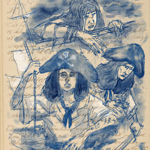
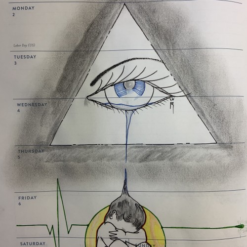
Playing card from a musical game of fours- no. 2

  • 81
  • 3
  • 0
Steve Steve
Enlarge
Glad To See You

Here's a watercolor painting of a couple really glad to see each other.

  • 8
  • 3
  • 0
Rigo Montes ♓️ Rigo Montes ♓️
Enlarge
Life

Another page out of my day planner

  • 3
  • 3
  • 0
Nancy Patton Wilson Nancy Patton Wilson
Enlarge
Frida Kahlo

“Feet, what do I need you for when I have wings to fly?” – Frida Kahlo

  • 8
  • 3
  • 0
Nancy Patton Wilson Nancy Patton Wilson
Enlarge
John Stienbeck

I wonder how many people I've looked at all my life and never seen. ― John Steinbeck

  • 2
  • 3
  • 0
Chandeep Kaur Chandeep Kaur
Enlarge
Gouache Birds

I have painted these birds using Arteza gouache colors on black sketchbook by Artway ltd.

  • 199
  • 3
  • 0
Lea Lea
Enlarge
Neon Lights

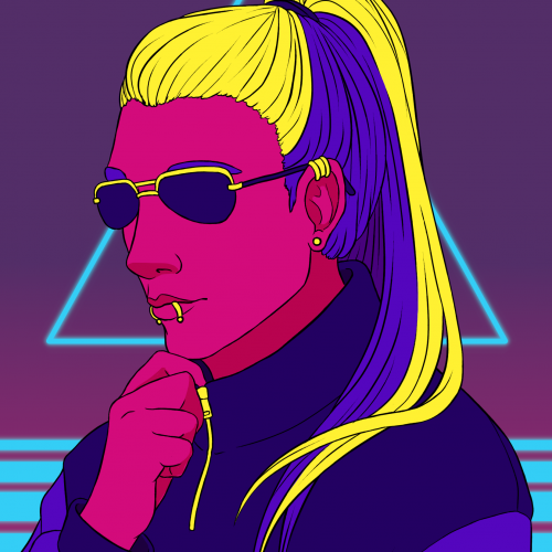
Another one! I ended up having so much fun with neon colours, that I decided to turn it into a series - last time it was Vega, now it's her companion Cyrus rocking those bright colours

  • 256
  • 3
  • 0
Nancy Patton Wilson Nancy Patton Wilson
Enlarge
Henri Matisse

I would like to recapture that freshness of vision which is characteristic of extreme youth when all the world is new to it. - Henri Matisse

  • 8
  • 3
  • 0
Rigo Montes ♓️ Rigo Montes ♓️
Enlarge
Alien

Watercolor pencils, pastels, pens and markers

  • 8
  • 3
  • 0
Hannah Claire Hannah Claire
Enlarge
Seasons greetings Owl

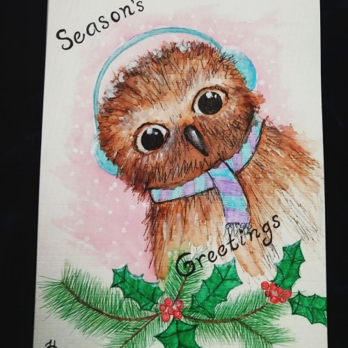
This is my first holiday card of the year. I paint them and get them printed on 5x7 folded cardstock. I sell them $5 a piece of $4 a piece when you buy 2 or more. I do take online orders so let me know if you would like to purchase one.

  • 39
  • 3
  • 0
Liz Lanspery Liz Lanspery
Enlarge
Secondary Colors

  • 4
  • 3
  • 0
Ginny Griffin Ginny Griffin
Enlarge
Summer Blooms

Hand drawn whimsical flowers in bright summer colors. Micron, watercolor with metallic accents

  • 313
  • 3
  • 0
Anlly Anlly
Enlarge
Iduuno

A little girl I drew a loong time ago. Loved the colors, but I have regressed to black and white to work on my values.

  • 12
  • 3
  • 0
Lena Zvereva Lena Zvereva
Enlarge
Some floral doodles and color test

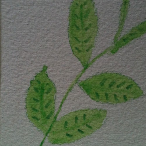
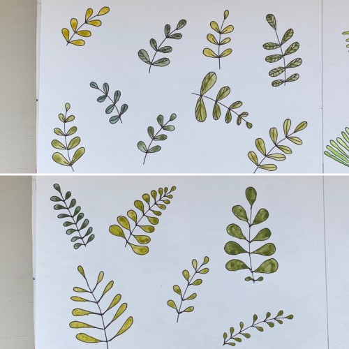
For some reason I tried some floral drawings, of different shapes, and I also used mixtures of different colors to produce hues of green. The first page - it’s a mix of the cobalt blue (PB 28) and cadmium yellow medium (PY 35). On the second one there is ultramarine (PB 29) for the blue color and the same yellow paint. To me, it seems the difference is very little but I’ve got the color closest to the ‘normal’ green using Cobalt rather than ultramarines. The latter gave either to yellowish to olive hues or too blueysh

  • 10
  • 3
  • 2
« Previous
Next »

Doodle Addicts

Navigate
  • Discover Art
  • Drawing Challenges
  • Weekly Drawing Prompts
  • Artist Directory
  • Art Marketplace
  • Resources
Other
  • News + Blog
  • About Us
  • Contact Us
Newsletter
© 2026 Doodle Addicts™ — All Rights Reserved Terms & Conditions / Privacy Policy / Community Guidelines
Add Doodle Addicts to your home screen to not miss an update!
Add to Home Screen