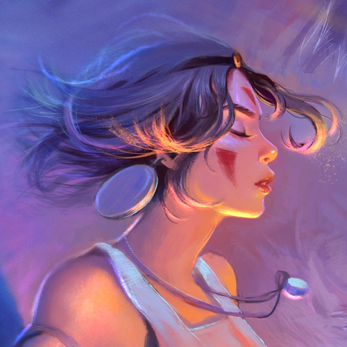
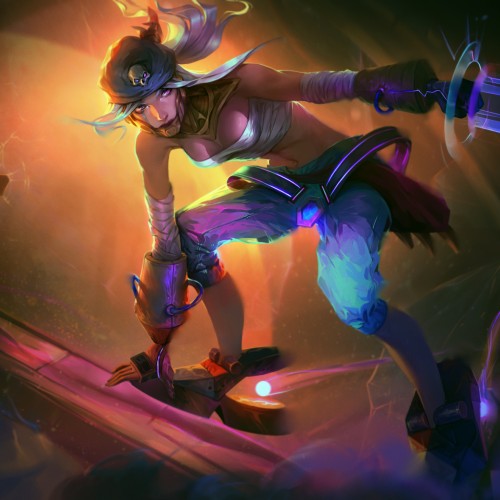
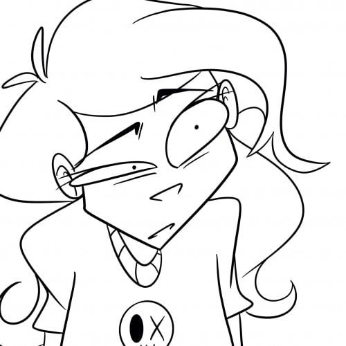
Finally I finished this one! New original character Marisha. She is a pirate and a very skilled thief! I was doing this artwork for Mooncolony art contest in Discord. Worth to try a new theme! https://www.youtube.com/watch?v=UAB-YNU2ZoA
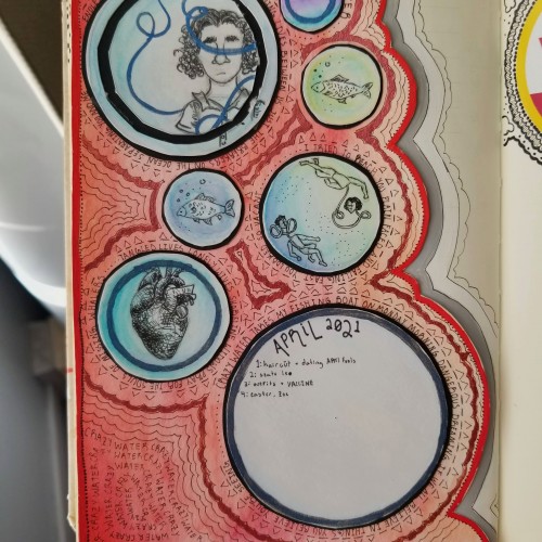
April has truly started off on a high note: 3 days of warm weather (a rare occurrence in an early Chicago spring), I finally did double-backs to the floor at gymnastics, found out I won a few art contests, and I got my first COVID vaccine! It's nice to have things starting to work out, even if it is just temporarily.
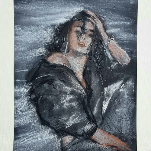
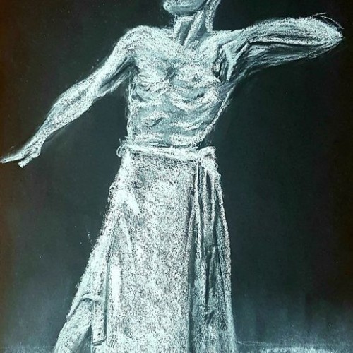
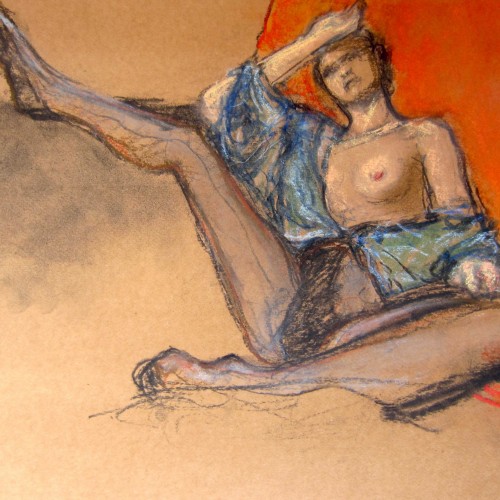
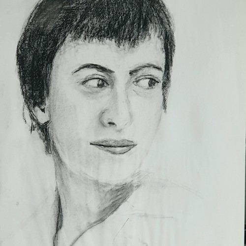
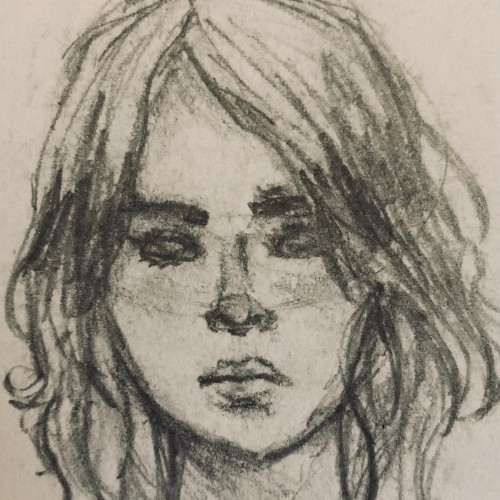
A life drawing I did yesterday via zoom with Drawing Life in Glasgow. The pose and theme were modelled after Egon Schiele. Charcoal, brush pens and conte on brown A3.
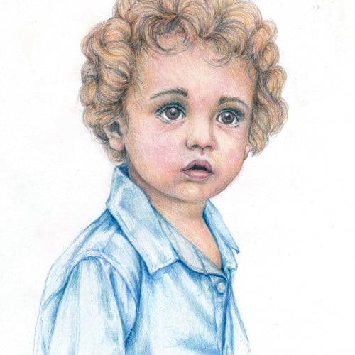
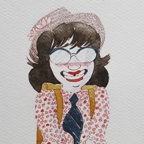
Playing with colored pencils this week. This is very loosely based on a photo....changed hair, eyes, and skin tones to suit my mood. Vintage Conte a Paris Criterium, Prismacolor Verithin, and Tombow Irojiten pencils.
Sketched while watching the Mariners get knocked out of playoff contention. Colored on the computer. I did a hue changing little animation with it if you check my Instagram. :)
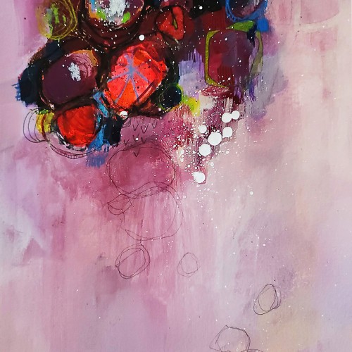
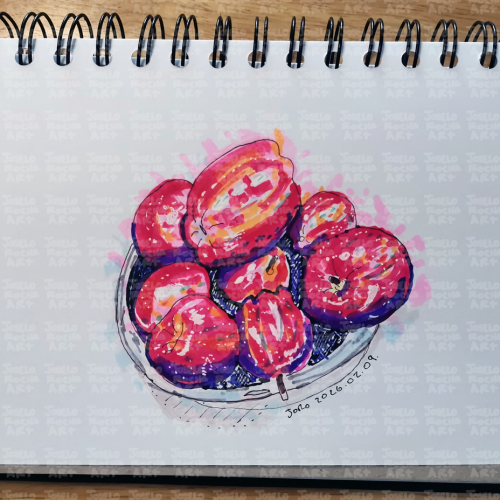
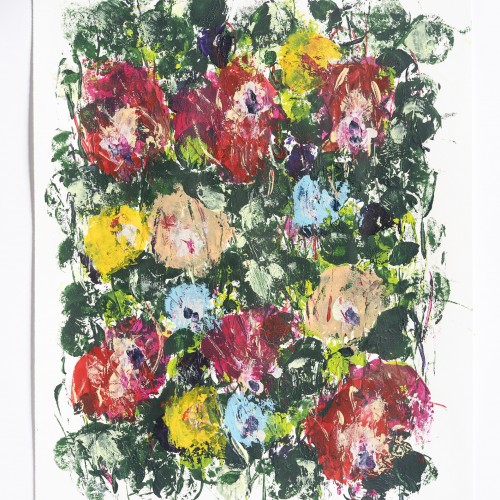
A vibrant exploration of color and line, this piece captures the ephemeral beauty of red plum blossoms in a textured, contemporary sketch style. Perfect for those who appreciate the intersection of traditional botanical themes and modern, expressive artistry.
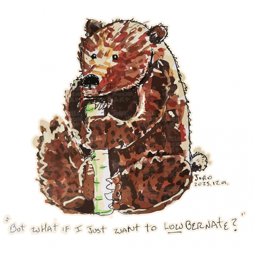
So yeah, I will color this image and add a word bubble. But um, this was my honest reaction to season two of Hazbin. Soooo, I will continue the roller coaster ride, but my ears will burn from the singing and my eyes will be scratched out due to the content in which I am forcing them to focus on. I might even go see a therapist and question all my life choices.
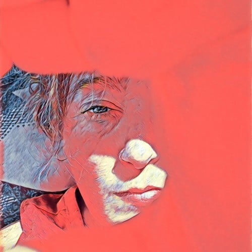
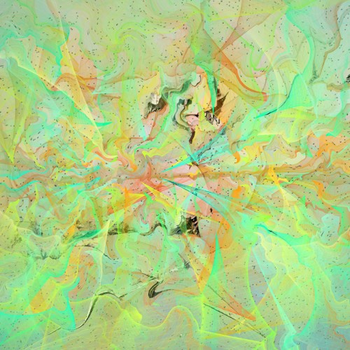
Trying to make sharp shadows without having everything blend toghether. My goal is to convey the warm, pinkish sunlight on the first day of spring, and light is not something i have given enough care to earlier. Removing colors from a photography is an effective way to get an idea of how sharp shadows actually are!
The materials that Meir uses in her works are not of the refined and so she is called an “arte povere” artist. At times she describes her work as someone dealing in alchemy - work develops as in a trial laboratory with different techniques and materials. She says, “ at times the artistic work process is a sort of puzzle demanding the filling in of all the empty squares “.
Some of her work focuses on women, and they incorporate criticism and cultural protest.
Meir has strong opinions about recycling and environmental protection that is represented in her works by use of materials and shapes. In her work she reacts to contemporary art that communicates with the eco system, waste, and she also searches for different worlds. Her works are made up of layers upon colorful layers that when we look at them it becomes clear that the mound of waste she chose is not coincidental. It actually becomes a colorful kaleidoscope of utopia.
Jaffa Meir is a multifaceted, autodidact artist working in painting, sculpture, photography, product design, carpets and furniture, painting on textile, and computer graphics.
The structural composition of some of the works is influenced also by her many years of working in the architects’ office.
Meir also worked in the developing of ideas within the field of ecosystems and recycling for factories such as Coca Cola, and during this process came up with ideas for designing parks and public game spaces using industrial waste products.
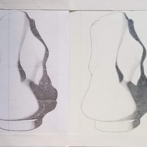
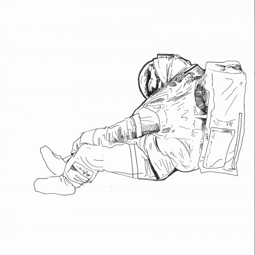
Yes, indeed, this is a foot. A foot that has taken up 5 months of my life but here we are. For some context, I'm lucky to be able to take 2 art classes this year (senior year perks, I suppose) especially given the strict scheduling connected to the STEM program I'm in. I'm taking Studio Drawing, and this is my first Bargue drawing. Definitely different than what I'm used to doing (and not the most interesting to look at), definitely mildly infuriating at times, but it's done.
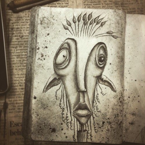
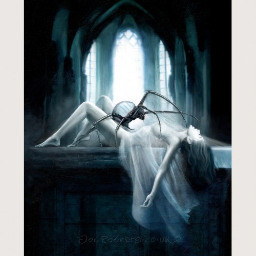
Originally inspired by the occult fiction of the seventies, this began life as a cover concept for a commercial horror anthology. It later transitioned away and became a personal project, granting me more freedom with its content, and a return to one of my favourite themes – the offsetting of monstrosity with beauty.