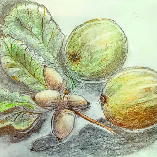
I live in the countryside and often pick bits up from the road when I'm out walking. I found these one time so brought them home to sketch . Thanks for looking.
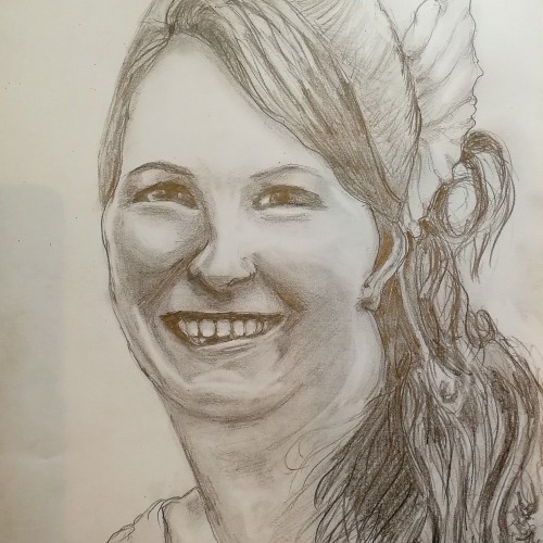
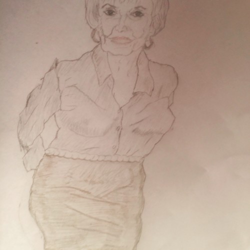
Very sad pencil drawing of a young friend who lost her life aged 37, in a freak car accident in 2017.She left 2 young sons and a husband to raise them alone. I gave him this picture as a gift, a tribute to a lovely lady who is no more....
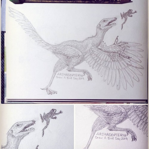
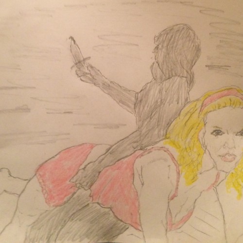
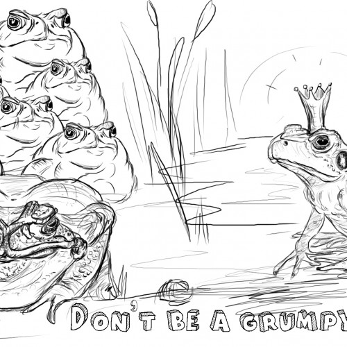
Today is Draw a Bird Day. I drew an archaeopteryx, the first bird. And Might Could Draw Today's prompt is frog. So I drew a frog too. This picture makes me happy. Don't worry, the frog gets away and the dinosaur finds something else to eat. ^_~
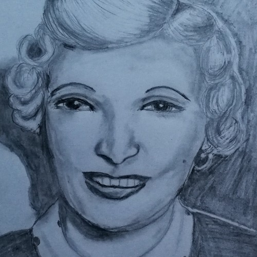
Graphite drawing of Ruth Ellis. She was the last woman in Britain to be hanged, in the 1950s. British justice was no where near as sophisticated then, as it is now. I am convinced that the overwhelming mitigating circumstances would have saved her life. Her confession was never examined or questioned. Today she would have received a manslaughter charge at most. Such a tragedy.