I’m fascinated in how something may make you feel. For instance, I’m deeply moved by images of outer space from the Hubble space telescope, but I do not try to recreate those photographs in my work. What does not exist in those photos, is how they may make us feel. This is why you won’t see any “realism” in my art. When we send astronauts to space, they can discuss factually what is happening, but what truly moves human beings is when astronauts describe how they felt while they were there. So, I choose to express how I feel, as opposed to illustrate what I see.
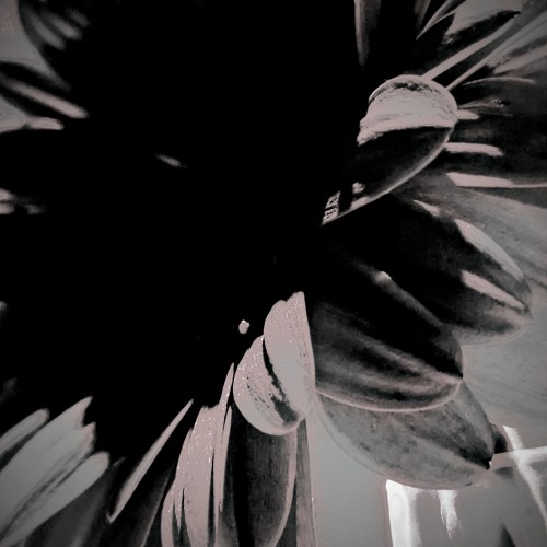
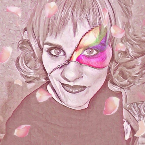
Capturing the spaces in between and amplifying them with a play on exposure and contrast to bring forth the beauty I see within the layers. This particular play is a flower I saved from a very special event I attended. I then dried the petals of this beauty. These special petals make their way to various projects, including oil and acrylic paintings and resin on canvas. More to come :)
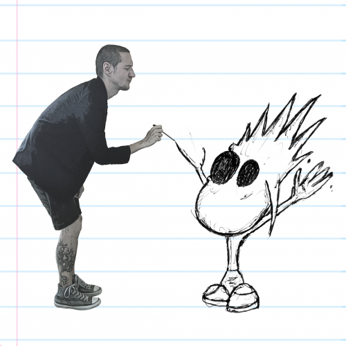
Hey boos! This is just a little drawing of me at like, 7 maybe, and my old imaginary friend I named Mr. Friend. He was a very nice imaginary friend. :DDDD
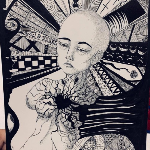
This piece critiques the modern tendency to hide identity behind brands and consumerism.
* Visual Focus: The mask is partially obscured by a fitted baseball cap, with the bill pulled down to cover one eye. The cap itself is a symbol of brand identity and fast-fashion culture. The uncovered eye retains an unsettling, almost mechanical gaze.
* Symbolism:
* The Cap: Represents the societal practice of hiding behind brands and allowing consumerism to dictate self-worth and block out unwanted truths. The act of seeing is deliberately curtailed.
* The Mask: Emphasizes that the consumer identity is often a façade-a manufactured mask that prevents others from truly
"seeing" the individual, while simultaneously restricting the individual's full sight of the world.
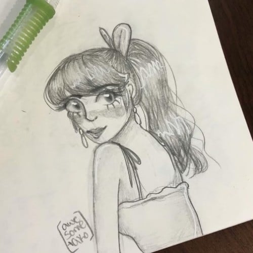
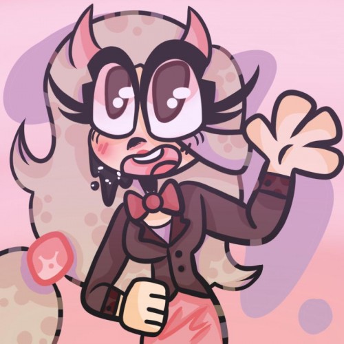
I forgot to post it here. I got better at drawing her. I tried a more '80s anime style recently but will keep at this style since that's how I draw. I love her even though she's not intended to be a main character
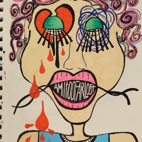
I would most definitely be lost if I didn't have my sketchbook to help me process my feelings...this is the product of my most recent therapeutic endeavor. Done with Posca Pens.
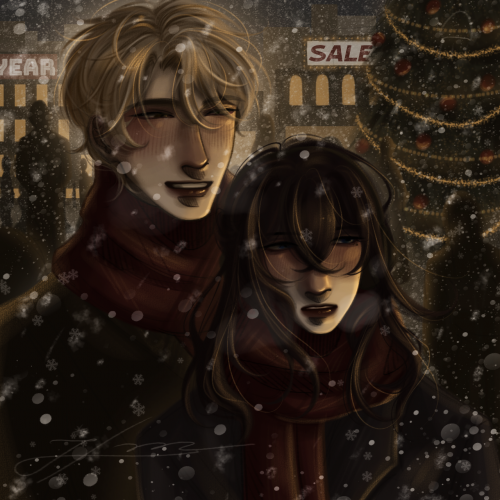
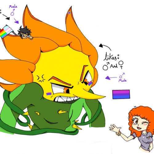
I drew my boyfriend (the flower guy) and Me (on top of him) with our Pride Flags. The red hair girl is our friend and is an Ally. And I drew this entirely with a mouse! :O
Hi, I'm new on here :)) I've been practicing different styles and made this [Alice Angel from Bendy and the ink machine!] Hope you like it! Posted on my Pinterest as'well: https://www.pinterest.ca/pin/669980882070115761/
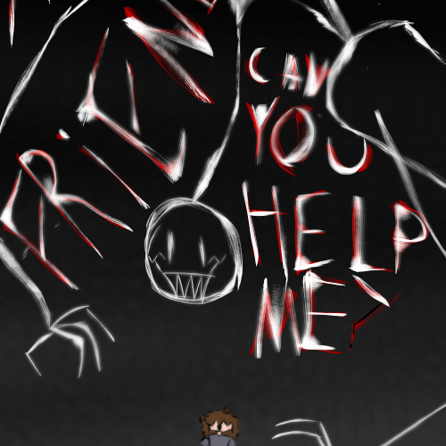
Started in 2017, finished in 2018. Have you ever been with someone who made you feel like the only way out of the situation was to kill yourself? I was.
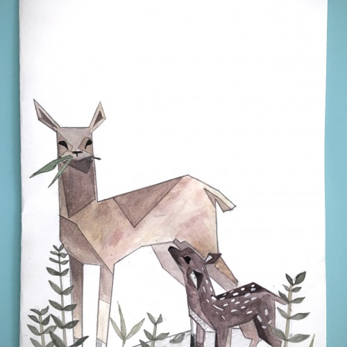
A geometrically stylized Doe and fawn illustration intended for the purposes of a greeting card. Materials used: Water soluble colored pencil, graphite pencil
I want my art to look like a child who has probably killed his parents.
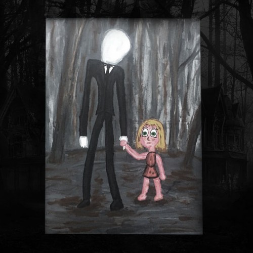
Slender Man and Madeleine McCann (2015)
26" x 26"
Acrylic
I got in a lot of trouble for this one.
We were having a thunder storm, so I figured I’d do a sketch waiting for my markers to get here. I ended up getting carried away and inking it right away. I put a few layers of fixatif on it, and I'm hoping that'll stop the paint/ink from bleeding too much when I apply the markers.
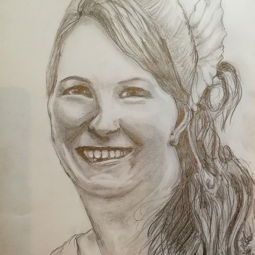
Very sad pencil drawing of a young friend who lost her life aged 37, in a freak car accident in 2017.She left 2 young sons and a husband to raise them alone. I gave him this picture as a gift, a tribute to a lovely lady who is no more....
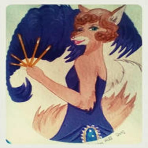
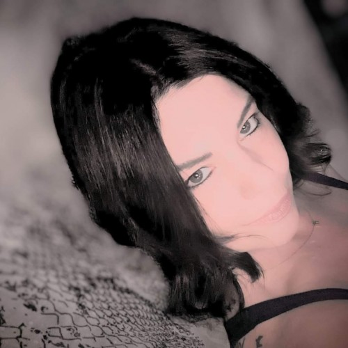
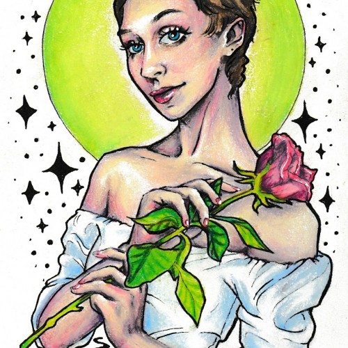
This drawing was done with pen and colored pencil. I wanted to create a self-portrait that could also serve as a profile picture for my art accounts. My other self-portraits tend to be realistic, so I decided to try and depict myself in my own illustrative style instead. My artistic influences for this piece include tattoo styles, pinup art, and art nouveau as well as inspiration taken from some of my favorite portrait artists, Sargent and Rockwell.
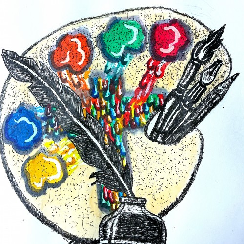
Well friends just got done creating my new logo to represent my ministry. The design incorporates symbols that represent both writing poetry, commentaries, short humorous stories. This is represented by the quill pen. My fine art, commercial art represented by the painter's palette, and illustrative tools.
The colors running to the center of the palette to from the cross, represent my Christian ministry. Going to FedExs to have business cards made. Planning to use this logo for my art fair booth
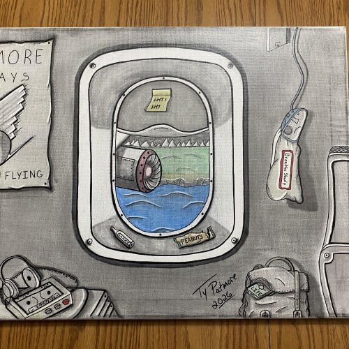
A quiet study of restraint at altitude. Framed through an aircraft window, the world below drifts by while the interior remains still—objects worn, familiar, and waiting. Subtle distortions in perspective and muted tones emphasize the tension between motion and pause, progress and endurance. This piece captures the discipline of waiting while suspended between departure and arrival, where patience is not passive, but practiced under pressure.